Jung von Matt/Alster: The Trojan Font

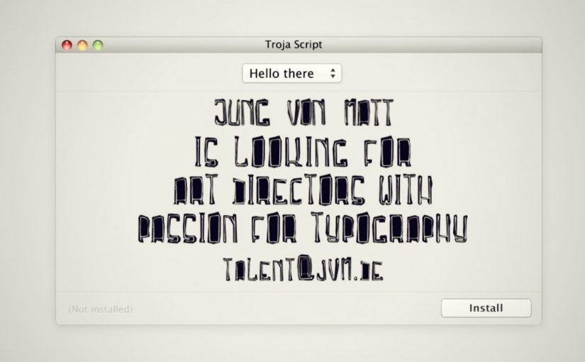
To reach designers with a passion for typography, Jung von Matt/Alster created a font of their own. Dubbed “Troja Script,” the typeface hides a recruitment ad where you’d normally expect the standard font preview.

Uploaded to free font websites, the font turned the download flow into a hiring funnel. Instead of “Aa Bb Cc,” the preview text itself carried the job pitch, so the first interaction with the product was the message.

Why the font format is the perfect carrier

Fonts are one of the few “free resources” designers actively seek out and evaluate with intent. That evaluation moment is intimate. You’re zooming in, testing, imagining usage. Replacing the preview with a recruitment message means the ad arrives when attention is already high and the audience is self-selected.

In creative industry hiring, embedding the application hook directly into a designer’s natural workflow can outperform broad employer-brand messaging.

Why this lands

This works because the medium is the filter. If you’re downloading free fonts, you’re likely the exact kind of person the agency wants to talk to. The message also feels earned rather than intrusive, because it appears inside a utility the user chose to access.

Extractable takeaway: If you’re recruiting for a specialist craft, place the pitch inside a tool or asset that specialists already pull into their process, so the channel itself does the targeting.

The business intent underneath

The stronger move is not to promote the vacancy more loudly, but to place it inside a behaviour that already signals fit.

The real question is how to turn a specialist asset into a self-qualifying hiring channel.

The campaign turns three steps into one. Discovery, qualification, and application. The reported outcome is a high ratio of signal to noise, because downloads come from the right community, and applications come from people who actually noticed and understood the move.

What this teaches about workflow-native recruiting

  • Make the artefact do the targeting. Put your message inside something only the right audience will seek out.
  • Embed the pitch in the default interaction. Use the “preview” moment, not an extra landing page.
  • Keep the twist legible. If the audience needs explanation, the hack loses momentum.
  • Measure the whole funnel. Track not just reach, but qualified actions (downloads) and outcomes (applications).

A few fast answers before you act

What is the “Trojan Font” idea?

It’s a font distributed through free font sites where the preview text is replaced with a recruitment message, turning a download into a hiring touchpoint.

Why target designers through free font websites?

Because that’s where typography-minded designers actively browse and evaluate resources, so attention and relevance are naturally high.

What makes this more effective than a normal job ad?

The audience is self-selected, and the message arrives inside a workflow moment, so it feels like discovery rather than interruption.

What result did the campaign report?

It was reported to generate around 14,000 downloads and 23 job applications for the open role.

How can other companies adapt the pattern?

Create a useful specialist asset, distribute it where specialists already look, and embed the hiring hook in the default usage or evaluation step.

Mercedes-Benz: Transparent Walls for PRE-SAFE

For the PRE-SAFE® precrash system from Mercedes-Benz, ad agency Jung von Matt in Germany set out to make chaotic traffic intersections safer.

The idea was to let everyone “look around the corner” as if walls were transparent. In this execution, “transparent walls” means projecting a live camera view onto the building edge so the blind spot becomes visible. A camera filmed what was happening out of sight around the corner, and the live images were projected onto an 18/1-format billboard mounted on the building edge for approaching traffic to see.

When out-of-home becomes a live safety interface

This is not an awareness poster. It behaves like infrastructure. The corner. The blind spot. The moment of uncertainty. All become the media placement and the message at the same time.

The real question is whether your safety story behaves like a tool at the decision point, not a slogan people ignore.

How the mechanism creates “transparent walls”

  • Capture. A camera records the street view that drivers cannot see until they commit to the turn.
  • Project. A large-format display on the building corner shows that view in real time.
  • Anticipate. People approaching the intersection get a few extra seconds to recognise a cyclist, car, or hazard.

In urban mobility and automotive safety communications, making risk visible in the moment can change behaviour faster than warning copy.

Why it lands

Safety messages often fail because they arrive as abstract advice. This one arrives as immediate utility. It gives people a concrete, legible advantage at the precise point where bad outcomes happen. Because the live projection turns hidden risk into visible information, the benefit is believed without asking anyone to trust a claim. Safety-led brand work should earn attention through utility, not admonition. The result feels less like advertising and more like “someone fixed a problem.”

Extractable takeaway: The most persuasive safety communication is not a claim. It is a demonstrable reduction of uncertainty, delivered at the exact moment people need it.

What the brand intent looks like underneath

The stunt does double duty. It dramatizes what PRE-SAFE® is for without explaining sensors, thresholds, or system logic. It also signals a brand posture. Mercedes-Benz is not only selling performance. It is selling anticipation.

Steal this pattern: make uncertainty visible

  • Build the message out of the environment. Pick a real-world constraint your audience feels, then solve it visibly.
  • Make the proof self-evident. If people can understand the benefit in one glance, the idea scales.
  • Reduce uncertainty, not fear. Practical clarity outperforms shock in public safety-adjacent work.
  • Choose the right “moment.” Place the intervention where decisions are made, not where people are merely passing through.
  • Design for all road users. Intersections are shared systems. Make the benefit readable for drivers, cyclists, and pedestrians.

A few fast answers before you act

What is “Transparent Walls” in one sentence?

It is a digital out-of-home installation that shows live footage from around a blind corner on a building-edge billboard, so approaching traffic can spot hazards earlier.

How does this connect to PRE-SAFE®?

It demonstrates the value of anticipation. Seeing danger earlier is the human equivalent of what precrash systems aim to deliver technologically.

Why use a live camera feed instead of a scripted film?

Because real-time content makes the utility undeniable. People trust what they can see unfolding right now.

What are the main execution risks?

Latency, visibility in different lighting conditions, weather robustness, and ensuring the display informs rather than distracts drivers.

How would you measure success?

Observed speed adjustments, braking behaviour changes, near-miss reduction at the intersection, dwell/attention metrics, and sentiment around perceived usefulness.

Vodafone: 5 Million Pixel Hunt

To promote the Vodafone LG Optimus Windows 7 phone with a 5-megapixel camera, Jung von Matt/Alster built a deceptively simple challenge: find the “winning” pixels inside a picture made of five million clickable pixels.

The premise is literal. One giant image is broken into a massive pixel field. A small set of those pixels are winners, and each winning pixel unlocks a prize, a new LG Optimus Windows 7 phone.

In handset launches, interactive “single mechanic” experiences can outperform heavier builds because the payoff is immediate and the learning curve is close to zero. By “single mechanic,” I mean one repeatable action loop that anyone can understand instantly.

A camera spec turned into a game mechanic

Most 5MP messaging ends up as lifestyle photography claims. This flips it into a rule: five million pixels. Go hunt them. That move makes the spec tangible, even if you never take a photo. Because the spec becomes a rule you can act on, the message lands without explanation and invites immediate participation.

It also reframes the product story from “better camera” to “better challenge.” The camera claim becomes the architecture of the experience.

In mass-market handset launches, the simplest interactive loops win because they reward attention in seconds, not minutes.

Why the pixel hunt pulls people in

A “pixel hunt” is a giant clickable image where only a small set of pixels are winners, and three forces do the work:

Extractable takeaway: When a spec can be turned into a single, repeatable micro-action with an obvious reward, participation scales faster than feature-heavy experiences.

  • Micro-actions: every click feels like progress, even when nothing happens.
  • Lottery logic: anyone can win, which keeps effort rational in small bursts.
  • Social proof: the more people play, the more the hunt feels “worth trying.”

The real question is whether your mechanic is so obvious that people can start without instructions and still feel progress within the first few clicks.

This is the kind of engagement design that scales without extra features. It is not a platform. It is a loop you can explain in one sentence.

Reported outcomes, and the real takeaway

The campaign is reported to have driven hundreds of thousands of visitors and to have had the full pixel field “clicked out” within weeks. Whether or not you track the exact numbers, the lesson holds: a single, repeatable micro-action can create massive aggregate participation when the reward is clear and the friction is low.

For spec-led launches, I would rather ship one obvious loop like this than a sprawling feature set that needs onboarding.

What to borrow from the pixel-hunt mechanic

  • Translate a spec into an experience rule, not a headline.
  • Use one action that is impossible to misunderstand, here it is “click to search.”
  • Make progress feel constant, even when outcomes are rare.
  • Keep the story retellable, “there were prizes hidden in five million pixels.”

A few fast answers before you act

What is a “pixel hunt” campaign?

An interactive image where users click through a dense pixel field to uncover hidden winning spots that unlock prizes.

Why does tying the hunt to “five million pixels” matter?

It turns a product attribute into the core mechanic. The spec becomes something you do, not something you are told.

What makes this kind of engagement scale?

Low friction plus high repeatability. People can participate in seconds, stop, and return without needing to relearn anything.

What is the biggest risk with this mechanic?

Fatigue. If the reward feels too remote, people churn. The prize framing and perceived odds must stay motivating.

How do you measure success beyond page views?

Unique participants, average clicks per session, return rate, and the conversion from participation into newsletter opt-ins, store visits, or qualified leads, depending on your objective.