Oakley: Pro Vision with Google Cardboard

When you picture a virtual reality (VR) headset, you probably imagine something high-tech and far too expensive to feel practical. Google Cardboard takes that assumption and flips it by turning a simple cardboard cutout into a phone-powered VR viewer.

Oakley borrows that logic and puts it exactly where people already accept cardboard. The packaging. Instead of being thrown away, the box becomes the device that unlocks the experience.

Packaging that turns into a VR product

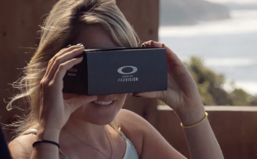
Google launched Google Cardboard as a cardboard cutout that turns Android phones into a VR headset. Oakley integrates that fold-and-slot concept into its sunglass packaging, so customers can transform the pack into a viewer and use their phone to access 360-degree content.

The payoff is described as a “you are there” look at extreme sports like surfing, skiing, mountain biking, skateboarding, and skydiving. It is less about specs and more about perspective.

In consumer product marketing, converting packaging from waste into a usable experience can create perceived value without adding new components.

Why this lands for an action-sports brand

This works because the medium matches the promise. Oakley is not only showing extreme sports. It is letting you look from inside the moment, using viewer control to make the content feel personal. The “VR made from packaging” twist also creates a good kind of surprise. The customer discovers the brand added value where they expected disposal.

Extractable takeaway: If your story is about immersion or perspective, build the experience trigger into something the customer already touches, then let the first interaction deliver the benefit before they read any explanation.

The commercial intent underneath

This is a purchase-adjacent experience. It turns the post-purchase moment into brand time, and it extends the product narrative beyond the sunglasses themselves. The packaging becomes a bridge between retail and content, with the customer doing the assembly that makes the story memorable.

The real question is whether the packaging can turn post-purchase curiosity into a usable brand experience, not whether it can imitate premium VR hardware.

What to steal from packaging-led immersion

  • Reuse an accepted “throwaway” material. If it is already in hand, it is frictionless distribution.
  • Make the first use obvious. Assembly and activation should be legible without instructions.
  • Match the experience to brand territory. Immersive POV content fits performance and extreme sports.
  • Design for sharing. If it looks clever on camera, people will demonstrate it for you.

A few fast answers before you act

What is Oakley Pro Vision in this context?

It is a packaging-led idea where an Oakley box folds into a Google Cardboard style VR viewer, using a phone to deliver 360-degree extreme sports content.

Why use Google Cardboard instead of a dedicated headset?

Because it lowers cost and setup. A phone plus folded cardboard is enough to deliver an immersive experience without asking people to buy new hardware.

What does 360-degree content add versus normal video?

It gives viewer control over where to look, which increases the sense of presence and makes the experience feel closer to a real point of view.

Where does the marketing value come from?

From turning packaging into a reusable object and extending brand time after purchase, while linking the product to high-adrenaline moments people want to feel.

What is the main failure mode with this pattern?

If the fold, fit, or onboarding is unclear, people will not assemble it. The physical usability has to be as strong as the content.

Metro Trains Melbourne: Dumb Ways to Die

Accident rates on the Melbourne Metro were rising due to an increase in risky behavior around trains, and a rail safety message was the last thing people wanted to hear.

So McCann Melbourne turned the message people needed to hear into a message people wanted to hear, by embedding it into a song and an accompanying music video. Dumb Ways to Die.

Entertainment-first safety communication

The mechanism is a deliberate format swap. Replace shock tactics and lecturing with an original song, a playful animated world, and a chorus that makes the safety points memorable enough to repeat.

In large urban public-transport systems, the most effective safety communication often feels like entertainment first, with the message carried by repetition and recall rather than warning language.

Why it lands

It works because it respects audience resistance instead of fighting it. The real question is how you make a safety message travel when the audience does not want to hear a safety message at all. For resistant audiences, entertainment-first is the stronger safety strategy because it earns voluntary attention before it asks for behavior change. People who tune out safety ads will still watch and share a catchy video, and the refrain makes the cautionary points stick through rhythm and humor. The legacy write-up reports that the campaign quickly moved beyond advertising into social currency, with very high sharing in its first month.

Extractable takeaway: When your audience actively avoids the topic, make the format shareable enough that people choose to spread it for the entertainment value, then let repetition do the behavior-change work.

The proof of spread

By using entertainment rather than shock tactics, the message is described as transcending advertising to become something people shared. Here is the case video.

What safety communicators can borrow

  • Start with a format people opt into. If attention is the barrier, do not begin with a PSA tone.
  • Write for recall. A chorus and simple phrasing can outperform “important information” copy.
  • Build a visual system. Distinct characters and repeatable scenes make the idea remixable and memorable.
  • Package the case story separately. A dedicated case video helps the idea travel in marketing circles without diluting the original film.

A few fast answers before you act

What is Dumb Ways to Die?

A rail-safety campaign for Metro Trains Melbourne that delivers the safety message through a catchy song and animated music video instead of traditional PSA warnings.

Why use humor for a serious safety topic?

Because the target audience resists conventional safety messaging. A humorous, musical format earns voluntary attention and repeat viewing, which increases recall.

What made it spread so widely?

A simple hook, a memorable chorus, and highly shareable animation that people could pass along as entertainment, with the safety message embedded inside.

What is the case video for?

It explains the strategy and rollout behind the campaign, and it packages results and rationale for marketers and stakeholders.

What is the main risk with “entertainment-first” safety work?

If the humor overwhelms the behavioral point, the audience remembers the joke but not the safety action you want them to change.

TAC: How to Plan a Funeral

In September 2012, the Transport Accident Commission (TAC) in Australia runs a Pinterest campaign with a line that lands like a punch: How to plan a funeral.

The idea is aimed at girlfriends and mothers of young men. The case frames the problem bluntly. Young men are far more likely to die in a crash than young women, and speeding is positioned as a primary contributor to those fatalities.

How Pinterest becomes a road-safety channel

The mechanism uses Pinterest boards that look like practical inspiration for funerals. Images and pins map to real funeral-planning themes, then steer toward the campaign’s message: “I’d hate to plan your funeral. Slowing down won’t kill you.” That works because the planning format lowers resistance before the safety message lands.

In road-safety behavior change, the most effective interventions often come from trusted relationships rather than institutional authority.

Why it lands

It shifts the emotional weight. Instead of telling a driver what TAC wants, it lets a partner or parent express what they fear. Pinterest is a deliberate platform choice because the boards feel like a real place someone would browse for “ideas”, which makes the moment of recognition more personal and more unsettling.

Extractable takeaway: If you need behavior change, route the message through the person with social permission to say it, meaning someone whose concern will be heard as care rather than control. Then build the media experience so it feels like everyday browsing, not an “ad break”.

What the campaign is really optimizing for

This is not trying to win an argument about enforcement. It is trying to trigger a conversation at home. The work uses a shareable, repeatable line that people can copy in their own words, because a close person saying it carries more force than a government body broadcasting it.

The real question is how to make the warning come from someone the driver will actually hear before the risky behavior happens.

The stronger strategic move here is to design for the relationship, not for the institution.

What to steal for your own safety or health campaign

  • Design for the messenger. Decide who the audience will actually listen to, then craft the creative for that relationship.
  • Choose a platform that matches the behavior. If the message is “planning” and “ideas”, a board format can feel native.
  • Use one line people can borrow. If supporters cannot repeat it verbatim or paraphrase it easily, it will not travel.
  • Make the consequence concrete. “Funeral planning” is an action. It forces imagination to do the work.

A few fast answers before you act

What is the core idea of How to Plan a Funeral?

A TAC Pinterest presence that looks like funeral-planning inspiration, designed to help girlfriends and mothers deliver a more impactful “slow down” message to young men.

Why use Pinterest instead of a typical road-safety ad format?

Because the browsing context feels personal and practical. That makes the emotional message land as something a loved one would stumble into and share, not something an authority announces.

What is the key insight behind the campaign line?

A close relationship can say what an institution cannot. “I’d hate to plan your funeral” is a social message first, and a safety message second.

Who is the message really meant to activate?

Girlfriends and mothers of young men. The campaign is built for the people whose concern is more likely to be heard as care than control.

What is the biggest risk in copying this approach?

If the platform context feels forced or exploitative, people disengage. The creative must feel native to the behavior on that platform, and the tone must stay respectful.