One of the biggest problems brick-and-mortar retailers face is that many consumers prefer the convenience of shopping online. So Klépierre, a European specialist in shopping center properties, decides to give customers a unique and personal window shopping experience that simultaneously advertises multiple brands available in its shopping center.
How the corridor turns browsing into a saved journey
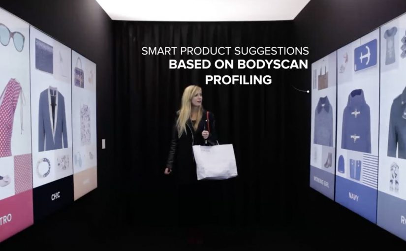
The mechanism is a walk-in “inspiration corridor” that is described as using an infrared camera and live detection to adapt the interface to the visitor. The walls then show a curated set of products pulled from real-time inventory, and the visitor can tap items to add them to a personal shopping list. At the end, the selection syncs to the Klépierre mobile app, which then helps locate the chosen products in the mall.
Here, live detection means the corridor reads the visitor in the moment and adjusts what appears on the walls accordingly.
In European shopping centers, the winning retail experiences blend discovery and convenience, giving visitors a reason to browse physically while keeping the efficiency people associate with online shopping.
The result is a browse-first experience that keeps discovery and wayfinding in one flow.
Why this beats “more screens”
This lands because it does not ask shoppers to learn a new behavior. It upgrades a familiar one. Window shopping. The corridor simply makes browsing feel personal and actionable, then removes the “I’ll never find it again” friction by saving the picks and turning them into a navigable list. The stronger move is not to add more screens, but to make physical browsing easier to finish. That works because discovery, selection, and store-finding happen in one continuous interaction.
Extractable takeaway: If your category is losing visits to online convenience, do not fight browsing. Instrument it. Let people browse with their body language and taps, then hand them a saved list that makes the rest of the journey feel effortless.
The quiet business intent
The real question is whether one shared experience can turn mall-level discovery into measurable value for multiple tenants at once.
Klépierre is not only showcasing technology. It is selling a multi-brand promise. One interaction can route a shopper to several tenants, lift discovery across stores, and create measurable signals of interest without needing a single retailer to run the whole experience alone.
What mall operators should borrow
- Curate across brands. A mall operator can create value by packaging discovery in a way individual stores cannot do alone.
- Connect to live stock. Recommendations feel credible when they map to what is actually available right now.
- Make saving the default. “Tap to add” is the key bridge from inspiration to purchase intent.
- Close the loop with wayfinding. The experience should end with “here’s where to get it”, not just “wasn’t that cool”.
- Design for low friction. The corridor should work in seconds, even for someone who did not plan to engage.
A few fast answers before you act
What is Klépierre’s Inspiration Corridor?
It is an in-mall interactive experience that personalizes product recommendations on surrounding walls and lets visitors tap to save items to a shopping list that syncs to the mall’s app.
How does the personalization work?
It is described as using live detection, for example via an infrared camera, to adapt recommendations and the interface to the visitor in the moment.
What problem does this solve versus standard mall advertising?
It turns passive promotion into active selection. Instead of only seeing brand messages, shoppers leave with a saved list and a practical path to find products.
What is the main metric to watch?
Saved items per session, app sync rates, store visit lift for featured tenants, and conversion from saved lists to purchases where measurement is possible.
What should you be careful about when deploying live detection?
Be explicit about what is being detected and why, keep the experience usable without any personal account setup, and avoid language that implies storing identities or profiling.