
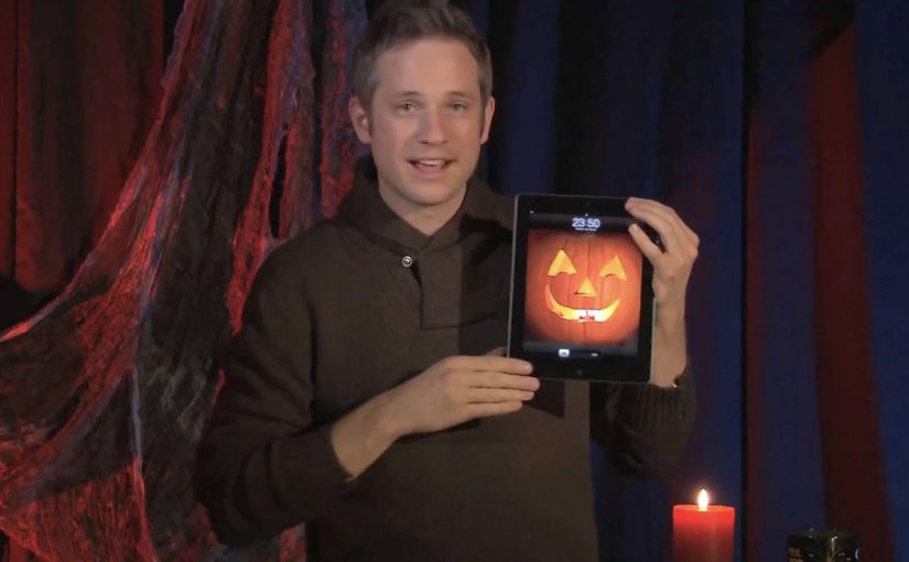
Simon Pierro: iPad Horror Halloween magic

Simon Pierro is a performance artist known for a contemporary style that blends live sleight of hand with screen-based illusion. In this Halloween edition of his iPad magic, he mixes physical tricks with carefully constructed digital wizardry to tell a short, creepy story. Here, “iPad magic” means coordinating physical moves with a pre-built on-screen sequence so the screen appears to affect the real world in one continuous event.

What you are actually watching

The hook is not “an iPad doing magic.” It is the choreography between two realities. One is the real-world performance in front of the camera. The other is the pre-built digital sequence on the iPad screen. When the timing is perfect, the boundary disappears and the viewer’s brain treats the composite as one continuous event.

The mechanism: timing, framing, and a believable interface

The iPad acts like a stage prop with rules the audience already understands. You can swipe, tap, and reveal. Pierro then exploits those expectations with tight timing, camera framing, and transitions that make the screen feel like a portal rather than a display. Because the interface behaves the way people expect, the viewer accepts more impossible outcomes without pausing to question the edit.

In consumer tech culture, touchscreen-first illusions travel because they compress surprise, proof, and shareability into a single loop.

The real question is whether the experience makes the screen feel like a believable tool, not a special effect.

If you want this pattern to travel, you have to design the interface logic before you design the surprise.

Why it lands: story first, tricks second

This is not just a reel of “look what I can do.” The Halloween framing gives each beat a reason to exist. That narrative spine matters, because it turns the tricks into plot points. The viewer stays to see what happens next, not only to decode the method.

Extractable takeaway: The most replayed “tech magic” works like product UX. One clear action, one clear consequence, then escalation. The audience always knows what they are supposed to feel, even if they do not know how it is done.

The business value behind a short viral performance

For a performer, this format does three jobs at once. It demonstrates craft, it demonstrates a distinctive signature style, and it creates a video object people want to pass along. That combination is stronger than a traditional showreel, because the concept is the brand.

What to steal if you build interactive experiences

  • Use familiar gestures as narrative verbs. Swipes and taps can carry meaning, not just navigation.
  • Design the “interface logic” first. The illusion is more believable when the screen behaves the way people expect.
  • Escalate in clean steps. Each beat should be slightly more impossible than the one before.
  • Keep the frame disciplined. The camera is part of the trick. Composition is not optional.
  • Wrap the mechanic in a story. Theme creates patience, and patience creates replays.

A few fast answers before you act

What is “iPad magic” in practical terms?

It is a performance format that coordinates physical sleight of hand with a pre-built on-screen sequence, so the screen appears to affect the real world in a continuous way.

Is this augmented reality?

Not in the typical “live 3D overlays in your environment” sense. It is closer to choreographed digital illusion and camera-based compositing, designed to feel like the screen is interacting with the performer.

Why do these videos get rewatched?

Because they deliver a fast surprise, then invite the viewer to hunt for the method. The best ones also add a narrative reason to stay until the end.

What is the most important design principle behind this style?

Believability of the interface. If the screen behaviour feels consistent and intuitive, the viewer will accept more impossible outcomes.

How can brands use this pattern without copying the trick?

Build short, gesture-driven micro-stories where one touch creates a visible transformation. Keep the logic simple and the payoff immediate, then escalate once.
Sukiennice: Secrets Behind Paintings

The Sukiennice Museum in Krakow is one of the oldest museums in Poland, and it is reopening after a complete renovation. The problem is not the building. The problem is attention. Young people do not automatically find 19th-century Polish art interesting.

Leo Burnett Warsaw gets the challenge to pull this audience back in, and answers it with an integrated campaign anchored by the New Sukiennice augmented reality app.

The mechanic: bring paintings to life with viewer control

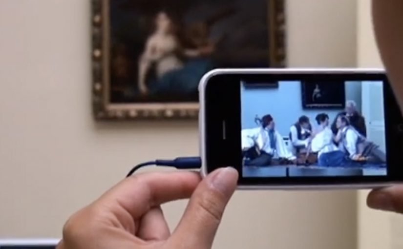
The app turns the visit into an interactive layer. Point your phone at selected works and the paintings come alive, revealing their stories through short films and animated moments. Instead of reading a label first, you get pulled into a scene first, then you choose to go deeper. Here, viewer control means visitors choose when to trigger the story and whether to go deeper.

In European museums trying to win younger audiences, lightweight AR can translate static collections into short, shareable stories without rewriting the institution’s identity.

Why it lands: it swaps “art history” for narrative tension

This is not about making the museum more “digital”. It is about making the first minute feel rewarding. Young visitors do not need more information at the start. They need a reason to care. That works because short films give the paintings a hook, and the phone becomes a bridge between a familiar screen habit and an unfamiliar art period.

Extractable takeaway: If the barrier is “this feels irrelevant”, do not lead with education. Lead with story. Give people one fast, emotional moment they can experience, then let curiosity pull them into context and detail.

An integrated campaign that keeps the app from being a lonely download

The real question is how you make a heritage visit feel immediately worth a young person’s time without turning the art into a gimmick.

The app plays the central role, but it does not stand alone. The campaign also uses billboards, social media and e-cards to create buzz and point people toward the experience. The intent is clear. Get young people to show up, then let the AR layer turn “I visited” into “I discovered”.

The buzz generated by the campaign is described as attracting a significant share of Krakow’s population to the museum.

What to steal for your own cultural or heritage activation

  • Start with one irresistible moment: pick a small set of works and make them unforgettable, rather than trying to animate everything.
  • Put the story before the lesson: emotion first, interpretation second.
  • Make it usable on-site: the experience should work in the gallery without long setup or instructions.
  • Design for “showing a friend”: the best museum tech spreads when people can demonstrate it in seconds.
  • Support it with media that explains the payoff: billboards and social should communicate the “why” of the visit, not just the existence of an app.

A few fast answers before you act

What is the New Sukiennice app?

It is an augmented reality museum app designed to bring selected paintings to life and reveal their stories through short film content during a gallery visit.

Why is AR a good fit for 19th-century painting?

Because the barrier is often distance. AR can add narrative entry points and context quickly, helping visitors connect emotionally before they engage intellectually.

What makes this more than a tech demo?

The app is positioned as the core of an integrated campaign. The surrounding billboards, social media and e-cards create the motivation to visit, and the on-site experience delivers the payoff.

What’s the biggest risk with museum AR?

Friction and distraction. If setup is slow, or the experience pulls attention away from the original work instead of back into it, the technology becomes the point and the art loses.

How should a museum measure success here?

Look at youth attendance lift, repeat visits, time spent in targeted rooms, and whether visitors progress from the AR moment into deeper engagement like reading labels, joining tours, or exploring more works.

Depaul UK: iHobo

It is easy to ignore a homeless person as you walk past them on the street, but after having one on your phone for three days Depaul UK hopes you will see the complex and varied issues behind youth homelessness.

This free app was created pro bono by Publicis London to raise awareness of Depaul UK, a charity devoted to youth homelessness in the UK.

Three days with a person you cannot swipe away

The mechanism is designed to feel like responsibility, not content. Over three days, the app keeps returning with prompts from a single “virtual homeless person”, pulling you back into their needs and decisions at inconvenient, everyday moments. That works because repeated prompts turn passive sympathy into felt responsibility.

In UK urban life where homelessness is visible but easy to mentally filter out, sustained micro-interruptions, small prompts that arrive during ordinary routines, can create empathy better than one big, easily-dismissed message.

Why it lands

The idea works because it weaponizes time. You do not get a one-minute burst of sadness and a clean exit. You get repeated friction, enough to feel the difference between “seeing” homelessness and “living alongside” it, even in a small way.

Extractable takeaway: If you need real attention for a complex cause, build a short, bounded experience that returns to the user repeatedly, then make the “I did something” step simple and immediate.

What Depaul is really trying to change

The real question is how to make someone feel ongoing responsibility for a problem they usually pass in seconds.

This is fundraising logic disguised as experience design. Depaul is trying to reach people who do not respond to posters and leaflets, and to do it on the device they check constantly. The app turns awareness into a relationship, then uses that relationship to make donating feel like a natural next step.

What cause campaigns can take from iHobo

  • Use duration as the persuasion. Three days is long enough to form a habit, short enough to try.
  • Design for interruption, not bingeing. Timed prompts beat long videos for sustained attention.
  • Keep the user’s role clear. Caring, deciding, responding. Clarity prevents drop-off.
  • Bound the experience. A defined end reduces resistance to starting.

A few fast answers before you act

What is iHobo?

A free mobile app created for Depaul UK that asks users to look after a “virtual homeless person” for three days to build awareness of youth homelessness.

What is the core mechanism?

Time-boxed engagement. The app returns with prompts over multiple days, creating repeated contact that is harder to ignore than a single awareness message.

Why three days?

It is long enough to create attachment and repeated friction, but short enough that people will still commit to trying it.

What makes this different from a standard charity film?

It turns passive viewing into ongoing responsibility. The message arrives on your schedule, not the campaign’s.

What is the most reusable lesson for other causes?

If the issue is complex, do not rely on a single emotional peak. Build a short series of small, repeated moments that accumulate into understanding and action.