Grolsch: The Movie Unlocker

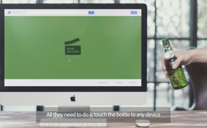
Paying for movies with a credit card is framed as yesterday’s behaviour. Grolsch positions a new alternative as “Movie Unlocker” technology, letting consumers use the beer bottle itself as the key to watch movies online.

The bottles are described as being fitted with custom Bluetooth beacons that transmit a unique code when brought close to a laptop or smartphone with Bluetooth Low Energy, or BLE, enabled. That code verifies the user and unlocks access to the chosen movie.

How the bottle becomes the checkout

The mechanism is a proximity-based redemption flow. Open the beer. Bring the bottle near your phone or laptop. The beacon transmits an identifier. The partner website receives it, validates it, and then grants access.

Functionally, it’s the same “code under the cap” idea, but moved from manual entry to a one-touch interaction triggered by distance and Bluetooth.

In consumer promotions, frictionless redemption mechanics often outperform bigger media spend because they turn the product into the access token.

Why “bottle-as-ticket” works

This lands because the value exchange is immediate and physical. The bottle is proof-of-purchase, and the unlock moment happens in the same context as consumption. At-home. On-device. With minimal steps. That makes the reward feel like a feature of the product, not a separate campaign hoop.

Extractable takeaway: If you want high participation in a reward mechanic, eliminate typing and logins where possible. Use a physical trigger that makes redemption feel like a natural extension of the product ritual.

What the brand is really optimizing

The real question is how to make purchase verification feel like part of the product experience rather than a separate redemption step.

Beyond “cool tech,” this is about repeat preference. It attaches a digital entertainment benefit to a beer purchase, creating a reason to choose Grolsch again the next time someone is deciding in-store.

What to steal from bottle-as-ticket

  • Turn proof-of-purchase into a trigger. Let the product initiate the unlock, not a coupon field.
  • Design for the living room moment. Redemption should work where consumption happens.
  • Keep the exchange legible. “Beer near device equals movie” is easy to explain.
  • Make authentication invisible. Users should feel the magic, not the plumbing.

A few fast answers before you act

What is Grolsch Movie Unlocker?

It’s a promotion mechanic where a beer bottle transmits a unique Bluetooth Low Energy code to help unlock a movie online.

What does BLE do here?

BLE enables low-power proximity communication so a nearby bottle can pass an identifier to a phone or laptop without pairing like a normal accessory.

Is this replacing payment or replacing a promo code?

It functions like replacing the promo code step with a proximity trigger. The “payment” is effectively the purchase of the beer tied to the unlock.

Why is this better than typing a code?

It reduces friction. Fewer steps usually means higher completion and less drop-off in promotional redemptions.

What’s the biggest practical risk?

Reliability and onboarding. If Bluetooth is off, compatibility is unclear, or the unlock flow is confusing, the perceived magic disappears fast.

TNT: A Dramatic Surprise on an Ice-Cold Day

In the quiet town of Dordrecht, a familiar red button sits waiting. When innocent passers-by dare to push it, pure TNT drama unfolds, with a slightly new twist: close participation from the public.

In April last year TNT launched their digital channel in Belgium with a big red push button in a quiet Flemish square.

Now, to launch their movie channel in the Netherlands, they created a new dramatic piece of the now-famous red button, this time pulling bystanders closer into the action.

The mechanic that makes the button irresistible

The mechanism is a simple dare plus instant escalation. A single, universal instruction invites a tiny act of curiosity. The moment someone commits, the environment “answers” with a choreographed sequence that feels bigger than the setting. The new twist is the proximity: the public is not only watching the drama, the public is forced to navigate it.

By “close participation”, the stunt means the action breaks the invisible line between performer and audience, so bystanders become part of the scene rather than spectators at a safe distance.

In channel launches and entertainment branding, public stunts that turn bystanders into participants are a shortcut to earned attention.

Why it lands

This works because it transforms a brand promise into a physical consequence. “We know drama” is not a slogan you politely agree with. It becomes something you experience in real time, in a place that looked ordinary seconds earlier. The tension comes from the button. The payoff comes from the world changing around the person who pushed it. That works because one visible action creates instant narrative clarity: everyone can see the cause, the consequence, and the brand promise in one beat. The real question is whether the escalation makes TNT’s promise legible in seconds, not whether people will press the button. This is a strong launch format because the button is only the trigger, while the readable escalation is what sells the channel.

Extractable takeaway: If you can convert a brand line into a simple action and an immediate, escalating response, you create a story people retell accurately. That accuracy is what makes the idea travel.

Design moves worth borrowing

  • One action, one trigger: make the entry point obvious and almost impossible to resist.
  • Escalation with clarity: raise the intensity quickly, but keep the through-line readable for anyone who arrives mid-scene.
  • Let the environment do the branding: the best stunts feel like the place itself has changed, not like a pop-up was installed.
  • Design for the crowd: build moments that work for the person in it and for everyone filming from the edges.
  • Keep the “twist” singular: here it is proximity. One twist is enough when the production is big.

A few fast answers before you act

What is “A Dramatic Surprise on an Ice-Cold Day”?

It is a TNT red button sequel staged in Dordrecht, where pushing the button triggers a choreographed chain of dramatic events that pulls bystanders into the action.

What’s different versus the earlier “quiet square” button?

The key twist is the closeness of participation: the drama happens nearer to the public, and the public is more directly swept into the scene.

Why does a single button work so well?

Because it creates instant viewer control. One obvious action produces an immediate consequence, which makes the story easy to understand and easy to share.

What’s the core marketing job this format does?

It turns a positioning line into a lived moment, then uses the crowd’s reactions and recordings as distribution.

What’s the biggest execution risk?

If the escalation feels confusing or unsafe, the narrative flips. The format depends on clear choreography and the audience feeling surprised, not threatened.

SNS Bank: I Want Interest on My Current Account

SNS Bank promotes a simple product shift. Paying interest on a normal current account. Instead of leading with rates and fine print, the work frames it as something worth protesting for.

People “join” the protest using their Facebook or Twitter account. Their profile picture then becomes the campaign’s moving unit, connected into live rich media placements running on Dutch publisher inventory such as msn.nl and telegraaf.nl. Here, the moving unit is the participant’s profile picture reused as the visible building block of the protest crowd.

How the protest mechanic is built

The mechanism is straightforward. Sign up with a social account, capture the profile image, then re-render that image as part of a marching crowd inside dynamic banners. The same identity asset travels from social sign-up, to landing experience, to high-impact display formats, including what is described as a homepage takeover on telegraaf.nl.

In European retail banking, feature-led propositions like “interest on current accounts” often need a memorable way for customers to visibly participate to cut through price parity and low attention.

Why it lands

It takes a boring benefit and gives it a human visual. A rate becomes a crowd. That shift matters because it makes the offer feel socially validated and easy to explain. It also turns ordinary display inventory into a live proof point, because the banners visibly update with real people rather than generic stock photography. This is the right strategic move because the campaign makes participation itself the proof of relevance.

Extractable takeaway: When your proposition is a small financial feature, convert it into a visible social object. One reusable profile image can power sign-up, storytelling, and proof across every paid placement.

What SNS Bank is really trying to achieve

The business intent is to make “interest on a current account” feel like a category change, not a marginal tweak. The protest framing gives SNS Bank permission to be louder than the feature itself, and it creates a participation funnel that can be measured from social sign-up to on-site conversion.

The real question is how to make a marginal banking feature feel like a public movement rather than a line item in a comparison table.

What to steal from this protest-led banking launch

  • Turn the benefit into a visual system. If the offer is intangible, give it a repeating picture that accumulates and grows.
  • Use one identity artifact everywhere. A single profile image can unify sign-up, landing experience, and ad formats into one story.
  • Make paid media feel live. Dynamic creative that visibly changes reads as proof, not just persuasion.
  • Respect permission and platform rules. If you are pulling profile images, ensure consent is explicit and the experience stays compliant.

A few fast answers before you act

What is the core mechanic of this campaign?

People join via Facebook or Twitter, and their profile image is then reused as the creative building block inside a marching protest rendered across rich media banners.

Why use display banners for something that starts in social?

Because banners can function as visible proof at scale. The audience sees real faces moving through the ad units, which makes the proposition feel active rather than purely claimed.

What is the main advantage of the “protest” framing?

It makes a dry feature feel like a cause. That reframing increases memorability and gives people a simple story to repeat.

What is the biggest risk in copying this approach?

Using social identity assets without clear consent creates trust and compliance issues. If the sign-up step is not explicit, the same mechanic can backfire fast.

When does this kind of mechanic work best?

It works best when the product feature is real but visually weak. The participation layer gives the feature a public shape without changing the underlying offer.