ASICS: Race Ryan Hall at Columbus Circle

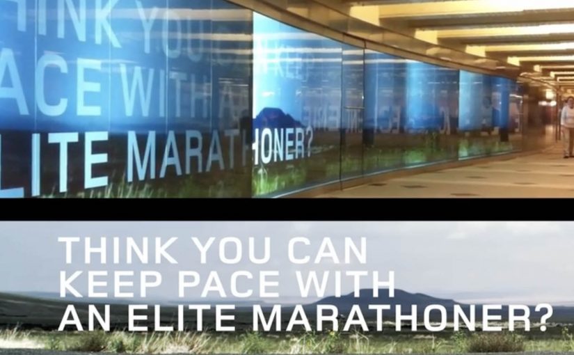
ASICS wants to level up physical interaction with their brand. So around this year’s ING New York City Marathon, they built a 60-foot video wall in the Columbus Circle subway station and challenged passersby to race U.S. marathon runner Ryan Hall.

The wall plays life-sized footage of Hall running at marathon pace, turning a commute corridor into a short, sweaty benchmark. You do not “watch” the message. You try to keep up with it.

Why a race works better than a slogan

In high-traffic urban transit environments, the fastest way to make a performance claim believable is to let people feel it with their own body, not just read it. Most sports sponsorship visibility lives on banners and logos. This flips the value. It gives the audience a direct comparison: your pace versus elite pace. Because the wall sets an elite pace as a moving yardstick, that comparison makes the brand message tangible in seconds, and it creates a story people can retell immediately.

Extractable takeaway: If you need credibility fast, turn the claim into a simple physical test that anyone can try without setup.

The craft move: frictionless participation

No sign-up. No app download. No instruction manual. The interaction is instinctive. See runner. Run next to runner. That simplicity matters because subway audiences have short attention windows and low patience for setup.

What ASICS is really doing with this build

On the surface it is a fun stunt. Underneath it is a credibility transfer, meaning the elite standard makes the sponsor’s performance story feel earned when people experience the comparison firsthand. The real question is whether your brand promise holds up when people can compare themselves to an elite benchmark in public. This is a stronger sponsorship play than more logo visibility because it produces felt proof, not just awareness. By letting everyday runners test themselves against a real benchmark, ASICS positions itself closer to serious performance culture, not just event sponsorship.

Big-event activation moves to copy

  • Turn a claim into a test. If the audience can try it, they will believe it.
  • Make participation obvious. The interaction should be understood without reading instructions.
  • Place it where behavior already fits. A corridor invites motion. Use spaces that support the action.
  • Design for one-sentence retell. “I raced Ryan Hall in the subway” is the whole message.

A few fast answers before you act

What is the core mechanic of this activation?

A long-form video wall shows Ryan Hall running at marathon pace, inviting passersby to physically race alongside the footage.

Why does transit placement matter here?

Transit corridors create natural “run lanes” and constant foot traffic, so the activation gets high exposure and the behavior feels socially plausible.

What makes this more effective than a normal video billboard?

It turns viewers into participants. The message is experienced as effort and pace, not as information.

What is the biggest execution risk?

If the wall is hard to notice, the corridor is too crowded to move, or the interaction cues are unclear, people default back to walking and the idea collapses.

How would you measure success?

Dwell time, participation rate, repeat attempts, social sharing volume, and any lift in event-area brand consideration versus baseline sponsorship exposure.

Newcastle Brown Ale: Shadow Art Billboard

Newcastle Brown Ale’s Shadow Art has debuted in San Diego’s nightlife hub, the Gaslamp district, now through the end of September. Using only a single light source and thousands of Newcastle Brown Ale bottle caps, two New York shadow artists partnered with Newcastle to bring to life a shadow sculpture spanning 128 square feet. Shadow art is an installation that reads abstract until a specific light angle casts a deliberate image.

How it works when the sun goes down

By day it reads like an abstract field of caps. By night, the light angle does the magic. The caps become a pixel grid, and the shadow resolves into a clear image that connects directly to the brand world and the “Lighter Side of Dark” idea. Because the image only resolves under the right light angle, it invites a second look and conversation in a noisy street.

In dense entertainment districts where outdoor media competes with movement, neon, and noise, physical interactivity that rewards a second look beats anything that needs time to decode.

The real question is whether your outdoor idea earns a second look without asking for extra attention.

Why it lands

It makes the reveal the reward. The billboard does not shout at you. It waits until the conditions are right, then surprises you with an image that feels like you discovered it.

Extractable takeaway: Out-of-home becomes memorable when the medium changes state based on real-world conditions like light and viewpoint. If the message only appears when the environment cooperates, the audience feels like they unlocked it.

It uses the product as raw material. Bottle caps are not a metaphor. They are literally the building blocks, which makes the craftsmanship feel inseparable from the brand.

It turns a static surface into a time-based experience. You do not just “see an ad”. You experience a transformation. That shift is what creates talk value in public spaces. Talk value here means it gives people a simple reason to bring it up to others in the moment.

Borrow from Shadow Art billboards

  • Design for a two-stage read. First glance should intrigue. Second glance should reward with clarity.
  • Make the material part of the story. When the build uses brand-native ingredients, the proof feels baked in.
  • Choose locations where “stop and stare” is natural. Nightlife zones work because people are already scanning, wandering, and socializing.
  • Anchor the payoff to one simple brand line. The reveal should resolve into a message people can retell in a sentence.

A few fast answers before you act

What is “shadow art” in an advertising context?

An installation that looks abstract from one angle or in one lighting condition, but becomes a clear image when a specific light source and viewpoint create the intended shadow.

Why use bottle caps instead of printed graphics?

Caps add texture, depth, and authenticity. They also turn the build into a craft story that people talk about, photograph, and share.

What makes this work in a place like the Gaslamp district?

Because it competes with nightlife the right way. It creates a moment people can discover and show to friends, rather than trying to out-shout the environment.

What is the business intent behind an installation like this?

To generate earned attention and brand distinctiveness by creating a public experience that feels “worth a look”, then “worth a share”.

What is the most transferable lesson?

Build a reveal that is conditional on the real world. Light, angle, and time can do the targeting for you without any data.

Daffy’s: The Undressing Room

You are walking past a Daffy’s store window in Manhattan and it looks like a fashion show has moved onto the street. Models are inside the display. A crowd is outside. And the public is controlling what happens by text message.

Daffy’s is a fashion retailer from NYC. For their fall fashion launch, they created a street-level event that blended window shopping, a fashion show, and an interactive peep show, meaning passers-by could text outfit requests to models inside while the exchange played out publicly on the glass, to create live interaction from hundreds of passers-by for an entire day and night.

The idea was simple. Put great-looking models in the window with items from the new range. Ask the public at street level to text a special number for each model, requesting specific items to try on and then change out of. Each message was projected onto the store window, letting the crowd follow the conversation, while the models used phones to interact with people on the street.

That shift from window to stage is what turns a shopfront into a live media channel when footfall competes with endless distractions.

Why the mechanism pulls a crowd

The mechanism is a tight loop. You text. Your message appears publicly. The model responds with an immediate, visible action. That creates instant feedback, plus social proof, because everyone can see that participation changes the experience.

Extractable takeaway: When participation is public and the response is immediate, bystanders become an audience because they can see cause and effect in real time.

It also turns fashion into a game with a scoreboard you can read. The projected message stream makes the crowd feel like a single audience, not scattered individuals passing by.

In high-traffic retail corridors, the format works best when the interaction loop is visible to everyone, not just the person who texts.

What Daffy’s is really buying

This is not just “engagement” for its own sake. It is earned attention at street level, then a shareable story that travels beyond the location. The activation is designed to make people stop, watch, talk, and tell others to come over.

The real question is whether you are designing for fast, visible participation that creates social proof, or just staging a spectacle.

This pattern is worth copying only when you can keep the loop tight and keep people safe once the crowd forms.

According to Daffy’s communications, more than 1,500 text messages were received between 6:00 p.m. and 9:30 p.m., and the event was suspended twice by NYC police due to crowd overflow impacting pedestrian and vehicle traffic.

Practical takeaways for interactive storefronts

  • Make the audience the controller. Participation should change something real, not just “send a message”.
  • Project the input publicly. Visibility creates social proof and gives bystanders a reason to join.
  • Design for fast feedback. The shorter the gap between action and response, the bigger the crowd gets.
  • Let the store be the medium. If the window is already the brand’s stage, use it as one.

A few fast answers before you act

What was Daffy’s “Undressing Room”?

A storefront window event where passers-by texted requests to models inside the window, and the messages were displayed publicly so the crowd could follow along in real time.

Why does projecting messages onto the window matter?

It turns private participation into a public feed. People see that the experience is live, and that others are actively shaping it, which increases curiosity and crowd growth.

What’s the core interaction design pattern here?

Public input plus immediate physical response. The text is the trigger. The window action is the payoff.

What makes this more effective than a normal fashion show?

Viewer control. People do not just watch. They influence what happens, and that makes them more likely to stay, share, and bring others.

What’s the biggest operational risk with this kind of activation?

Crowd control. If the moment works, it attracts more people than a normal storefront can safely handle, so permits and on-site management matter.