Europcar: Crush Hour

A crushed-car prank with a very public punchline

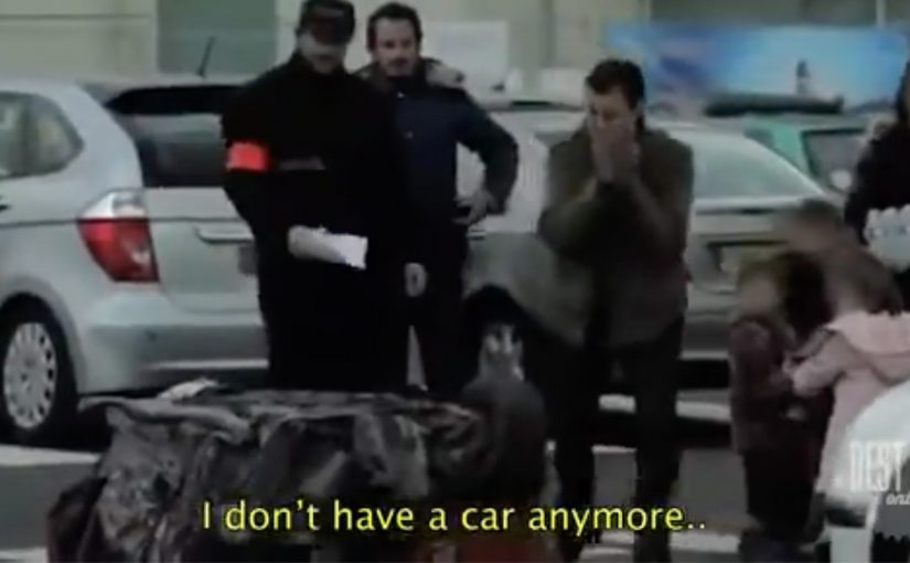
Ogilvy Paris was entrusted to drive acquisition for Europcar’s Auto Liberte, a service that aims to have you rent cars instead of buying them. So, they devised a wicked prank in which they towed away unsuspecting people’s cars, while replacing them with crushed cube cars, and a number to call for help.

The phone number given was of a local radio station that was broadcasting live to everyone in Paris.

The mechanism: make “car ownership pain” impossible to ignore

The stunt works because it hijacks a real ownership fear. Your car is gone. Then it escalates the feeling by replacing it with a cube that looks final, and a phone number that turns the private panic into a public moment. Here, “car ownership pain” means the sudden anxiety, time loss, and hassle that can come with owning and managing a car in a city.

Instead of resolving the situation quietly, the call routes into live radio, so the story instantly becomes shareable content and social proof.

In urban mobility markets, moving people from ownership to access depends on reframing convenience, cost, and hassle in a way that feels personal and immediate.

Why it lands: it turns a product claim into lived experience

Auto Liberté is an alternative to owning a car. The prank makes “owning a car is a headache” feel visceral in seconds, without needing a brochure explanation. It also flips the usual persuasion order. Emotion first. Rationalization second. Once the audience feels the pain, the rental alternative feels like relief.

Extractable takeaway: Make the old habit’s hidden costs felt in seconds, then let the alternative arrive as immediate relief.

The business intent behind the spectacle

This is acquisition marketing dressed as entertainment. The goal is to create talk value at street level, then convert that attention into brand consideration for a service that competes with a deeply ingrained habit.

The real question is whether you can make the old habit feel costly enough that the alternative feels like relief.

Prank marketing like this is worth doing only when the reveal is safe and the resolution is fast.

By integrating radio, the campaign extends the moment beyond the people on the sidewalk to a city-scale audience, while keeping the message anchored to everyday reality.

Four moves for ownership-to-access campaigns

  • Attack the habit, not the competitor. The target here is ownership friction, not another rental brand.
  • Build a simple reveal. Missing car. Crushed cube. One number to call. Instant comprehension.
  • Make the amplification native. Live radio turns reactions into content without needing a separate distribution plan.
  • Design the story to travel in one sentence. “They crushed my car and put me live on radio” spreads fast.

A few fast answers before you act

What is Europcar’s “Crush Hour” campaign?

It is a street prank created for Auto Liberté where parked cars were towed away and replaced with crushed cube cars, pushing owners to call a number for help.

How does the prank actually work, step by step?

Remove the real car. Replace it with a visually shocking “final” object. Add a single instruction. Call the number. Then route the call into a live broadcast so the reaction becomes the content.

Why use a crushed cube car instead of a simple “your car was towed” sign?

Because it escalates emotion instantly. It makes the loss feel irreversible and personal, so the audience experiences “ownership pain” before they ever hear the service pitch.

How does the live radio element change the impact?

It turns a private moment into a public story. The call becomes instant broadcast content, which amplifies reach and makes the message feel socially real, not just advertised.

What is the campaign trying to persuade people to do?

It positions Auto Liberté as an alternative to car ownership, using a high-drama metaphor to make ownership feel stressful and renting feel like relief.

What should brands be careful about with prank marketing?

Intensity and consent. If the “moment of truth” feels unsafe, humiliating, or too punitive, the brand can lose trust even if the stunt earns attention.

POWA: Waking Up the Neighbourhood

This social experiment was carried out using hidden cameras in a townhouse complex in Johannesburg. The message is pretty clear: “Don’t condone violence by doing nothing”.

It is structured as a test of what people will react to. When something is merely annoying, neighbors complain quickly. When something is genuinely harmful, the same neighbors often hesitate, rationalize, or stay silent.

How the experiment is engineered

The mechanism is simple and uncomfortable: place residents in a situation where intervention feels “socially costly”, then reveal how easily people default to inaction even when the signals are obvious. Here, “socially costly” means risking awkwardness, conflict, or reputational blowback with the people you live next to. That engineered discomfort is why the film persuades. It forces the viewer to notice the exact moment hesitation becomes a decision.

In close-quarter urban living, social friction often gets managed faster than serious harm because “not getting involved” is treated as the safest norm.

Why it lands

It attacks the real barrier. Many people do not support violence, but they also do not act. The work focuses on that gap between belief and behavior.

Extractable takeaway: Anti-violence communication changes behavior when it targets the bystander decision point. Make inaction feel like a choice with consequences, and intervention feel like the socially supported default.

It reframes intervention as normal. By showing how readily people mobilize for minor disturbances, it implies that speaking up about violence should be even more expected.

It removes the viewer’s excuses. The hidden-camera format makes “I wasn’t sure” feel less credible, because the audience sees the same signals and the same hesitation play out.

The real question is whether you want to be the neighbor who notices and still stays silent. Campaigns should be judged on whether they move bystanders into safe action, not on whether they earn agreement.

Design cues that wake bystanders

  • Design for the moment people freeze. Identify the exact instant where hesitation happens, then build the story around breaking it.
  • Use contrast to make the point undeniable. A “small problem” people act on is a sharp mirror for the “big problem” they avoid.
  • Keep the message actionable. A clear instruction beats a general plea, especially for behavior people are scared to perform.

A few fast answers before you act

What is the core message of this experiment?

That doing nothing enables violence. If you suspect abuse, silence is not neutral. It is permission.

Why use hidden cameras for a topic like this?

Because it captures real hesitation, not rehearsed opinions. The credibility comes from watching ordinary behavior under social pressure.

What behavior is the campaign trying to change?

It aims to reduce bystander inaction. The target is the moment someone hears or suspects violence and chooses not to intervene.

What makes this approach effective compared to statistics?

It is experiential. Viewers can imagine themselves in the same setting, which makes the moral choice feel immediate rather than abstract.

What is the most transferable lesson for brands or NGOs?

If you want action, dramatize the decision point, show the cost of inaction, and make the desired intervention feel socially acceptable and doable.

The North Face: Red Flags in China

The North Face in China turns a simple outdoor ritual into a phone-powered race. You “plant” a virtual red flag to claim a location. You get the bragging rights of being first. Then you try to out-plant everyone else.

A modern take on the oldest explorer move in the book

Planting a flag is a universally understood symbol. It’s the shorthand for “I was here first.” This campaign borrows that instinct and digitizes it, so the only equipment you need is a mobile phone.

The mechanic: claim a place, then defend your status

At the heart of the idea is a competitive map. Participants place virtual red flags on locations they discover, and the campaign keeps score so “firsts” become collectible. It’s a light-touch way to make exploration feel like a game you can win, not just a virtue you should aspire to.

In fast-growing outdoor markets where many people are still taking their first steps into hiking culture, this kind of social competition is an effective on-ramp.

Why it lands: it converts curiosity into a scoreboard

Outdoor positioning often sounds lofty. “Explore more.” “Get outside.” The problem is that those ideas are hard to act on today, especially in cities where “nature” is not a default habit.

Extractable takeaway: If you want behavior change, give people a visible “progress signal” they can earn quickly. A simple status marker (first, top 10, streak, champion) turns vague aspiration into a repeatable loop.

Red flags work because they’re instantly legible. You don’t need instructions to understand what it means to claim something, and you don’t need a long explanation to feel the urge to beat someone else to the next spot.

The real question is how do you turn exploration from a brand line into a repeatable action people want to perform?

The business intent: make “Never Stop Exploring” measurable

This is a smart brand move because it makes “Never Stop Exploring” visible as behavior instead of leaving it as a slogan.

Case-study write-ups describe this as an integrated push that blends mobile participation with on-ground visibility and retail activation. The core goal is to move the brand from “admired” to “acted on”, by making exploration something people can start immediately, then repeat.

What brand teams can steal from Red Flags

  • Use a symbol people already understand: flags, stamps, passports, badges. Familiar metaphors reduce friction.
  • Turn progress into a public artifact: a claimed location or visible marker is more motivating than a private point total.
  • Design for repeat loops: one action should naturally suggest the next one.
  • Make competition optional but obvious: the scoreboard should be there for people who want it, without blocking casual participation.
  • Reward “first steps”: the earliest wins matter most when you’re trying to create a new habit.

A few fast answers before you act

What is the Red Flags idea in one sentence?

The Red Flags idea is a mobile competition where people plant virtual red flags to claim places and earn status for being first, encouraging more exploration through a simple scoreboard.

Why does “claiming a location” work so well?

Claiming a location works because it makes exploration feel personal and scarce. Once a place is “yours”, you feel ownership, and ownership increases repeat behavior.

Is this gamification or location-based marketing?

Red Flags is both gamification and location-based marketing. The location is the proof of action, and the game layer, claims, status, and competition, supplies motivation and repeatability.

What’s the main risk in copying this mechanic?

The main risk in copying this mechanic is overcomplicating it. If placing the first marker takes too long or requires too many steps, you lose the impulse that makes the idea work.

What’s a modern equivalent if you don’t want maps?

A modern equivalent without maps is any “claimable” unit: completing a route, checking in at partner venues, finishing a micro-challenge, or earning a time-bound “first” in a shared feed.