
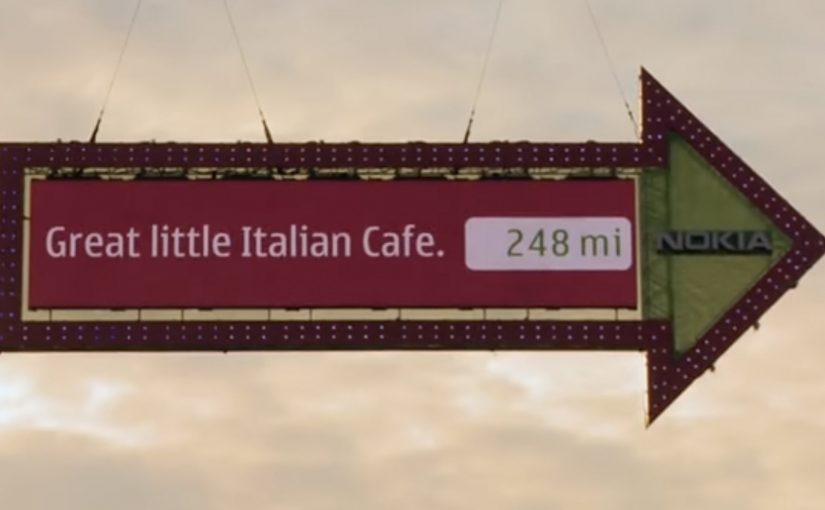
Nokia: The World’s Biggest Signpost

When navigation stops being private

Making navigation social is the new big idea by Swedish agency FarFar for Nokia.

What the “big signpost” actually does

The idea is simple at street level. Put a colossal digital signpost in a place with constant foot traffic, then let the public control it. People submit a location from their phone or via the web, and the sign turns to point toward that place while displaying the direction and distance.

Instead of selling navigation as a spec on a phone, the campaign turns it into a shared public utility and a social recommendation engine. Your place becomes part of the experience, and everyone nearby gets a live demonstration of what the service can do.

In global consumer tech marketing, “useful features” often stay invisible until you give them a public stage and a participatory hook.

Why it lands

It takes something normally solitary, finding your way, and makes it performative. Watching the sign react in real time creates instant credibility, and seeing other people’s “good things” transforms navigation from point-to-point directions into discovery. The spectacle draws a crowd, but the viewer control keeps the crowd engaged because the output is never the same twice.

Extractable takeaway: If you are marketing a capability people underestimate, externalize it in a physical demonstration, then let the audience drive the input so the proof feels self-generated.

What Nokia is really buying with this stunt

The visible job is attention. The deeper job is adoption.

The real question is whether a public demonstration can turn navigation from a private utility into a behavior people want to repeat and share.

This is a stronger way to sell navigation than listing features in isolation because the product benefit becomes visible, social, and easy to try.

Done well, the “map of good things” becomes more than a campaign artifact. Here, “map of good things” means a navigation layer shaped by public recommendations, not just static directions. It becomes a product behavior.

What brands can steal from the signpost

  • Turn an invisible feature into a visible ritual. Make the value legible in under five seconds, even with no sound.
  • Design for participation, not just impressions. Let people submit inputs, then reward them with a public output.
  • Make the crowd the content engine. Recommendations from real people do the persuasion work for you.
  • Build a clean bridge to “try it now.” If the demo is the billboard, the next step must be immediate on the device in someone’s pocket.

A few fast answers before you act

What is “The World’s Biggest Signpost” for Nokia?

It is a large interactive signpost installation that lets the public submit locations and then shows the direction and distance to those places, used to promote Nokia’s navigation services as social and shareable.

How does the experience make navigation “social”?

It shifts navigation from personal utility to public discovery by letting anyone contribute places and letting everyone nearby see the recommendations and results live.

What is the core mechanic that makes it work?

Real-time viewer control. People submit a destination and immediately see the sign respond with a physical, public proof of the service.

Why use a large physical installation instead of a regular ad?

A physical demo creates instant trust. It shows the capability in the real world, not as a claim, and it attracts attention through spectacle while keeping engagement through interaction.

What’s the key transferable lesson for brands?

If you want people to value a capability, stage it as a shared experience where the audience supplies the inputs and the product supplies undeniable outputs.
McDonald’s Angus Burger: Grill Smoke

When the medium is literally the product moment

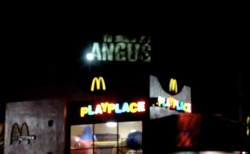
A great ambient strategy by Leo Burnett Puerto Rico to launch the Angus Burger for McDonald’s.

The mechanic: “smokvertising” in one move

Here, “smokvertising” means using real grill smoke as the placement. As smoke rises, imagery and copy are projected onto it, so the message appears to live inside the smell and heat of cooking rather than on a static board.

In high-frequency food and beverage categories, ambient work performs best when it hijacks a real-world byproduct of consumption and turns it into a media surface.

Why it lands

This is attention without shouting. People notice it because it behaves unlike advertising, then the sensory context does the rest. Smoke is already a cue for freshness and grilling, so the brand gets meaning “for free” before a single word is read. It also creates a built-in crowd moment: smoke draws eyes, the projection rewards the look, and the whole thing becomes naturally filmable.

Extractable takeaway: If you want a product to feel immediate, put the message inside an existing sensory cue people already associate with the product, then keep the copy minimal and let the environment do the persuasion.

What the brand is really buying

This is not only awareness. It is salience. The work aims to anchor “Angus Burger” to the visceral trigger of grilling, so the next time someone sees smoke, they are primed to think of the product.

The real question is how to bind appetite cues and brand memory in the same instant.

What food brands can borrow from this

  • Start from a native signal. Find the byproduct or ritual your category already owns (smoke, steam, heat, condensation) and treat it as media.
  • Make the trick readable instantly. Ambient placements succeed when the viewer understands the rule in under a second.
  • Keep the craft on-message. The “wow” should reinforce the appetite cue, not distract from it.
  • Design for phones. If it films cleanly, it travels without needing paid amplification.

A few fast answers before you act

What is McDonald’s “Grill Smoke” activation?

It is an ambient out-of-home concept where grill smoke becomes the “screen” and brand visuals are projected onto it to promote the Angus Burger.

What is the core creative mechanic?

Use a real, moving, sensory element (smoke) as the media surface, then overlay a simple projected message that only exists while the smoke exists.

Why does this beat a normal billboard for a food launch?

Because it collapses message and appetite cue into the same moment. The medium already signals “fresh off the grill,” which makes the product claim feel more believable.

What’s the transferable lesson for other brands?

When you can borrow a natural environmental cue, embed your message into it instead of placing your message next to it.

What is the main risk of copying this approach?

If the effect is hard to see quickly, or if the sensory cue does not match the product promise, the execution becomes a gimmick rather than a brand reinforcement.

McDonald’s: Steaming Bus Shelter

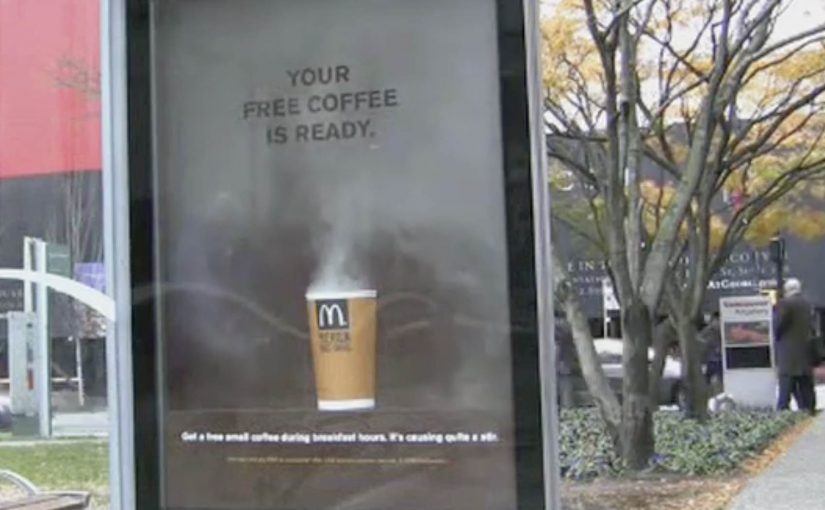
Over the last couple of months we have seen some innovative bus shelter ideas from Cadbury and Coca-Cola. Now McDonald’s joins in with a cup of coffee that looks like it is still breathing.

Steam that writes the message for you

Instead of printing “hot coffee” on the poster, the execution uses real-looking steam rising from the cup. As the steam drifts across the panel, a simple line appears and disappears, turning a static bus shelter into a time-based reveal.

Interactivity here is low-tech but real. The ad changes over time in front of you, without screens, taps, or instructions. That works because a behavior you can see in real time makes the product benefit feel proved rather than merely claimed.

In out-of-home advertising, the strongest work turns waiting time into a short, sensory experience that people understand in a glance.

Why this lands in the street

Steam is a credibility cue. It signals warmth, freshness, and immediacy. At a bus stop, that matters because you are standing still, watching your breath in the cold, and you have time for one small surprise that feels physical rather than “ad-like”. The reveal also creates a micro-rhythm. By micro-rhythm, the ad creates a simple pattern of pause, reveal, and reset that a passer-by can read in seconds. Nothing happens. Then it happens. That pacing earns a second look.

Extractable takeaway: If you can make the medium behave like the product, you reduce explanation to near zero. The environment becomes your proof point, and the call-to-action feels like the obvious next step.

What McDonald’s is really buying with this shelter

This is a promotion mechanic disguised as a moment of theatre. The shelter does three jobs at once: it dramatizes the heat of the coffee, it frames the offer as “ready now”, and it catches commuters at the exact time window when a breakfast purchase is plausible.

The real question is whether the shelter makes hot coffee feel immediately available in the exact moment a commuter might buy it.

It also borrows the social logic of street magic. When something unexpected happens in public, people point it out. That turns one paid placement into multiple conversations, and it does it without adding complexity for the passer-by.

What to steal for your next transit activation

  • Use a single sensory cue. One clear signal beats layered cleverness in a noisy street.
  • Build a reveal that loops. A repeating moment gives late arrivals a chance to see it.
  • Make the message readable mid-glance. Design for people who look up for two seconds, not twenty.
  • Time the call-to-action to the context. Commuters make different choices at 8am than at 8pm.
  • Let the placement do the targeting. Transit media already filters for routines. Do not overcomplicate the copy.

A few fast answers before you act

What makes this bus shelter execution “interactive”?

The panel changes in real time in front of the viewer. The steam effect creates a repeating reveal, so the message appears and disappears rather than sitting permanently on the poster.

Does this need digital screens to feel modern?

No. The “modern” part is the behavior. A physical effect that updates over time can feel as fresh as a screen when it is tightly connected to the product benefit.

What is the main marketing objective here?

To drive immediate trial during a breakfast window by making “hot coffee” feel tangible, and by framing the offer as available right now.

What is the biggest risk with executions like this?

If the effect is subtle, unreliable, or hard to see from a normal standing distance, the entire idea collapses. The reveal must be legible without effort.

When is a bus shelter the right medium for this kind of idea?

When your message benefits from a short looped demonstration, and when your audience is naturally paused. Transit environments provide both attention and repetition.