NIVEA: Protection Ad

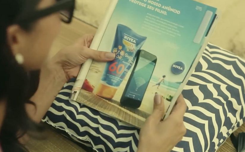
Last year NIVEA transformed a regular print ad into a portable solar charger for smartphones. Now in its latest ad, NIVEA has made the right side detachable, so people on the beaches of Brazil can use it as a trackable bracelet.

Parents who want to keep an eye on their children can rip off the bracelet, attach it to a child’s arm, and then download the companion app. In the app, they can add each child’s name and set the maximum distance each child can wander. If a child goes too far, the app sends a loud alert.

From print to proximity

The clever part is that it is not just a “detachable freebie”. The bracelet is described as embedding Bluetooth proximity tech, so the printed unit becomes a functional signal that a phone can detect and monitor.

In FMCG innovation, utility-based media works best when the object removes a real anxiety in the exact moment the product is used. Utility-based media here means an ad unit that doubles as a small tool people use right away.

The real question is whether the utility you build into the media unit is reliable enough to earn trust when the anxiety spikes.

Why the idea lands on the beach

NIVEA’s product promise is protection, but protection on a beach is not only about skin. It is also about the panic of losing sight of a child in a crowded, noisy, high-movement environment. The bracelet reframes the brand benefit from a claim to a service. This works because it shifts “protection” from a claim about skin into a service parents can experience in minutes.

Extractable takeaway: If you want a print placement to behave like product, compress the mechanism into four verbs that anyone can repeat. Tear it out. Put it on. Set a safe radius. Get alerted. That simplicity is what turns a print placement into something people talk about, and something press can repeat without over-explaining.

Business intent

This is a campaign designed to win preference in a category full of parity. It makes NIVEA Sun Kids feel like an innovator in a place where it matters, and it creates a reason to choose the brand that is not only SPF.

The work later received major awards recognition, including winning the Mobile Lions Grand Prix at Cannes Lions.

Steal the protection-to-service pattern

  • Turn media into a usable object. If it solves a real problem, people keep it and share it.
  • Map the utility to the brand promise. The best “useful ads” make the benefit feel literal.
  • Make setup frictionless. Clear instructions and a fast pairing experience are the difference between buzz and abandonment.
  • Design for the real environment. Beach. Noise. Distance. Movement. The alert has to work in the messy world.

A few fast answers before you act

What is NIVEA’s Protection Ad?

It is a print ad that includes a tear-out bracelet for children, paired with a mobile app that alerts parents if a child moves beyond a preset distance on the beach.

How does the bracelet connect to the phone?

Coverage describes the bracelet as using Bluetooth proximity technology. The phone detects the bracelet, and the app uses distance thresholds to trigger alerts.

Why does this count as strong “useful advertising”?

Because the ad delivers a real service in-context. It does not only talk about protection, it provides an extra layer of it during a real beach day.

What is the biggest risk with safety-themed tech campaigns?

Trust and reliability. If pairing fails, alerts misfire, or the experience feels unclear, the concept turns from reassurance into frustration.

What should you measure if you build something similar?

Redemption and pairing success rate, app installs driven by the ad unit, repeat usage during real outings, and brand preference uplift versus a control region or period.

Volkswagen Norway: Test drive in a print ad

You open a magazine and see a long, empty road. Then you hover an iPhone over the printed page and a Volkswagen appears to “drive” along that road on your screen. It is a test drive that happens inside a print ad, with summer and winter road versions depending on the magazine insert.

Volkswagen Norway builds this as a hybrid print and mobile experience. Readers are prompted to download an app, developed by Mobiento, that turns the printed road into a track. The phone becomes the controller and the page becomes the environment. The payoff is simple viewer control. You move the phone. The car moves with you.

An augmented reality print ad is a piece of print that a camera can recognize as a trigger. Once recognized, an app overlays a digital layer onto the page, anchored to the printed design so the interaction feels connected to the physical medium.

In European automotive marketing, the hardest part is making driver-assist feel concrete without getting people behind the wheel.

The experience is designed to demo three features in a way print usually cannot. Lane assist, adaptive lights, and cruise control. It is not a real test drive, but it is a clear and surprisingly tactile explanation of systems that are otherwise hard to “feel” from a magazine spread.

Why this works as an explanation engine

By “explanation engine” I mean a format that lets someone experience a feature benefit in seconds, not just read about it. Driver-assist features are abstract until you see them respond to a road situation, and this setup works because the printed road plus the phone’s motion becomes a simple input loop the viewer can control. This kind of demo is worth doing when the feature’s value is easier to show than to describe.

Extractable takeaway: When the benefit is behavioural, make the user’s motion the control and the physical asset the scenario.

What the campaign is really doing for the brand

This is a positioning move as much as a product demo. It says Volkswagen brings technology into everyday life and it does it with familiar media, not only with future-facing formats. Print becomes the doorway into a mobile experience, and that contrast makes both feel more interesting.

The real question is whether your media choice can carry the product story without needing a live demo.

What to steal for your own print-to-mobile idea

  • Make the printed asset the interface. The road is not decoration. It is the input surface.
  • Choose features that benefit from simulation. Assist systems and “smart” behaviours are ideal for quick demos.
  • Keep the interaction one-step. Download, point, move. Anything more kills curiosity.
  • Provide two contexts. Summer and winter versions make the concept feel robust and replayable.

A few fast answers before you act

What is “test drive in a print ad” in simple terms?

It is a magazine ad that works with an iPhone app. When you hover the phone over the printed road, the app overlays a car on screen and lets you simulate driving along the page.

What features does the VW print-ad test drive demonstrate?

The experience is built around lane assist, adaptive lights, and cruise control, using the printed road as the scenario that triggers the system behaviours.

Why is this better than a normal print ad for tech features?

Because it shows behaviour, not descriptions. The viewer sees the system respond in a road context, which is more memorable than reading about it.

Is it accurate to call it the world’s first?

Volkswagen Norway bills it that way, and the work is widely described as an early example of augmented reality applied to print as a functional “test road”.

What is the main risk with print-to-app activations?

Friction. If install or recognition is slow, people stop. The first payoff has to arrive quickly so the novelty turns into understanding.