
Lexus ES: Print Ad That Comes Alive on iPad

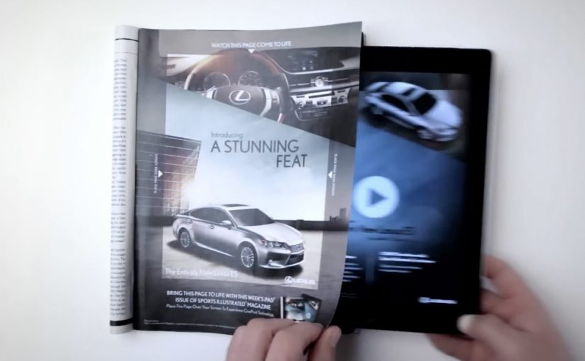
You are flipping through Sports Illustrated and a Lexus ES print ad starts behaving like a screen. The car appears to change color, its headlights flare on, the interior reveals itself, and the whole moment syncs to music.

On a number of occasions I have featured examples of brands creating interactive print ads. By “interactive print ad”, I mean a print page that becomes dynamic when paired with a tablet, with the page acting as the interface and the screen supplying light and motion. Here, the new Lexus 2013 ES is seen changing colors, turning on its headlights and exposing its interiors while music plays in this interactive print ad for the Oct. 15 Sports Illustrated issue.

Paper as a “display”

The trick is not that the magazine suddenly has electronics inside it. The page becomes a physical overlay, and the motion comes from a second screen underneath it. Place the ad over an iPad while the matching Lexus ES video plays, and the printed ink acts like a mask that makes the animation feel like it is happening on the paper itself.

An interactive print ad is a print execution that becomes dynamic when paired with a second screen, using the page as the interface and the tablet as the light and motion source.

In premium automotive marketing and magazine environments, this approach keeps the experience on the page while still delivering the “wow” of moving imagery.

Why this beats the usual print-to-digital handoff

Most interactive print ideas send you away from the page via QR codes, short links, or app installs. This one does the opposite. It pulls the digital layer into the print moment, so the reward arrives immediately and visually, without asking the viewer to leave the ad context.

Extractable takeaway: When a medium is already in someone’s hands, bring the digital layer into that moment instead of routing people elsewhere.

What Lexus is buying with this execution

This is not primarily a spec demo. It is a perception demo. The real question is whether the format makes “advanced technology elevated by style” feel true before the viewer even reads the copy. The ES positioning is “advanced technology elevated by style”, and the format reinforces that promise by making a traditionally static medium feel newly technical. The ad itself becomes proof of the claim.

Stealable moves for interactive print

  • Keep the interaction on the page. If you can deliver the payoff in the same frame, attention holds.
  • Use a familiar object as the interface. A magazine page is intuitive. No learning curve.
  • Design one signature reveal. Headlights, interior, color shift. Pick the one moment people will retell.
  • Make it work in low light. If the illusion depends on contrast, design the experience so it still reads in real life.

A few fast answers before you act

How does this “interactive print ad” actually work?

The print page is placed over an iPad while a synced video plays underneath. The page acts as a mask, so the animation appears to live on the paper.

Is the interactivity coming from electronics inside the magazine?

No. The motion, light, and sound come from the tablet. The magazine page provides the physical overlay and the illusion of print moving.

Why is this more engaging than a QR code in a print ad?

The payoff is immediate and stays on the page. QR flows add steps and send the viewer away, which increases drop-off.

What is the brand advantage of doing it this way?

The medium becomes the message. The execution demonstrates “technology plus design” through the experience itself, not just through copy.

What is the key execution risk?

If alignment, lighting, or setup friction is too high, the illusion breaks and the viewer quits before the reveal lands.
Lexus GS: NFC-Enabled Print Ad in WIRED

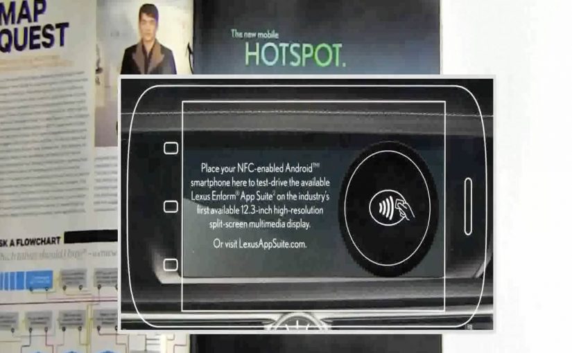
A print ad sits inside WIRED, but it behaves like a link. Hold an NFC-enabled phone (NFC is short for near-field communication) to the page and a Lexus GS demo opens on your device, without scanning a code or typing a URL.

Brands like Mercedes Benz, Reporters Without Borders, Volkswagen etc have all been working hard to create clutter breaking and engaging print ads.

In this latest example of an interactive print ad, WIRED magazine and Lexus have teamed up to create what they describe as the first mass-produced print ad embedded with an NFC tag. The ad, reported as appearing in 500,000 subscriber copies of WIRED’s April issue, lets readers with NFC-enabled phones access a demo of the Lexus GS 2013’s Enform App Suite simply by holding their phone up to the ad.

A tap replaces the scan

The mechanism is straightforward. An NFC tag is embedded into the page, and the phone reads it when placed close to the printed area. That single “tap” launches a mobile experience that can demonstrate features and apps without requiring camera alignment or extra steps. Because the tap collapses multiple steps into one, the handoff feels effortless.

In global publishing and automotive marketing, bridging print to mobile works best when the handoff is faster than habit, and simple enough to do without thinking.

Why this matters for print innovation

Most interactive print relies on behavior people already associate with effort, like scanning codes or typing. NFC flips that. The interaction feels like “just place phone here”, which is closer to natural curiosity than task completion.

Extractable takeaway: NFC works in print when it replaces effort with instinct. Design the handoff as a single tap that proves value immediately.

Definition-tightening: NFC tags in print are typically passive. The page is not powered. The phone provides the energy and reads a short payload that triggers a destination on the device.

What Lexus is really buying

This is a modern product story told through a legacy medium. The GS positioning leans into connected experiences, so demonstrating an app suite through a connected print interaction reinforces the message at the exact moment of discovery.

The real question is whether the tap reinforces the product promise at the moment of discovery.

Steal this pattern for interactive print

  • Design for one gesture. If it takes more than a tap, many readers will not try.
  • Reward instantly. The first screen after the tap should feel like a payoff, not a loading screen.
  • Make the print do real work. Print should provide context and desire. Mobile should provide depth and demonstration.
  • Plan for non-NFC readers. If the print idea relies on a capability not everyone has, ensure there is still a clear alternate path.

A few fast answers before you act

What makes this WIRED ad “interactive”?

The page contains an embedded NFC tag. Tapping an NFC-enabled phone to the ad launches a Lexus GS mobile demo experience.

Why use NFC instead of a QR code?

NFC removes the camera step. A tap is faster and tends to feel easier than scanning, which can increase participation.

Do you need a special app to use an NFC print ad?

Typically no. If NFC is enabled, the phone reads the tag and opens the linked mobile experience using standard system behavior.

What is the key benefit for the advertiser?

A lower-friction bridge from print attention to a measurable digital demo, without breaking the reading flow as aggressively as “go type this URL”.

What is the biggest execution risk?

Compatibility and clarity. If readers do not have NFC, or do not understand where to tap, the interaction collapses back into a normal print ad.

Eterna Cadencia: The Book That Cannot Wait

Last month I wrote about Austria Solar’s annual report, whose pages became visible only when exposed to sunlight.

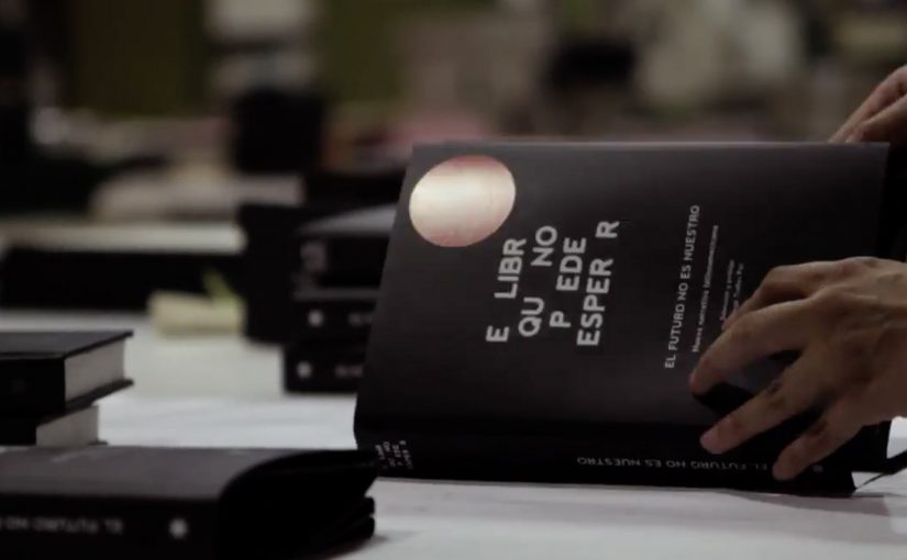
Now Buenos Aires based bookshop and publisher Eterna Cadencia has released “El libro que no puede esperar”, “The book that cannot wait”. It is an anthology of new fiction printed in ink that disappears after two months of opening the book.

The mechanic: ink that fades once you open the seal

How is that possible. Here, the mechanic is a built-in physical rule: the books are described as being silk-screened using a special ink, then sealed in air-tight packaging. Once opened, the printed material reacts with the atmosphere and starts to fade. The result is that, after roughly two months, the text vanishes.

In global publishing markets where e-books change reading habits, physical formats regain attention when they add a constraint that digital cannot replicate.

Why it lands: urgency turns reading into an action, not an intention

The idea does not compete with e-readers on convenience. It competes on psychology. A normal book is patient. This one is not. It creates a deadline, and deadlines change behavior. Because the fading is irreversible, the deadline feels real rather than promotional.

Extractable takeaway: If you want people to stop postponing a behavior, make the cost of waiting tangible and irreversible. Scarcity works best when it is built into the product, not added as a marketing slogan.

What it is really doing for new authors

The real question is whether a physical constraint can turn passive interest into immediate reading.

This is smart publishing design, not a gimmick for its own sake.

At face value, this is a publishing gimmick. Underneath, it is an argument for momentum. New fiction struggles when it sits unread on a shelf, because “I’ll get to it” often becomes “never”. A time-limited book reframes the purchase as a commitment to read now, which is exactly what emerging authors need.

The project is also widely described as being developed with DraftFCB, which helps explain why the execution feels like an idea engineered for cultural pickup, not just for bookstore shelves.

What to steal if you are marketing anything physical

  • Build the message into the object: the product itself should carry the story, even without a campaign.
  • Make the constraint legible: people should understand the rule in one sentence.
  • Turn delay into loss: urgency works when waiting has a real consequence.
  • Use packaging as a trigger: opening the seal is a clear “start” moment, and that matters for behavior.
  • Design for retellability: “a book that disappears if you do not read it” spreads on its own.

A few fast answers before you act

What is “The Book That Cannot Wait”?

It is a print book sealed in packaging where the text is printed with ink that starts fading once the seal is opened, so the content disappears after around two months.

Why would a publisher want ink that disappears?

To create urgency. The mechanic nudges readers to start and finish the book quickly, which can help emerging authors get read instead of getting postponed.

Is this a product innovation or a marketing campaign?

It is both. The object is the media. The disappearing ink turns the product into the message, which then earns coverage and conversation.

What is the biggest risk of copying this idea?

Trust. If people feel tricked or if the fade behavior is inconsistent, the stunt becomes resentment. The rules need to be clearly communicated and reliably delivered.

Where else does “built-in urgency” work?

It can work in limited editions, time-bound access, perishability, or experiences that change after first use. It is strongest when the constraint feels meaningful, not arbitrary.