
Austria Solar: Sun-Powered Annual Report

Austria Solar’s annual report arrives looking almost blank. Then you step into sunlight, and the pages wake up.

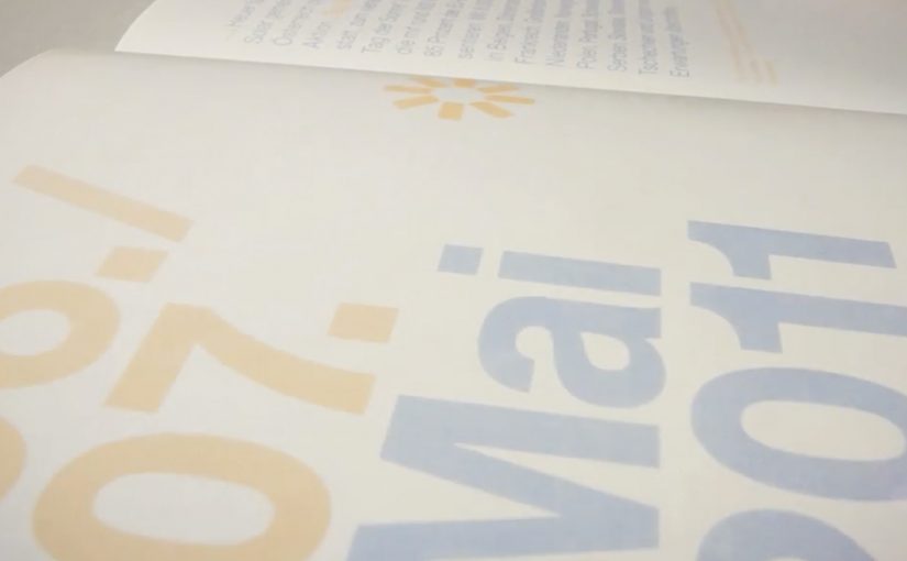
Serviceplan’s idea is to put solar energy “to paper” in the most literal way. The report’s typography and graphics only become visible when exposed to sunlight, turning the act of reading into a live demonstration of the product story.

How it works, and why the packaging matters

The mechanism sits in the production craft: a special printing process using light-reactive inks so the content remains invisible until UV-rich daylight hits the page, at which point the design reveals itself.

The report is then wrapped in light-proof foil before distribution, so recipients experience the reveal as a first-time moment rather than an already-exposed artifact.

In B2B and association communications, annual reports are expected to be worthy, and often get skimmed, so engineered “stops”, deliberate interruptions that force a reader to pause, can earn attention without needing louder messaging.

Why the reveal lands

This works because the medium is doing the persuasion. Because the content stays hidden until sunlight, the reader has to take one small step, which makes the reveal feel earned rather than announced. The real question is whether your format can do the convincing before your copy does.

Extractable takeaway: When your value proposition is invisible in everyday life, design a simple interaction that makes it visible in the moment. Let the audience “prove” the benefit to themselves through a familiar artifact.

There is also a quiet confidence in the restraint. The pages look empty at first, which builds curiosity. Then the content appears, which feels like a payoff rather than a pitch. This is a stronger move than adding more words when you need attention without hype.

The business intent behind the craft

The report is doing several jobs at once. It modernizes a traditionally dry format, positions Austria Solar as an innovation-led industry organization, and gives members and stakeholders a story they can easily retell.

Because the reveal is physical and repeatable, it also travels well in meetings. The report becomes a prop for advocacy, not just a document for compliance.

Practical moves to borrow from the sun-reveal report

  • Turn a claim into a demonstration. If your topic is energy, data, security, or sustainability, look for a way the format can embody the message.
  • Design for the first 10 seconds. Engineer a moment that forces curiosity before you ask for attention.
  • Make the interaction effortless. The user action here is trivial. Move into daylight.
  • Package the experience, not just the content. The light-proof wrap protects the “first reveal” so the idea survives distribution.

A few fast answers before you act

What is the core idea of Austria Solar’s sun-powered annual report?

It is an annual report printed so that its content only becomes visible when exposed to sunlight, turning reading into a physical demonstration of solar energy’s presence and power.

Why does making the content invisible at first help?

The initial blankness creates curiosity and a clear contrast. When the content appears, the reveal feels like a payoff, which increases attention and recall compared to a conventional report page.

What makes this more than a gimmick?

The interaction directly reinforces the organization’s story. The report does not just talk about solar power. It requires sunlight to function, which makes the message inseparable from the format.

Why does the light-proof wrap matter?

It preserves the first-time reveal by preventing premature exposure, so recipients experience the idea as a moment rather than a pre-exposed artifact.

Where else can this pattern work?

Any communication where audiences expect low novelty, like policy packs, compliance updates, investor or member reports, or annual reviews, especially when you can embed a simple demonstration into the artifact itself.
AXA: iPhone App for Car Accidents

AXA is Belgium’s first insurance company to launch an iPhone app. Their free application helps and guides you through some basic steps when you have a car accident.

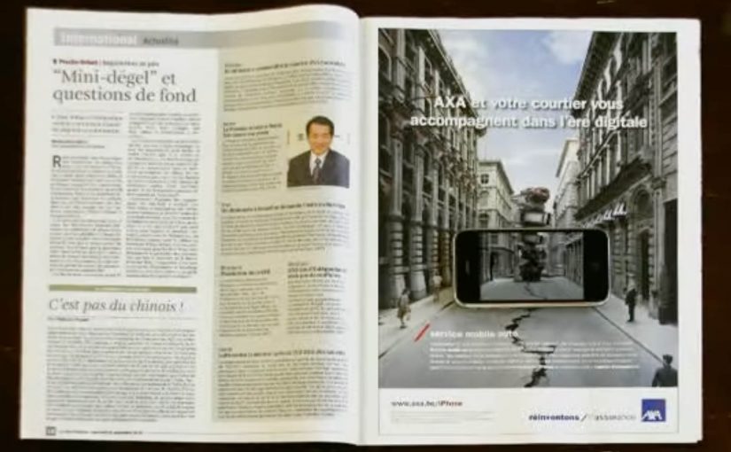
To launch this new app Duval Guillaume Antwerp / Modem from Belgium created an innovative print ad that required your iPhone to complete the message.

Why the print idea is a smart match

The product promise is practical. Help me when I am stressed and do not know what to do next. The launch mirrors that by making the iPhone essential to “finishing” the ad, so the viewer experiences the role of the phone immediately. Because the viewer has to use their own device to complete the message, the concept is remembered as help in the moment, not a feature claim. In European insurance marketing, the first interaction needs to make crisis guidance feel tangible.

Extractable takeaway: If your product is built for high-stress moments, design the launch so people experience the first step, not a promise about steps.

  • Device as the missing piece. The iPhone is not just where the app lives. It is how the message becomes complete.
  • Low barrier to understanding. You do one simple action and the concept clicks.
  • Print-to-mobile bridge. The campaign uses print to trigger a mobile behavior, instead of treating print as a dead end.

What to reuse from this approach

The real question is whether your launch makes someone feel guided before they have to believe you.

If the utility of your app is “guidance in a critical moment”, your launch should demonstrate guidance, not describe it. By “guidance”, I mean a few clear, step-by-step prompts that reduce decision load when people are stressed. A small, tangible interaction can do that faster than any list of features.

  • Start with one action. Give people a single, low-friction step that mirrors the moment your app is built for.
  • Make the device essential. Let the phone complete the story so the product role is experienced, not inferred.
  • Bridge media into behavior. Use the channel to trigger the next step, not just to carry copy.

A few fast answers before you act

What does the AXA Belgium iPhone app do?

It helps guide drivers through basic steps after a car accident, providing practical assistance when they need it most.

Who created the print launch ad?

Duval Guillaume Antwerp / Modem (Belgium) created the print execution to launch the app.

What made the print launch ad innovative?

The print execution required the viewer’s iPhone to complete the message, turning the phone into an active part of the ad rather than a separate channel.

Why is this a strong launch mechanic for an insurance app?

It demonstrates the phone’s role as a helper in-the-moment, which aligns directly with the app’s accident-assistance promise.

What is the transferable pattern?

Design a simple physical or media trigger that forces a first interaction with the device. Then let that interaction explain the product in seconds.

Volkswagen: Talking Newspaper Ad

In India, Volkswagen has created a “talking” press ad that makes a newspaper behave like a greeting card. Reports described it as one of the most talked about topics of the day on Facebook and Twitter, because the ad does something print is not supposed to do. It speaks.

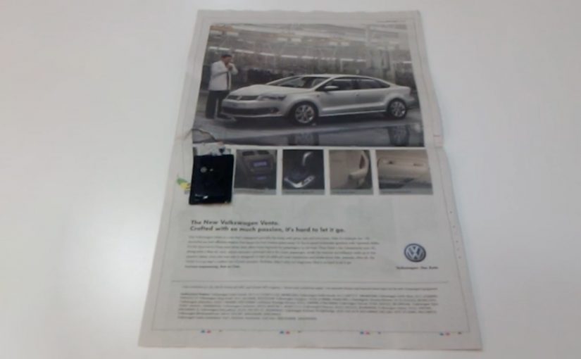
If you bought the Times of India edition carrying the special wrap, you would have seen a clutter-breaking execution with a built-in audio module. When you open the newspaper, a light-sensitive sensor acts like a switch and the message starts playing. Fold the paper and the audio shuts off.

The activation is widely reported as part of Volkswagen’s launch push for the Vento, executed at massive scale in India’s daily press.

Print that behaves like a device

The genius here is not the audio file. It is the interface. Open equals on. Close equals off. That single rule makes the experience feel magical, because it requires no instructions and no “tech literacy”. The paper itself becomes the power button.

It also creates a physical moment of surprise in an environment that is normally predictable. You expect ink. You do not expect a voice.

In mass-circulation newspaper markets, turning a silent medium into a sensory one is a reliable way to earn attention, as long as the mechanic is instant and self-explanatory.

Why this spread so fast

The format does the distribution work. People do not share “a new car ad”. They share “my newspaper started talking”. That is the difference between a message and a story.

Extractable takeaway: If the mechanic can be demonstrated in a repeatable loop, the audience becomes your distribution by showing it to other people.

It also turns the reader into a demonstrator. Once you discover it, you want to show someone else by repeating the action. Open. Close. Open again. That loop is built for office desks, breakfast tables, and social feeds.

What Volkswagen is really buying

The business intent is to make “arrival” unmissable. A new model launch needs attention in a crowded category, and this format forces a moment of engagement even if someone is only half-reading the paper.

The real question is whether your format makes the story self-propagate before you pay for reach.

This pattern works when the surprise is tightly coupled to the product story you want retold, not just the novelty of the mechanic.

It also signals “German engineering” through the medium itself. The ad does not just claim innovation. It performs it.

What to steal from a talking newspaper

  • Build a one-rule mechanic. A one-rule mechanic is a single on and off trigger people can explain and repeat in one sentence.
  • Make discovery physical. The more “showable” the action, the faster it spreads.
  • Let the medium carry the proof. If you are selling engineering, make the communication feel engineered.
  • Design for repeat demonstration. A loopable experience gets re-played and re-shared.

A few fast answers before you act

How does a “talking newspaper” ad work?

A small audio module is attached to the printed wrap or page. A light-sensitive sensor detects when the paper is opened and triggers playback. Closing or folding the paper stops the audio.

Why is this more effective than a normal print ad?

Because it forces a moment of attention through surprise, and it creates a story people repeat. The format itself becomes the message.

What kind of campaign is this best suited for?

Launch moments, announcements, and “new arrival” messaging, where the job is to break through clutter and get people talking immediately.

What is the biggest risk with sensory print executions?

Annoyance. If the audio is too loud, too long, or hard to stop, the novelty flips into irritation. The on and off behavior must feel fully under the reader’s control.

What should you measure if you run something like this?

Earned mentions, correct retelling of the mechanic, and immediate brand linkage to the intended message. If people talk about the talking paper but forget the brand, you paid for novelty, not impact.