Lux: Magic Shower Rooms

Lux: Magic Shower Rooms

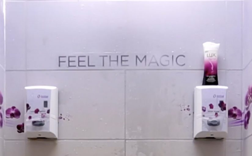
Unilever samples the new Lux Magic Spell shower soap in ladies’ shower rooms across spas, clubs and gyms in Singapore. But instead of handing out a bottle and hoping for recall later, the sampling moment is engineered into the space itself.

The walls and floors are covered with special stickers made using hydrochromic ink. Hydrochromic ink is a water-reactive coating that changes appearance when it gets wet. As soon as water hits the surface, the white layer disappears to reveal the message and beautiful trails of orchids, so the shower moment becomes a small piece of “magic” tied directly to the product experience.

When the environment becomes the sampler

The mechanism is water-activated reveal. The user does not need instructions, scanning, or a download. The shower triggers the transformation automatically, and the brand message arrives as part of the ritual.

In APAC beauty and personal-care sampling, the most efficient activations reduce the gap between trial and emotion by making the first-use moment feel special.

Why it lands

This works because it avoids the typical sampling failure mode. The product is tried, but nothing memorable happens. Here, the reveal creates a clear “before and after” moment, and that moment is inseparable from using water and being in the shower, which is exactly where the product belongs. In-space triggers beat a handout when the product is used in a fixed ritual and the trigger is unavoidable.

Extractable takeaway: If you want sampling to drive preference, attach the product trial to a sensory trigger in the same environment where the product is naturally used, and make the payoff immediate and unmistakable.

The real question is whether your sampling moment creates a memorable “before and after” that only happens in the product’s natural context.

Moves to borrow for your next ambient sampling activation

  • Make the trigger inevitable. Water is not optional in a shower room. So the reveal is guaranteed to happen.
  • Let the brand behave like a “feature” of the space. The message is not pasted on top. It is revealed by the environment.
  • Use beauty cues that match the promise. Orchids and floral trails visually echo fragrance and sensoriality without needing copy-heavy explanation.
  • Design for the first five seconds. The moment someone sees the reveal, they understand what changed and why it is interesting.

A few fast answers before you act

What is “Magic Shower Rooms” in one sentence?

A Lux sampling activation where shower-room stickers reveal orchids and messaging only when water hits them, turning product trial into a live, in-context surprise.

Why use hydrochromic ink here?

Because it converts water contact into a visible transformation, making the shower itself the interaction trigger.

What makes this stronger than a normal sampling handout?

It creates a memorable moment during first-use, in the exact environment where the product is meant to be experienced.

Where does this idea work best?

In environments where the trigger is unavoidable and the product ritual is already happening, so the reveal feels native instead of staged.

What is the main execution risk?

If the reveal is hard to notice, messy, or poorly maintained, the magic becomes confusion, and the brand association turns negative.

Coca-Cola: Hug Me Machine

Coca-Cola: Hug Me Machine

As part of its global “Open Happiness” campaign, Coca-Cola set up a vending machine at the National University of Singapore that doesn’t take coins or any other cash. It only takes hugs. For every public display of machine love, the Coca-Cola “Hug Me” machine gifts the person a free can of Coca-Cola.

A vending machine that runs on human behavior

The mechanism is a single, universal trigger. Instead of payment, the machine asks for a hug. That one action creates a public moment, signals the brand promise instantly, and makes the reward feel earned through emotion rather than money.

In FMCG sampling and brand experience work, replacing “transaction” with a simple human gesture is a repeatable way to turn distribution into a story.

Why it lands

This works because it transforms a functional object into a social catalyst. A vending machine is normally private and transactional. A hug is public and disarming. That contrast generates smiles, draws a crowd, and makes the brand feel like the instigator of the moment rather than the sponsor of a giveaway. The real question is whether the brand can make the giveaway feel like a public act people want to witness and copy. Coca-Cola gets this right because the machine itself turns sampling into visible, social participation.

Extractable takeaway: If you can swap payment for a simple, universally understood gesture, you turn sampling into participation. Participation creates social proof, and social proof is what makes the experience travel beyond the physical location.

The machine is one of a number of Happiness Machines Coca-Cola has deployed around the world since 2009.

What to steal from the Hug Me machine

  • Pick one obvious action: the trigger should be instantly understood without instructions.
  • Make the behavior visible: public participation is the engine for attention and sharing.
  • Keep the reward immediate: the dispense moment is the payoff that seals the memory.
  • Design for bystanders: the crowd reaction is part of the product.
  • Let the object carry the message: the machine itself should explain the campaign in one glance.

A few fast answers before you act

What is the Coca-Cola “Hug Me” machine?

It is a branded vending machine that dispenses a free Coke when a person hugs it, turning sampling into a public, playful interaction.

Why use a hug as the trigger?

A hug is universally understood, emotionally positive, and visibly social. It signals “happiness” faster than copy, and it recruits bystanders naturally.

What’s the marketing job this format does best?

It converts distribution into a shareable moment. The product is delivered, but the real value is the public reaction and the story people retell.

Where does this work well outside campuses?

Any high-footfall environment where people are open to playful participation. Events, malls, transit hubs, and city centers.

What is the biggest risk with this kind of activation?

If the gesture feels awkward or culturally mismatched, participation drops. The trigger has to feel comfortable, obvious, and safe for the audience.

Nike: Trackball for CTR360

Nike: Trackball for CTR360

When Nike launched the CTR360 football boot in Singapore, they wanted something that could deliver the revolutionary features that make this product the ultimate in ball control.

So an interactive in-store experience was created where ball control and product knowledge of the Nike CTR360 was both seamless and seductive.

The real question is how to make a ball-control claim feel true within a few seconds of interaction.

For performance products, the best retail education is interaction, not explanation.

Why this retail execution works

The strongest part is that it does not separate “demo” from “education”. The interaction itself becomes the explanation. You learn by doing, and that is exactly how a ball-control product should be introduced. In performance-footwear retail, shoppers believe what they can trigger themselves without instructions. Here, “the mechanic” is the single interaction pattern that carries both the demo and the message.

Extractable takeaway: When a benefit is about control, design one self-explanatory action that proves control before you explain anything else.

  • Product truth in the mechanic. Control is demonstrated through controlled interaction, not described in copy.
  • Low friction discovery. Visitors do not need instructions to begin. The interface invites experimentation.
  • Retail as experience, not shelving. The store becomes the medium that proves the claim.

What to take from it

If your product benefit is physical or performance-based, build a retail moment that lets people feel the promise quickly. The goal is not to show every feature. It is to create one memorable proof point that makes the product easier to believe and easier to talk about.

  • Pick one proof point. Let people feel the promise quickly, instead of trying to cover every feature.
  • Make the start frictionless. Invite experimentation without needing staff to interpret what to do.
  • Design for retellability. Create a moment people can describe right after they try it.

A few fast answers before you act

What did Nike do for the CTR360 launch in Singapore?

Nike created an interactive in-store experience that demonstrated ball control while also communicating CTR360 product features through the interaction itself.

Why pair product education with interaction?

Because performance products are understood faster through demonstration than explanation. The experience makes the benefit tangible.

What is the core pattern behind this kind of retail activation?

Translate the product promise into a simple, inviting interaction. Then let that interaction deliver both the “wow” and the learning.

How do you know if an in-store experience is doing its job?

If a visitor can explain the product benefit immediately after trying it, without needing staff to interpret it, the design is working.