GOL: Valentine’s Flight Seat Challenge

Brazilian airline GOL ran a Facebook activation designed to grow its online community and raise brand awareness in a highly competitive airline market. The insight behind it was simple. A trip can be one of the most romantic Valentine’s gifts to receive.

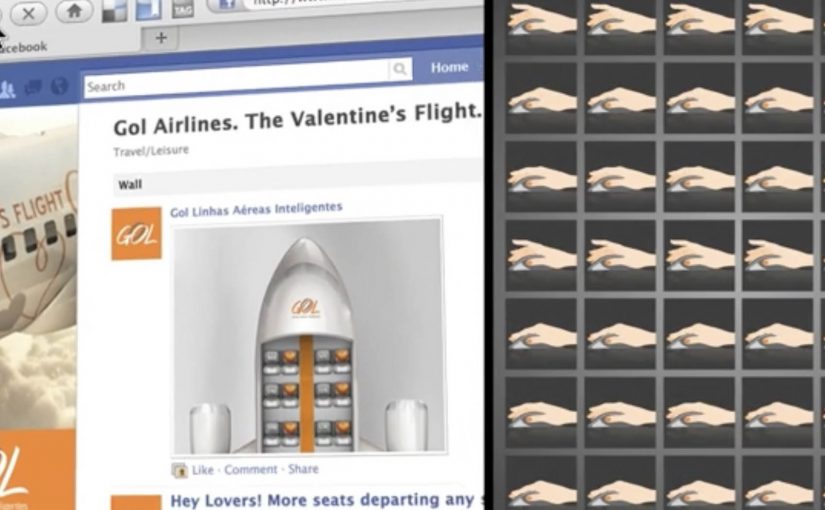
Over the Valentine’s weekend, GOL posted a series of images featuring empty airplane seats on its Facebook wall, without warning. The first people to see each image and comment the correct seat numbers won a pair of return tickets to any of GOL’s destinations.

The campaign was reported to have grown GOL’s Facebook community from 12,000 to over 200,000 in three days, making it number one in its category for the period.

A giveaway that rewards attention, not effort

The mechanism is a speed game disguised as a romantic prize. You do not fill out a form or write a story. You notice a post. You read a seat layout. You comment a number faster than everyone else.

In mass-market consumer categories, lightweight “attention rewards”, small prizes for noticing and reacting in the feed, can outperform complex promotions because they fit how people already behave in social feeds.

Why it lands

The execution stacks three accelerators. Surprise timing. A simple visual puzzle. A high-value reward that feels emotionally relevant to the weekend. That combination converts scrolling into urgency, and urgency fuels sharing and repeat checking, even among people who never win. The real question is whether your winner logic is instantly believable at feed speed.

Extractable takeaway: If you want rapid community growth, design a loop where the behaviour is already native to the platform, and the winner selection is instantly credible. Speed plus clarity beats creativity-plus-forms.

What the brand is really buying

Beyond awareness, this format buys habit. People learn that the page can drop value without notice, so they follow, refresh, and invite friends to watch too. The prize is the hook. The real outcome is an audience that has trained itself to pay attention at the brand’s tempo.

Steal this: Surprise-seat giveaway loop

  • Use a recognisable visual trigger. A seat map is instantly readable, even at feed speed.
  • Keep participation to one action. Commenting is frictionless. That matters more than polish.
  • Make the rules self-verifying. Everyone can see the seat numbers and understand who was first.
  • Lean on surprise scheduling. Unannounced drops drive repeat checking far better than a fixed timetable.
  • Match prize to context. A Valentine’s weekend mechanic wants a prize that feels like a shared experience.

A few fast answers before you act

What is the Valentine’s Flight Seat Challenge in one sentence?

It is a Facebook giveaway where GOL posted surprise images with empty seat layouts, and the first users to comment the correct seat numbers won return tickets.

Why does “first to comment” work so well on Facebook?

Because it rewards attention and speed, which are native behaviours in a feed. It also creates a visible, easy-to-trust winner logic.

What makes the seat map a strong creative device?

It is instantly legible, visually distinctive in the feed, and turns the brand’s core product into a simple game mechanic.

What is the biggest risk with this format?

Perceived fairness. If timing, moderation, or winner confirmation is unclear, the campaign can trigger backlash rather than growth.

What should you measure beyond follower count?

New follower retention after the weekend, engagement rate on subsequent posts, repeat participation behaviour, and whether awareness lift correlates with search and booking intent.

SAS: Up for Grabs on Facebook

To promote a million-seat fare sale, Scandinavian Airlines (SAS) and Crispin Porter + Bogusky Stockholm ran a Facebook competition where fans could “grab” a free trip. The ask was visual and dead simple, and it turned participation into the media.

Fans changed their profile picture into a custom “Up For Grabs” image, then posted a matching photo on the SAS Facebook wall where they physically “grabbed” the trip. Every entry looked like an ad, and every ad looked like a friend.

The mechanic that turns fans into distribution

The campaign’s mechanism was a two-step loop. First, replace your profile image with a branded frame that signals you are “in”. Second, publish a playful photo on the brand wall that demonstrates the concept, grabbing the prize. That wall then becomes a live gallery of social proof, with each new post re-selling the fare sale in a more human way than a banner ever could.

In airline marketing, promotions that convert participation into shareable images can outperform price-only fare announcements.

Why it lands

It turns an abstract offer into a physical gesture. “Grab a trip” becomes something you can perform, photograph, and show. The profile-picture switch is a light commitment that broadcasts intent, and the wall post is a public performance that invites imitation. The momentum comes from visibility, because the more entries you see, the more “normal” it feels to join.

Extractable takeaway: When you need scale fast, design one participation artifact that doubles as an ad unit, and make the action easy enough that people will copy it without instructions.

What the shutdown reveals about the strategy

The campaign was reportedly against Facebook promotion terms, and it was shut down. That ending is part of the story, because it highlights the tightrope of social-first promotions. The creative is built on a behavior Facebook historically restricts for contest entry, asking people to publish specific content as a condition of participation, even if the idea is clever and the buzz is real.

The real question is whether the participation mechanic can spread the offer without depending on a platform behavior that can be switched off overnight.

The stronger strategic read is that the creative idea is right, but the distribution mechanic is too dependent on borrowed platform rules.

What to steal for your own launch

  • Make the entry format the message. If the entry itself demonstrates the offer, you get free repetition of the proposition.
  • Use a low-friction first step. Profile-picture frames and templates work because they are fast and socially legible.
  • Design a single visual trope. “Grabbing” is a trope anyone can reproduce, and that consistency creates a recognizable feed.
  • Build compliance in from day one. If the mechanic depends on prohibited platform behaviors, plan a compliant alternative before launch.

A few fast answers before you act

What is the core idea of Up for Grabs?

A Facebook contest where fans change their profile picture to a branded frame and post a “grabbing the trip” photo on the SAS wall to compete for a free flight.

Why does the profile-picture step matter?

It turns participation into persistent visibility. The frame signals “I am in”, and it spreads through everyday browsing without requiring an additional media buy.

What made the campaign travel beyond the SAS page?

Each entry was both participation and promotion. When fans changed their profile picture and posted a matching photo, the fare sale moved into personal networks instead of staying inside brand media.

Why was it shut down?

It was reportedly closed for violating Facebook promotion rules by conditioning entry on specific platform actions, such as posting photos on the wall.

How do you keep the upside without the platform risk?

Keep the visual template and the “grab” trope, but move the submission mechanic to a compliant entry flow, then allow optional sharing that is not required to participate.