Brake New Zealand: Living Memories

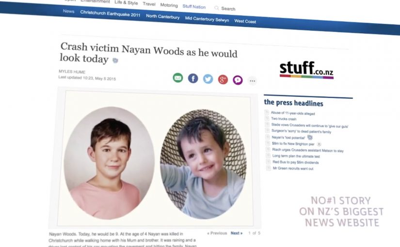
Five families sit down to meet someone they have not seen in years. Not in footage, and not in memory. They are shown a new portrait of what their child would look like today if the crash had not happened.

That is the emotional core of “Living Memories”, a campaign created for New Zealand road safety charity Brake with Y&R New Zealand. Five bereaved families volunteer their stories and photographs. A forensic age progression specialist creates an age-progressed sketch for each child, then Weta Digital applies a film-grade 3D character workflow to render those sketches into lifelike portraits.

From forensic sketch to a portrait that feels real

The mechanics are deliberately simple and respectful. Start with family photos. Build a plausible “today” version using forensic age progression. Then use a VFX-grade craft process to land realism: facial structure, skin texture, hair, lighting, and the small imperfections that make an image feel like a person, not a concept.

In interviews about the project, the team describes avoiding the usual driver-centric shock formula. Instead, the work reframes a fatal crash as a theft of future, not only a loss of life. The portraits are the device that makes that reframing unavoidable, which is why the work lands as empathy instead of another warning people learn to tune out.

In road safety communication, behaviour change work gets stronger when it makes consequences specific, personal, and imaginable, rather than statistical and abstract.

Why it lands without lecturing

The real question is how to make the cost of a crash feel immediate before another family has to imagine the years that never happened. It works because it replaces generic warning language with a concrete counterfactual. That counterfactual means a specific life that should have continued. You are not asked to fear injury. You are asked to face a specific life that could have continued. That shift moves the message from compliance to empathy, and empathy is harder to shrug off. This is a stronger road safety move than another driver-centric shock ad because it turns consequence into empathy instead of noise.

Extractable takeaway: If you need behaviour change, pick one vivid, human “missing future” moment your audience can picture in seconds, and build your creative device around making that moment feel undeniably real.

The brand and charity intent behind the emotion

Brake’s job is awareness plus support for people affected by road trauma. This execution earns attention without spectacle, and it gives the charity a clear platform story to carry through the week. For Y&R, it is a case study in how craft and restraint can outperform volume, especially when budgets are limited.

What to steal for your next high-stakes message

  • Stop telling people to “be careful”. Show the specific, lifelong cost of one decision.
  • Use a single, truthful device. Here, it is age progression plus realism, not a pile of tactics.
  • Cast real stakeholders, not actors. Voluntary participation carries moral weight and credibility.
  • Let craft carry the persuasion. When realism is the point, invest in the details that make it believable.
  • Build the story for earned reach. The reveal moment is inherently newsworthy and shareable.

A few fast answers before you act

What is “Living Memories” in one sentence?

It is a Brake New Zealand road safety campaign that uses forensic age progression and Weta Digital craft to show what five children killed in crashes might look like today.

What is the core mechanism?

Family photos become age-progressed forensic sketches, then those sketches are rendered into realistic portraits so the audience can emotionally grasp “lost futures”, not just “lost lives”.

Why use portraits instead of crash scenes?

Portraits shift the message from fear to empathy. They make the consequence personal and imaginable, which tends to travel further than generic warnings.

How do you keep work like this from feeling exploitative?

Consent and dignity are the guardrails. Participation must be voluntary, families must control boundaries, and the storytelling must centre the person lost, not the brand or the spectacle.

What is the most reusable lesson for other topics?

When you need serious behaviour change, replace abstract statistics with a single, concrete “this is what is missing” moment that people can picture instantly.

TAC: How to Plan a Funeral

In September 2012, the Transport Accident Commission (TAC) in Australia runs a Pinterest campaign with a line that lands like a punch: How to plan a funeral.

The idea is aimed at girlfriends and mothers of young men. The case frames the problem bluntly. Young men are far more likely to die in a crash than young women, and speeding is positioned as a primary contributor to those fatalities.

How Pinterest becomes a road-safety channel

The mechanism uses Pinterest boards that look like practical inspiration for funerals. Images and pins map to real funeral-planning themes, then steer toward the campaign’s message: “I’d hate to plan your funeral. Slowing down won’t kill you.” That works because the planning format lowers resistance before the safety message lands.

In road-safety behavior change, the most effective interventions often come from trusted relationships rather than institutional authority.

Why it lands

It shifts the emotional weight. Instead of telling a driver what TAC wants, it lets a partner or parent express what they fear. Pinterest is a deliberate platform choice because the boards feel like a real place someone would browse for “ideas”, which makes the moment of recognition more personal and more unsettling.

Extractable takeaway: If you need behavior change, route the message through the person with social permission to say it, meaning someone whose concern will be heard as care rather than control. Then build the media experience so it feels like everyday browsing, not an “ad break”.

What the campaign is really optimizing for

This is not trying to win an argument about enforcement. It is trying to trigger a conversation at home. The work uses a shareable, repeatable line that people can copy in their own words, because a close person saying it carries more force than a government body broadcasting it.

The real question is how to make the warning come from someone the driver will actually hear before the risky behavior happens.

The stronger strategic move here is to design for the relationship, not for the institution.

What to steal for your own safety or health campaign

  • Design for the messenger. Decide who the audience will actually listen to, then craft the creative for that relationship.
  • Choose a platform that matches the behavior. If the message is “planning” and “ideas”, a board format can feel native.
  • Use one line people can borrow. If supporters cannot repeat it verbatim or paraphrase it easily, it will not travel.
  • Make the consequence concrete. “Funeral planning” is an action. It forces imagination to do the work.

A few fast answers before you act

What is the core idea of How to Plan a Funeral?

A TAC Pinterest presence that looks like funeral-planning inspiration, designed to help girlfriends and mothers deliver a more impactful “slow down” message to young men.

Why use Pinterest instead of a typical road-safety ad format?

Because the browsing context feels personal and practical. That makes the emotional message land as something a loved one would stumble into and share, not something an authority announces.

What is the key insight behind the campaign line?

A close relationship can say what an institution cannot. “I’d hate to plan your funeral” is a social message first, and a safety message second.

Who is the message really meant to activate?

Girlfriends and mothers of young men. The campaign is built for the people whose concern is more likely to be heard as care than control.

What is the biggest risk in copying this approach?

If the platform context feels forced or exploitative, people disengage. The creative must feel native to the behavior on that platform, and the tone must stay respectful.

Shell: Pedestrian Ghost

A driver approaches a crosswalk too fast. A “pedestrian” suddenly appears from a manhole cover, then shoots up into the sky like a soul escaping. The only sane response is to slow down.

Speeding cars and pedestrian safety is a huge problem in Ukraine. Ukraine is described as having the highest percentage of pedestrian collisions in Eastern Europe at 56%. To make people think twice about speeding, Shell along with JWT Ukraine created an ambient campaign called the Pedestrian Ghost, a person-shaped helium decoy that appears only when a driver is speeding. The campaign ran during Halloween and generated a lot of buzz over the internet.

A ghost that only shows up when you speed

The mechanism is built for one job. A radar detects an approaching vehicle that exceeds the speed limit. When the threshold is crossed, a hidden device integrated into a manhole cover inflates a person-shaped “ghost” using helium-filled balloons. The figure rises fast and disappears upward, creating a moment that feels like you just hit someone, even though nothing living is harmed.

In dense city streets where drivers routinely treat crosswalks as negotiable, the sharpest safety interventions are the ones that create a visceral consequence in the exact second a bad decision is made.

The real question is how to make speeding feel consequential before harm happens.

Why it lands

It works because it weaponizes surprise without needing explanation. The ghost is unmistakably human-shaped, the timing is unmistakably linked to speed, and the “escape” into the sky reads like consequence. That instant cause-and-effect loop is what resets behavior, at least for the next few blocks. For road-safety messaging, this is the right trade-off: simulate consequence hard enough to reset behavior, but never create real danger.

Extractable takeaway: If you want to interrupt dangerous habits, trigger the intervention only at the violation moment, and make the feedback so immediate and legible that drivers connect cause and effect without being told.

What this crosswalk ghost gets right

  • Trigger only on the infraction. The selectivity makes the moment feel targeted, not random.
  • Use a single, readable symbol. A human silhouette beats a statistic for behavior change.
  • Design for “I have to tell someone”. A story people can repeat in one sentence becomes earned media.
  • Keep the intervention non-injurious. The fear is simulated, the outcome is safe.

A few fast answers before you act

What is “Pedestrian Ghost”?

An ambient road-safety stunt where a ghost-like pedestrian figure rises from a manhole cover at a crosswalk when a radar detects a speeding car, forcing drivers to slow down.

What is the core mechanism?

Radar detects speeding. A concealed device inflates a person-shaped helium “ghost” and releases it upward. The driver experiences an immediate, consequence-like shock without any real harm.

Why does it change behavior better than a warning sign?

Because the feedback is timed to the violation and feels personal. The driver is not being advised. They are being startled at the exact moment of risk.

What is the biggest failure mode if I copy this pattern?

Unreliable triggering. If the effect fires at the wrong time, or too often, people stop believing the cause-and-effect link and the intervention becomes noise.

What is the simplest modern variant?

A violation-triggered intervention that is immediate, physical, and unmistakably tied to speed. For example light, sound, or motion that only activates above a threshold at the crosswalk.