SNS Bank: I Want Interest on My Current Account

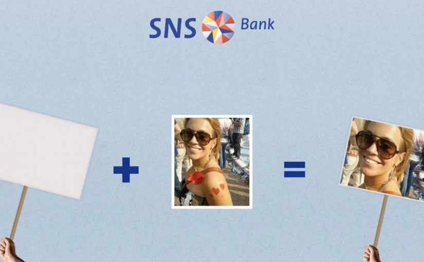
SNS Bank promotes a simple product shift. Paying interest on a normal current account. Instead of leading with rates and fine print, the work frames it as something worth protesting for.

People “join” the protest using their Facebook or Twitter account. Their profile picture then becomes the campaign’s moving unit, connected into live rich media placements running on Dutch publisher inventory such as msn.nl and telegraaf.nl. Here, the moving unit is the participant’s profile picture reused as the visible building block of the protest crowd.

How the protest mechanic is built

The mechanism is straightforward. Sign up with a social account, capture the profile image, then re-render that image as part of a marching crowd inside dynamic banners. The same identity asset travels from social sign-up, to landing experience, to high-impact display formats, including what is described as a homepage takeover on telegraaf.nl.

In European retail banking, feature-led propositions like “interest on current accounts” often need a memorable way for customers to visibly participate to cut through price parity and low attention.

Why it lands

It takes a boring benefit and gives it a human visual. A rate becomes a crowd. That shift matters because it makes the offer feel socially validated and easy to explain. It also turns ordinary display inventory into a live proof point, because the banners visibly update with real people rather than generic stock photography. This is the right strategic move because the campaign makes participation itself the proof of relevance.

Extractable takeaway: When your proposition is a small financial feature, convert it into a visible social object. One reusable profile image can power sign-up, storytelling, and proof across every paid placement.

What SNS Bank is really trying to achieve

The business intent is to make “interest on a current account” feel like a category change, not a marginal tweak. The protest framing gives SNS Bank permission to be louder than the feature itself, and it creates a participation funnel that can be measured from social sign-up to on-site conversion.

The real question is how to make a marginal banking feature feel like a public movement rather than a line item in a comparison table.

What to steal from this protest-led banking launch

  • Turn the benefit into a visual system. If the offer is intangible, give it a repeating picture that accumulates and grows.
  • Use one identity artifact everywhere. A single profile image can unify sign-up, landing experience, and ad formats into one story.
  • Make paid media feel live. Dynamic creative that visibly changes reads as proof, not just persuasion.
  • Respect permission and platform rules. If you are pulling profile images, ensure consent is explicit and the experience stays compliant.

A few fast answers before you act

What is the core mechanic of this campaign?

People join via Facebook or Twitter, and their profile image is then reused as the creative building block inside a marching protest rendered across rich media banners.

Why use display banners for something that starts in social?

Because banners can function as visible proof at scale. The audience sees real faces moving through the ad units, which makes the proposition feel active rather than purely claimed.

What is the main advantage of the “protest” framing?

It makes a dry feature feel like a cause. That reframing increases memorability and gives people a simple story to repeat.

What is the biggest risk in copying this approach?

Using social identity assets without clear consent creates trust and compliance issues. If the sign-up step is not explicit, the same mechanic can backfire fast.

When does this kind of mechanic work best?

It works best when the product feature is real but visually weak. The participation layer gives the feature a public shape without changing the underlying offer.

Nike Take Mokum: graffiti you paint by running

Boondoggle Amsterdam came up with a campaign for Nike that made running less serious. They distracted youngsters from their boring running schedules and challenged them to release their creativity on Amsterdam by using their feet as paint instead.

A Facebook app called “Take Mokum” (Amsterdam’s local nickname) was developed that allowed runners to make digital graffiti on the map of Amsterdam. All they had to do was actually run the route and upload their KMs with Nike+. In this context, Nike+ is simply the upload that validates the kilometres. The app would then paint the graffiti for them. These graffiti pieces could then be shared, and liked fanatically.

Running as a creative tool, not a discipline

The mechanism is beautifully simple: convert effort into expression. The runner designs a “tag” by choosing a route. Here, a “tag” is the graffiti-style signature you draw with your route. The city becomes the canvas. Nike+ becomes the proof that the route was actually run. Then the app visualises the path as graffiti, so the output feels like art rather than exercise data.

That flips the motivation model. Because the route becomes a visible mark, every kilometre contributes to something you can show, not just a number you log. You are not running to hit a number. You are running to create something worth showing. The real question is whether you can turn a fitness discipline into a culture-native act of self-expression.

In youth-facing, city-based campaigns, adoption often follows social signalling, not self-optimisation.

Why it lands with youngsters

This campaign taps into identity and visibility. Graffiti culture is about leaving a mark. Take Mokum lets people do that in a digital layer without vandalising anything. The “like” loop adds social reward. The route becomes content, not just a workout.

Extractable takeaway: If you want people to stick with effort, make the output look like identity and let the community reward it.

It also removes the seriousness that can make running feel like punishment. The challenge is playful. The accomplishment is shareable.

The intent: make Nike’s running promise felt, not claimed

The business intent is aligned with Nike’s broader mission to change running. Instead of telling young people that running is cool, the campaign makes running a means to do something else: create, compete for attention, and express style. The product story is embedded in the behaviour.

Behaviour-change work should treat data as validation and culture as the incentive.

The result, as described: young Amsterdam started running, and Nike’s mission to change running was actually experienced by youngsters.

What to steal from Take Mokum

  • Turn effort into an artefact. People stick with habits when the output feels worth keeping or sharing.
  • Let users design the challenge. The route is the creative input. That increases ownership.
  • Use data as validation, not as the headline. Nike+ proves the run. The graffiti is the reward.
  • Build a social loop. Sharing and liking are not add-ons. They are the motivation engine.
  • Match the culture. The campaign borrows from street expression rather than “fitness discipline”.

A few fast answers before you act

What is Nike Take Mokum?

It is a Facebook app that lets runners create digital graffiti on an Amsterdam map by running a route and uploading the kilometres through Nike+.

How does the app turn a run into graffiti?

The runner’s route becomes the “drawing”. After the Nike+ upload, the app visualises the path as a graffiti-like mark on the city map.

Why is this motivating compared to a normal running plan?

Because the reward is creative and social. You produce something you can share and get reactions to, not just a time and distance record.

What audience behaviour did this campaign aim to create?

To get young people running by making the activity feel playful, expressive, and socially visible, rather than structured and serious.

What is the key takeaway for behaviour-change campaigns?

Motivation improves when you convert effort into identity. Give people a way to express themselves, then let the community reinforce it.

Sea Life: Rain Ads That Appear When It Rains

An octopus that only shows up in the rain

Fresh Green Ads is a green media agency from Amsterdam that developed a Rain Campaign, a street-message activation that appears only when pavement is wet, for Sea Life Scheveningen.

Every time it rains the octopus of Sea Life Scheveningen appears on the streets with its tentacles holding the text: “Sea Life laat je niet meer los” (Sea Life never lets you go). When the streets dry up the Rain Campaign disappears. The striking and environmentally friendly message remains visible for up to eight weeks.

The weather trigger is the headline

The campaign is not just placed outdoors. It is activated by the outdoors. Rain becomes the on-switch, which makes the appearance feel like a small surprise rather than an imposed ad.

In outdoor and ambient media, context-triggered visibility works best when the environment itself becomes the activation switch.

Why it fits Sea Life perfectly

Water is not a backdrop here. It is the medium. The octopus “arrives” with rain and disappears when the street dries. That behavior mirrors the theme and makes the line “never lets you go” feel playful instead of pushy.

Extractable takeaway: When your activation trigger is the same element your brand is about, the visibility feels earned and the message can stay playful instead of pushy.

The quiet business logic

The real question is whether your activation can earn repeated attention by showing up only when conditions are right.

Create repeated moments of attention without constant visual clutter. You get spikes of visibility exactly when conditions are right, and then the street returns to normal.

This is the better pattern when you want outdoor attention without turning every day into an ad.

Tactics to borrow from rain-triggered OOH

  • Use context as a trigger. Weather can be a switch, not just a backdrop.
  • Let the idea control visibility. Appear. Disappear. Create surprise.
  • Build sustainability into the execution. Make sure the cleverness is not wasteful.

A few fast answers before you act

What is the Sea Life Scheveningen Rain Campaign?

A street-message activation that appears when it rains, showing a Sea Life octopus and the line “Sea Life laat je niet meer los” (Sea Life never lets you go).

Who developed it?

The post credits Fresh Green Ads, a green media agency from Amsterdam.

What happens when the streets dry?

The rain-activated message disappears as the street dries.

Why does weather-triggered visibility feel less intrusive?

Because rain acts as the on-switch, the message arrives as a surprise rather than a constant presence.

How long can the message remain visible overall?

The post says the environmentally friendly message can remain visible for up to eight weeks.