Heineken Departure Roulette

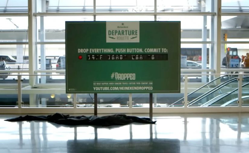
Board at JFK Terminal 8. A single red button. A real decision. To embody Heineken’s adventurous spirit, Wieden + Kennedy in New York sets up a Departure Roulette board at JFK’s Terminal 8 and dares travelers to play. If they press the button, they drop their existing plans and go somewhere totally new and exotic.

The commitment is real. The travelers who take the dare receive $2,000 to cover expenses and get booked into a hotel for two nights at the new destination. This is the recently released video of how it unfolds at JFK.

The stunt links to a broader idea. The game draws inspiration from Dropped, a Heineken campaign launched from W+K Amsterdam in which four men get sent to remote destinations, and the adventure of getting back gets filmed.

In global FMCG brand marketing, high-traffic moments like airports make public, irreversible choices unusually effective at turning a value into proof.

Why this stunt works

The power is not the prize. It is the forced, public decision moment that turns “adventurous” from a claim into an observable act.

Extractable takeaway: If your brand stands for a value, design one visible, irreversible choice that makes people either live it or walk away.

It makes spontaneity measurable

Most people can say they are spontaneous. Departure Roulette forces a binary choice in public. Press or walk away. The brand promise becomes an observable action. Because the choice is binary and public, it creates proof people can retell without needing extra context.

It raises stakes without needing complex rules

The mechanic is simple. Here, the mechanic is the single red-button press that swaps your itinerary on the spot. The tension is high. You do not need a long explanation to understand what is at risk: your plan.

It turns a brand value into a story people retell

The red button is a prop with meaning. It compresses the entire narrative into one symbol that is easy to remember, share, and debate.

The real question is whether your brand promise can survive a real, irreversible choice in front of people.

This pattern is worth copying only when the commitment and the logistics are truly real in the moment.

What to measure beyond views

  • Participation rate. How many approached travelers agree to play.
  • Completion rate. How many press the button after hearing the rules.
  • Story lift. How often people retell the mechanic correctly.
  • Brand linkage. Whether the audience connects the act to “adventurous spirit,” not just “free trip.”

Steal the red-button blueprint

  • One irreversible trigger: Reduce the experience to a single action that cannot be half-done.
  • Visible trade-off: Make what they give up as clear as what they gain.
  • Decision-first filming: Capture the seconds before and after commitment, not just the outcome.
  • Operations as creative: Treat booking, payout, and handoff as part of the story, because failure kills believability.

A few fast answers before you act

What is Departure Roulette?

A physical airport activation where travelers can press a red button and immediately swap their planned trip for a surprise destination.

Where did the activation take place?

At JFK Airport, Terminal 8, where the Departure Roulette board invited travelers to press the red button and swap trips.

What is the core mechanic?

One irreversible choice that turns a brand value into an action people can witness.

How does it connect to Heineken’s Dropped campaign?

It borrows the premise from Dropped, where participants are sent to remote destinations and the journey back becomes the story that gets filmed.

What makes it repeatable for other brands?

The format is not travel. It is a high-stakes choice with a simple trigger, a clear trade-off, and a real reward.

What is the biggest failure mode?

When the commitment is not credible, or the operations cannot deliver the promise.

Virgin Atlantic: No Ordinary Park Bench

Virgin Atlantic wanted to give the people of New York a taste of their onboard services. So with the help of Y&R New York they took over an ordinary bench and gave unsuspecting park-goers an unforgettable Virgin Atlantic experience.

How an “ordinary” bench becomes an airline product demo

The mechanism is a simple swap. Take a familiar public object. Upgrade it with unmistakable “premium” cues. Then add a layer of surprise service so the bench behaves less like street furniture and more like a seat with hospitality. The passersby reaction becomes the content, and the content carries the brand promise further than a static poster ever could.

In premium service brands, the fastest route to belief is letting people experience the service promise before they ever buy.

Why it lands

This works because it compresses a complex claim, “we make flying feel special”, into a single, legible moment in the real world. You do not need a fare sale, a cabin diagram, or a spec sheet. You just need the contrast of ordinary versus treated-like-a-guest.

Extractable takeaway: When your differentiation is a feeling, stage a public, bite-sized version of that feeling. Make it easy to understand in one glance and easy to retell in one sentence.

What the stunt is really doing for the brand

It turns an intangible benefit, service, into something tangible and shareable. The real question is how you make an intangible service promise feel credible before purchase. The bench is not the point. The point is credibility by demonstration. It is a live proof point that “Virgin Atlantic service” is a thing you can recognize, even on the ground.

What premium service brands can borrow

  • Choose a familiar object: the more ordinary the baseline, the stronger the contrast when you upgrade it.
  • Make the promise physical: show the service, do not describe it.
  • Design for bystanders: build a moment that attracts a crowd without requiring explanation.
  • Keep the story clean: one setup, one surprise, one payoff.
  • Capture reactions: human responses are the most efficient proof of “this is different”.

A few fast answers before you act

What is the “No Ordinary Park Bench” idea?

It is a Virgin Atlantic street activation where an ordinary park bench is transformed into a branded service moment, giving park-goers a taste of the airline’s onboard experience.

Why use a bench instead of a pop-up booth?

A bench is instantly understood and frictionless. People sit without committing to “an activation”, which makes the surprise feel more genuine and the reactions more watchable.

What makes this effective for premium brands?

Premium is hard to prove with claims alone. A live demonstration makes the promise tangible, and it gives people a story to repeat.

What is the core pattern to reuse?

Pick one everyday touchpoint, upgrade it dramatically, and deliver the brand benefit in a way people can feel immediately.

What is the biggest risk with this format?

If the experience feels staged, intrusive, or confusing, the audience will not lean in. The best versions are simple, respectful, and clearly additive to the public space.

Coca-Cola: The Happy Flag

Airports in Denmark have a simple tradition. People welcome arrivals with flags.

Coca-Cola takes a small cultural detail and turns it into a physical interaction. After a discovery that the Danish flag can be seen inside the Coca-Cola script, the brand brings that idea to Denmark’s biggest airport and makes the flag literally tearable from the logo.

The mechanism is a special poster where passers-by can take small Danish flags straight from the Coca-Cola mark, so even people who arrived without a flag can still join the welcome.

A logo that becomes a utility

This is not a poster that asks you to look. It is a poster that gives you something to do. The brand symbol becomes a dispenser. The action is obvious, the reward is immediate, and the result is visible in the room as more people start waving flags. For out-of-home, participation beats passive exposure when the action is effortless.

In global consumer brand portfolios, small rituals scale when you turn them into simple, repeatable behaviors that people are happy to perform in public.

The real question is whether your most recognizable cue can become a public action people do instinctively, not a message they merely notice.

Why it lands in an airport

Airports are full of waiting and scanning. A physical action breaks the autopilot, and the output is social. Because the poster turns the logo into a one-step flag source, the first few waves appear fast and trigger imitation. You do not keep a flag to yourself. You wave it. That makes the message travel without needing an additional media buy.

Extractable takeaway: When your brand asset is already recognizable, turn it into a useful object inside a real-world ritual. Utility creates permission. Participation creates memory.

The intent behind the “happiness” frame

The story is designed to borrow from Denmark’s “happiest country” reputation as described in various rankings and conversations, then translate that abstract label into something concrete. Here, “happiness” is framed as a warmer, more participatory welcome, not a vague claim. A warmer welcome. More flags in more hands. More people involved.

Moves to borrow for participatory out-of-home

  • Start with a local ritual. Find a behavior people already do gladly, then amplify it.
  • Make the interaction self-explanatory. If someone needs instructions, the moment dies.
  • Use a brand asset as the mechanism. When the logo is the tool, branding feels natural, not pasted on.
  • Design for public visibility. The best output is something others can see and copy instantly.

A few fast answers before you act

What is Coca-Cola’s “The Happy Flag” idea?

It is an airport poster activation where people can tear off Danish flags from the Coca-Cola logo, so more arrivals can be welcomed with flags even when greeters did not bring one.

What is the core mechanism that makes it work?

A familiar brand mark is redesigned as a dispenser. The logo becomes a physical utility, and the action produces a visible social signal in the space.

Why is an airport a strong place for this?

The environment already contains anticipation, reunions, and cameras. A simple, shareable gesture fits the emotional context and spreads through imitation.

How can brands adapt this pattern?

Pick a recognizable asset, connect it to a real-world ritual, and redesign it into a simple object people can use. Then make the output visible so participation recruits more participation.

What is the main failure mode to watch for?

If the action is not instantly obvious or the utility runs out quickly, participation collapses and the installation becomes a normal poster. Design the interaction, replenishment, and visibility so the first wave of use is effortless.