Here is a TV ad from Le Trèfle, a premium toilet paper brand in France. It plays on a very current household dynamic. The person who wants to replace everything with a tablet meets the one thing a screen cannot substitute when you are behind a closed door.
A modern life joke with a very old punchline
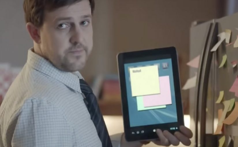
The mechanism is classic comedy timing. A husband repeatedly patronises Emma for using “paper” instead of his beloved tablet. Then the film corners him in the one place where being digital-first does not help. Here, digital-first means treating the tablet as the default answer to everyday tasks. The solution arrives under the door, framed like a tech assist, but it is really a reminder that toilet paper remains non-negotiable.
In European FMCG advertising, bathroom and hygiene categories often rely on humour to make low-involvement products feel culturally present rather than purely functional.
Why it lands
The spot works because it does not argue about softness or absorbency. It argues about relevance. It turns a generic category into a shared, domestic truth, and it does it without cruelty. Emma is not a punchline. She is the steady adult in the room, and the brand becomes her quiet win. The real question is whether a low-interest household product can prove its necessity in a culture that keeps mistaking newer for better. This is stronger brand work than a feature-led hygiene ad because it makes that necessity visible in one clean scene.
Extractable takeaway: If your product is a “must-have” with little perceived differentiation, stop over-explaining features. Build a single scene that proves the product’s place in modern life, and let the audience supply the conclusion.
What the craft communicates
The execution stays restrained. One recurring behavior. One reversal. One prop that everyone understands. That reversal works because viewers see the product’s necessity before the brand makes a claim. That discipline is the point. When the joke is this clean, the brand does not need to shout. The ending locks the memory, and the category gets a fresh reason to be talked about.
What to borrow from Emma
- Use a repeatable behavior, then reverse it. Repetition builds expectation. Reversal creates the laugh and the brand point.
- Let the product appear as a solution, not a claim. When viewers see the need, they accept the brand’s role instantly.
- Write for one scene people retell. If the story can be summarised in one sentence, it travels further.
- Keep the tone kind. The best category humour makes viewers feel seen, not judged.
A few fast answers before you act
What is Le Trèfle’s “Emma” ad about?
A tablet-obsessed husband mocks Emma’s habit of using paper, until he needs toilet paper and the “paper is obsolete” argument collapses instantly.
What is the main message?
Some products are not optional, even in a digital-first household. Toilet paper remains essential.
Why choose humour for toilet paper?
Because functional claims converge. Humour creates distinctiveness and makes the brand memorable without relying on product lectures.
What is the core creative structure?
Repetition plus reversal. A repeated behavior is set up, then the same behavior is flipped at the most inconvenient moment.
How can another brand apply this pattern?
Find a modern-life tension your audience recognises, then write one scene where your product resolves it cleanly and visibly.