Snickers: Hungry Purchase Resale

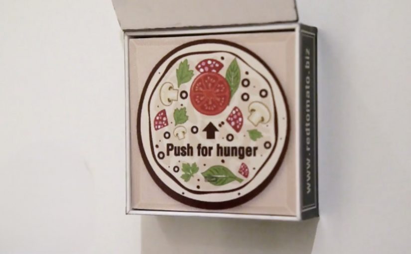
The global Snickers platform “You’re not you when you’re hungry” has generated plenty of buzz. To extend it in Dubai, and make the downside of hunger feel more real, Impact BBDO created “Hungry Purchase Resale”.

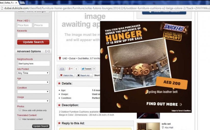
The insight is simple. During big sales, people often buy things they later regret. Snickers pins these shopping bloopers on hunger and, in partnership with Dubizzle.com, lets shoppers upload the items they want to sell straight into Snickers branded banners that appear on the site’s homepage. Clicking the banner takes people directly to the classified listing so the item can be sold on.

Turning regret into a media unit

The clever bit is that the ad is not just an ad. It becomes a functional resale slot that people actually want, because it helps undo a mistake. This is the stronger move, because utility gives the audience a reason to use the format, not just notice it.

In high-velocity retail environments, the best digital ideas piggyback on existing intent surfaces, meaning the places where people are already ready to browse, compare, or buy, then give people a reason to interact that is bigger than “engage with our brand”.

The real question is how to turn a brand platform into a useful action inside the exact behavior it is commenting on.

Why it lands

The better approach here is to make the platform behave like a service, not a message. The audience is already on a classifieds site to browse, compare, and transact. By turning remorse into a shareable listing, the campaign earns attention inside the exact behavior it is commenting on.

Extractable takeaway: If your brand truth is behavioral, do not just illustrate it. Build a mechanic that lets people enact it in a familiar environment, and make the brand the enabler of a useful outcome.

What the results are described to show

Campaign reporting describes over 200 submissions in a week. It also describes the interactive banners achieving a click-through rate almost five times the industry standard, with 80% of posted items sold the same day.

What commerce teams should steal from this

  • Make the ad do a job. Utility beats persuasion when attention is scarce.
  • Put the idea where intent already exists. Classifieds, marketplaces, and search are “ready-to-act” contexts.
  • Let users supply the proof. Real submissions and real listings create credibility you cannot script.
  • Keep the action one-step. Upload, appear, click, sell. No extra hoops.

A few fast answers before you act

What is “Hungry Purchase Resale”?

It is a Snickers activation in Dubai where shoppers can upload regretted purchases into Snickers branded homepage banners on a classifieds site, linking directly to the resale listing.

What is the core insight behind it?

People often make irrational purchases during sales and later regret them. The campaign frames hunger as the trigger for those mistakes.

Why partner with a classifieds site?

Because it is where resale intent already lives. The campaign becomes actionable in-context instead of being a standalone brand message.

What makes the idea feel credible?

It routes real items from real people into a real marketplace flow, so the audience can see behavior, not just hear a claim.

How can another brand replicate the pattern?

Choose a partner platform that already hosts the behavior you are talking about, then build a simple mechanic that turns your brand message into a useful action.

Fridge Magnets: Pizza Button and Smart Drop

Who says plain fridge magnets cannot be reinvented? Here are two brands who do exactly that, and in the process also enhance the brand experience with their consumers.

VIP Fridge Magnet

Red Tomato Pizza in Dubai take their loyal pizza patrons very seriously. So they created the “Pizza Emergency Button”, a fridge magnet with a difference. Each button has a loyal pizza patron’s favorite pizza programmed into its memory. When hungry, all the loyal patron needs to do is flip the pizza box lid on the magnet and press the pizza button inside.

Wifi Water Magnet

Evian in Paris created a simple fridge magnet that allows owners to order water and request a particular delivery time directly from their fridge.

The “Smart Drop” magnet is made up of a microcontroller, LED screen, a wireless chip, battery and an inbuilt HTML5 app that does all the work.

The mechanic: turn the fridge door into a service interface

Both executions take a boring surface and give it a single, high-frequency job. One turns repeat ordering into a one-press ritual. The other turns replenishment into a quick scheduling choice, without opening a laptop or digging for an app.

In connected-home style experiences, the winning pattern is not “more features”. It is fewer steps placed exactly where the habit already happens.

Here, “connected-home” means a branded shortcut embedded in an existing household habit, not a full smart-home platform.

Why this lands

These magnets win because they reduce effort at the moment of desire. Hunger and “we’re out of water” are not times when people want menus, logins, or long flows. A physical button and a tiny display on the fridge convert a decision into a reflex.

Extractable takeaway: If the customer action repeats weekly, design the interface around speed and placement first, and only then worry about adding options.

What the brands are really buying

Red Tomato turns loyalty into a tangible perk that feels exclusive and personal. Evian turns replenishment into an owned service moment, and makes delivery feel like part of the product, not a separate chore.

The real question is whether the brand can earn a permanent shortcut into a repeat household behavior.

What to steal for repeat-order design

  • Anchor the interaction to the habit location. Put the “button” where the decision already happens.
  • Make the primary action one-step. If it needs instructions, it is not a fridge magnet anymore.
  • Personalize the default. Pre-selecting “my usual” removes choice friction and makes the experience feel made for me.
  • Show just enough state. A tiny display that confirms quantity and timing often beats a full app for repeat tasks.

A few fast answers before you act

What makes these magnets more than gimmicks?

They replace a recurring micro-task with a faster interface placed at the point of need. The form factor is the strategy, not decoration.

When does a physical button beat an app?

When the action is frequent, low-consideration, and time-sensitive. In those cases, speed and placement outperform feature depth.

Why does placement matter so much here?

Because the fridge is where need becomes action. Putting the interface there removes recall and navigation steps that usually interrupt repeat behavior.

What is the transferable principle for digital teams?

Design around the moment of intent. If you can remove steps at that moment, you usually get higher repeat usage than by adding more functionality.

What is the biggest risk with this pattern?

Over-engineering. If the device needs setup, troubleshooting, or too many choices, the friction cancels out the convenience.

Nissan Micra: Savvy With Space Banner

From an under-the-seat shoe drawer to an extra-large glovebox, the 2011 Nissan Micra makes the most out of what it has. Here, “space-savvy” means fitting more useful function into a small footprint without making the car feel cramped. To reach drivers who value space-savvy functionality, TBWA\RAAD Dubai takes the same idea into media and builds a banner ad that “packs in” more utility than you would expect.

The punchline is simple. The banner is so clever with space that you can even use the ad itself to help sell your car.

When the format becomes the message

Instead of talking about storage compartments and smart design in a conventional way, the campaign uses the banner’s own layout as the demonstration. The ad behaves like the Micra. Compact, efficient, and surprisingly capable inside a tight footprint.

In automotive marketing, proving practical value often works best when the proof is baked into the experience format, not layered on as copy.

Why this lands

This works because it turns “space-savvy” from a feature claim into something you can feel. The audience is not asked to believe a list of compartments. They experience a compact unit that still does more than expected, which mirrors the product promise in a way that reads instantly.

Extractable takeaway: If your product advantage is “smart use of limited resources,” make the media unit demonstrate that constraint directly, so the format itself becomes the proof.

What the campaign is really optimizing for

The real question is whether the media can make clever functionality feel obvious before the audience has to read a feature list.

This is a strong fit for the Micra because the format does the selling work before the copy has to. The target is not everyone who wants a car. It is drivers who prioritise clever functionality and everyday usefulness. The banner’s “utility-first” design signals that the Micra is designed for people who like practical wins, not flashy theatre.

What functional brands can borrow

  • Let the container prove the claim. Build the story into the experience mechanics.
  • Design for instant comprehension. The idea should land before someone reads supporting text.
  • Match the medium to the benefit. Functional products benefit from functional media behaviors.
  • Keep it user-relevant. If the execution helps someone do something, attention comes easier.

A few fast answers before you act

What is “Savvy With Space” in this Nissan Micra campaign?

It’s a banner-led idea that uses the ad unit’s compact, space-efficient design to mirror the 2011 Nissan Micra’s “smart storage and functionality” positioning.

What makes this different from a normal feature ad?

The format demonstrates the benefit. Instead of only describing clever storage, the banner’s behavior and layout are designed to feel space-smart.

Who is the campaign aimed at?

Drivers who value practical, space-savvy functionality and small design decisions that make daily use easier.

What’s the reusable pattern here?

Make the medium behave like the product benefit, so the audience experiences the claim rather than just reading it.

What could go wrong if you copy this approach?

If the “cleverness” is not immediately obvious, it can look like gimmickry. The functional proof has to be legible fast.