Sprint: Unlimited Love Billboard in Times Square

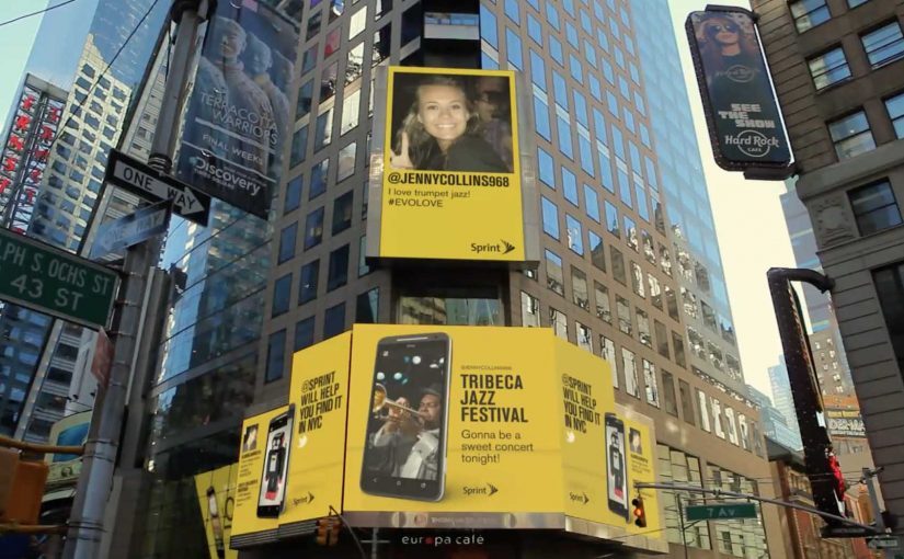
You are in Times Square and a billboard asks a simple question. What do you love. You tweet your answer with #EVOLOVE to @sprint, and the screen answers back with places in New York City where you can find it.

Sprint in the USA created an integrated advertising campaign for the launch of the HTC EVO 4G LTE phone on their network. To launch EVO in New York City they set up an interactive billboard in Times Square that encouraged visitors to tweet things they love with #EVOLOVE to @sprint. Then, with the help of local experts, the billboard re-tweeted locations of where these things of love could be discovered in New York City.

Why the mechanic works

The mechanism is a clean exchange. You give the brand a public signal. A tweet about something you love. The brand gives you an immediate, useful response. A location you can act on right now. That “reply with value” is what turns a hashtag prompt into participation.

Extractable takeaway: Interactive OOH works best when the public input reliably triggers a fast, specific reply that helps someone decide what to do next.

It also creates a visible social proof layer. The billboard is not only showing Sprint’s message. It is showing other people’s messages, which makes the campaign feel alive and current while you are standing there.

In consumer technology launches and telco marketing, a social-to-DOOH loop, where a social post immediately changes what the screen shows, turns a landmark screen into a real-time recommendation engine that people can influence from their own phones.

What Sprint is really buying

This is a launch tactic that behaves like service. It positions the EVO as a device you use to discover the city, not just a phone with specs. At the same time, it lets Sprint demonstrate “unlimited” as a lived experience. Always on, always connected, always responding in real time.

The real question is whether you can keep the reply layer fast, relevant, and brand-safe in public.

If you cannot operationalize that reliably, a simpler DOOH idea will outperform an “interactive” one that feels slow or generic.

Steal this reply-with-value billboard pattern

  • Make the input obvious. One hashtag. One handle. One sentence prompt.
  • Return something concrete. Maps, directions, a nearby place, a clear next action.
  • Curate the response layer. “Local expert” guidance beats generic automation for relevance and trust.
  • Design for the crowd and the clip. The street moment should be fun to watch. The video should still work without being there.

A few fast answers before you act

What is the Sprint #EVOLOVE Times Square billboard?

A digital billboard that invites people to tweet what they love with #EVOLOVE to @sprint, then responds by showing where in New York City they can find that thing.

Why connect Twitter to a billboard instead of running a normal DOOH spot?

Because participation becomes the content. The screen stays fresh, people feel seen, and the interaction creates a public spectacle that attracts more participants.

What is the “value exchange” in this campaign?

The user provides a public message and attention. The brand provides a timely, useful recommendation and makes the user visible on a high-profile screen.

What makes this different from simply displaying tweets on a screen?

The reply layer. The billboard does not only mirror tweets. It answers them with specific places and directions, which turns social chatter into utility.

What is the biggest execution risk?

If the responses feel slow, generic, or off-topic, people stop playing. The campaign only works when the replies feel genuinely relevant in the moment.

Recruitment: Pirates and Cyber Warriors

Since 2010 I have covered how different agencies around the world have been innovating with their recruitment campaigns. Now here are the latest two to join the list.

Two modern filters for hard-to-hire talent

Both ideas avoid broad “we’re hiring” noise. Instead, they place the offer inside the candidate’s real behavior, then use a simple mechanism to separate curiosity from capability.

The better recruitment move is to screen for behavior before you screen for polish.

The real question is not how to attract more applicants, but how to surface people whose behavior already matches the role.

Pirate Recruitment

Young web designers often need expensive application suites to create, and many end up downloading them from illegal pirate websites. Ogilvy Brussels uses that insight by uploading a file that appears to be the “wanted” application suite.

When designers download it, they do not find the software. They find a stronger offer: a job opportunity, delivered right inside the moment of intent.

In competitive digital talent markets, the hardest problem is not reach but signal.

Why this one works

The delivery is the targeting. If you are not the kind of person who looks for pro tools, you never see it. If you are, the offer lands as a wink that proves the agency understands your world. Because the message appears inside a live tool-search moment, it feels relevant instead of interruptive.

Extractable takeaway: Put the offer where the target audience already goes to solve a real problem. The closer your message sits to a “work moment”, the higher the relevance and the lower the waste.

Cyber Warriors Challenge

Wieden+Kennedy wants to recruit community managers for its client Old Spice, so it creates a deliberately crazy set of challenges. Candidates get five days to complete one or more tasks and submit proof of their exploits.

Cyber Warriors Challenge

Why this one works

It forces the right kind of effort. Community management is not just “posting”. It is speed, judgment, creativity, and resilience under ambiguity. A challenge-based entry filters for people who can actually do the work, not just describe it.

A small, time-boxed demonstration of the craft makes the screening signal stronger than a generic application form.

What to steal for your own recruitment

  • Recruit inside real behavior: distribute where the audience already acts, not where recruiters usually post.
  • Make the first step self-selecting: the wrong candidates should bounce naturally.
  • Keep the proof simple: “show me” beats “tell me”, but it has to be feasible in limited time.
  • Respect the audience: clever targeting works when it feels insightful, not exploitative.
  • Optimize for quality, not volume: fewer applicants can be a feature if they are better matched.

A few fast answers before you act

What is “pirate recruitment” in one line?

A job offer is packaged as a fake software download on pirate sites, so the right web designers discover the recruitment message at the moment they search for pro tools.

What is the Cyber Warriors Challenge?

A time-boxed set of tasks used as a screening step to recruit Old Spice community managers by requiring candidates to submit proof of real-world exploits.

Why do these tactics outperform standard job ads?

They target behavior, not demographics. Both approaches reach people in-context and require a small demonstration of motivation or capability.

What is the biggest risk when copying these ideas?

Trust and ethics. If the tactic feels deceptive, unsafe, or disrespectful to the audience, it can damage the employer brand faster than it attracts applicants.

How do you measure success?

Not by raw applicant volume. Track qualified applicants, interview-to-offer ratio, time-to-hire, and early performance or retention of hires sourced through the mechanic.

Jimmy Kimmel: Halloween Candy Prank 2012

Last year for Halloween, talk show host Jimmy Kimmel challenged the parents of America to tell their kids that they ate all their Halloween candy and then video tape their reactions and share them on YouTube. The challenge was a huge success and the best-of compilation reportedly passed 34 million views within a year.

So this year, once again, Jimmy Kimmel issued the same challenge. The results are exactly as brutal and hilarious as you’d expect.

A late-night segment built from other people’s cameras

The mechanic is straightforward: a single, repeatable prank with a clear instruction. Tell the kids you ate the candy, capture the reaction, upload it, and label it so the show can find it. The audience does the filming. The show does the curation.

In mass-audience US entertainment formats, recurring viewer challenges turn a broadcast show into a participatory channel.

The real question is how you turn a simple prank into a recurring submission format people want to recreate.

This is smart format design, not just a funny late-night stunt.

Why it lands

It is a format, not a one-off. The joke is simple enough to repeat annually, which makes participation feel like joining a tradition.

Extractable takeaway: Repeatable audience challenges go viral when the instruction is easy, the emotional payoff is immediate, and the show’s role is tight curation. The audience supplies volume. The editor supplies pace and punch.

It scales because the setup is universal. Every family understands the stakes instantly. No explanation needed. Just the moment.

It is engineered for contrast. You get the full spectrum in minutes: outrage, tears, bargaining, moral lectures, and the occasional surprisingly mature response.

What this recurring prank format teaches

  • Write the participation brief like a recipe. One action, one prompt, one deliverable, one label.
  • Design for low production. If it can be filmed on a phone with no setup, you will get scale.
  • Make the headline self-evident. If people can describe it in one sentence, they will share it.
  • Curate ruthlessly. The “best-of” cut is what turns raw clips into a watchable story.

A few fast answers before you act

What is the core idea behind this Jimmy Kimmel challenge?

A simple prank prompt that viewers can easily recreate, then submit, allowing the show to compile the best reactions into a tight, shareable segment.

Why does it work so well as a recurring format?

Because the setup is instantly understood, participation is easy, and each year produces fresh reactions without changing the concept.

Is this “user-generated content” or just a TV bit?

Both. The audience generates the footage. The show packages it into a broadcast-quality narrative through editing and selection.

What makes the compilation feel addictive to watch?

Fast escalation and variety. Each clip delivers a quick emotional hit, and the edit keeps the pace moving before any one moment drags.

What is the transferable lesson for marketers?

If you want mass participation, create a repeatable prompt with an immediate emotional outcome, then invest in curation so the best entries become the distribution engine.