Volkswagen: Image Search SEO as an “Organic Ad”

Volkswagen: Image Search SEO as an “Organic Ad”

When the “ad” is the search results page

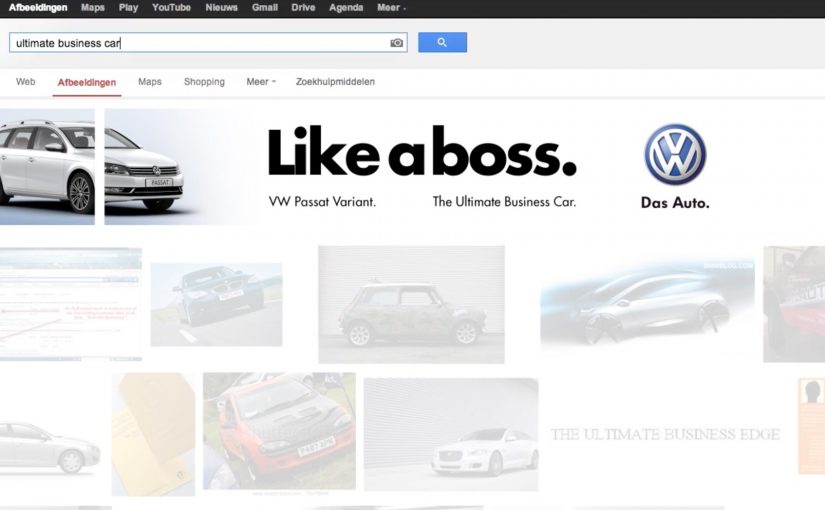
Everyday millions of people are searching for products and brands on Google. So in this latest example of search optimisation, SEA Team from UK created a search engine advertising campaign for Volkswagen which positioned the car in a unique “organic ad” created by optimising the first five individual URLs of a Google Image Search.

By “organic ad” here, I mean unpaid image results arranged to read like a single designed creative.

The campaign does feel realistic but when I searched for “ultimate business car”, I got only images from people posting about the campaign.

The hack: assemble a creative out of ranked tiles

The idea is essentially compositional SEO. By compositional SEO, I mean deliberately ranking separate assets so the grid reads as one coherent “ad.” You do not buy a placement. You engineer multiple image results so the interface itself becomes the creative. The medium is the interface people already trust.

In consumer brands and automotive marketing, this only holds when the search behavior is stable enough to be predictable.

Why it is both clever and fragile

It feels native because it lives inside an everyday behavior. Searching. But the moment the campaign becomes the story, the query gets polluted. That contamination is when coverage and commentary replace the normal mix of competing results.

Extractable takeaway: If your “creative” depends on organic authenticity, assume the interface will amplify attention first and destroy repeatability second.

What this is really trying to achieve

The real question is whether you can borrow organic credibility without turning the query into a PR artifact.

Borrow the credibility of organic results while delivering the impact of a designed creative. A brand moment that lives exactly where intent lives. It is clever, but I would not treat it as a repeatable acquisition lever.

Steal the container, not the banner

  • Use interface-level creativity. Sometimes the container is the canvas.
  • Plan for contamination. Once the stunt spreads, organic authenticity degrades fast.
  • Choose mechanics that survive attention. Pick queries where the effect can outlive press and copycats.

A few fast answers before you act

What was the Volkswagen “organic ad” concept?

A campaign that optimized the first five source URLs in a Google Image Search so the image grid formed a single Volkswagen creative.

Was this paid search?

No. The idea is to engineer multiple image results so the grid becomes the creative, rather than buying a placement.

Who created it?

The post credits SEA Team from the UK.

Why does it feel realistic at first?

Because it appears inside an organic search behavior and uses the familiar image-results interface as the placement.

What problem did the post observe when trying it later?

Searching for “ultimate business car” returned mostly images of people posting about the campaign, rather than a clean, normal-looking result set.

British Airways: Barcode Reader

British Airways: Barcode Reader

You pick up a travel guide, walk to the barcode reader, and scan it to check the price. Instead of only showing numbers, the scanner delivers a British Airways message that nudges you toward destinations beyond the UK.

The placement is the whole strategy. British Airways runs this in the travel section of a bookstore, right when people are already thinking about leaving town. If someone is browsing Rome, New York, or Buenos Aires, the brand can show up in a way that feels like a useful prompt rather than a random interruption.

The mechanic is simple. The barcode scan is the trigger, and the barcode reader becomes the display. British Airways uses that moment to broaden perception of its route network, aimed at Brazilians who may only associate BA with the UK.

In travel marketing, the planning moment is the highest-intent moment, and well-timed messages can feel like help rather than advertising.

Why the bookstore aisle is the right “media channel”

Travel guides are a proxy for intent. People do not usually buy a destination book by accident. So a bookstore travel aisle acts like a real-world keyword search, with the added benefit that the customer is already in decision mode.

What makes the barcode reader feel credible

The message arrives from the same device people trust for pricing and checkout. That matters because it borrows the authority of a functional tool. The ad does not ask for a click or a download. It simply uses an existing action and adds a relevant layer.

Extractable takeaway: Put your message inside a trusted utility that already supports the customer’s task, so the “ad” inherits credibility instead of fighting for it.

What the campaign is really trying to change

The real question is whether you can change route perception by showing up inside the tools people already use to plan.

This kind of placement beats broad-reach travel ads because it earns attention at the moment of intent.

This is not a fare promotion first. It is a mental map update. By “mental map update” I mean shifting which destinations people associate with the brand before they default to “UK airline.” The brand wants travellers to store British Airways as “global option,” not “UK airline.” The work is credited to AGE Isobar São Paulo and was later shortlisted in the Direct Lions under Ambient Media, small scale.

What to steal for your own context-first activation

By “context-first activation” I mean a placement where the environment and the user’s current task create relevance before the copy does.

  • Target the moment of intent. Find the real-world behaviour that signals “I am planning.”
  • Use the tools already in the environment. Functional devices carry trust and reduce friction.
  • Make the message additive. Add information that fits the action, do not derail it.
  • Design for instant comprehension. If it needs explanation, it will be ignored.

A few fast answers before you act

What is the British Airways Barcode Reader activation?

It is a contextual bookstore execution where scanning travel books on a barcode reader triggers British Airways messaging about flying to destinations beyond the UK.

Why does it work better than a generic travel ad?

Because it appears at the exact moment people are considering travel. The placement creates relevance before the copy even starts.

What is the core behaviour the campaign hijacks?

Price checking. The scan is already happening, so the brand adds a message to an existing action rather than asking for a new one.

What business problem is this solving?

Route perception. It aims to expand awareness that British Airways serves many destinations, not only the UK, in a market where that belief is limited.

What is the main risk with this kind of tactic?

If the message feels intrusive or slows down the checkout flow, it turns from helpful to annoying. The execution has to stay lightweight and quick.

Volkswagen: Rock in Rio Drumset

Volkswagen: Rock in Rio Drumset

A banner ad you can actually “play”

To celebrate Rock in Rio, Volkswagen built a banner execution that uses your webcam as the input device. Instead of asking you to watch, it invites you to perform, like a tiny drum solo inside a media placement.

How the mechanism earns attention

The core mechanic is simple: webcam permission turns a standard banner into an interactive surface, where your movement becomes the “controller” for the drum kit. That shifts the experience from passive exposure to active participation in a few seconds. Because the unit reacts to a single, instantly legible gesture, it earns attention before the viewer has time to move on.

In brand-led entertainment marketing, the smallest possible interaction can turn a paid unit into something people choose to engage with.

Why it lands in a festival context

Rock in Rio is already about energy, performance, and communal hype. A drum kit inside a banner borrows that emotional language and makes it personal. You are not being shown “festival vibes”. You are generating them, even if it’s just for a moment at your desk.

Extractable takeaway: When a paid unit lets people create a recognizable mini-performance in one step, the creative feels like entertainment, not media.

The payoff is not the complexity. It’s the contrast: banners normally ask for a click, this one asks for a gesture. That little shift makes the format feel fresh again.

The real question is whether your paid placement gives people something to do, not just something to click.

This is the right kind of interactivity for display: opt-in, one-step, and instantly legible.

Takeaways for webcam-controlled banners

  • Use one input. A single action users already understand (movement, tap, swipe) beats multi-step instructions.
  • Make the first five seconds obvious. If the user can’t “get it” instantly, they drop. Here, the drum metaphor does the teaching.
  • Match the interaction to the moment. Music festival content should feel performative. The interaction mirrors the cultural context.
  • Keep the reward emotional. The win is “I played it”, not “I learned a feature list”.

A few fast answers before you act

What is a webcam-controlled banner ad?

It’s a display ad unit that asks for webcam access and uses the camera feed as a live input, usually via motion detection, to let the viewer interact with the creative.

Why use a webcam in a banner at all?

Because it turns a standard media placement into an experience. That can increase attention and memorability when the interaction is instantly understandable.

What makes this Rock in Rio execution work?

The interaction fits the occasion. A drum kit is a native “festival” object, and the gesture-based control makes the format feel playful instead of intrusive.

What’s the main risk with webcam-based ads?

Friction and trust. If the value isn’t obvious, users will refuse permissions or bounce. The creative must communicate intent and payoff immediately.

What’s the simplest modern takeaway?

Give the audience a one-step action that creates a visible result. If the interaction is clear and rewarding, the format becomes the message.