Misereor: The Power of a Coin

Misereor: The Power of a Coin

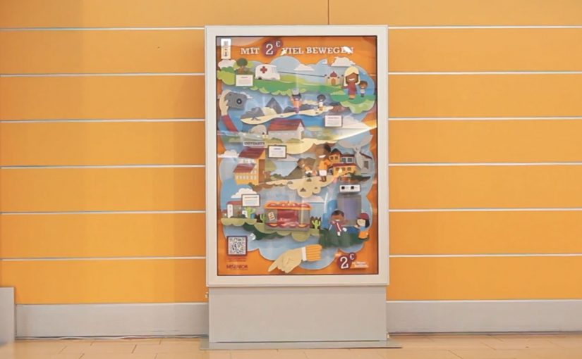
A billboard at Hamburg Airport does not just ask for money. It takes a 2-euro donation and immediately shows what that coin can do.

Misereor has been committed to fighting poverty in Africa, Asia and Latin America for over 50 years. To drive more donations, they install a billboard with a donation box built into it. When people put in 2 euros, the billboard brings to life how that coin can help across Misereor’s aid projects.

The billboard also links the offline act to an online conversation. It takes a photo of the donor and posts it to the campaign’s Facebook app. A QR code on the billboard lets donors share the promotion on their own Facebook page.

How the interaction is designed to convert

The mechanism is a tight, three-step loop. Physical donation triggers an immediate visual payoff. The payoff translates “impact” from an abstract promise into a concrete scene. The scene then becomes shareable proof through an automatic photo post and a QR-driven sharing prompt.

In high-traffic public spaces where attention is fragmented and dwell time is unpredictable, donation design wins when it minimizes steps and makes impact visible immediately.

Why it lands

This works because it replaces guilt with clarity. You do not just hear that your money helps. You see a specific outcome the moment you give, which makes the decision feel both meaningful and finished.

Extractable takeaway: If you want more donations, build a “give. see. share.” loop where the act of giving triggers instant, legible impact, and the sharing step is optional but effortless.

The real goal behind the 2-euro choice

The real question is whether a donation ask can feel immediate, visible, and worth doing before the traveler walks away. A 2-euro ask is small enough to feel impulse-safe, especially in an airport moment where people already make small purchases without overthinking. The campaign then uses the experience to recruit advocates, not just donors, by turning each donor into a visible participant online.

What this donation design gets right

  • Make the donation amount frictionless. Small, fixed amounts reduce decision paralysis.
  • Show impact instantly. The payoff must happen before the donor walks away.
  • Bridge offline to online. Capture a shareable artifact, but keep it consent-friendly.
  • Keep the interface obvious. A slot, a prompt, a clear result. No instructions required.

A few fast answers before you act

What is “The Power of a Coin”?

An interactive airport billboard for Misereor where a 2-euro donation triggers an animation that shows how the money helps, and then offers easy sharing via photo and Facebook.

What is the core mechanism?

Donate a fixed amount, get an immediate visual “impact reveal”, then optionally share via an automatically posted donor photo and a QR-enabled share prompt.

Why is the instant animation important?

It turns “trust us” into “watch this”. Immediate feedback reduces skepticism and increases the chance of giving in-the-moment.

What is the biggest risk with the social layer?

Consent and platform drift. If posting feels automatic in a way donors did not expect, or if platform permissions change, the sharing layer can backfire or break.

What is the transferable lesson for other causes?

Design the donation moment like a product demo. One action triggers a clear result, then the donor can share proof without extra effort.

Coca-Cola Hilltop Mobile Ad

Coca-Cola Hilltop Mobile Ad

In March I had written about Google’s advertising experiment where they set out to re-imagine and remake some of the most iconic ad campaigns from the 1960’s and 1970’s with today’s technology.

During these experiments the iconic Coca-Cola “Hilltop” ad campaign was re-imagined. Fulfilling the promise of the original ad, special vending machines were created that allowed users to instantly send a Coke around the globe to unsuspecting recipients.

Now the whole experience has been taken onto mobile and can be experienced through the Google AdMob network, across iOS and Android devices. Viewers can now truly ‘Buy the World a Coke’ with just a few taps on their mobile phones.

What changes when “Hilltop” moves to mobile

The original re-imagining leaned into physical surprise. A vending machine became a global gifting interface. Moving that same promise into an AdMob-delivered mobile experience changes the distribution model completely. Instead of waiting for someone to encounter a special machine, the interaction can show up wherever people already spend time on their phones.

That is the real upgrade here. Not just “mobile as a smaller screen,” but mobile as a friction-reducer for participation. A few taps can replicate the core gesture. Sending a Coke to someone else. Without requiring a specific location, a specific moment, or a special install. It works because mobile removes the location and setup barriers that made the vending-machine version memorable but limited.

In global brand portfolios, the scalable opportunity is turning a famous campaign promise into a simple action people can complete wherever they are.

The real question is not whether a classic ad can be remade for mobile, but whether its core promise becomes easier to act on.

Why this is more than a nostalgic remake

Remaking a classic can easily turn into pure tribute. The stronger move here is not the tribute. It is the translation of the original promise into a faster, more repeatable action. What keeps this one relevant is that it tries to honor the original promise with a modern mechanic. Here, the mechanic is the simple user action itself: send a Coke to someone else in a few taps.

Extractable takeaway: If you want a campaign to travel, design one action that people can complete quickly and understand instantly, then let the story emerge from participation rather than explanation.

What to borrow for your next mobile campaign

If you are planning mobile work right now, this points to a few practical moves:

  • Design for one clear action. In this case, sending a Coke. Everything else is supporting detail.
  • Make sharing native to the mechanic. Gifting is inherently social and inherently repeatable.
  • Use mobile distribution for scale. An ad network can turn a niche experience into a widely reachable one, without relying on a single physical activation.

A few fast answers before you act

What is the Coca-Cola Hilltop Mobile Ad?

It is a mobile version of the re-imagined “Hilltop” campaign experience, delivered through Google’s AdMob network across iOS and Android devices.

How does this relate to Google’s advertising experiment?

It extends the re-imagining of iconic 1960’s and 1970’s campaigns, taking the Coca-Cola “Hilltop” concept from the experiment into a mobile execution.

What was the original re-imagined mechanic?

Special vending machines were created that allowed users to instantly send a Coke around the globe to unsuspecting recipients.

What is the key user promise in the mobile version?

That viewers can “Buy the World a Coke” with just a few taps on their mobile phones.

Why is the mobile move important?

It shifts the experience from a location-based activation to scalable distribution. Participation becomes possible anywhere, not only where a special vending machine exists.

Bradesco Seguros: The Fake iPad Ad

Bradesco Seguros: The Fake iPad Ad

A fake ad that behaves like a real crash

Bradesco Seguros created a cheeky ad in the iPad version of Quatro Rodas, a Brazilian car magazine. When readers swipe the “page,” the car in the ad follows the direction of the gesture and crashes into the side of the screen, unveiling the message: “Unexpected events happen without warning. Make an insurance plan.”

The mechanic: one native gesture, one irreversible consequence

The entire idea is built on the most common tablet behavior: swiping to move on. Instead of letting the user escape the ad, the ad “obeys” the swipe and turns it into the cause of an accident. The crash is the reveal. It is also the proof that the format is touch-native, not a print layout copied onto glass. Here, touch-native means the idea only works because the swipe directly causes the outcome on the screen.

In touch-first publishing, a single gesture-driven interaction can turn an ad into a micro-experience that earns attention the way content does.

Why it lands

It creates a moment of surprise without requiring explanation. The user thinks they are performing a routine action, then the ad responds in a way that feels physical and slightly alarming. Because the message is revealed by the crash itself, the brand does not need to overclaim. The interaction makes the point. The real question is whether the gesture itself makes the risk message feel immediate, inevitable, and brand-relevant. This is a strong use of tablet media because the interaction and the message are inseparable.

Extractable takeaway: If your message is about risk or unpredictability, make the audience cause a small, safe “unexpected event” through a familiar action, then reveal the message as the consequence.

What touch-first ad teams should steal

  • Exploit a default gesture. Build on what people already do, not what you wish they would do.
  • Make the payoff immediate. The interaction must resolve within a second or two, or it feels like a gimmick.
  • Let the mechanic carry the copy. If the interaction proves the point, the line can stay simple and memorable.
  • Keep it brand-safe. Use surprise, not fear. The crash is symbolic, not distressing.

A few fast answers before you act

What is Bradesco Seguros’ “Fake Ad” in Quatro Rodas?

It is an interactive iPad magazine ad where a swiping gesture makes the car in the ad move and crash into the screen, revealing the insurance message about unexpected events.

What is the core creative mechanic?

Gesture mirroring. The ad responds to the swipe like content would, then turns that response into a surprising consequence that delivers the message.

Why is this better than a standard banner or full-page ad?

It uses the tablet’s native behavior, so the attention is earned through interaction, not demanded through interruption.

What is the key lesson for touch-first advertising?

Design around one familiar gesture and make the output feel inevitable and meaningful, not decorative.

What is the most common way this approach fails?

When the interaction is slow, unclear, or unrelated to the message. The mechanic must be the argument.