Simon Pierro: iPad Horror Halloween magic

Simon Pierro: iPad Horror Halloween magic

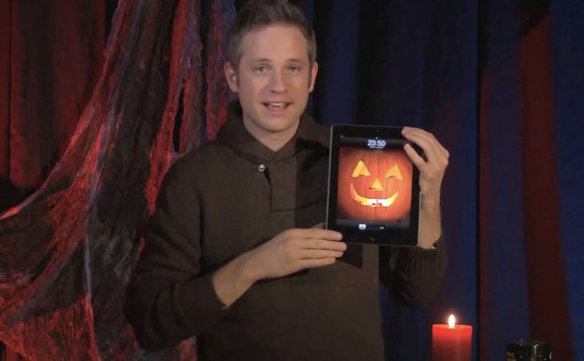
Simon Pierro is a performance artist known for a contemporary style that blends live sleight of hand with screen-based illusion. In this Halloween edition of his iPad magic, he mixes physical tricks with carefully constructed digital wizardry to tell a short, creepy story. Here, “iPad magic” means coordinating physical moves with a pre-built on-screen sequence so the screen appears to affect the real world in one continuous event.

What you are actually watching

The hook is not “an iPad doing magic.” It is the choreography between two realities. One is the real-world performance in front of the camera. The other is the pre-built digital sequence on the iPad screen. When the timing is perfect, the boundary disappears and the viewer’s brain treats the composite as one continuous event.

The mechanism: timing, framing, and a believable interface

The iPad acts like a stage prop with rules the audience already understands. You can swipe, tap, and reveal. Pierro then exploits those expectations with tight timing, camera framing, and transitions that make the screen feel like a portal rather than a display. Because the interface behaves the way people expect, the viewer accepts more impossible outcomes without pausing to question the edit.

In consumer tech culture, touchscreen-first illusions travel because they compress surprise, proof, and shareability into a single loop.

The real question is whether the experience makes the screen feel like a believable tool, not a special effect.

If you want this pattern to travel, you have to design the interface logic before you design the surprise.

Why it lands: story first, tricks second

This is not just a reel of “look what I can do.” The Halloween framing gives each beat a reason to exist. That narrative spine matters, because it turns the tricks into plot points. The viewer stays to see what happens next, not only to decode the method.

Extractable takeaway: The most replayed “tech magic” works like product UX. One clear action, one clear consequence, then escalation. The audience always knows what they are supposed to feel, even if they do not know how it is done.

The business value behind a short viral performance

For a performer, this format does three jobs at once. It demonstrates craft, it demonstrates a distinctive signature style, and it creates a video object people want to pass along. That combination is stronger than a traditional showreel, because the concept is the brand.

What to steal if you build interactive experiences

  • Use familiar gestures as narrative verbs. Swipes and taps can carry meaning, not just navigation.
  • Design the “interface logic” first. The illusion is more believable when the screen behaves the way people expect.
  • Escalate in clean steps. Each beat should be slightly more impossible than the one before.
  • Keep the frame disciplined. The camera is part of the trick. Composition is not optional.
  • Wrap the mechanic in a story. Theme creates patience, and patience creates replays.

A few fast answers before you act

What is “iPad magic” in practical terms?

It is a performance format that coordinates physical sleight of hand with a pre-built on-screen sequence, so the screen appears to affect the real world in a continuous way.

Is this augmented reality?

Not in the typical “live 3D overlays in your environment” sense. It is closer to choreographed digital illusion and camera-based compositing, designed to feel like the screen is interacting with the performer.

Why do these videos get rewatched?

Because they deliver a fast surprise, then invite the viewer to hunt for the method. The best ones also add a narrative reason to stay until the end.

What is the most important design principle behind this style?

Believability of the interface. If the screen behaviour feels consistent and intuitive, the viewer will accept more impossible outcomes.

How can brands use this pattern without copying the trick?

Build short, gesture-driven micro-stories where one touch creates a visible transformation. Keep the logic simple and the payoff immediate, then escalate once.

Steve Jobs 1955 – 2011

Steve Jobs 1955 – 2011

On 06/10/2011 my day starts at 5:30am. Blurry eyed, I press the home button on my iPhone, and the first thing I see is a push notification from NDTV India: “Steve Jobs, Apple’s visionary, dies at 56.”

The next few seconds feel like some invisible force knocks the air out of me. The Newton equivalent from the modern world is just gone in a blink of an eye. By “Newton equivalent” I mean a once-in-a-generation inventor whose work changes how ordinary people live.

While all the social channels flood with people sharing the news, all I can do is post a few tribute pictures on Facebook. I want to write a few lines about it on Ramble, but I sit speechless throughout the day. In fact the days that follow feel similar, and I cannot find the words to pen down anything, that is until now.

The real question is what a tribute has to do to feel earned.

Two tributes that feel right in this moment

Of the dozens of memorial photos and videos created to honor Steve Jobs, I keep coming back to the following as the most appropriate for the occasion.

Mechanism-wise, both tributes rebuild a public feeling from familiar materials. One uses sounds and a voice people associate with Apple products. The other uses a simple office material to create something large, collective, and visible.

In global consumer-tech culture, where product design quietly rewires daily habits, tributes built from the culture itself tend to feel the most honest.

A tribute earns its place when it demonstrates craft and restraint, not when it tries to explain impact with adjectives.

1) AzR’s Apple-sampled tribute

A musician who calls himself AzR creates a video built from sounds sampled from Apple products and Steve’s 2005 Stanford commencement speech. Sampling here means recording short sounds from devices and using them as instruments in a new composition. Every instrument, including drums, is sampled from a Mac product, tuned by ear, and replayed in the context of the song.

2) 4,001 Post-it Notes in Munich

Fans in Germany find a wonderful way to express their respect. They create a portrait of Steve Jobs out of 4,001 Post-it Notes. The portrait adorns the front-facing glass walls of an Apple Store in Munich, Germany.

Why these tributes land

They do not ask you to agree that Steve Jobs mattered. They let you hear and see how his work lives inside everyday objects and shared spaces. That mechanism makes the respect feel physical rather than rhetorical.

Extractable takeaway: If you want a tribute to travel, build it from the same materials the person put into the world, then make it simple enough to share in one listen or one glance.

What stays with me

To sum up, I am glad to have lived in a period of world history that witnessed Steve Jobs change the world.

We remember Steve Jobs

How to make a tribute feel earned

  • Start with a material. Use a concrete artifact, a sound, a tool, a place, then build the tribute around it.
  • Make it shareable fast. If it does not land quickly, it will not travel.
  • Let people participate. The Munich wall works because many hands make one face.
  • Keep the words minimal. Craft carries more respect than adjectives.

A few fast answers before you act

What is this post about?

It is a personal note from the morning I saw the news, plus two tributes that capture why Steve Jobs mattered to people.

Which two tributes are highlighted?

AzR’s music video built from sounds sampled from Apple products and Steve Jobs’ 2005 Stanford commencement speech. A 4,001 Post-it Notes portrait on an Apple Store in Munich, Germany.

Why does the Apple-sampled video work?

It turns familiar device sounds and a familiar voice into a new piece of music. That craft makes the tribute feel earned rather than narrated.

Why does the Munich Post-it portrait stand out?

It is physical, collective, and public. It turns respect into a visible act that other people can walk past and feel.

What is the simplest takeaway?

Some people do not just build products. They reshape culture and daily behavior. When they are gone, you feel the absence immediately.

The future of Augmented Reality

The future of Augmented Reality

You point your phone at the world and it answers back. In Hidden Creative’s video, a mobile device scans what’s around you and returns live, on-the-spot information. The same AR layer lets you preview change before you commit to it, by virtually rearranging furniture or trying colours in a real space.

Utility AR: the phone becomes a real-time lens

The value is not “wow.” It is utility. The device behaves like a real-time lens you can use in the middle of a decision:

  • Scan surroundings and get contextual information immediately.
  • Overlay objects into physical space to plan renovations or layout changes.
  • Configure colours virtually before making real-world changes.

What the mechanic actually is

At its simplest, the camera feed becomes the interface. The device recognises elements in the scene, then anchors relevant information and virtual objects to the real world so you can act on what you see. When overlays reliably “stick” to reality, the experience stops feeling like a gimmick and starts behaving like a tool you can trust.

In consumer retail and home-improvement scenarios, AR becomes habitual only when it works predictably across devices and requires near-zero setup beyond opening the camera.

Why this kind of AR lands

People do not adopt AR because it is impressive. They adopt it when it reduces uncertainty in a moment that matters, like “Will this fit?”, “Will this look right?”, or “What is this thing in front of me?”. Campaign AR often optimises for novelty. Everyday AR has to optimise for reliability, speed, and repeatability.

Extractable takeaway: If AR does not reduce a real decision into a faster yes or no, it will stay a one-off experience, even if engagement looks great in the first week.

The real question is standardisation, not creativity

Augmented Reality is already active in brand campaigns around the world, mainly because it creates high engagement and talk value. Yet it still does not play an everyday role in most people’s lives because the experience is fragmented across ecosystems.

Before daily-life AR becomes normal, platform owners and developers need to standardise the experience across their ecosystems. Apple, Google, and Microsoft/Nokia each move in their own direction, and the result is fragmentation.

By “a standard AR experience,” I mean a consistent base layer for recognition, anchoring, lighting, scale, and interaction patterns so users do not have to relearn AR every time they switch apps or devices.

One master app vs. an app store full of one-offs

Right now the app stores are cluttered with many Augmented Reality apps, each doing a slice of the job. One cross-platform “master app,” or at least a consistent base layer, is a plausible starting point for making AR feel like an always-available capability instead of a novelty download.

The stance: AR becomes mainstream when it is treated like a standard capability layer, not a series of isolated one-off apps.

What to steal for your next AR decision

  • Design for repeat use. Pick a high-frequency decision moment, not a “shareable” moment.
  • Reduce setup friction. If the experience needs a special download for a single task, adoption will stall.
  • Make reliability visible. Use cues that show tracking and anchoring are stable so users trust what they see.
  • Define the base layer you depend on. Be explicit about which platform capabilities you require and what breaks without them.

A few fast answers before you act

What does the Hidden Creative video demonstrate?

It shows a phone scanning a real environment, returning contextual information in real time, and overlaying virtual objects into the scene for practical tasks like planning and previewing changes.

What is the core AR mechanic described here?

The camera feed becomes the interface. The device recognises the scene and anchors information or objects to it so the overlay stays aligned with the real world while you move.

Why does AR still feel like a campaign tool in most cases?

Because many AR experiences optimise for novelty and short-term engagement, not for reliability and repeat use. Fragmentation across platforms also prevents a consistent everyday habit.

What does “a standard AR experience” mean in practice?

It means consistent behaviour across devices and apps for recognition, anchoring, scale, lighting, and interaction patterns so users do not have to relearn AR each time.

What is meant by a “base layer” or “master app” for AR?

A shared foundation that reduces fragmentation. Instead of dozens of one-off AR apps, users get a consistent AR capability that multiple experiences can plug into.

What is the simplest next step if a brand team wants AR to drive real adoption?

Target one repeatable decision moment and design the experience to work quickly and predictably with minimal setup. If it does not reduce uncertainty, it will not become a habit.