WWF: Augmented Reality Tiger T-Shirt

A retail AR gut-punch for WWF’s Siberian tiger

This is a great piece of Augmented Reality for WWF aimed at raising awareness around the plight of the siberian tiger, created by Leo Burnett Moscow.

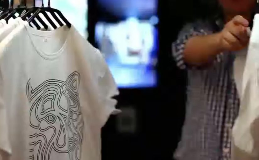
WWF printed thousands of tiger t-shirts and distributed them online and to key stores in Moscow featuring specially placed AR video mirrors that would instantly activate the AR experience the moment a tiger t-shirt was detected. And at that moment, the experience became quite graphical to anyone wearing the t-shirt, complete with bullet wounds, huge amounts of blood and sound effects to match it.

How the “video mirror” mechanic does the heavy lifting

The setup is simple. Put the message on the body. Put the trigger in the store. Put the reveal in a mirror people already trust as “truth”.

An AR video mirror is a camera plus screen installation that shows your live reflection while overlaying digital effects in real time. In this case, the mirror detects the tiger shirt and then renders the simulated injuries and audio as if they are happening to you.

In retail environments and public spaces, AR activations work best when the interaction is instant, unmistakable, and socially visible to bystanders.

Why the experience lands so hard

It converts an abstract cause into a first-person moment. You do not just look at an endangered animal. You temporarily “become” the target.

The shock is not only the gore. It is the sudden loss of control. You step into a normal shopping routine and the story hijacks your reflection before you can rationalize it away.

The intent behind making it graphic

The creative choice forces attention and memory. A polite AR overlay would be easy to ignore. A visceral one is harder to dismiss and more likely to be retold, especially when friends are watching from behind you.

What to steal for your next experience design

  • Use a frictionless trigger. Detection happens automatically. No app download. No QR hunt. No instructions.
  • Choose a culturally “trusted” surface. Mirrors feel like evidence, which makes overlays feel more real than a phone screen effect.
  • Make the message social. The bystander view matters. People react together, and that reaction becomes the spread mechanism.
  • Design the reveal as a single sentence. “This is what it feels like to be hunted.” If the concept cannot be repeated instantly, it will not travel.

A few fast answers before you act

What is the core idea of the WWF tiger t-shirt AR campaign?

It uses an AR video mirror to detect a tiger t-shirt and instantly overlay a graphic “poaching” simulation on the wearer, turning awareness into a first-person experience.

Why use an AR mirror instead of a mobile AR app?

The mirror removes friction and makes the moment public. Everyone nearby sees the same reveal at the same time, which increases impact and sharing.

What makes this activation effective as cause marketing?

It translates a distant problem into a personal reaction. The wearer feels shock and vulnerability, and that emotional spike improves recall and conversation.

What are the key components if you want to replicate the mechanism?

You need a clear trigger (the shirt), a camera plus screen “mirror” setup, real-time overlay rendering, and a reveal that communicates the message in seconds.

What is the main risk with shock-based AR experiences?

If the graphic content overwhelms the cause, people remember only the stunt. The message has to be explicit enough that the emotional reaction points to the intended story.

Nokia invents a new kind of real life gaming!

Even though Nokia has joined the Google, Apple smart phone party pretty late, they are definitely trying to do whatever it takes to innovate and catch up to their competition. So with their Nokia Push project they have tried to re-imagine snowboarding! 🙂

The Nokia Push technology mixes gaming and reality with the data that you generate snowboarding on any mountain in the world! The bigger your tricks, the faster you go, the crazier the turns, the more points you score. And it’s all connected through your snowboard and synced with your social life in real time, while logging your entire mountain experience online. 😎

In 2011, Nokia Push will be collaborating with the world’s biggest snowboarding company, Burton Snowboards, to create a new type of connected snowboarding. Work has already started between Nokia and Burton, and the collaboration will be run in the spirit of the Push project — transparently, and openly in beta. Throughout this time, regular videos will be published detailing their progress so far, and counting down to the beta launch at next year’s Burton Euro Open in January.

Technology in 2014

A 2014 screen daydream from The Astonishing Tribe

This is essentially an experience video by Swedish interface gurus The Astonishing Tribe, envisioning the future of screen technology with stretchable screens, transparent screens and e-ink displays, to name a few.

How the film turns “new screens” into real interactions

Instead of listing specs, the video uses everyday moments to make the screen itself feel like a material you can bend, place, and share. The point is not the exact device. The point is the interaction model that becomes possible when the display is flexible, see-through, or paper-like.

An experience video is a short concept film that prototypes interface behavior and user flows before the underlying hardware is ready for the market.

In consumer electronics and enterprise device ecosystems, display form factors shape interaction patterns, content formats, and the business models built on top of them.

Why “stretchable, transparent, e-ink” is a strong provocation

Stretchable screens challenge the idea that UI must live inside rigid rectangles. Transparent screens challenge the idea that a screen must block the physical world. E-ink displays challenge the assumption that every screen is emissive, high-refresh, and power-hungry.

E-ink is a reflective display technology designed for readability and low power use, which makes it a useful contrast to bright, always-on panels.

Steal these moves for your next interface pitch

  • Show behaviors, not features. Demonstrate how people move, share, and switch context when the screen stops behaving like a slab.
  • Prototype the handoffs. The “wow” is usually in the transitions, not the destination screen.
  • Use one material shift as the story engine. Flexible, transparent, or reflective. Pick one and build a coherent set of moments around it.
  • Make it boring on purpose. Ground the future in ordinary work, home, and commuting situations so the audience focuses on usability.

A few fast answers before you act

What is “Technology in 2014” about?

It is a concept experience video that imagines how screens could evolve by the year 2014. The focus is on new display form factors and the interactions they enable.

Which display ideas does it highlight?

The video spotlights stretchable screens, transparent screens, and e-ink displays. Those three examples are used to suggest different ways UI could live in the physical world.

What should marketers or product teams take from it?

Use concept films to communicate interaction shifts early, when prototypes are still rough. Anchor the story in everyday scenarios so the intended behavior is unmistakable.

How do you apply the idea without future hardware?

Focus on the interaction principles: continuity across surfaces, simple sharing moments, and readable, low-friction information layers. You can prototype those behaviors with today’s devices and materials.

What’s the biggest pitfall when making this kind of video?

Over-indexing on visual spectacle and under-explaining the user flow. If viewers cannot repeat the “how it works” in one sentence, the concept will not travel inside an organization.