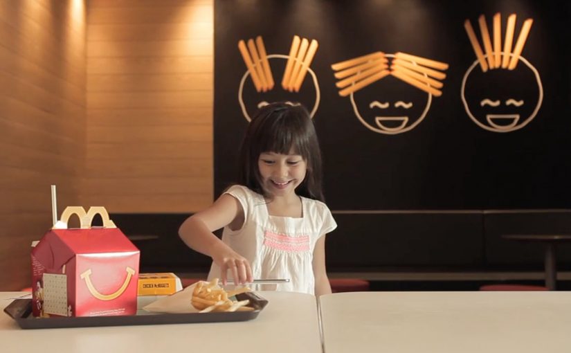
A child sits down in a McDonald’s Singapore restaurant, opens the McParty Run app on an NFC-enabled smartphone, and places the phone on a marked spot on the table. The tabletop immediately becomes the playfield. A McDonaldLand-style racing track appears around the phone, and the whole table turns into a shared game surface.
The idea. Turning a restaurant table into play
McDonald’s Singapore introduces Happy Table as an interactive dining concept that converts an ordinary in-store table into a digital playground for kids. Instead of handing out a traditional toy, the experience uses mobile technology to project a short, location-based game onto the table itself.
Here, “interactive dining” means the table is the shared surface for a short in-restaurant moment, and the phone is only the trigger.
How it works. McParty Run plus NFC
The mechanic is simple and deliberately physical:
- Customers download the McParty Run mobile app.
- The phone needs to be NFC-enabled.
- The customer places the phone on a designated table inside the outlet.
- Once the table detects the device, the tabletop becomes a virtual racing track, with animated characters and objects appearing around the surface.
Kids move around the table to control the game, racing to collect burgers and fries while avoiding familiar McDonald’s characters like the Hamburglar and Captain Crook. The table is the center of interaction, so the gameplay is naturally shared and social.
In family-oriented quick-service restaurants, the table is the shared touchpoint everyone already gathers around.
Why this is interesting in-store
Happy Table shifts the experience away from passive, individual screen time and toward a shared activity that fits the restaurant context. The game is anchored to the location and to a physical object. The table becomes the shared interface, and the phone becomes the trigger. Because the table is the interface, participation becomes social by default.
Extractable takeaway: If you want digital play to feel additive in a physical venue, make the venue the interface and keep the phone as the on-ramp.
The real question is whether you can turn waiting time into a branded group moment without making the meal feel harder for parents.
This pattern is worth copying when the interaction is optional, short, and anchored to a shared surface people already use.
What brands can take from this pattern
A few practical takeaways that translate beyond fast food:
- Make the physical environment do the work. When the venue becomes the interface, the digital layer feels less like an add-on.
- Design for group behavior, not solo attention. A shared surface encourages participation and reduces the “everyone disappears into their own screen” effect.
- Keep it short and contextual. A quick, playful moment that fits waiting time is more natural than a long-form experience that competes with eating.
- Use familiar brand assets in motion. McDonald’s characters and food cues make the experience instantly legible to kids.
Happy Table is created by the DDB Group and runs as a pilot at select outlets across Singapore.
A few fast answers before you act
What is McDonald’s Happy Table?
An interactive dining concept in McDonald’s Singapore that turns an in-store table into a digital game surface for kids.
What do you need to use it?
The McParty Run app and an NFC-enabled smartphone, placed on a designated table inside the outlet.
What is the gameplay?
A McDonaldLand-style racing experience where kids move around the table to collect burgers and fries while avoiding characters such as the Hamburglar and Captain Crook.
What makes it different from a typical mobile game?
The table is the shared interface. The experience is designed to be physical and social, centered on a real-world location and group play.
Where is it running?
As a pilot in select McDonald’s outlets across Singapore.


