Gesture Sharing using Microsoft Surface

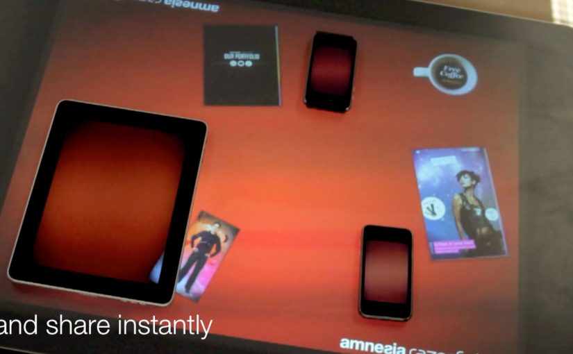
You place two iPhones and an iPad around a Microsoft Surface table. With a single gesture, a photo slides off one device, travels across the tabletop, and drops into another device. The transfer is instant, and the UI makes it feel like content is physically moving between screens.

Amnesia Razorfish is back in the news with the launch of Amnesia Connect. It is software that enables instant, seamless sharing and transfer of content, including photos, music, and embedded apps, between multiple handheld devices using a Microsoft Surface table and a single gesture.

How the “single gesture” illusion works

In the moment, the Surface table connects devices over WiFi and shares in real time. The table tracks each object’s position, so the visual effect stays locked to the device placement. Content appears to move in and out of the iPad and iPhone exactly where they sit on the table.

What is supported right now, and what comes next

The software works with Apple iOS devices, and it is being developed to work with Android, Windows Phone, and BlackBerry smartphones. The concept scales anywhere multiple devices need to share quickly without cables, menus, or friction.

Why brands care about gesture-based sharing

As smartphones become omnipresent, this kind of interaction opens a different design space for brand experiences. It makes sharing visible, social, and fast. Instead of asking people to “send” something, you let them move it, together, in plain sight.


A few fast answers before you act

What is gesture sharing in a multi-device experience?

Gesture sharing is when users move content between devices through physical gestures, like swiping an item from one screen to another, rather than using menus, Bluetooth pairing, or file dialogs.

How does a Microsoft Surface table enable this?

The table tracks where devices sit and aligns the interface to that physical layout. It also supports real-time connectivity so content can transfer while the visuals stay spatially consistent.

What makes this feel “seamless” to users?

The key is removing steps. No selecting recipients, no attaching files, no waiting screens. The motion itself becomes the transfer, and the UI reinforces that mental model.

Where can brands apply this pattern?

Anywhere shared exploration matters. Retail demonstrations, event installations, collaborative product discovery, and multi-screen storytelling all benefit when “sharing” becomes a visible group interaction.

Black Eyed Peas: BEP360 AR music video

In 2011, the smartest artists are starting to behave like brands. Not only by releasing content, but by building experiences around it that fans can actually play with.

BEP360 is a strong example of that thinking. It packages a 360-degree, motion-controlled music video experience around The Black Eyed Peas, designed for iPhone, iPad, and iPod touch.

The core mechanic is simple. You move your device, and the camera view moves with you, giving you viewer control inside the scene. On top of that, BEP360 includes an augmented reality layer triggered by pointing the iPhone camera at the album cover for The Beginning, plus a virtual photo session feature that lets fans stage shots with the band and share them.

In global entertainment marketing, app-based experiences are becoming a practical way to deepen fandom between releases and justify paid content with participation.

It is also an early signal of where “music video” can go when it is treated as a product experience rather than a clip you watch once. The app is billed as a first-of-its-kind 360-degree mobile music video, built under will.i.am’s will.i.apps banner, with augmented reality support via Metaio and 3D360 video technology referenced in early coverage.

Why this is more than a promo gimmick

The best part is the shift from passive viewing to participation. A 360-degree experience creates a reason to replay, because you cannot see everything at once. That replay value is what standard video launches rarely earn.

What the AR layer adds, and what it does not

The AR trigger is not the main event. It is a novelty layer that extends the universe into the physical world, using the album cover as the marker. The real value is the combination of interactive video plus social output. Fans can create something and share it, which keeps the campaign alive without requiring more media spend.

What to steal for your own fan-first experience

  • Give people viewer control. Control creates replay value.
  • Bundle features around one hero action. Here the hero action is “step inside the video”. Everything else supports that.
  • Use AR as an on-ramp, not the whole product. A quick wow moment is fine, but the experience must hold attention afterwards.
  • Design for sharing outputs. Photo sessions and remixable moments extend reach organically.

A few fast answers before you act

What is BEP360?

BEP360 is a Black Eyed Peas iOS app that turns a music video into an interactive 360-degree experience controlled by moving your device, with an added augmented reality layer triggered by the album cover.

What makes the music video “360-degree” in this case?

The camera perspective changes as you rotate or swing the phone, giving you control over where you look inside the scene while the track continues.

How does the augmented reality part work?

You point your iPhone camera at the The Beginning album cover, and the app overlays animated BEP characters and related content on screen.

Why does an app make sense for music marketing?

Because it can bundle interaction, social sharing, and ongoing fan content into one place. It gives people a reason to pay for the experience, not only consume a free clip.

What is the main risk with app-based fan experiences?

Friction. If downloads, device compatibility, or onboarding are annoying, the idea collapses. The experience has to deliver value within seconds.

Adidas: adiVerse Virtual Footwear Wall

A footwear wall that behaves like ecommerce

The future of instore displays is here. With this example you will see how today’s instore displays are evolving to meet our online experiences.

Adidas has created an in-store digital experience that was described at the time as showcasing over 8,000 Adidas shoes. The technology can be easily deployed to allow almost any retailer to sell the entire Adidas product range without having to be a flagship store in a major city.

How the adiVerse wall runs in-store

The experience is defined by a large footwear wall, made of multiple LCD touch screens that use facial recognition to detect a customer’s gender on approach to the wall. The adiVerse virtual footwear wall then customizes the product experience for that gender, and helps guide them to the perfect shoe.

Alternatively it lets them browse the entire range of products, with each shoe rendered in real-time 3D.

Endless aisle is a retail setup where a store sells the full catalogue digitally, even if only a fraction of it is physically stocked on the shelf.

In multi-brand sporting goods retail, bridging endless-aisle breadth with guided discovery is the difference between “too much choice” and “the right choice”.

Why it feels like online shopping, only bigger

This is essentially ecommerce browsing translated into a shared physical surface. You can scan, filter, compare, and inspect details, but the store controls the pacing and the context.

The mechanism that matters is the blend of quick orientation plus depth on demand. The wall can help you narrow down, then let you dive into a single shoe in 3D with richer content when you care.

Content depth for the winners, speed for everything else

The most popular products in the range get the full content play, including videos, game stats, product specs and even twitter feeds. Everything else stays light, so browsing does not become slow or confusing.

This “tiered content” approach is a practical way to keep performance high while still making hero products feel premium.

The retail play hiding inside the screens

In the end customers can add their selected product into a virtual cart, and check out via an iPad that the store sales staff would have.

That last step is the business intent. Sell the long tail without expanding floor space, while keeping checkout and assistance inside the store experience.

The adiVerse Virtual Footwear Wall is an in-store touchscreen wall that lets shoppers browse a large adidas shoe catalogue, inspect products in real-time 3D, and hand selections to store staff for checkout via tablet.

What to steal for your own digital wall

  • Build an endless aisle that feels curated. Offer the full catalogue, but guide to a shortlist fast.
  • Use tiered content deliberately. Deep media for hero products. Lightweight data for everything else.
  • Make staff checkout the final bridge. Tablets in hand keep conversion human and immediate.
  • Design for “public browsing”. Big screens invite group decisions. The UI should support that.

A few fast answers before you act

What is the adiVerse Virtual Footwear Wall?

It is an in-store wall of touchscreen displays that lets shoppers browse a large adidas shoe catalogue, inspect products in real-time 3D, and pass selections to staff for checkout via tablet.

What does “endless aisle” mean in this context?

It is a retail setup where a store can sell the full catalogue digitally, even if only a fraction is physically stocked on the shelf. It expands choice without expanding floor space.

How does it personalize the experience?

It uses facial recognition to detect gender on approach and adapts the interface to that mode, while still allowing shoppers to browse the full range if they prefer.

Why does real-time 3D matter on a digital wall?

Because it supports confident decision-making in-store. Shoppers can inspect details quickly and compare options without needing a physical sample of every model.

What is “tiered content”, and why is it useful?

Hero products get rich media like video and deeper specs, while the long tail stays lightweight. This keeps browsing fast while still making winners feel premium.

How does checkout work in the flow?

Selections are handed to store staff who complete checkout on a tablet. That keeps conversion human and immediate, instead of pushing shoppers to leave the store journey.

What should retailers measure to judge success?

Uplift in conversion for non-stocked variants, assisted sales rates, time to shortlist, and basket size. Also track whether the wall reduces “too much choice” by increasing confident decisions.