
Depaul UK: iHobo

It is easy to ignore a homeless person as you walk past them on the street, but after having one on your phone for three days Depaul UK hopes you will see the complex and varied issues behind youth homelessness.

This free app was created pro bono by Publicis London to raise awareness of Depaul UK, a charity devoted to youth homelessness in the UK.

Three days with a person you cannot swipe away

The mechanism is designed to feel like responsibility, not content. Over three days, the app keeps returning with prompts from a single “virtual homeless person”, pulling you back into their needs and decisions at inconvenient, everyday moments. That works because repeated prompts turn passive sympathy into felt responsibility.

In UK urban life where homelessness is visible but easy to mentally filter out, sustained micro-interruptions, small prompts that arrive during ordinary routines, can create empathy better than one big, easily-dismissed message.

Why it lands

The idea works because it weaponizes time. You do not get a one-minute burst of sadness and a clean exit. You get repeated friction, enough to feel the difference between “seeing” homelessness and “living alongside” it, even in a small way.

Extractable takeaway: If you need real attention for a complex cause, build a short, bounded experience that returns to the user repeatedly, then make the “I did something” step simple and immediate.

What Depaul is really trying to change

The real question is how to make someone feel ongoing responsibility for a problem they usually pass in seconds.

This is fundraising logic disguised as experience design. Depaul is trying to reach people who do not respond to posters and leaflets, and to do it on the device they check constantly. The app turns awareness into a relationship, then uses that relationship to make donating feel like a natural next step.

What cause campaigns can take from iHobo

  • Use duration as the persuasion. Three days is long enough to form a habit, short enough to try.
  • Design for interruption, not bingeing. Timed prompts beat long videos for sustained attention.
  • Keep the user’s role clear. Caring, deciding, responding. Clarity prevents drop-off.
  • Bound the experience. A defined end reduces resistance to starting.

A few fast answers before you act

What is iHobo?

A free mobile app created for Depaul UK that asks users to look after a “virtual homeless person” for three days to build awareness of youth homelessness.

What is the core mechanism?

Time-boxed engagement. The app returns with prompts over multiple days, creating repeated contact that is harder to ignore than a single awareness message.

Why three days?

It is long enough to create attachment and repeated friction, but short enough that people will still commit to trying it.

What makes this different from a standard charity film?

It turns passive viewing into ongoing responsibility. The message arrives on your schedule, not the campaign’s.

What is the most reusable lesson for other causes?

If the issue is complex, do not rely on a single emotional peak. Build a short series of small, repeated moments that accumulate into understanding and action.

Renault Espace: iPad 360° View

The Renault Espace is a large MPV from French car-maker Renault. With a new iPad app, Renault gives users an onboard view of the Espace like never before.

The application is a 360 degree interactive video. All you need to do is tilt your iPad and explore different angles as if you were right there.

A virtual showroom that behaves like your head

The mechanism is refreshingly direct. The app uses the iPad’s motion sensors to map physical movement to viewpoint changes inside the car. Instead of tapping through static photos, you “look around” by moving the device. It is a smart use of motion sensing because it keeps the interface invisible and the focus on the cabin.

In automotive consideration journeys, anything that increases spatial understanding of the interior helps bridge the gap between online browsing and a test drive.

Why it lands

Interior experience is one of the hardest things to communicate in standard car marketing. This solves that by letting the user control perspective. It also creates a calmer kind of interactivity. No menus, no instructions, no friction. Just tilt and explore.

Extractable takeaway: When your product has a strong spatial component, give people viewer control over perspective. It builds confidence faster than adding more copy.

What Renault is really trying to achieve

The real question is whether this kind of “tilt to explore” experience reduces uncertainty enough to make a showroom visit feel worth it.

This is a digital test-sit, a lightweight simulation of sitting in the cabin so you can judge layout and comfort before a showroom visit. It is designed to make the Espace feel accessible before a showroom visit, and to reduce uncertainty about cabin layout, visibility, and perceived comfort. Done well, it also keeps attention longer than a typical brochure flow.

Steal this for spatial product demos

  • Use motion as navigation. If the device supports it, motion control can feel more natural than UI controls.
  • Keep the interaction single-mode. One behaviour. Tilt to look. That simplicity is the feature.
  • Prioritise the interior. For family vehicles, cabin experience often sells more than exterior styling.
  • Let curiosity drive. Give users freedom to explore, rather than forcing a predetermined tour.
  • Make it fast to load. Interactive video dies when buffering becomes the dominant experience.

A few fast answers before you act

What is this Renault Espace iPad app in one sentence?

It is an iPad experience that uses a 360 degree interactive onboard video so users can tilt the device to explore the Espace interior from different angles.

Why use 360 video instead of a standard photo gallery?

Because it communicates space and layout more effectively. Users can look where they want, which reduces uncertainty faster than scrolling images.

What makes “tilt to explore” feel intuitive?

It mirrors how people look around in real life. Physical movement maps directly to viewpoint changes, so interaction feels natural.

What is the main execution risk?

Performance. If motion tracking feels laggy, or the video quality is poor, users will abandon quickly and the experience will feel like a gimmick.

What should you measure if you ship this type of experience?

Time spent, percentage of users who explore multiple viewpoints, completion rate, repeat sessions, and whether it correlates with test-drive requests or dealer inquiries.

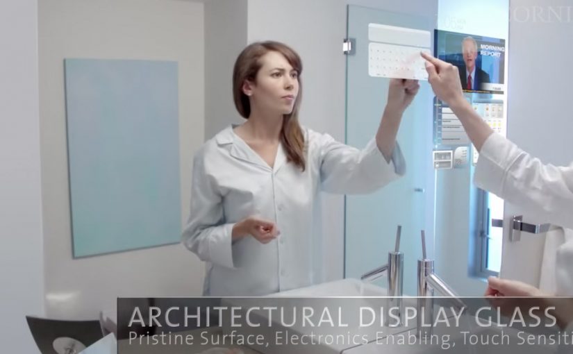
Corning: A Day Made of Glass

Here is a future vision video by Corning, on where they see multi-touch digital displays over the next few years. Multi-touch means the surface can track several fingers or hands at once, so gestures like pinch, rotate, and shared interaction become natural.

What the film is really demonstrating

The core mechanic is simple. Turn glass from “protective cover” into “primary interface”. Every surface becomes a screen. Every screen becomes responsive to direct manipulation. Information follows you across contexts, from home to school to office, with the same touch-first language, meaning a shared set of gestures and feedback that stays consistent across devices.

In consumer electronics and workplace IT, concept films like this are used to align designers, suppliers, and product teams around a shared interface direction.

The real question is whether your interaction language can stay consistent as screens spread across surfaces and contexts.

Treat the glass as incidental. The interaction model is the product.

Why it lands

It removes the usual friction between people and devices. No boot-up rituals, no “find the remote,” no hunting through menus. You touch the thing you want to change, and the system answers in place. That immediacy is the real promise, not the glass itself. Because the system responds at the point of intent, it reduces both cognitive load and coordination cost in multi-screen tasks.

Extractable takeaway: When you are pitching a new interface paradigm, show behavior before hardware. Make the gestures, feedback loops, and handoffs between screens unmistakable, so the idea remains valuable even if the materials and form factors change.

What to steal for your own work

  • Design the interaction language first. Define the small set of gestures and responses that can travel across surfaces, sizes, and contexts.
  • Keep information anchored to the object or task. The winning moments happen when data appears exactly where the decision is being made.
  • Plan for multi-user moments. Big surfaces invite collaboration. Design for two people at the same time, not just one user plus spectators.
  • Prototype the “seams.” The handoff between phone, table, wall, and car is where most visions break. That is the first place to test.

A few fast answers before you act

What is “A Day Made of Glass” trying to communicate?

It is a vision of glass becoming an interactive medium, where touch-first displays move from dedicated devices into everyday surfaces.

What’s the practical value of watching concept videos like this?

They are useful for spotting interface patterns early, then translating the patterns into near-term prototypes and roadmap language for teams and partners.

What’s the biggest product risk in “glass everywhere” thinking?

Over-indexing on the surface and under-investing in the interaction model. If the gestures, feedback, and context switching are weak, the material does not matter.

What is one immediate takeaway a UX or product team can apply?

Write a short “interaction grammar” for your experience, then test it across at least two form factors. If the grammar does not travel, the concept will not scale.

Who should use this kind of vision film internally?

Use it when you need to align design, product, and IT partners on a shared interaction direction before you lock hardware decisions.