Mercedes-Benz: Yes, A.I. Do

Mercedes-Benz: Yes, A.I. Do

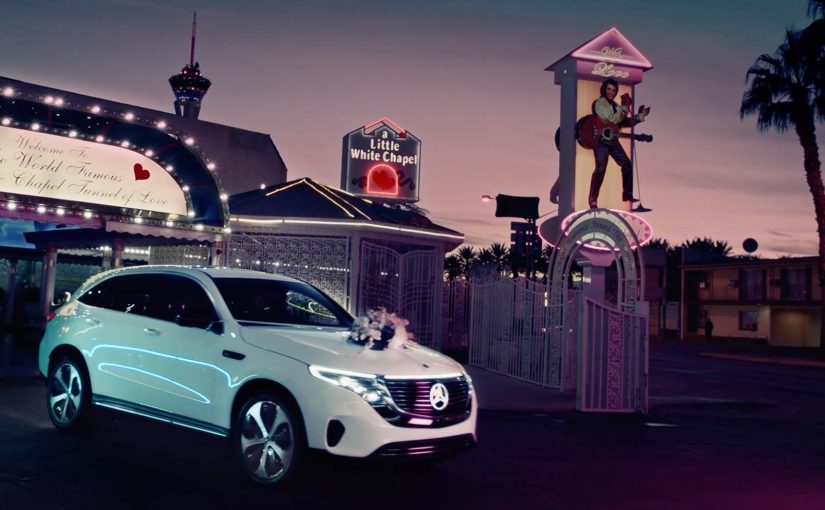
For the world premiere of their new Mercedes-Benz EQC at CES 2019 in Las Vegas, Mercedes transformed their new model into a wedding carriage. Four lucky couples were invited to test drive the new Mercedes-Benz EQC on the roads of Las Vegas and experience its special A.I. features first hand. In this context, “A.I. features” refers to the in-car intelligent functions Mercedes chose to demonstrate during the drive.

The real question is how you make a new, tech-heavy product feel experienceable in minutes, not explainable in slides.

Why this launch twist works

By wrapping a CES tech premiere in a wedding ritual and putting couples behind the wheel, Mercedes turns abstract capability into visible behavior. The ritual creates instant stakes and attention, so the A.I. moments are noticed as part of a real drive, not as claims.

Extractable takeaway: If your features are hard to describe, borrow a human ritual people already recognize so the experience carries the technology.

  • It turns a product reveal into a story. A “wedding carriage” reframes a tech premiere into an experience people immediately understand.
  • It makes A.I. tangible. Instead of describing features on a stage, it puts them into a real drive where reactions matter.
  • It earns attention without shouting. The setup is unusual enough to travel, while still keeping the car at the center.

In consumer-tech and automotive launches where attention is fragmented and skepticism is high, familiar rituals help audiences grasp “what is happening” before they judge “what it does”.

Steal the ritual frame for launches

Wrap a launch moment in a simple, human ritual. Then invite a small group to experience the product in-context so the story carries the technology, not the other way around.

  • Pick a ritual that already means something. Use a simple human frame to make the launch instantly legible.
  • Let real use do the persuading. Put the product into an in-context experience so reactions carry more weight than narration.
  • Keep the product as the stage. The theme should guide attention toward the product experience, not away from it.

A few fast answers before you act

What happened in the Mercedes-Benz “Yes, A.I. Do” activation?

For CES 2019 in Las Vegas, Mercedes used the EQC premiere as a wedding-carriage themed experience and invited four couples to test drive the car and experience its A.I. features first hand.

Why use couples and a wedding theme for a car launch?

It creates an instantly recognizable narrative frame, which makes the activation easier to remember and easier to share than a standard demo.

What is the main takeaway for product launches?

Give the viewer a clear story hook, then let the product prove itself through a real experience rather than through claims.

How do you keep a stunt from overshadowing the product?

Make the product the “stage”. The theme should guide attention toward the experience of the product, not away from it.

Pizza Hut: Pie Tops II

Pizza Hut: Pie Tops II

Pizza Hut is the official pizza of the NCAA, a men’s basketball tournament known informally as March Madness and played each spring in the United States.

For last year’s tournament, Pizza Hut created what was billed as the world’s first shoe that ordered a pizza. Now, to celebrate their second year as the official pizza of the NCAA, Pizza Hut, Droga5 and the Shoe Surgeon launched Pie Tops II. It is a limited-edition high top shoe that not only uses your geolocation to order the current Pizza Hut deal at the press of a button, but also allows users to pause the game while they receive their delivery.

A TV ad has also been released to highlight the new pause feature of these newly relaunched Pie Top shoes.

A sneaker button that behaves like a remote

The mechanism is deliberately simple. Put a single button on the shoe. Tie it to an app. Map the press to two jobs: order, then pause. The shoe becomes a physical shortcut for a very specific March Madness moment, when people want food but do not want to miss play. That works because it removes friction at the exact moment attention is highest.

In second-screen sports viewing, the strongest interactions reduce interruption while keeping attention on the live game.

Why it lands on game day

Pie Tops II works because it converts a familiar tension into a prop. Hunger versus attention. Convenience versus FOMO. The “pause” feature turns a delivery problem into a punchline, and the shoe format makes the whole thing instantly tellable.

Extractable takeaway: If you can turn a high-frequency habit into a one-action ritual, you make the brand feel like part of the event, not just an ad around it.

The real intent behind the novelty

This is not really about footwear. The real question is how Pizza Hut earns a place inside the live ritual instead of advertising around it. It is about owning a behavior loop during March Madness. By behavior loop here, I mean a repeatable sequence of trigger, action, and reward that keeps the brand attached to the moment. Pizza ordering, deal recall, and a reason to talk about Pizza Hut in the same breath as the game. The smart move here is not the gadget but the way it turns brand utility into event behavior. Limited-edition scarcity does the rest, because it makes the product itself a piece of shareable culture.

What brands can steal from Pie Tops II

  • Pick one moment to own: design for a specific tension that happens repeatedly during an event, not for “sports fans” in general.
  • One control, two outcomes: a single action that triggers both utility and delight is more memorable than a complex feature list.
  • Make the object do the storytelling: the product should explain the campaign in one sentence, even without a logo.
  • Build viewer control into the idea: letting people keep the game in their hands makes the brand feel helpful, not interruptive.
  • Scarcity as distribution: limited runs can function like media spend when the object is inherently talkable.

A few fast answers before you act

What are Pie Tops II?

They are limited-edition Pizza Hut sneakers designed for March Madness that let you order pizza via a button press and, as described, pause the game while you wait for delivery.

What problem is this campaign solving?

It dramatizes a familiar game-day problem. People want food without missing play. The stunt turns that tension into a memorable product feature and a shareable story.

Why does the “pause” feature matter more than the pizza-ordering feature?

Ordering is convenient. Pausing is emotionally resonant because it speaks directly to FOMO during live sports. It is the twist that makes the idea travel.

Is this wearable tech or brand entertainment?

It is primarily brand entertainment packaged as a functional shortcut. The utility makes it credible. The novelty makes it worth talking about.

What is the reusable pattern for other brands?

Create a physical or tactile shortcut for a high-frequency moment. Keep the interaction to one obvious action. Then tie it to an event where people already have strong emotions and repeat behaviors.

Jaguar launches in-car cashless fuel payment

Jaguar launches in-car cashless fuel payment

Drive up to a Shell pump. Choose your fuel amount on the car’s touchscreen. Pay without leaving the seat. In a world-first, Jaguar and Land Rover owners can pay for fuel via the touchscreen of their car at Shell service stations. Rather than paying at the pump or queuing to pay in the shop, installing the Shell app via InControl means drivers can drive up to a pump at participating Shell service stations, select how much fuel they require, and pay with PayPal or Apple Pay on the vehicle’s touchscreen.

For more details see Jaguar’s announcement.

Why this matters beyond fuel

This is not really a “payments innovation” story. It is a friction story. The value comes from removing context switching, meaning the driver does not have to break the refuelling task to pull out a phone, walk to the shop, and re-authenticate. No wallet. No phone. No queue. By keeping selection and payment inside the in-car interface, the flow reduces both steps and “did it work” anxiety, which is why it feels meaningfully faster. This is the right direction for in-car commerce, but only if station and pump identification are unambiguous and receipts are immediate. In connected-vehicle ecosystems where multiple brands share the same moment, the primary interface should own the transaction at the point of need.

Extractable takeaway: Collapse checkout into the moment of intent inside the primary interface, and the “innovation” will be felt as time and effort saved.

It moves checkout into the moment of intent

The moment you decide to refuel is the moment you can complete the transaction. That reduces drop-off, reduces effort, and makes the experience feel modern without changing the core product.

It turns the car into a commerce surface

Once the dashboard becomes a trusted place to authenticate and pay, the opportunity expands to other “on-the-go” services where drivers normally step out, wait, or juggle devices. A commerce surface is any interface that can identify the context, confirm the choice, and take payment without switching devices.

It is a clean example of partner-led experience design

Jaguar provides the in-car platform. Shell provides the forecourt context and operational integration. The user experiences it as one flow, not two brands handing off a task.

The real question is whether your primary interface can complete payment at the exact moment intent forms, without sending people into a separate device, screen, or queue.

The reusable pattern

  1. Embed the action where the context already is. Put the transaction inside the primary interface, not a separate detour.
  2. Keep the flow short and explicit. Select, confirm, pay, receipt. Anything more breaks the promise.
  3. Design for trust signals. Clear station identification, clear confirmation, and a clear receipt reduce “did it work” anxiety.
  4. Make the benefit obvious in one sentence. “Pay from your car” is enough. The value is immediate.

What to measure beyond views

  • Adoption. Percentage of eligible drivers who activate the in-car payment feature.
  • Repeat usage. Whether people use it again after the first try.
  • Time saved. Reduction in “fuel stop duration” compared with paying in-store.
  • Experience confidence. Drop-off rates between selecting the pump and confirming payment.

Guardrails to steal for in-car checkout

  • False positives. The system must reliably know which station and which pump the driver is using.
  • Failure recovery. If payment fails, the user needs a clear next step that does not create embarrassment at the pump.
  • Trust. Drivers need clear confirmation, receipts, and predictable behavior every time.

A few fast answers before you act

What is Jaguar’s in-car cashless fuel payment?

A Shell fuel payment flow that lets Jaguar and Land Rover drivers select an amount and pay from the vehicle touchscreen via the Shell app in InControl.

What problem does it solve?

It removes the need to pay at the pump or queue inside the shop. The entire task completes from the car.

What is the core mechanism?

A contextual in-car experience that links the driver, the station, and the payment method into one short flow.

What is the most reusable lesson?

Move checkout into the moment of intent inside the primary interface. Then keep the steps minimal and confidence high.

What is the biggest failure mode?

Any ambiguity about station or pump, or any unclear “did I pay” outcome. Trust collapses fast in payments.