Puma: HardChorus for Valentine’s Match Day

Puma: HardChorus for Valentine’s Match Day

When Valentine’s Day lands on match day

This year 14 February, Valentine’s Day, fell on a Sunday. For men everywhere this presented a dilemma. Love or football. Atletico Madrid vs Barcelona, Manchester City vs Liverpool, Napoli vs Inter, or romance with a loved one?

A love song delivered like a terrace chant

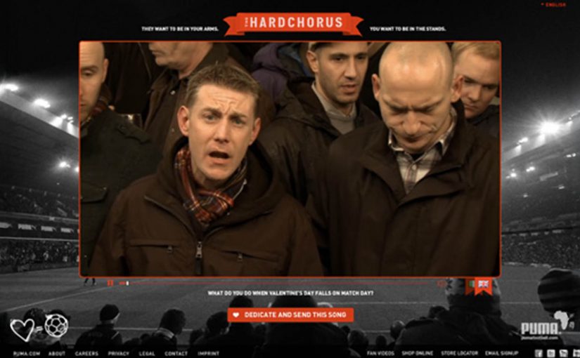
Puma recognized this dilemma as “They want to be in your arms. You want to be in the stands”, and so with Droga5 created the Puma HardChorus.

A crowd of football supporting men, assembled in a pub to sing Savage Garden’s Truly Madly Deeply, which then football fans could send to their loved ones while enjoying the game. An Italian version was also created where a similar group sang Umberto Tozzi’s 1977 hit Ti Amo.

Puma HardChorus English version:

Puma HardChorus Italian version:

In European football culture, match day is a ritual with its own language, loyalty, and emotion.

Why it works: it turns the conflict into a gesture

The genius is the tone swap. It takes the toughest-coded environment in the brief and makes it do something unexpectedly tender. That contrast creates surprise, and surprise creates shareability. It also gives the viewer control over the trade-off. You are not choosing between football and your partner. You are converting match-day energy into a message that says, “I’m here, I’m thinking of you, and yes, I’m still going to the game”.

Extractable takeaway: If a moment forces a binary choice, design a small, sendable action that turns the tension into a gesture, so the audience can keep what they love without neglecting who they love.

What Puma is really selling in the background

This is not about listing product benefits. It is about aligning the brand with a lived tension and resolving it in a way that feels culturally fluent. The real question is whether you can convert a culturally loaded trade-off into a message people are happy to send. This is a smart way to earn brand warmth without asking fans to abandon the game. Puma borrows the credibility of the stands, then uses it to deliver romance without embarrassment.

Steal the pattern: two audiences, one moment

  • Name the real conflict. This works because the tension is true, not manufactured.
  • Use a familiar cultural code. Stadium chanting is instantly recognisable and instantly readable.
  • Flip the code without mocking it. The humour is in the contrast, not in making fans look stupid.
  • Make it easy to pass along. If the output is meant to be sent, it needs to stand on its own.

A few fast answers before you act

What is Puma HardChorus?

A Valentine’s match-day idea where football supporters sing romantic songs like stadium chants, which fans can send to their loved ones while they watch the game.

What is the core mechanism in one line?

Turn terrace energy into a love message, then make it easy to share directly with the person who feels “second place” to football.

Why does the idea feel funny and effective?

Because it flips a tough-coded cultural setting into a tender gesture. The contrast creates surprise, and surprise creates shareability.

What is the audience “problem” it solves?

It resolves a real conflict between two priorities by converting match-day behaviour into a signal of care, rather than forcing a binary choice.

What is the most transferable takeaway?

If you have two audiences competing for the same moment, design a simple action that transforms the conflict into a gesture one person can send to the other.

Nokia: The World’s Biggest Signpost

Nokia: The World’s Biggest Signpost

When navigation stops being private

Making navigation social is the new big idea by Swedish agency FarFar for Nokia.

What the “big signpost” actually does

The idea is simple at street level. Put a colossal digital signpost in a place with constant foot traffic, then let the public control it. People submit a location from their phone or via the web, and the sign turns to point toward that place while displaying the direction and distance.

Instead of selling navigation as a spec on a phone, the campaign turns it into a shared public utility and a social recommendation engine. Your place becomes part of the experience, and everyone nearby gets a live demonstration of what the service can do.

In global consumer tech marketing, “useful features” often stay invisible until you give them a public stage and a participatory hook.

Why it lands

It takes something normally solitary, finding your way, and makes it performative. Watching the sign react in real time creates instant credibility, and seeing other people’s “good things” transforms navigation from point-to-point directions into discovery. The spectacle draws a crowd, but the viewer control keeps the crowd engaged because the output is never the same twice.

Extractable takeaway: If you are marketing a capability people underestimate, externalize it in a physical demonstration, then let the audience drive the input so the proof feels self-generated.

What Nokia is really buying with this stunt

The visible job is attention. The deeper job is adoption.

The real question is whether a public demonstration can turn navigation from a private utility into a behavior people want to repeat and share.

This is a stronger way to sell navigation than listing features in isolation because the product benefit becomes visible, social, and easy to try.

Done well, the “map of good things” becomes more than a campaign artifact. Here, “map of good things” means a navigation layer shaped by public recommendations, not just static directions. It becomes a product behavior.

What brands can steal from the signpost

  • Turn an invisible feature into a visible ritual. Make the value legible in under five seconds, even with no sound.
  • Design for participation, not just impressions. Let people submit inputs, then reward them with a public output.
  • Make the crowd the content engine. Recommendations from real people do the persuasion work for you.
  • Build a clean bridge to “try it now.” If the demo is the billboard, the next step must be immediate on the device in someone’s pocket.

A few fast answers before you act

What is “The World’s Biggest Signpost” for Nokia?

It is a large interactive signpost installation that lets the public submit locations and then shows the direction and distance to those places, used to promote Nokia’s navigation services as social and shareable.

How does the experience make navigation “social”?

It shifts navigation from personal utility to public discovery by letting anyone contribute places and letting everyone nearby see the recommendations and results live.

What is the core mechanic that makes it work?

Real-time viewer control. People submit a destination and immediately see the sign respond with a physical, public proof of the service.

Why use a large physical installation instead of a regular ad?

A physical demo creates instant trust. It shows the capability in the real world, not as a claim, and it attracts attention through spectacle while keeping engagement through interaction.

What’s the key transferable lesson for brands?

If you want people to value a capability, stage it as a shared experience where the audience supplies the inputs and the product supplies undeniable outputs.

Lynx’s online tools for offline dating

Lynx’s online tools for offline dating

Lynx does something smart and very “of its time.” It takes the messy, awkward first 20 seconds of talking to someone offline, and it turns that moment into a mobile toolkit. Here, “toolkit” means lightweight, in-the-moment utilities you can pull up on your phone to create an opening.

BBH London releases a second round of mobile “pickup tools” for Lynx’s “Get In There” campaign. The promise is simple. Give young guys digital tips, tricks, and small utilities that help them make the leap from online confidence to real-world interaction. The tools are built as icebreakers you can actually use in the moment, not just a brand message you nod at and forget.

The idea, stripped down

Turn “offline dating” anxiety into a set of mobile utilities that create an opening.

What the toolkit looks like

The campaign centers on a suite of mobile experiences backed by video content. Three apps sit at the heart of the set: “Say Cheese,” “Spin The Bottle,” and “Perfect Man Revealed.”

Say Cheese plays with the “take my photo” moment to create a surprise reveal.

Spin The Bottle gamifies group energy and removes the “who do I choose” tension.

Perfect Man Revealed reframes a quiz into a playful personal reveal.

The pattern matters more than the specifics. Each tool is designed to create a socially acceptable reason to start an interaction, then let the person take it from there.

In youth-focused consumer brands, the winning use of mobile is often to reduce in-the-moment social friction, not to replace the interaction.

The real question is whether your digital work helps people take the next awkward step in the real world.

When you want behavior change, utility-first beats message-first.

Why this works as marketing, not just “a funny app”

Most brand campaigns try to persuade with claims. This one tries to equip with utility. By making the icebreaker the mechanic, the brand shows up at the moment of action, which is why it sticks.

Extractable takeaway: When the behavior is awkward, ship a small, optional utility that creates a socially acceptable opening, then get out of the way and let the human interaction do the work.

  1. It inserts the brand into behavior, not media.
    If the tool gets used, the brand is present at the exact moment the customer cares, not ten minutes later in a recall survey.
  2. It makes “digital to physical” a real bridge.
    A lot of digital work stops at clicks. Here, the mechanic is literally about translating screen confidence into real-world action.
  3. It scales with video and gets remembered through the gag.
    The utility is the hook. The humor is the memory device. Video content becomes the distribution layer that makes a niche behavior hack feel like a mainstream campaign.
  4. It is brand-consistent without being product-heavy.
    The “Lynx Effect” idea is not explained. It is implied. The campaign behaves like an accomplice to confidence, which is exactly what the brand wants to stand for.

The deeper point

This is early evidence of a direction many brands move toward. Marketing that ships as tools, not just communications.

Instead of asking for attention, the brand earns a place in real life by being useful in a situation people actually want help with.

Patterns to borrow when you ship tools

  • Start with the awkward moment. Pick the one moment people avoid because it feels risky. Then design a tool that reduces the social friction in that moment.
  • Make the utility the hero. If the only payoff is “branding,” people drop it. If the payoff is a usable social script, they try it once, and that is often enough to create talk value.
  • Design for respect and consent, even when the creative is cheeky. When you play in dating and social dynamics, the difference between playful and creepy is not subtle. Build mechanics that keep choice and comfort with the other person, not tricks that corner them.

A few fast answers before you act

What is Lynx “Get In There” trying to do?

It aims to help guys get offline and start real-world interactions, using tips, tricks, and mobile tools as icebreakers.

What makes these tools different from standard mobile ads?

They are designed to be used in the moment, not just consumed. Utility first, branding second.

Which apps are part of the toolkit?

“Say Cheese,” “Spin The Bottle,” and “Perfect Man Revealed.” Each is designed to create a simple opening for real-world conversation.

What is the reusable marketing lesson?

If you can turn a customer’s friction point into a simple tool that helps them act, you move from awareness to behavior.

What is the main risk with this kind of idea?

If the mechanic crosses into manipulation, it backfires. The tool must stay playful, optional, and respectful.