Sen.se: Mother and the Motion Cookies

Sensors are showing up everywhere, from wrist wearables like Jawbone UP and Fitbit to the first wave of “smart home” kits. The promise is always the same. Data that helps you understand your day, then nudges you when something matters.

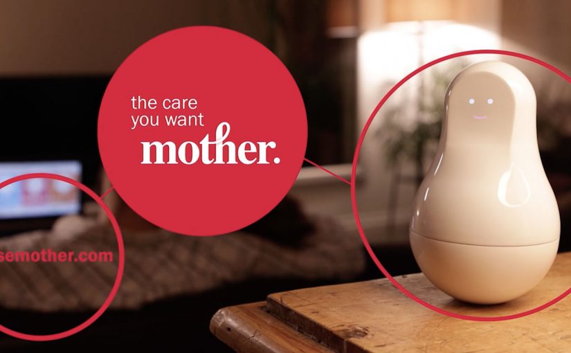
Mother and the Motion Cookies, from connected-objects startup Sen.se, is positioned as a more flexible take on that idea. Instead of buying a single-purpose gadget for each habit, you get one “Mother” hub and a set of small sensor tags. The Motion Cookies. You decide what you want to track, attach a Cookie to the relevant object, and set alerts for the moments you care about.

Definition tightening: A Motion Cookie is a small sensor you can stick to an object. The “Mother” device is the home base that receives the signals and turns them into simple dashboards and notifications.

If you strip away the friendly character design, this is a configurable rules engine for everyday life. The sensors stay the same. The meaning changes based on what you attach them to and what you tell the app to watch for.

Watch the demo video for more.

A sensor kit that behaves like a toolkit

The smart move here is that the hardware is deliberately generic. One sensor type can be repurposed across dozens of “jobs”, depending on where you place it. Toothbrush, medication box, door, bag, water bottle. The product is less about owning the perfect device, and more about reassigning the same device as your priorities change.

In consumer IoT, products only survive if setup friction stays low and the data translates into a simple action.

Why the “Mother” framing makes the tech feel usable

Smart home products often fail at the handoff between capability and comprehension. Mother softens that gap by packaging sensing as caregiving. The real question is whether a sensor system can feel understandable enough that people actually try it. That emotional framing reduces the intimidation factor and makes experimentation feel normal.

Extractable takeaway: When your product is technically broad, give users a friendly mental model and a small first win, then let reconfiguration become the habit that unlocks the long tail of use cases.

What connected-product teams should copy

  • Design for reassignment, not perfection. People’s routines change. Your hardware should survive those changes.
  • Make “setup” the product. If a user cannot get to value in minutes, they will not get to value at all.
  • Translate sensing into verbs. “Brush”, “open”, “arrive”, “drink”, “take”. Verbs beat metrics.
  • Alert sparingly. The fastest way to kill trust is to spam people with “insights” they did not ask for.

A few fast answers before you act

What is Mother and the Motion Cookies?

It is a smart home kit with one central hub and multiple small sensor tags. You attach a sensor to an object, choose what you want to track, and get updates or alerts based on that behaviour.

What is the core idea compared to a single-purpose wearable?

Reconfigurability. The same sensors can be reassigned to different objects and routines, so the system adapts to what you want to measure this week, not what the device designer assumed forever.

What problem is it trying to solve?

Turning ambient behaviour into something actionable, without requiring you to buy a new gadget for every habit or household scenario.

Why does the “Mother” framing matter?

It makes a technically broad sensor system feel more understandable and less intimidating. That framing helps users see the product as practical support, not just instrumentation.

What makes this kind of product hard to sustain?

Reliance on companion apps and backend services, plus the challenge of keeping alerts useful rather than noisy. If the system becomes high-maintenance, it stops feeling like help.

EmotiCoke: Coca-Cola Emoji Web Addresses

Coca-Cola, through its campaign in Puerto Rico, tries to make the internet a happier place by turning emojis into a mobile call-to-action. The brand is described as registering web addresses for the emojis that convey happiness, then using huge outdoor ads to push people to try them on their phones.

EmotiCoke Outdoor Ad

Those emoji web addresses route visitors to a landing page, www.EmotiCoke.com, where people could sign up for a chance to win the emoji web addresses for themselves.

The mechanic: emoji addresses that redirect to one place

The execution hinges on a simple redirect loop. Type a “happy” emoji as the web address (with a supported suffix), land on the same destination, then convert curiosity into sign-up. Under the hood, these are internationalized domain names (IDNs) represented in a DNS-safe format, even if the user experience is “just type the emoji.” This works because every emoji address resolves to one destination, so the user does not have to learn multiple URLs to get the payoff.

In mobile-first out-of-home campaigns, the simplest call-to-action wins because the billboard has only seconds to convert attention into a tap.

Why it lands

It takes a behavior people already practice, using emojis to express mood, and repurposes it as navigation. That small twist is the hook. It is instantly legible from a distance, it is fun to try, and it creates a low-friction bridge from street-level attention to a trackable digital interaction. The real question is whether your call-to-action can be copied from a distance and tried instantly on a phone.

Extractable takeaway: When you need mass participation from a passive channel like OOH (out-of-home), make the call-to-action both copyable and inherently playful. “Try this now” works best when the first step feels like a game, not a form.

Why .ws shows up in the story

For anyone wondering why .ws shows up, it is the country-code suffix for Samoa. The campaign is described as choosing .ws because emoji characters were not accepted on common top-level domains like .com, .net, and .org at the time. The additional brand rationale mentioned in coverage is that “.ws” could be read as “We smile,” which fits the happiness positioning.

Steal this pattern: emoji URLs as a CTA

  • Optimize for retyping, not explaining. If someone cannot replicate it from memory, you lose the moment.
  • Use one destination. Let novelty drive entry, then keep the conversion path clean and consistent.
  • Make the first interaction instant. If the page loads slowly or the redirect breaks, the idea collapses.
  • Plan for platform variance. Emoji rendering differs by OS and font. Keep the creative readable even when the glyph changes.

A few fast answers before you act

What is EmotiCoke in one sentence?

It is a Coca-Cola Puerto Rico activation that uses emoji-based web addresses on billboards to drive mobile users to EmotiCoke.com to sign up for a chance to claim those emoji URLs.

How do “emoji URLs” work in practice?

They rely on internationalized domain name support. The emoji the user sees is encoded into a DNS-compatible form, then redirected to a standard landing page.

Why did the campaign use the .ws suffix?

Because the campaign is described as needing a suffix that accepted emoji characters, and .ws was positioned as a workable option. Coverage also cites the “We smile” wordplay as a fit for Coca-Cola’s happiness theme.

Are emoji web addresses reliable everywhere?

No. Support varies across browsers, keyboards, registrars, and operating systems. Emoji appearance also changes by platform, which can affect recognition and retyping accuracy.

What are the biggest execution risks?

Broken redirects, slow mobile load times, unclear typing instructions, and inconsistent emoji rendering across devices. Any of these adds friction and kills the novelty fast.