Friskis&Svettis Stockholm: #friskissthlm

Friskis&Svettis Stockholm: #friskissthlm

January in Sweden is when gyms and health clubs go loud, chasing everyone who made the classic New Year’s resolution to start exercising. Stockholm-based health club Friskis&Svettis is no exception.

Because Friskis&Svettis is a non-profit association owned by its members, they and their agency Volt build a campaign where members inspire the wider community. A hashtag, #friskissthlm, invites people to work out, photograph the moment, and tag their pictures, so the members themselves become the creative running “around Stockholm”.

How the member-driven mechanic scales

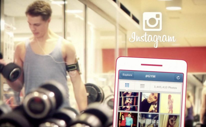
The mechanism is participation as media: member actions create the content and also help distribute it. Instead of producing a single hero ad, the brand defines one simple behavior: train, post, tag. The hashtag becomes the aggregation layer, a single place where the posts collect and stay discoverable, and every new image becomes both proof and invitation. The campaign’s distribution is powered by the same thing gyms want more of in January: visible momentum.

In member-owned fitness communities, letting real members supply the proof tends to land harder than brand-led messaging, because the social permission comes from peers rather than from advertising.

The real question is not how to make a louder January gym ad, but how to make visible member momentum easier to join. The stronger move here is to make member behavior the campaign, not to outshout every other club in January.

Why it lands

It turns the most fragile moment in fitness, starting, into something public and shareable without making it complicated. The posts do two jobs at once. They show variety (different workouts, different people, different branches) and they reduce intimidation, because the “campaign face” is not a model, it is your neighbor.

Extractable takeaway: If you want community growth, choose one repeatable participation unit and one clear tag, then let volume and variety do the persuasion. Your members become the credibility layer.

What to borrow for your own January push

  • Make the ask behavioral. “Work out, post, tag” is easier to follow than “join our movement”.
  • Let variety do the selling. Many small proofs beat one polished claim, especially in fitness.
  • Turn members into the creative. It is cheaper, more credible, and naturally localized.
  • Design for aggregation. One hashtag, one place to browse, one loop that keeps filling itself.

A few fast answers before you act

What is #friskissthlm in one sentence?

A member-powered Instagram hashtag campaign where workouts posted and tagged by members become the campaign content for Friskis&Svettis Stockholm.

Why is this stronger than a typical January gym ad?

Because the proof is peer-generated. People trust “someone like me did this” more than they trust a brand saying “you should”.

What is the key design decision?

Keeping the participation unit tiny and repeatable, so the barrier to contributing stays low while the content volume stays high.

What is the main risk with hashtag-led campaigns?

If the tag is not actively adopted, the feed looks empty and the idea collapses. You need early seeding from members and staff so momentum is visible from day one.

How would you adapt this outside fitness?

Keep the pattern, not the category. Pick one repeatable action people are already willing to do, give it one clear tag or container, and make the resulting proof easy for others to browse and copy.

Sony: Headphone Music Festival AR posters

Sony: Headphone Music Festival AR posters

People in Tokyo who wear headphones, or simply want to try new ones, were treated to an augmented reality music festival from Sony Japan. Four popular local rock groups were turned into original AR performances, then “played” through band tour posters placed in busy locations. Sony-branded headphone trial stations were set up nearby so anyone could join in.

The loop is clean. Spot the poster. Scan it. Get a performance that feels like it is happening in your surroundings. Then step over and compare that moment on Sony headphones.

What makes this feel like a festival, not a tech demo

The execution is essentially a pop-up concert system distributed across the city. The posters act as stages. The phone acts as the ticket. The headphone stand acts as the product trial. That chain of touchpoints is why the experience reads as “festival” rather than “app feature.”

The mechanism: posters as portals

Instead of forcing people into a microsite or a branded app maze, Sony uses a familiar object. The tour poster. The poster becomes the launch surface for AR content. That matters because it removes the biggest friction in mobile AR. The “what do I point my camera at” question.

In supporting materials, the technology is described as Sony’s SmartAR and a smartphone app that recognises the posters and overlays 3D performance content into the live camera view. The mechanics stay invisible to the audience. They just see the band appear.

In dense urban retail markets, AR works best when it turns everyday street media into an immediate try-before-you-buy demo.

The real question is whether your AR trigger reduces friction enough that product trial becomes the next obvious step.

Why it lands for headphone marketing

Headphones are hard to sell with words. Most people cannot translate driver specs into feeling. This activation sells through a direct comparison. You hear a performance, then you hear it again through the product the brand wants you to try.

Extractable takeaway: A retail AR activation lands when the trigger is already in public view, the payoff is instant, and the path from wow-moment to product trial is one physical step away.

It also frames Sony as the host of the music moment, not just the logo next to it. That is a stronger association than “better sound.” It is “better access to the thing you love.”

The business intent behind the street setup

The intent is not just awareness. It is footfall and trial. The AR content pulls people in, but the trial stations convert curiosity into a product experience. If you can get someone to listen for 30 seconds, you can start building preference.

Steal this for poster-triggered AR trials

  • Anchor AR to a physical trigger people already understand. Posters, packaging, signage, tickets.
  • Make the payoff immediate. The first five seconds decide whether AR feels magical or annoying.
  • Keep the bridge to trial short. If you sell hardware, put the demo within sightline of the trigger.
  • Use content that earns replays. Music clips, reveals, limited drops, rotating “sets” work better than static overlays.
  • Design for scanning in real conditions. Glare, crowds, bad signal, rushed users. Make recognition forgiving.

A few fast answers before you act

What is the Sony “Headphone Music Festival” idea?

It is a street-based AR activation where tour posters trigger AR music performances on a phone. Sony pairs that content with nearby headphone trial stations so people can immediately test the product while they are engaged.

Why use posters instead of geofencing or QR codes?

Posters provide a clear camera target and an obvious reason to scan. They also carry cultural meaning. A tour poster already signals music and discovery, so the AR layer feels natural.

What makes AR effective for selling headphones?

It creates a controlled listening moment in an uncontrolled environment. The activation gives you a reason to put headphones on right now and compare the experience immediately.

What is the biggest pitfall in poster-triggered AR campaigns?

Recognition friction. If the scan fails or the experience takes too long to load, people abandon it. The trigger must be reliable and the content must appear quickly.

How do you measure success for this kind of activation?

Track scans per poster location, completion rates for the AR experience, and trial-station interactions. If possible, connect trial interactions to store visits or product interest signals.

Jimmy Kimmel: Talking ATM

Jimmy Kimmel: Talking ATM

Here is some Monday morning humor with talk show host Jimmy Kimmel pranking innocent people with a “Talking ATM”.

What the bit is, in one clean idea

The premise is as simple as it sounds. You walk up to an ATM expecting silence and routine. Instead, the machine “talks back”, and the normal transaction turns into a public surprise.

Here, the bit is the repeatable comic setup, an ordinary ATM behaving like a person in public.

The mechanism is minimal. Put the prank inside a familiar object, then let the setting do the rest. Because everyone understands what an ATM is for, the moment the ATM behaves differently, the audience immediately gets the joke.

In everyday urban life where people run on autopilot, the cleanest pranks work by interrupting a routine object, not by adding complicated setup.

Why it works on camera

This lands because it is universal and fast. There is no niche reference to decode, and the reactions happen in seconds. The “victim” goes from focused to confused to laughing, and viewers get the same emotional arc without needing context.

Extractable takeaway: For shareable humor, build around a routine people recognize instantly, then flip one expectation. The clearer the routine, the bigger the reaction.

What brands can learn from this style of content

The real question is how you borrow the clarity of a universal routine without copying the prank.

The lesson is not “prank people”. It is “use familiarity as your amplifier”. When the object is universally understood, you can spend your creative budget on the twist, not on explaining the world you built.

Have a great week. For more videos of Jimmy Kimmel click here.

Steal this pattern, not the ATM

  • Start with a known ritual. Withdraw cash. Buy coffee. Scan a ticket. Simple beats clever.
  • Change one rule only. The moment should be legible on mute.
  • Design for reaction clarity. Confusion first, then release. That is the loop people share.
  • Keep it short. The best bits do not overstay the premise.

A few fast answers before you act

What is “Talking ATM”?

A Jimmy Kimmel prank segment where an ATM appears to speak to people during a withdrawal, turning a routine moment into a surprise reaction.

Why is an ATM such a good prank object?

Because it is a universal routine object. People expect it to be silent and transactional, so any break in that expectation is instantly noticeable.

What is the core mechanism that makes it shareable?

A familiar setup plus a single clear twist, delivered quickly enough that viewers can understand the premise and enjoy the reaction without explanation.

What is the safest marketing takeaway?

Use familiar rituals to reduce explanation, then concentrate creativity in one unmistakable moment that people can describe in a sentence.

What should a brand copy from this format?

Copy the structural discipline, not the stunt: start with a routine people already understand, change one clear rule, and make the reaction easy to grasp in seconds.