
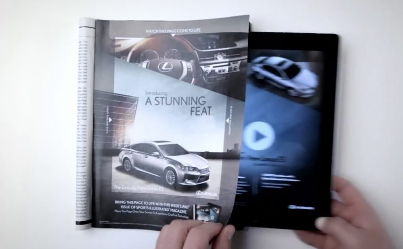
Lexus ES: Print Ad That Comes Alive on iPad

You are flipping through Sports Illustrated and a Lexus ES print ad starts behaving like a screen. The car appears to change color, its headlights flare on, the interior reveals itself, and the whole moment syncs to music.

On a number of occasions I have featured examples of brands creating interactive print ads. By “interactive print ad”, I mean a print page that becomes dynamic when paired with a tablet, with the page acting as the interface and the screen supplying light and motion. Here, the new Lexus 2013 ES is seen changing colors, turning on its headlights and exposing its interiors while music plays in this interactive print ad for the Oct. 15 Sports Illustrated issue.

Paper as a “display”

The trick is not that the magazine suddenly has electronics inside it. The page becomes a physical overlay, and the motion comes from a second screen underneath it. Place the ad over an iPad while the matching Lexus ES video plays, and the printed ink acts like a mask that makes the animation feel like it is happening on the paper itself.

An interactive print ad is a print execution that becomes dynamic when paired with a second screen, using the page as the interface and the tablet as the light and motion source.

In premium automotive marketing and magazine environments, this approach keeps the experience on the page while still delivering the “wow” of moving imagery.

Why this beats the usual print-to-digital handoff

Most interactive print ideas send you away from the page via QR codes, short links, or app installs. This one does the opposite. It pulls the digital layer into the print moment, so the reward arrives immediately and visually, without asking the viewer to leave the ad context.

Extractable takeaway: When a medium is already in someone’s hands, bring the digital layer into that moment instead of routing people elsewhere.

What Lexus is buying with this execution

This is not primarily a spec demo. It is a perception demo. The real question is whether the format makes “advanced technology elevated by style” feel true before the viewer even reads the copy. The ES positioning is “advanced technology elevated by style”, and the format reinforces that promise by making a traditionally static medium feel newly technical. The ad itself becomes proof of the claim.

Stealable moves for interactive print

  • Keep the interaction on the page. If you can deliver the payoff in the same frame, attention holds.
  • Use a familiar object as the interface. A magazine page is intuitive. No learning curve.
  • Design one signature reveal. Headlights, interior, color shift. Pick the one moment people will retell.
  • Make it work in low light. If the illusion depends on contrast, design the experience so it still reads in real life.

A few fast answers before you act

How does this “interactive print ad” actually work?

The print page is placed over an iPad while a synced video plays underneath. The page acts as a mask, so the animation appears to live on the paper.

Is the interactivity coming from electronics inside the magazine?

No. The motion, light, and sound come from the tablet. The magazine page provides the physical overlay and the illusion of print moving.

Why is this more engaging than a QR code in a print ad?

The payoff is immediate and stays on the page. QR flows add steps and send the viewer away, which increases drop-off.

What is the brand advantage of doing it this way?

The medium becomes the message. The execution demonstrates “technology plus design” through the experience itself, not just through copy.

What is the key execution risk?

If alignment, lighting, or setup friction is too high, the illusion breaks and the viewer quits before the reveal lands.
Philips Russia: The Art of Ironing

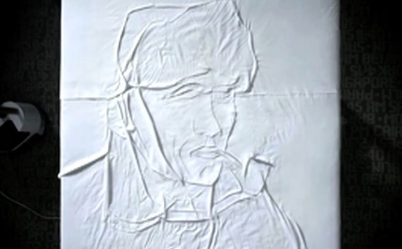
Earlier this year I had covered a couple of novel approaches to art. Joining that collection is this film from Philips Russia, where the performance of its irons and steamer products is demonstrated by recreating famous Dutch paintings on a plain piece of white cloth.

It is a simple setup with a surprising payoff. A sheet. A tool you already understand. Then, with pressure, heat, and steam, the fabric starts behaving like a canvas.

When fabric becomes a canvas

The craft trick is that wrinkles and flattened areas act like light and shadow. Steam relaxes fibres, pressure fixes the fold, and controlled temperature makes the result repeatable. In other words, the “brushstroke” is not pigment. It is texture, created and locked in by the iron.

In global consumer electronics and home appliance marketing, the hardest job is to make small performance differences feel tangible in seconds.

Why it lands

This works because it makes an invisible promise visible. Most iron claims are abstract. More steam. Better glide. Fewer wrinkles. Here, the demonstration turns those claims into a proof you can read from across the room. That is why the idea persuades so quickly: the same steam, pressure, and temperature control needed to shape fabric into a portrait also signals control over everyday wrinkles. If an iron can reliably “draw” with fabric, it can reliably handle a shirt collar.

Extractable takeaway: When your product benefit is hard to evaluate (speed, precision, consistency), design a demo where the benefit becomes a visible artefact. The artefact should be legible instantly and hard to fake without the real capability.

What Philips is really selling

The paintings are the hook, but the real message is controllability. Consistent steam output. Predictable temperature. Even pressure. The art is not the point. It is the credibility vehicle that lets viewers infer performance without needing specs.

The real question is how to make product control visible before a viewer has to trust the spec sheet.

The spot is credited to DDB Moscow, which fits the overall approach. Make the proof the story, not the claim.

What to steal for your next product demo

  • Pick a “hero capability” and exaggerate it safely. If precision matters, show precision at a level nobody expects in the category.
  • Use a familiar reference. Famous paintings function as a built-in quality benchmark. Viewers know what “good” looks like.
  • Make the proof readable without explanation. If the demo needs narration to work, it is probably not a demo yet.
  • Engineer for repeatability. The best demos look like magic, but behave like a process.

A few fast answers before you act

What is “The Art of Ironing”?

It is a Philips Russia film that demonstrates iron and steamer performance by recreating classic Dutch paintings using wrinkles and flattened texture on white cloth.

What product point does the demo prove?

Control and consistency. Steam output, temperature stability, and pressure control are implied by the ability to create repeatable, detailed fabric texture.

Who is credited for the campaign?

The campaign is credited to DDB Moscow.

Why use famous paintings instead of an original design?

Recognition compresses understanding. Viewers instantly know the reference, so they can judge the fidelity without being taught the criteria.

How can another brand use this approach without copying it?

Translate the principle, not the prop. Choose a culturally familiar benchmark in your category, then create a visible artefact that only your real capability can produce.

Heineken: The Real Master of Intuition

Just last week I wrote about the Heineken Star Player app, designed to let fans interact in real time with the nail-biting action of the UEFA Champions League.

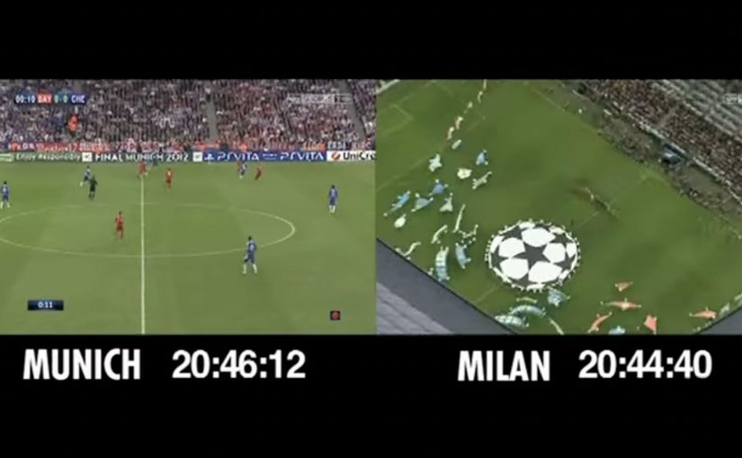
To promote the same Star Player app in Italy, Heineken decides to prank a famous sports bar in Milan, with Italian football legends Billy Costacurta and José Altafini providing live commentary on the UEFA Champions League final. What nobody in the pub knows is that Heineken has hidden cameras everywhere, and the match broadcast is delayed by two minutes, so people in the audience can upstage the legends by calling shots before they are even made.

A prank built on timing and social proof

The mechanism is simple and ruthless. Put credible legends in the room. Keep the crowd confident and loud. Then create a small information advantage by delaying the broadcast, so “intuition” looks like supernatural match-reading instead of a technical trick.

In European football marketing, second-screen ideas work best when they turn match tension into something people can perform together, not just watch.

Why it lands

This works because it weaponizes the most contagious thing in a sports bar: certainty. When one person confidently predicts a moment, everyone else starts scanning for the next prediction. The prank uses that energy to make the app’s promise, real-time interaction, feel like a natural extension of how fans already behave during big matches.

Extractable takeaway: If you want to demonstrate “real time” as a benefit, do not explain it. Create a live situation where the audience experiences the advantage socially, in front of other people, with instant feedback.

What the brand is really proving

This is not only entertainment. It is a credibility transfer. By that, I mean the authority of the commentators spills over onto the app experience and makes the real-time feature feel legitimate inside football culture.

The real question is whether Heineken can make real-time interactivity feel credible enough to belong in serious match culture.

By putting famous voices in the room, Heineken frames Star Player as something that belongs in serious match culture, while the hidden-camera format makes the proof shareable beyond the bar.

How to dramatize real-time advantage

  • Demonstrate the benefit under pressure. Big-match stakes make the mechanic feel meaningful.
  • Use a believable setting. A sports bar is already a “live commentary” environment.
  • Design for group contagion. The best moments are the ones other people in the room amplify.
  • Make the reveal the product story. The twist is the proof of what “real time” can do.

A few fast answers before you act

What is “The Real Master of Intuition”?

It is a Heineken hidden-camera prank in a Milan sports bar where a delayed match broadcast makes fans appear to predict plays before two football legends do, to promote the Star Player app.

Why delay the broadcast?

Because a small timing advantage is enough to create the illusion of extraordinary intuition, and it produces a strong, repeatable demonstration moment on camera.

What does this have to do with a second-screen app?

It dramatizes the idea of being “ahead of the action” and turns real-time interaction into a story people can feel, not just understand.

What makes the idea shareable?

Public embarrassment and surprise, plus a clear “how did that happen?” mystery that gets answered by the reveal.

What is the transferable lesson for marketers?

Create a live scenario where the audience experiences your product advantage socially, with immediate feedback, rather than relying on feature explanation.