Audi: Urban Future at Design Miami 2011

Audi: Urban Future at Design Miami 2011

A 190m² LED city surface that reacts to people

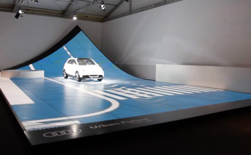
Audi, to showcase its A2 concept at Design Miami 2011, created a 190 m2 three-dimensional LED surface that provided a glimpse of the future of our cities where infrastructure and public space is shared between pedestrians and driverless cars. The installation demonstrated how the city surface would continuously gather information about people’s movements and allow vehicles to interact with the environment.

The installation used a real-time graphics engine and tracking software that received live inputs from 11 Xbox Kinect cameras mounted above the visitors’ heads. Through the cameras, the movement of the visitors was processed into patterns of movement displayed on the LED surface.

In global mobility and smart-city work, embodied demos beat decks when you need belief fast.

The punchline: the street becomes an interface

This is a future-city story told through interaction, not a render. You do not watch a concept. You walk on it. The floor responds, and suddenly “data-driven public space” is something you can feel in your body. Here, “data-driven public space” means a shared surface that senses movement and responds with immediate feedback.

In smart city and mobility innovation, the fastest way to make future infrastructure feel believable is to turn sensing and responsiveness into a physical interaction people can experience in seconds.

Why it holds your attention

Because it turns an abstract topic, infrastructure sharing, sensing, autonomous behavior, into a single, legible experience. Your movement creates immediate visual feedback, and that feedback makes the bigger idea believable for a moment.

Extractable takeaway: If a future system is hard to explain, compress it into one cause-and-effect loop a person can control, then let the feedback do the convincing.

What Audi is signaling here

The real question is whether a smart-city vision can be made legible through a single, shared interaction.

A vision of cities where surfaces sense movement continuously and systems adapt in real time. Not just cars that navigate, but environments that respond.

Moves to borrow for experiential design

  • Make the future physical: Translate complex futures into one physical interaction people can understand instantly.
  • Show the feedback loop: Use real-time input, processing, output, so the concept feels alive.
  • Let visitors generate the proof: Make the visitor the driver of the demo so their movement generates the proof.

A few fast answers before you act

What did Audi build for Design Miami 2011?

A 190 m2 three-dimensional LED surface installation showcasing an “urban future” concept tied to the Audi A2 concept.

What was the installation demonstrating?

A future city surface that continuously gathers information about people’s movements and enables vehicles to interact with the environment.

How was visitor movement captured?

Visitor movement was captured via 11 Xbox Kinect cameras mounted above visitors’ heads, feeding live inputs to tracking software.

What was the core mechanic?

Real-time tracking of visitor movement was translated into dynamic patterns displayed on the LED surface.

Why did this format make the idea feel believable fast?

Because visitors could trigger immediate feedback with their own movement, turning an abstract “responsive city” claim into a felt experience.

Sodimac: The 5-Second Skip Behavior Ad

Sodimac: The 5-Second Skip Behavior Ad

Viewers usually spend five seconds counting down to the “Skip Ad” button. Homecenter Sodimac from Chile uses that exact moment to ask a better question: do you want to skip the ad, or skip the behavior?

Working with agency MayoDraftfcb, Sodimac created a set of environmental messages that turn the skippable format into a moral choice. The button becomes the idea. Either you opt out, or you commit to changing a small wasteful habit.

A tiny mechanic that flips the meaning of “skip”

The creative move is to hijack an interface behavior people already know. That matters because it removes learning friction. The audience understands what to do instantly, and the campaign only has to change what that action means.

In brand communication, this is a neat example of interface-led storytelling. By that I mean the story is carried by a native UI element, not just the film around it.

The platform UI is not just a container for the message. It is the message.

In skippable video media, the first five seconds are the only attention you can reliably design for.

Why this works better than a standard awareness film

It uses the countdown moment as the content, so the viewer understands the choice instantly and the message lands before the skip reflex kicks in.

Extractable takeaway: If the platform gives people a default behavior, design your idea so that default action becomes the point, not the obstacle.

  • It is time-native. The idea fits the five-second window instead of fighting it.
  • It creates viewer control. The viewer makes an explicit choice, not a passive nod.
  • It is measurable. The “change” action is a click, not a vague sentiment.
  • It is consistent with the topic. Environmental habits are about small repeated actions. The format mirrors that.

Reported impact, and the real lesson

The campaign is reported to have driven over 80,000 people to choose the “change” option within a week. This is a smarter use of pre-roll than most awareness films because it makes the click mean something. The real question is whether your first five seconds invite a meaningful choice or just a reflexive skip. The bigger takeaway is structural: if you can turn a default skip behavior into a meaningful action, you get engagement that feels earned rather than bought.

Design rules for your next skippable campaign

  • Build for the first five seconds, and make the idea readable without audio.
  • Use the interface as a prop, buttons, timers, overlays, or any native UI element that viewers already trust.
  • Offer a single clean choice, so the click means something unambiguous.
  • Make the action lead somewhere useful, tips, tools, pledges, or a next step that matches the promise.

A few fast answers before you act

What is the core idea in one line?

It reframes the skippable pre-roll moment. Skip the ad, or skip the bad habit.

Why does this mechanic fit environmental messaging?

Because sustainability is built on small decisions repeated often. A skippable ad is also a small decision, repeated often.

What makes this different from a normal call-to-action?

The CTA is embedded inside a familiar platform behavior. The campaign is not asking for extra attention. It is redirecting an existing action.

What is the biggest risk with “interface hijack” ideas?

Here, “interface hijack” means repurposing a familiar UI element like the Skip button without hiding what is happening. If the viewer feels tricked, trust collapses. The choice has to feel fair, clear, and reversible.

What should you measure to prove it worked?

Click choice rate, completion rate, and downstream behavior on the landing destination, plus any lift in eco-tip engagement over the campaign window.

Volkswagen: The BlueMotion Label

Volkswagen: The BlueMotion Label

A magazine gets read, then it gets tossed. The campaign framing cites a blunt number: 77% of magazines, along with their ads, end up in the trash, which makes the medium itself feel like waste.

So when Volkswagen wants to promote the eco-conscious thinking behind its BlueMotion vehicles, Ogilvy develops a print insert that does not just talk about recycling. It makes recycling the default next step.

The insert is designed to get people in Cape Town to recycle their magazines via the city’s post boxes. Once you are done reading, you use the insert and drop the magazine into a post box, turning postal infrastructure into a recycling pathway instead of sending the paper to landfill.

When the medium becomes the message

The mechanism is a print ad that changes the fate of the print medium. Instead of adding more paper persuasion, it converts the entire magazine into something that can be routed to recycling, using a familiar behavior, posting, to remove the friction of “finding a recycling option”.

In consumer marketing, “sustainability” claims land best when the communication channel follows the same rules the product is asking people to adopt.

The strongest sustainability advertising makes the medium do part of the environmental work itself. The real question is whether the communication changes the waste behavior around the product, or just describes a greener intent.

Why it lands

This works because it removes hypocrisy. If you are going to sell eco-conscious thinking, your ad cannot behave like disposable clutter. By turning the magazine itself into the recyclable object, the campaign gives people a satisfying feeling of doing the right thing with almost no extra effort, and it makes the brand promise feel practical rather than moralizing.

Extractable takeaway: If your benefit is “less waste”, design the communication so it physically reduces waste, and let the proof be the experience, not the copy.

What to borrow from the BlueMotion Label

  • Replace messaging with utility. If you can change behavior directly, you do not need to preach.
  • Use existing infrastructure. People already know how to use post boxes, so adoption is friction-light.
  • Make the action one-step. The closer the action is to the moment of disposal, the higher the follow-through.
  • Make the proof visible. A physical insert is something people can show, talk about, and demonstrate.

A few fast answers before you act

What is “The BlueMotion Label”?

A Volkswagen BlueMotion print insert designed to make magazine recycling easy by letting readers use post boxes to route finished magazines into a recycling flow.

Why is this stronger than a standard eco-themed print ad?

Because it behaves like the promise. It reduces waste through the ad itself, instead of adding more disposable paper to argue about sustainability.

What behavior change does it target?

Moving magazines from “trash by default” to “recycle by default” at the exact moment people finish reading.

What is the key execution ingredient?

Friction removal. The action must be simple enough that people will do it immediately, without searching for a recycling option.

When should brands use this pattern?

When your claim depends on credibility, and you can redesign the medium or distribution so the communication itself demonstrates the value.