Jung von Matt: Lorem Ipsum Recruitment

Jung von Matt: Lorem Ipsum Recruitment

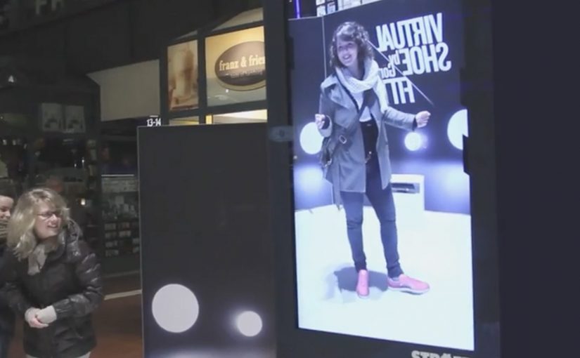
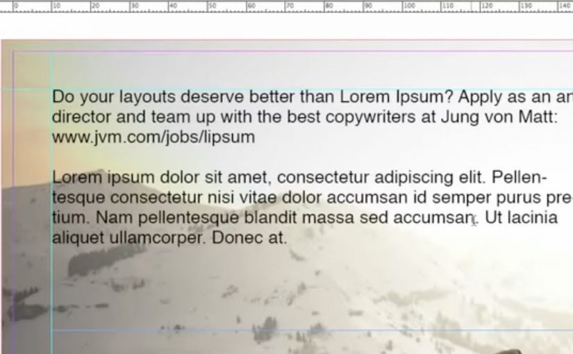
Art Directors in agencies use Lorem Ipsum (dummy text) as a placeholder when creating layouts. A de facto place to generate that dummy text is Lipsum.com, described as drawing tens of thousands of creatives from around the world each day.

So for one week in January, Jung von Matt slipped a recruitment message into the flow. When anyone copy and pasted Lorem Ipsum from Lipsum.com into their layouts, a Jung von Matt recruitment line came along with the dummy text.

Recruitment that hides inside the tool, not the feed

The mechanism is a Trojan insertion into a daily workflow. Here, “Trojan insertion” means placing a message inside a routine working asset so it gets discovered during real task flow rather than through paid media. Instead of buying attention where creatives scroll, the message shows up exactly where creatives build. Inside the placeholder text that sits in the middle of real work. That works because the recruitment line appears when designers are already focused on layout work, which makes the interruption feel relevant rather than random.

In agency talent markets, the most efficient recruitment messages appear inside the tools and rituals creatives use every day.

Why it lands

This idea earns its attention rather than demanding it. The surprise is subtle. You spot it only if you are doing the job, which makes the message feel targeted and insider. It also travels naturally. Layouts get shared for feedback, reviewed, and iterated, so the line can surface in multiple contexts without additional media. This is smarter than a generic job ad because it uses working context as targeting.

Extractable takeaway: If you want to reach specialists, place the recruitment message inside a high-frequency workflow artifact, so the moment of discovery feels personal and relevant.

The real question is how to place a hiring message inside a creative ritual without making the brand feel intrusive.

What Jung von Matt is really optimizing for

The obvious goal is applications. The deeper goal is employer brand positioning. The agency is signalling that it understands how creatives work, and that it will recruit with the same craft it expects in the job.

What recruitment teams can steal from this

  • Target the workflow, not the platform. Start from where your talent produces, not where they consume.
  • Use a low-friction carrier. Dummy text is copied at scale, which makes distribution effortless.
  • Make the message context-native. A recruitment line should look like it belongs in the artifact it hijacks.
  • Design for second-hand discovery. Make it likely to be noticed in reviews, sharing, or handoffs.
  • Keep it respectful. The best hacks feel clever, not invasive.

Previously Jung von Matt have recruited creatives via the Trojan Recruitment campaign.


A few fast answers before you act

What is Lorem Ipsum Recruitment in one sentence?

It is a recruitment tactic where a Jung von Matt hiring message was embedded into Lorem Ipsum text so it appeared when creatives copied dummy text into layouts.

Why is Lipsum.com a smart place to do this?

Because dummy text generation is a repeated, habitual step in layout work, so the message shows up at high frequency in a relevant context.

What makes this more effective than a normal job ad?

It reaches the right audience while they are actively designing, and the discovery feels targeted rather than broadcast.

What is the main risk?

Trust. If the audience experiences it as tampering rather than wit, the stunt can harm employer brand instead of helping it.

What should you measure if you run a similar idea?

Qualified applications, referral quality, portfolio traffic, and whether employer brand perception improves among the specific roles you are targeting.

Bradesco Seguros: The Fake iPad Ad

Bradesco Seguros: The Fake iPad Ad

A fake ad that behaves like a real crash

Bradesco Seguros created a cheeky ad in the iPad version of Quatro Rodas, a Brazilian car magazine. When readers swipe the “page,” the car in the ad follows the direction of the gesture and crashes into the side of the screen, unveiling the message: “Unexpected events happen without warning. Make an insurance plan.”

The mechanic: one native gesture, one irreversible consequence

The entire idea is built on the most common tablet behavior: swiping to move on. Instead of letting the user escape the ad, the ad “obeys” the swipe and turns it into the cause of an accident. The crash is the reveal. It is also the proof that the format is touch-native, not a print layout copied onto glass. Here, touch-native means the idea only works because the swipe directly causes the outcome on the screen.

In touch-first publishing, a single gesture-driven interaction can turn an ad into a micro-experience that earns attention the way content does.

Why it lands

It creates a moment of surprise without requiring explanation. The user thinks they are performing a routine action, then the ad responds in a way that feels physical and slightly alarming. Because the message is revealed by the crash itself, the brand does not need to overclaim. The interaction makes the point. The real question is whether the gesture itself makes the risk message feel immediate, inevitable, and brand-relevant. This is a strong use of tablet media because the interaction and the message are inseparable.

Extractable takeaway: If your message is about risk or unpredictability, make the audience cause a small, safe “unexpected event” through a familiar action, then reveal the message as the consequence.

What touch-first ad teams should steal

  • Exploit a default gesture. Build on what people already do, not what you wish they would do.
  • Make the payoff immediate. The interaction must resolve within a second or two, or it feels like a gimmick.
  • Let the mechanic carry the copy. If the interaction proves the point, the line can stay simple and memorable.
  • Keep it brand-safe. Use surprise, not fear. The crash is symbolic, not distressing.

A few fast answers before you act

What is Bradesco Seguros’ “Fake Ad” in Quatro Rodas?

It is an interactive iPad magazine ad where a swiping gesture makes the car in the ad move and crash into the screen, revealing the insurance message about unexpected events.

What is the core creative mechanic?

Gesture mirroring. The ad responds to the swipe like content would, then turns that response into a surprising consequence that delivers the message.

Why is this better than a standard banner or full-page ad?

It uses the tablet’s native behavior, so the attention is earned through interaction, not demanded through interruption.

What is the key lesson for touch-first advertising?

Design around one familiar gesture and make the output feel inevitable and meaningful, not decorative.

What is the most common way this approach fails?

When the interaction is slow, unclear, or unrelated to the message. The mechanic must be the argument.

Görtz: Virtual Shoe Fitting

Görtz: Virtual Shoe Fitting

In September last year I had written about a Nike Sneaker Customization concept from Miami Ad School. Since then, ad agency kempertrautmann, along with German shoe retailer Görtz, creates the same virtual shoe store at Hamburg Central Station and transforms a digital billboard into a point of sale for shoes.

A station billboard that behaves like a shop window

Using Microsoft Kinect gesture controls, the shopper’s feet are scanned and reproduced on the screen. A selection of shoes is then presented to try on and compare virtually. A social component lets shoppers share a snapshot of themselves with the shoes on Facebook. Those who decide to buy receive a QR code that leads to a mobile checkout, with next-day delivery.

Virtual shoe fitting is an interactive retail experience that overlays a chosen shoe style onto a live on-screen view of your feet, so you can judge look and proportion before purchasing.

In European retail environments where commuters split time between offline browsing and mobile checkout, the strongest executions connect fast “try” moments to a low-friction purchase path.

Why it lands: it compresses the path from curiosity to checkout

The idea removes the biggest barrier in out-of-home retail, which is the gap between “that looks interesting” and “I can actually get it”. The Kinect scan creates a personal moment, the virtual try-on creates confidence, and the QR code turns intent into an immediate transaction rather than a promise to remember later. That matters because each step reduces the drop-off that usually happens between public interest and private purchase.

Extractable takeaway: If you want digital out-of-home to sell, not just impress, design the experience so the last step is not “find us later”. Make the last step “buy now”, with the minimum possible handoff friction.

What the campaign is really proving

The real question is whether a public screen can do enough selling work in the moment to replace the need for a later retail visit.

It is less about tech novelty and more about role change. The billboard stops being a broadcast surface and starts behaving like a staffed shop assistant. It recognizes you, helps you evaluate options, and hands you a clear next step to purchase.

This works best when the technology serves the buying decision, not when it becomes the point of the experience.

What this retail screen gets right

  • Personalize instantly: a scan, a fit, a quick moment that feels made for the passer-by.
  • Keep choices bounded: a curated range beats a full catalog when people are in a hurry.
  • Build a shareable artifact: snapshots extend the experience beyond the station.
  • Make the handoff obvious: QR-to-checkout should feel like the natural next click, not a separate journey.
  • Promise something operationally real: next-day delivery turns “stunt” into “service”.

A few fast answers before you act

What is the core idea?

A digital billboard in a train station becomes a virtual shoe store. Shoppers try on shoes using gesture control, then complete purchase on mobile via a QR code.

Why use Kinect in a public space?

Because it enables hands-free interaction and creates a personal “fit” moment without requiring an app download or typing in a rushed environment.

What makes this different from a normal QR poster?

The poster does not only link out. It provides evaluation first. The virtual try-on is the persuasion layer, and the QR code is the conversion layer.

What is the biggest execution risk?

Latency and calibration. If the scan feels inaccurate or the overlay looks wrong, the experience loses trust and the checkout step will not happen.

What should you measure?

Interaction starts, completed try-ons, QR scans, checkout completion rate, and next-day delivery satisfaction. Those metrics show whether the billboard is acting as a true point of sale.