smart Argentina: The Tweet Commercial

smart Argentina: The Tweet Commercial

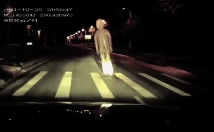
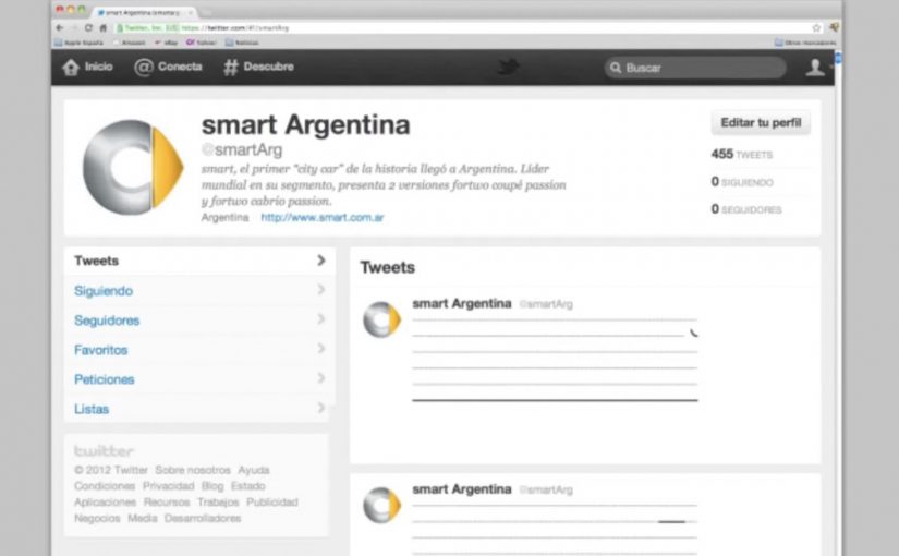
Argentina continues to set the standard in creative Twitter campaigns. In this latest execution, when you visit smart’s official account for Argentina, you might think some kid got in there and had his way with the keyboard. In reality, the feed is built from carefully crafted ASCII art tweets (images built from text characters) that stack into an animated sequence.

A Twitter timeline that behaves like a commercial

The mechanic is simple and slightly mischievous. The smart Argentina team publishes hundreds of ASCII frames as consecutive tweets, then relies on Twitter’s keyboard navigation to “play” them quickly. The result is billed as a Twitter-based animated commercial built from the timeline itself.

In consumer brand social media marketing, repurposing native interface behavior into a brand experience is one of the fastest ways to earn attention without buying more media.

How to watch it the intended way

Visit the smart Argentina twitter account and hold down the “J” key to move rapidly through the tweets and see the flipbook effect. Alternatively, the video below captures the idea as it was meant to be experienced.

Why this works, even though it is “just tweets”

It treats a constraint as a canvas. The 140-character format becomes the production rule, and the feed becomes the screen. That restraint is also the brand fit. A small car brand using a small-message platform to create a big-format effect is a neat piece of coherence. Because the viewer has to actively scroll to make it move, the act of watching feels like participation, which makes the trick easier to remember and repeat. The real question is whether you can make a platform’s native navigation feel like a viewing ritual, not a gimmick.

Extractable takeaway: If the interface can become the playback engine, you can turn a feed into a format, and a format into shareable proof of craft.

Steal the timeline-as-commercial pattern

  • Build the ad out of the platform. If the medium is the message, people are more likely to show others how it works.
  • Exploit one native behavior. Here, a single shortcut becomes the playback engine.
  • Make the payoff legible in seconds. The moment the animation “clicks”, the story tells itself.
  • Let craft signal effort. Hundreds of frames reads as obsession, and obsession reads as share-worthy.

A few fast answers before you act

What is “The Tweet Commercial” in one line?

A flipbook-style animation made from hundreds of ASCII tweets, designed to “play” as you move through smart Argentina’s Twitter timeline.

What role does the “J” key play?

It uses Twitter’s keyboard navigation to advance quickly through tweets, effectively turning the timeline into a fast-scrolling animation reel.

Why is the “world’s first” claim risky to repeat as fact?

Because “first ever” is hard to prove across a platform’s full history. It is safer to treat it as how the work was billed at the time.

What is the transferable lesson for brand teams?

If your platform is saturated with conventional posts, build a sequence that only makes sense in the native interface. The novelty becomes the distribution.

What is the main execution risk if platform behavior changes?

If keyboard shortcuts or timeline behavior change, the “playback” may break. Treat the navigation trick as a bonus, and make sure the idea still holds up when captured as video.

Shell: Pedestrian Ghost

Shell: Pedestrian Ghost

A driver approaches a crosswalk too fast. A “pedestrian” suddenly appears from a manhole cover, then shoots up into the sky like a soul escaping. The only sane response is to slow down.

Speeding cars and pedestrian safety is a huge problem in Ukraine. Ukraine is described as having the highest percentage of pedestrian collisions in Eastern Europe at 56%. To make people think twice about speeding, Shell along with JWT Ukraine created an ambient campaign called the Pedestrian Ghost, a person-shaped helium decoy that appears only when a driver is speeding. The campaign ran during Halloween and generated a lot of buzz over the internet.

A ghost that only shows up when you speed

The mechanism is built for one job. A radar detects an approaching vehicle that exceeds the speed limit. When the threshold is crossed, a hidden device integrated into a manhole cover inflates a person-shaped “ghost” using helium-filled balloons. The figure rises fast and disappears upward, creating a moment that feels like you just hit someone, even though nothing living is harmed.

In dense city streets where drivers routinely treat crosswalks as negotiable, the sharpest safety interventions are the ones that create a visceral consequence in the exact second a bad decision is made.

The real question is how to make speeding feel consequential before harm happens.

Why it lands

It works because it weaponizes surprise without needing explanation. The ghost is unmistakably human-shaped, the timing is unmistakably linked to speed, and the “escape” into the sky reads like consequence. That instant cause-and-effect loop is what resets behavior, at least for the next few blocks. For road-safety messaging, this is the right trade-off: simulate consequence hard enough to reset behavior, but never create real danger.

Extractable takeaway: If you want to interrupt dangerous habits, trigger the intervention only at the violation moment, and make the feedback so immediate and legible that drivers connect cause and effect without being told.

What this crosswalk ghost gets right

  • Trigger only on the infraction. The selectivity makes the moment feel targeted, not random.
  • Use a single, readable symbol. A human silhouette beats a statistic for behavior change.
  • Design for “I have to tell someone”. A story people can repeat in one sentence becomes earned media.
  • Keep the intervention non-injurious. The fear is simulated, the outcome is safe.

A few fast answers before you act

What is “Pedestrian Ghost”?

An ambient road-safety stunt where a ghost-like pedestrian figure rises from a manhole cover at a crosswalk when a radar detects a speeding car, forcing drivers to slow down.

What is the core mechanism?

Radar detects speeding. A concealed device inflates a person-shaped helium “ghost” and releases it upward. The driver experiences an immediate, consequence-like shock without any real harm.

Why does it change behavior better than a warning sign?

Because the feedback is timed to the violation and feels personal. The driver is not being advised. They are being startled at the exact moment of risk.

What is the biggest failure mode if I copy this pattern?

Unreliable triggering. If the effect fires at the wrong time, or too often, people stop believing the cause-and-effect link and the intervention becomes noise.

What is the simplest modern variant?

A violation-triggered intervention that is immediate, physical, and unmistakably tied to speed. For example light, sound, or motion that only activates above a threshold at the crosswalk.

McDonald’s Reflective Billboard

McDonald’s Reflective Billboard

You drive past a billboard during the day and see nothing. Then you pass it again at night, your headlights hit the surface, and a message appears. “Open all night.”

The idea. An ad you can only see at night

McDonald’s wanted to target people looking for a late night snack, so Cossette Vancouver created an ad that only showed itself when the audience was most likely to want it.

How reflective tape turns headlights into a reveal

Reflective tape was used to write “Open all night” on the billboard. The message was not visible during the day, but at night, with car headlights, it was revealed.

For late-night retail and roadside food brands, timed visibility like this turns the placement itself into the filter.

Why this works for late-night intent

This is behavioural targeting without data. The medium uses context instead of audience data to decide when the message becomes visible. Because the message only appears when headlights activate it, the reveal feels timely rather than intrusive.

Extractable takeaway: When the environment can decide who sees the message, the creative can stay simple and still feel precise.

What this does for late-night traffic

The real question is whether the medium can do the filtering before the copy has to. In this case, the billboard spends visibility only on people who are out at night, which makes a simple store-hours message feel more useful and more memorable.

This is a stronger OOH move than a generic night-time billboard because the medium itself makes the message feel useful.

What to steal for context-driven OOH

  • Turn an environmental condition into the trigger. Here, light does the targeting without any data.
  • Align message visibility with intent. If the audience can see it, they are already in the right moment to act.
  • Keep the proposition short and literal. The reveal is the effect, so the copy should be instantly readable at speed.
  • Design for repeat exposure. The “I saw nothing. Then I saw it” contrast is what makes it stick.

A few fast answers before you act

What is the McDonald’s Reflective Billboard concept?

It is a billboard that stays visually “blank” in daylight, but reveals the line “Open all night” when car headlights hit reflective tape after dark.

Why is night-only visibility a smart creative constraint?

Because it aligns the message with the moment of need. People out late are more likely to want a snack, so the ad appears when intent is highest.

What is the key production technique here?

Using reflective tape to create a hidden message that only becomes legible under direct light sources like headlights.

Why does this feel less intrusive than normal targeting?

Because the environment does the filtering. The ad only becomes visible in the right condition, so the timing feels useful instead of forced.

What is the broader lesson for outdoor advertising?

Let context do the targeting. When the medium responds to time, light, or location, the message can feel personalised without collecting data.