Contrex: The Contrexperience

When diet culture repeats, brands look for a better hook

Contrex looked for a way to make the same truth feel like an experience instead of advice.

Every year, magazines announce new fad diets. And each time, the conclusion is the same. It does not work. To lose weight effectively and permanently, one must adopt a balanced diet, drink water, and do regular exercise.

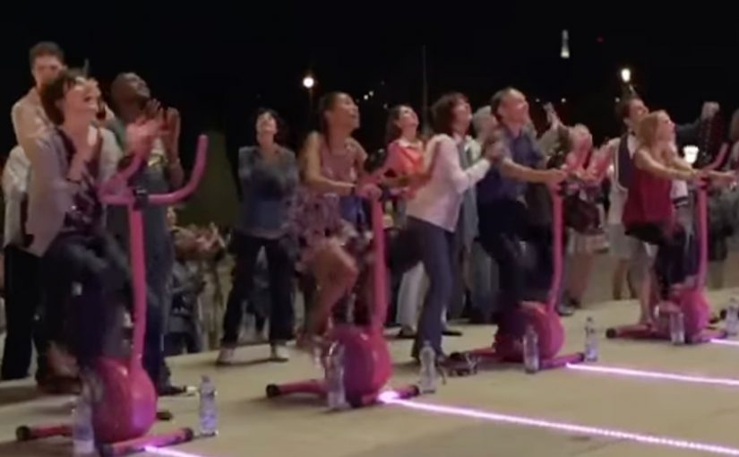
So Contrex, a mineral water brand owned since 1992 by Nestle Waters, decided to create an ambient campaign that showed how losing weight could be fun.

Here, “ambient” means a real-world installation that turns the message into something people do, not something they read.

How the ambient idea turned effort into play

The mechanism was to move the message out of print logic and into physical behavior.

The real question is how to make a wellness behavior feel worth starting now, not merely worth agreeing with.

Rather than telling people to exercise, the campaign created an environment where movement was the point, and where participation delivered a visible, enjoyable payoff. The installation did what most health messaging cannot. It made action feel lighter than intention.

That matters because it turns intention into a felt first step, and felt first steps are easier to repeat.

In European FMCG marketing, “health” messages often fail when they sound like lectures.

Why “fun” can outperform discipline

Fad diets fail for a predictable reason. They demand willpower every day, and they punish slips.

Extractable takeaway: When you need behavior change, design the first step to feel like play, not a test of discipline.

By contrast, play removes friction. When exercise feels like a game, people start without negotiating with themselves. That first step matters because health change is rarely blocked by knowledge. It is blocked by starting.

Contrex used that psychological shift to reframe weight loss from restriction to participation.

The business intent behind making weight loss entertaining

The intent was to connect Contrex with a sustainable, realistic path to wellness, not a temporary fix.

In wellness marketing, lowering the friction to start beats repeating discipline slogans.

By associating the brand with water, movement, and balance, the campaign positioned Contrex as a companion to everyday healthy behavior. In a category where the product is easily interchangeable, that behavioral association is where differentiation lives.

Design moves for your next wellness activation

  • Turn advice into action. If your message is behavioral, build an experience that makes the behavior happen.
  • Design for a low-friction start. The first minute matters more than the perfect plan.
  • Use play as a motivator. Fun can carry people further than discipline messaging.
  • Link brand value to the routine. The brand should feel like part of the habit, not a slogan around it.

A few fast answers before you act

What is Contrexperience?

An ambient campaign by Contrex designed to show that exercise and weight-loss motivation can be fun, not just disciplined.

What problem was Contrex responding to?

Recurring fad-diet cycles that promise quick fixes but do not lead to lasting results.

What was the core mechanism?

Move the health message into a physical, participatory experience that rewards movement and lowers the barrier to starting.

Why does a “fun” approach work in wellness messaging?

Because play reduces friction and gets people moving without requiring constant willpower negotiations.

What is the transferable takeaway for brands?

If your product supports healthy behavior, build experiences that make the behavior feel easy to start and satisfying to repeat.
Opel Movano: File Mover banner

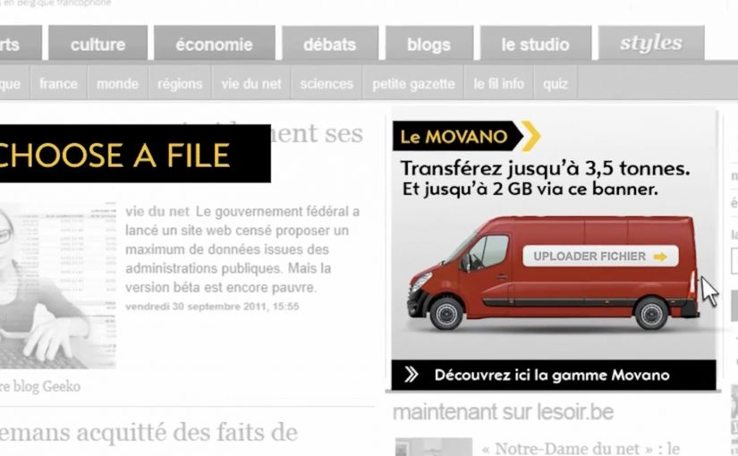
To promote the Opel Movano van range, McCannLowe created a banner that is both useful and innovative. Working like file transfer services such as YouSendIt or WeTransfer, the banner lets users upload up to 2GB of data “into the rear of the van” and send it to someone across the web.

The recipient then gets an email to download the file and learn about the Opel Movano. Simple, practical, and spot-on for the target audience. This is the right kind of B2B creativity because it turns “capacity” into something you can use.

In B2B and SME logistics markets, utility-based advertising wins when the ad itself performs a real job for the viewer. Here, “utility-based advertising” means the ad unit delivers a small, real service before it asks for attention.

When the ad behaves like a service

The smart move is that the interaction mirrors the product story. The Movano is built to carry stuff. So the banner becomes a carrying service for digital “stuff.” That alignment makes the message feel proved, not claimed. The real question is whether your creative can earn attention by doing a job your audience already needs done.

Extractable takeaway: If your product promise is functional, build a functional ad. A banner that does a real task can earn attention without needing a hard sell.

The mechanism: upload, send, deliver

The mechanic is easy to explain and easy to repeat. Choose a file. Upload it into the banner unit. Send it to a contact. The brand payload arrives as part of the delivery moment, which is when the recipient is most attentive. Here, “brand payload” is the branded context and message that rides along with the delivery. Because the brand arrives at the exact moment the task succeeds, the mechanism turns utility into positive brand proof.

In B2B commercial vehicle marketing, utility-first creative tends to work best when it removes friction inside an existing workflow.

Why this is a strong commercial vehicle play

Commercial vehicle advertising often struggles because capabilities blur together. This execution dramatizes “capacity” in a way people can feel immediately, and it does it in the same environment where business users already move files and coordinate work.

Service-first takeaways for B2B banners

  • Make the benefit experiential. If the product carries, let the ad carry.
  • Keep the flow obvious. One task, one outcome, no learning curve.
  • Use the recipient moment. Delivery creates a second touchpoint that feels useful, not intrusive.
  • Match the utility to the audience. File sending is naturally relevant for business users.
  • Keep branding inside the service. The brand should feel like the enabler, not the interruption.

A few fast answers before you act

What is the Opel Movano “File Mover” banner?

It is an interactive banner that works like a file transfer tool. Users upload a file into the banner, send it, and the recipient receives an email to download the file along with Opel Movano information.

Why is “utility” such a strong creative strategy in B2B?

Because it earns attention through usefulness. A business audience is more likely to engage when the ad helps them do something real, even briefly.

What makes this different from a standard lead-gen banner?

The value exchange is immediate. The user gets a working service, and the brand message is attached to the service delivery rather than gated behind a form.

What’s the biggest execution risk in a “service banner”?

Reliability and trust. If uploads fail, emails do not arrive, or the experience feels unsafe, users abandon quickly and the brand takes the blame.

How could a brand update this idea today?

Keep the same principle. Offer a real micro-service inside the ad unit. Then design the handoff so it is fast, secure, and clearly permission-based.

Steve Jobs 1955 – 2011

On 06/10/2011 my day starts at 5:30am. Blurry eyed, I press the home button on my iPhone, and the first thing I see is a push notification from NDTV India: “Steve Jobs, Apple’s visionary, dies at 56.”

The next few seconds feel like some invisible force knocks the air out of me. The Newton equivalent from the modern world is just gone in a blink of an eye. By “Newton equivalent” I mean a once-in-a-generation inventor whose work changes how ordinary people live.

While all the social channels flood with people sharing the news, all I can do is post a few tribute pictures on Facebook. I want to write a few lines about it on Ramble, but I sit speechless throughout the day. In fact the days that follow feel similar, and I cannot find the words to pen down anything, that is until now.

The real question is what a tribute has to do to feel earned.

Two tributes that feel right in this moment

Of the dozens of memorial photos and videos created to honor Steve Jobs, I keep coming back to the following as the most appropriate for the occasion.

Mechanism-wise, both tributes rebuild a public feeling from familiar materials. One uses sounds and a voice people associate with Apple products. The other uses a simple office material to create something large, collective, and visible.

In global consumer-tech culture, where product design quietly rewires daily habits, tributes built from the culture itself tend to feel the most honest.

A tribute earns its place when it demonstrates craft and restraint, not when it tries to explain impact with adjectives.

1) AzR’s Apple-sampled tribute

A musician who calls himself AzR creates a video built from sounds sampled from Apple products and Steve’s 2005 Stanford commencement speech. Sampling here means recording short sounds from devices and using them as instruments in a new composition. Every instrument, including drums, is sampled from a Mac product, tuned by ear, and replayed in the context of the song.

2) 4,001 Post-it Notes in Munich

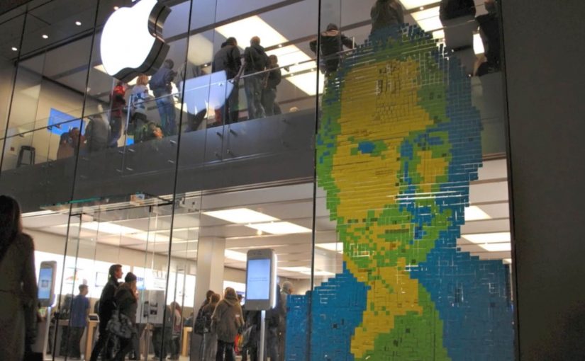
Fans in Germany find a wonderful way to express their respect. They create a portrait of Steve Jobs out of 4,001 Post-it Notes. The portrait adorns the front-facing glass walls of an Apple Store in Munich, Germany.

Why these tributes land

They do not ask you to agree that Steve Jobs mattered. They let you hear and see how his work lives inside everyday objects and shared spaces. That mechanism makes the respect feel physical rather than rhetorical.

Extractable takeaway: If you want a tribute to travel, build it from the same materials the person put into the world, then make it simple enough to share in one listen or one glance.

What stays with me

To sum up, I am glad to have lived in a period of world history that witnessed Steve Jobs change the world.

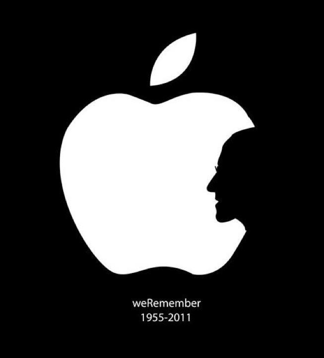
We remember Steve Jobs

How to make a tribute feel earned

  • Start with a material. Use a concrete artifact, a sound, a tool, a place, then build the tribute around it.
  • Make it shareable fast. If it does not land quickly, it will not travel.
  • Let people participate. The Munich wall works because many hands make one face.
  • Keep the words minimal. Craft carries more respect than adjectives.

A few fast answers before you act

What is this post about?

It is a personal note from the morning I saw the news, plus two tributes that capture why Steve Jobs mattered to people.

Which two tributes are highlighted?

AzR’s music video built from sounds sampled from Apple products and Steve Jobs’ 2005 Stanford commencement speech. A 4,001 Post-it Notes portrait on an Apple Store in Munich, Germany.

Why does the Apple-sampled video work?

It turns familiar device sounds and a familiar voice into a new piece of music. That craft makes the tribute feel earned rather than narrated.

Why does the Munich Post-it portrait stand out?

It is physical, collective, and public. It turns respect into a visible act that other people can walk past and feel.

What is the simplest takeaway?

Some people do not just build products. They reshape culture and daily behavior. When they are gone, you feel the absence immediately.