
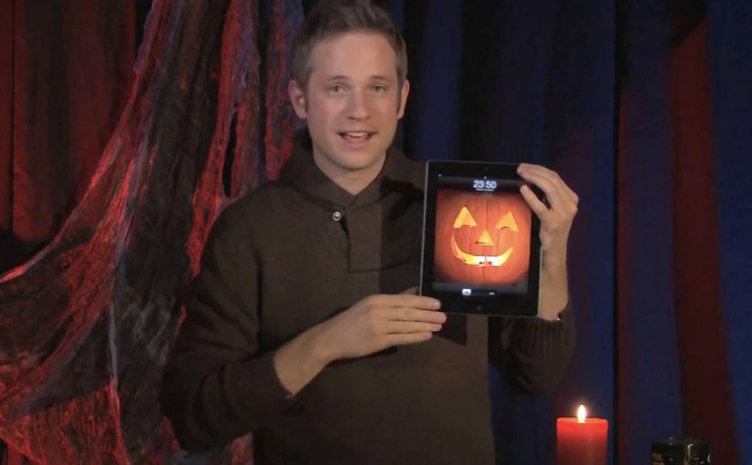
Simon Pierro: iPad Horror Halloween magic

Simon Pierro is a performance artist known for a contemporary style that blends live sleight of hand with screen-based illusion. In this Halloween edition of his iPad magic, he mixes physical tricks with carefully constructed digital wizardry to tell a short, creepy story. Here, “iPad magic” means coordinating physical moves with a pre-built on-screen sequence so the screen appears to affect the real world in one continuous event.

What you are actually watching

The hook is not “an iPad doing magic.” It is the choreography between two realities. One is the real-world performance in front of the camera. The other is the pre-built digital sequence on the iPad screen. When the timing is perfect, the boundary disappears and the viewer’s brain treats the composite as one continuous event.

The mechanism: timing, framing, and a believable interface

The iPad acts like a stage prop with rules the audience already understands. You can swipe, tap, and reveal. Pierro then exploits those expectations with tight timing, camera framing, and transitions that make the screen feel like a portal rather than a display. Because the interface behaves the way people expect, the viewer accepts more impossible outcomes without pausing to question the edit.

In consumer tech culture, touchscreen-first illusions travel because they compress surprise, proof, and shareability into a single loop.

The real question is whether the experience makes the screen feel like a believable tool, not a special effect.

If you want this pattern to travel, you have to design the interface logic before you design the surprise.

Why it lands: story first, tricks second

This is not just a reel of “look what I can do.” The Halloween framing gives each beat a reason to exist. That narrative spine matters, because it turns the tricks into plot points. The viewer stays to see what happens next, not only to decode the method.

Extractable takeaway: The most replayed “tech magic” works like product UX. One clear action, one clear consequence, then escalation. The audience always knows what they are supposed to feel, even if they do not know how it is done.

The business value behind a short viral performance

For a performer, this format does three jobs at once. It demonstrates craft, it demonstrates a distinctive signature style, and it creates a video object people want to pass along. That combination is stronger than a traditional showreel, because the concept is the brand.

What to steal if you build interactive experiences

  • Use familiar gestures as narrative verbs. Swipes and taps can carry meaning, not just navigation.
  • Design the “interface logic” first. The illusion is more believable when the screen behaves the way people expect.
  • Escalate in clean steps. Each beat should be slightly more impossible than the one before.
  • Keep the frame disciplined. The camera is part of the trick. Composition is not optional.
  • Wrap the mechanic in a story. Theme creates patience, and patience creates replays.

A few fast answers before you act

What is “iPad magic” in practical terms?

It is a performance format that coordinates physical sleight of hand with a pre-built on-screen sequence, so the screen appears to affect the real world in a continuous way.

Is this augmented reality?

Not in the typical “live 3D overlays in your environment” sense. It is closer to choreographed digital illusion and camera-based compositing, designed to feel like the screen is interacting with the performer.

Why do these videos get rewatched?

Because they deliver a fast surprise, then invite the viewer to hunt for the method. The best ones also add a narrative reason to stay until the end.

What is the most important design principle behind this style?

Believability of the interface. If the screen behaviour feels consistent and intuitive, the viewer will accept more impossible outcomes.

How can brands use this pattern without copying the trick?

Build short, gesture-driven micro-stories where one touch creates a visible transformation. Keep the logic simple and the payoff immediate, then escalate once.
Nike: Jordan Melo M8 Water Projection

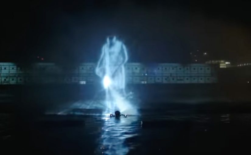
I have seen plenty of projection mapping in the last year or so, but this Nike execution for the Jordan Melo M8 takes a different route. Instead of treating a building as the canvas, it turns the Hudson River into the screen and uses a water curtain to make the visuals feel alive. A “water curtain” is a thin sheet of mist or falling water used as a temporary projection surface.

Trade coverage describes the launch as a live event at Pier 54, where a crowd gathered for performances and then got hit with a large-scale water projection moment featuring Carmelo Anthony and the Melo M8, layered with mapped effects that made the “explosive” theme feel physical.

When projection mapping stops being “mapping”

The mechanic is simple and smart. Water gives you motion for free, so the visuals do not need to do all the work. Every splash, ripple, and mist edge amplifies the animation and makes the illusion feel bigger than it would on a flat wall.

It also creates a built-in contrast. The shoe is a hard, engineered object. The canvas is fluid and unpredictable. That tension is what makes people stare.

In global sportswear launches, the fastest way to earn attention is to make the product reveal feel like a public event, not a private ad.

Why the water screen is the brand message

The most important thing this stunt communicates is not “this is a new shoe”. It is “this is an event-level product”. The audience reads production scale as product importance, especially in a category where new drops appear constantly.

Extractable takeaway: If the reveal mechanic is instantly retellable and the footage visibly signals scale, you get product importance and distribution without needing to explain a single feature.

The real question is whether the spectacle gives people a story they can repeat that makes the drop feel inevitable.

Using water also supports the narrative hook that appears in reporting around the event. Melo “walks on water” as a visual flex. Whether you call it projection, illusion, or theatre, the point is the same. The launch gives people a story they can retell without describing a single feature.

Business intent

This is launch-week acceleration. Get a live crowd. Create a spectacle that looks unreal on camera. Seed the footage. Then let the audience do the distribution, because the clip is more shareable than a standard product film.

Steal this from water-screen projections

  • Choose a canvas that adds value. Water, smoke, ice, and mirrors all contribute “movement” that visuals can ride.
  • Make the environment part of the claim. A river-scale reveal says “major” before any copy does.
  • Design for the recap video. If it does not look unbelievable on a phone screen, it will not travel.
  • Give people one sentence to repeat. “They projected Melo and the shoe onto the Hudson” is enough.

A few fast answers before you act

What is a water screen projection?

A water screen projection uses a thin curtain of mist or falling water as the surface. A projector throws imagery onto it, creating a floating effect that feels more dimensional than a wall projection.

Why does projection on water feel more “real”?

Because the surface moves. Ripples and spray add natural variation, so the visuals feel integrated with the environment rather than pasted onto it.

What makes this kind of stunt effective for a product launch?

It signals importance through scale, creates immediate talk value, and produces recap footage that performs better than a standard reveal because it looks like an event, not an ad.

What is the main operational risk?

Reliability. Water, wind, sightlines, and crowd control can all degrade the experience. If the image is not crisp and the moment does not land fast, the spectacle becomes confusion.

What metrics matter most?

Earned pickup, social share rate of the hero clip, completion rate, and correct retelling of the mechanic. If people remember “Hudson water projection” and connect it to the shoe, the stunt did its job.

Volkswagen Beetle: Juiced Up

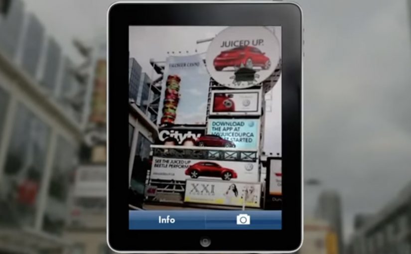
A billboard looks normal until you point your phone at it. Then the Beetle “juices up” into a 3D scene that spills out of the frame, turning a static poster into something you can explore.

That is the twist behind Volkswagen’s Beetle “Juiced Up” launch, created with Red Urban. Traditional out-of-home placements like billboards and bus shelters double as augmented reality markers. Download the custom app, scan the printed ad, and a 3D experience unlocks on your screen.

An AR marker is a printed visual pattern that a camera can recognize. When the app detects it, it anchors digital 3D content to the real-world poster so the animation appears to sit on top of the physical ad.

The best out-of-home work turns “I noticed it” into “I did something with it”, without asking people to learn a new behaviour.

Why AR markers work so well in out-of-home

Out-of-home already has the two things AR needs. Scale and repetition. People pass the same placements multiple times, which makes it easier for curiosity to build. Once someone scans, the experience feels like a hidden layer you only get if you engage. In global consumer brands running large-scale launches, out-of-home works best when it functions as a repeated trigger, not a one-time impression. A revamp is hard to communicate through copy alone. A 3D reveal makes the “newness” feel more tangible, even if the viewer only plays for a few seconds.

Extractable takeaway: Treat the physical placement as the interface. Make the first scan feel like the poster is “unlocking”, and keep the payoff immediate so the viewer control feels effortless.

What this launch is really optimizing for

This is not just about feature education. It is about reframing the Beetle’s personality and making the redesign feel more assertive and contemporary. The real question is whether your out-of-home is only a reminder, or a trigger that rewards interactivity. The app is a proof device, meaning it proves “this is different” by behaving differently than a normal poster campaign. This approach is worth doing only when the interaction reinforces the product story, not when it is novelty for its own sake.

What to steal for your next OOH-led activation

  • Make the trigger obvious. A single prompt, scan here, is enough. Let the payoff do the persuasion.
  • Anchor the interaction to the medium. If it is out-of-home, the phone should feel like a lens on the poster, not a separate experience.
  • Keep the first moment fast. If the 3D reveal does not land immediately, the novelty collapses.
  • Design for “I have to show you”. The best activations create a demo impulse that spreads in person.

A few fast answers before you act

What is “Volkswagen Beetle: Juiced Up”?

It is an out-of-home launch activation where Volkswagen posters and billboards act as AR markers. A dedicated mobile app unlocks a 3D Beetle experience when viewers scan the ads.

Why use AR markers instead of a standard QR code?

Markers make the poster itself the interface. That keeps the experience visually seamless, and it helps the 3D content feel physically attached to the real ad.

What is the main benefit of this approach for a product revamp?

It makes “newness” experiential. A 3D reveal can communicate attitude and redesign energy faster than a feature list.

What is the biggest practical risk with AR OOH?

Friction. If the app install and scan flow is slow, most people will not complete it. The reward has to justify the effort quickly.

What is the simplest way to improve completion rates?

Reduce steps and increase immediate payoff. Clear instruction at the poster, fast recognition, and an instant 3D moment that feels worth showing to someone else.