Foursquaropoly: Real-World Monopoly via Foursquare

Can you imagine playing a real-world version of Monopoly wherever you go, 24/7. A bunch of students decide to explore exactly that, and the result is a concept video that mashes up Foursquare-style check-ins with classic Monopoly rules.

Mechanic in plain terms: your location becomes the board. You “move” by going places, you “claim” by checking in, and ownership plus rewards become part of everyday movement through a city.

In mobile-first consumer experiences, location-based play works best when it turns routine movement into a simple loop of progression, competition, and collectible status.

Why it lands

It takes an abstract board game and makes it instantly legible in the real world. Because the check-in becomes both the move and the proof, the player gets status feedback without learning new controls. The joy comes from recognition. Streets become properties, venues become squares, and everyday decisions get a light layer of consequence. The real question is whether you can keep the loop fair and legible once real places and real rewards enter the rules.

Extractable takeaway: When you translate a familiar game into a real-world experience, keep the rules understandable in one sentence and the feedback immediate. The faster a player can see “what I did” and “what it unlocked,” the longer the concept stays sticky.

What this hints at for brands

The intriguing angle is not just “Monopoly in the streets.” It is the reward layer. By “reward layer,” I mean a simple, visible benefit attached to a check-in. Brands could join in by sponsoring virtual rewards that are redeemable for real-world objects, using check-ins as the trigger and redemption as the payoff. Done carefully, the value exchange is clear: attention and footfall in return for something tangible. This works best as an opt-in, time-boxed layer, not a permanent loyalty system.

Steal these mechanics for location activations

  • Turn geography into progress. Make “being somewhere” the action, so participation feels effortless.
  • Use scarcity that maps to reality. Limited locations, limited time windows, and visible ownership are more compelling than generic points.
  • Reward the behavior you actually want. If you want visits, reward arrivals. If you want repeat, reward streaks and routes.
  • Keep the redemption simple. The moment the payoff is confusing, the game stops being a game and becomes admin.

A few fast answers before you act

What is Foursquaropoly?

A concept for turning Monopoly into a 24/7, location-based game where check-ins and real-world movement replace dice rolls and board squares.

Why is Monopoly a good fit for a real-world location game?

Because it already maps cleanly to places, ownership, and rivalry. Those ideas translate naturally into neighborhoods, venues, and repeat visits.

What makes a location-based game loop feel sticky?

It feels sticky when each check-in produces immediate feedback, such as status or ownership, and the rules stay understandable without a manual.

How could brands participate without breaking the experience?

By sponsoring rewards that feel additive, such as limited-time bonuses at specific locations, and keeping the rules consistent so the game still feels fair.

What is the biggest risk in making this real?

Player fatigue and confusion. If the rules are too complex or the rewards feel arbitrary, people stop understanding what to do next and the loop collapses.

IAA 2011: Walk of Innovations

I was at the IAA 2011 this Saturday, and I got a glimpse of our automobile future. It felt awe-inspiring. Almost all electric. Fully computerized. Interactive dashboards and even window displays.

But while I looked at the cars with amazement, I kept a close look out for innovative implementations of “today’s” cutting-edge technologies. I was curious to see how car makers use touch displays, social media, QR codes, and augmented reality to engage visitors at such a massive event.

Here, augmented reality means a phone-triggered digital layer added on top of a physical object or display.
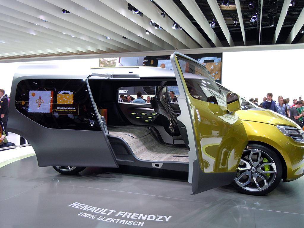
Renault Frendzy. 100% Electric

Here is a quick photo report of what I found interesting and innovative at the show.

Volkswagen
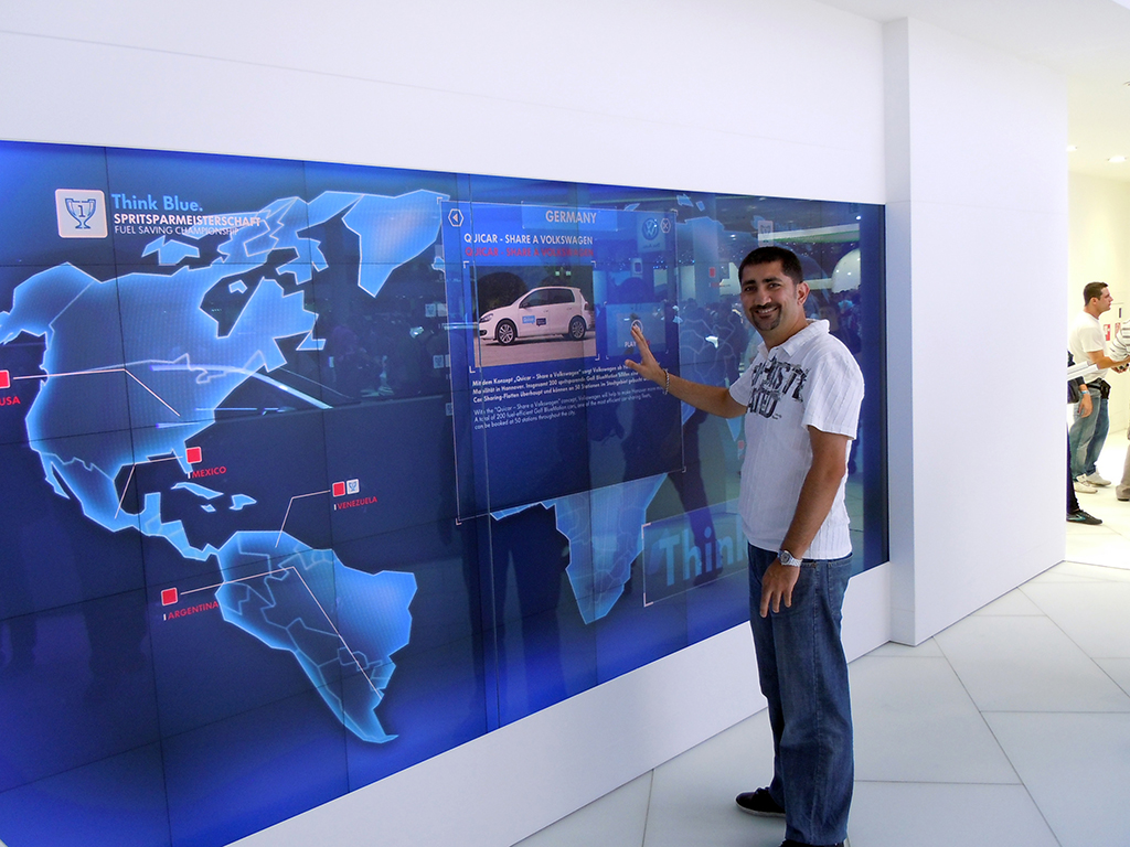
Volkswagen Interactive Motion Display

The Volkswagen BlueMotion technology was presented through a huge motion-based interactive display. Visitors did not need to touch the display. They used various gestures to navigate through the menu options.

Renault
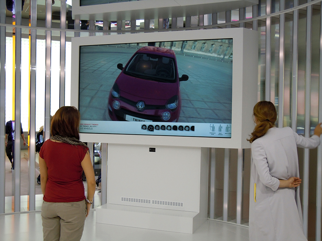
Renault Twingo

Visitors used the motion-based interactive display to learn more about the Renault Twingo. They could also change the colors of the model and watch demo videos.

Hyundai
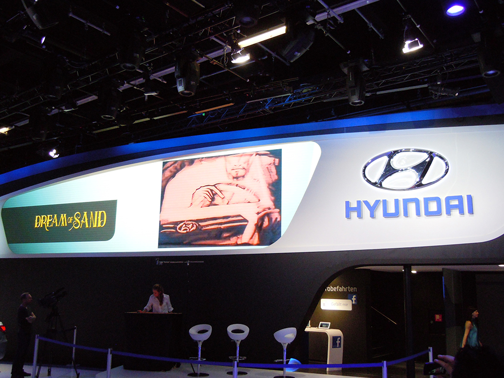
Dream of Sand

The main draw at the Hyundai stall was the “Dream of Sand” show by Svetlana Goncharenko and Natalya Netselya, who created vivid pictures in real time using sand.

Hyundai was also one of the only car brands trying to connect the stand with Facebook. Visitors needed to “Like” the Facebook page in order to be part of a lucky draw that gave them a chance to drive a Hyundai dream car. Important details like the fan page URL and contest information were not visible, or not easily accessible.

Skoda
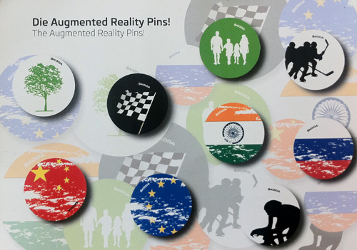
Skoda Augmented Reality Pins

Skoda gave visitors augmented reality pins. The Junaio AR app was used to scan the pin and activate the augmented reality. Most of the pins were gone by the time I got there, so I scanned the info card instead. It did not trigger the 3D surprises that the pins would, but it did offer a set of regional videos.

Citroën
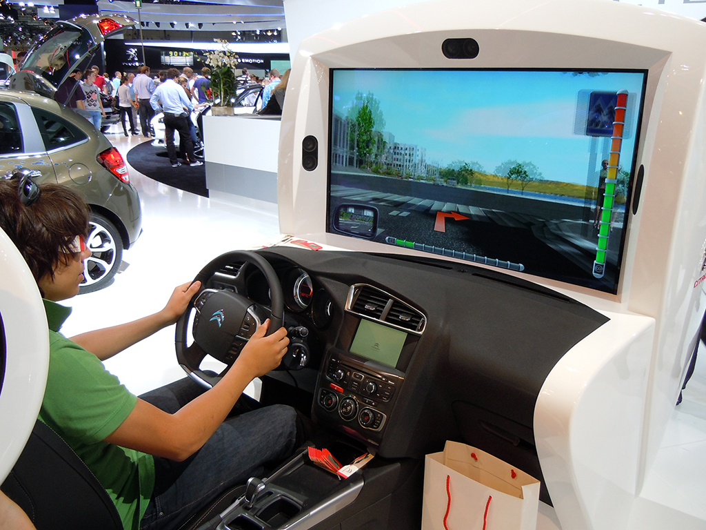
Citroen Eco Drive

At the Citroën Eco Drive simulator, visitors could take the car for a 3D test drive.
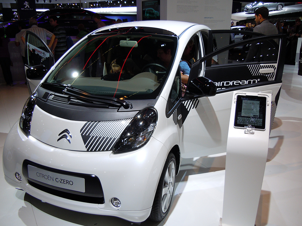
Citroen C-Zero

iPads were used by many car manufacturers to interactively share model specifications, videos, brochures, and to take automated enquiries from high-potential buyers.

Opel
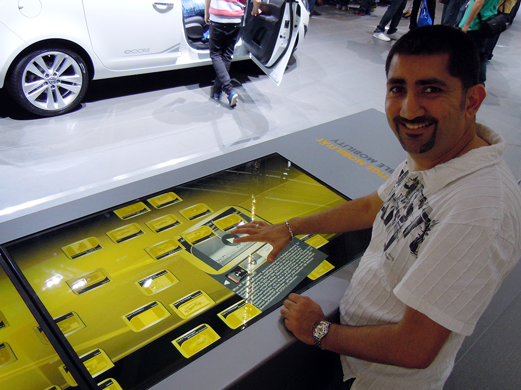
Opel Microsoft Surface setup

Opel used Microsoft Surface technology to share information about its cars. This was my first live experience with Surface. It worked much like the Apple touch interface, even though it did not feel as sensitive and smooth.

Ford
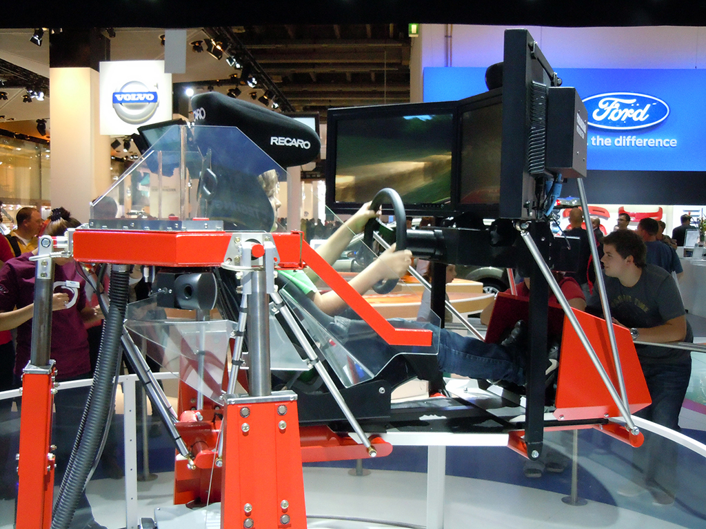
Ford Simulator

Ford, like Citroen and Volvo, set up a car simulator at its stand.
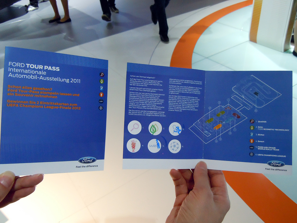
Ford Stamps

They also engaged visitors with a small “collect the stamps” game. The game made visitors go to each section of the Ford stand, correctly answer some easy questions related to the car and technology, collect the stamps, and get Ford-branded water bottles. Visitors could also play further and win two tickets for the UEFA Champions League Final in 2012.
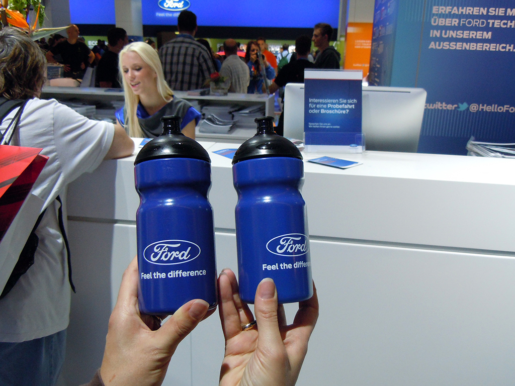
Ford Bottles

Chevrolet

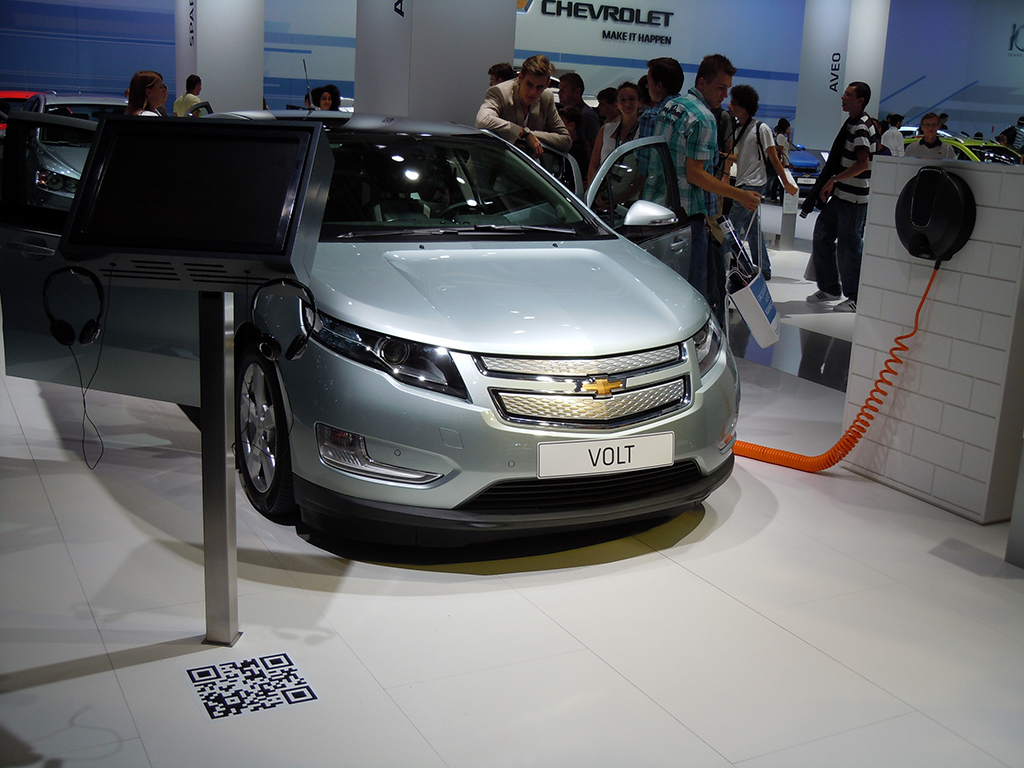
Chevrolet Volt

Visitors could scan the QR code on the floor to view a short Chevrolet Volt specs video.

Volvo
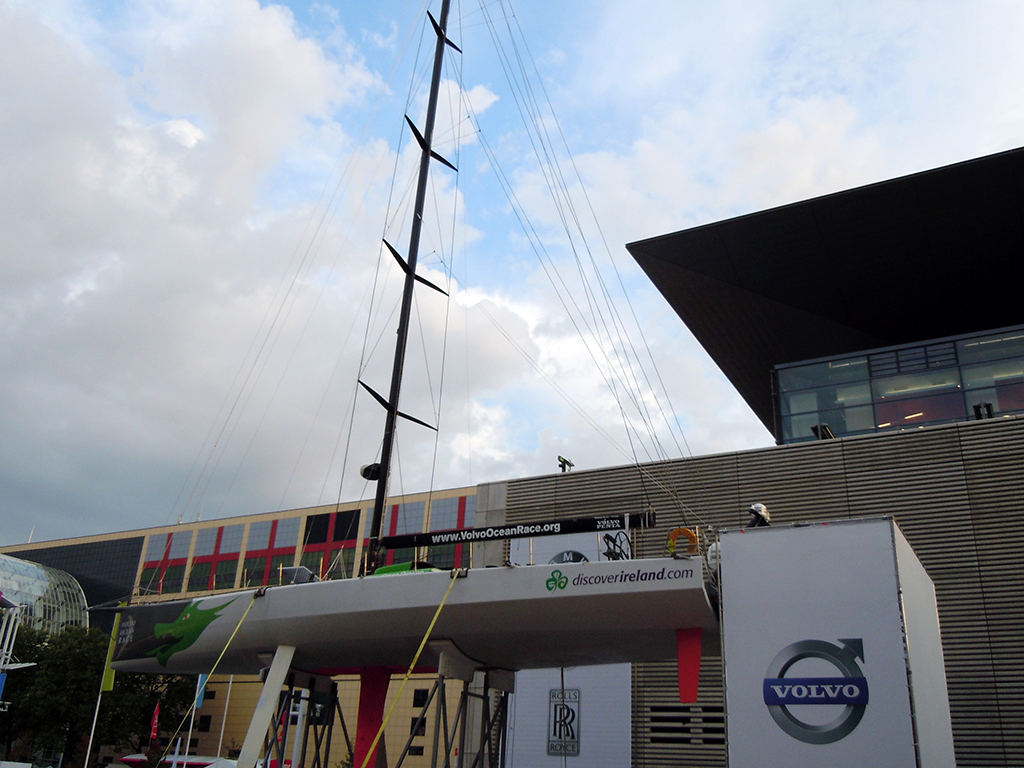
Volvo Sailing

The Volvo Open 70 Simulator gave visitors a first-hand experience of what the Volvo sailing team goes through when they go sailing in the ocean.
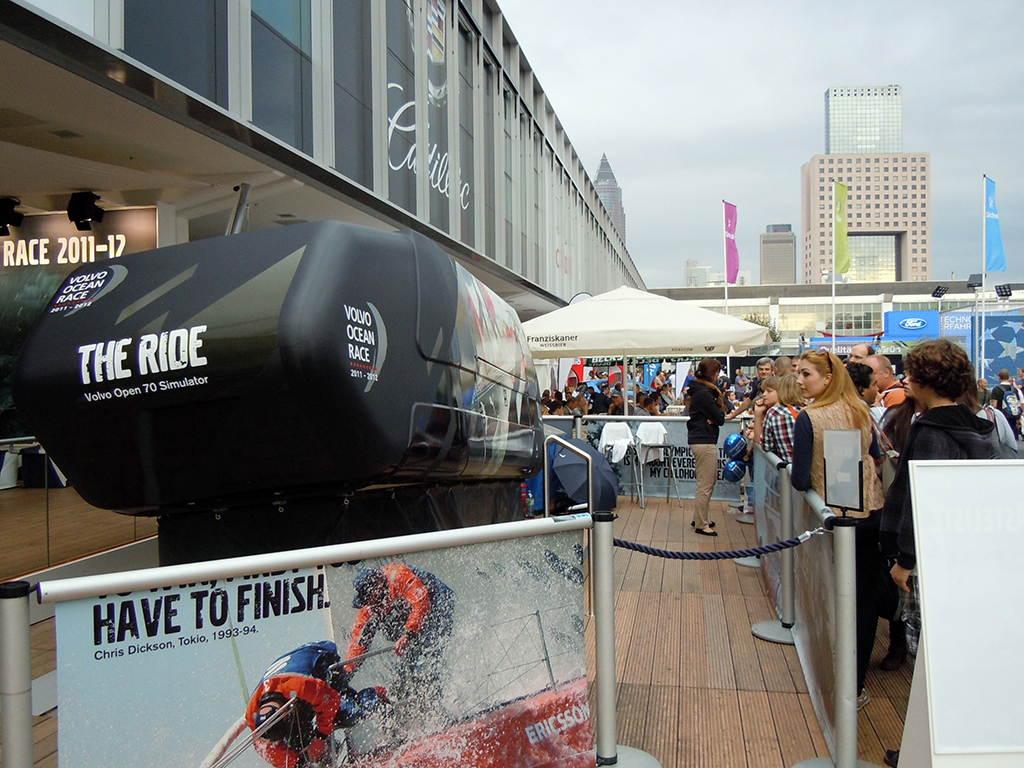
Volvo Sailing Simulator

On taking the ride I slid steeply from left to right on the seat. There was also non-stop wind blowing on my head, with regular splashes of water. It created a strong 4D-style experience. By 4D-style, I mean the simulator added physical effects like motion, wind, and water to the visual ride.

Visitors could also try to hoist a virtual sail. On my second attempt I hoisted the sail in 12.3 seconds. The current record was set at 9.03 seconds by one of the previous visitors.
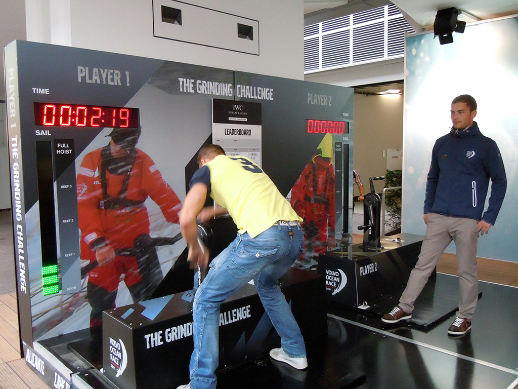
Volvo Sail Hoisting

Mini Cooper

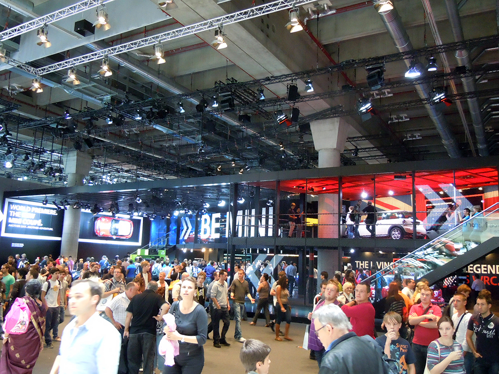
Mini Cooper stand overview

I really enjoyed visiting the Mini Cooper stand. The displays were amazing. A beautiful Mini surrounded by a bright circular display appeared as one entered the stand.
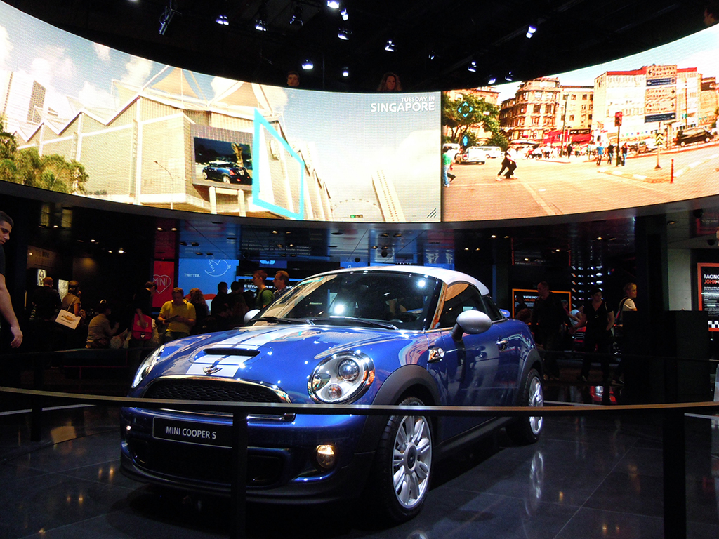
Mini Display

Minis in multiple colors were on display with various digital displays across the walls.
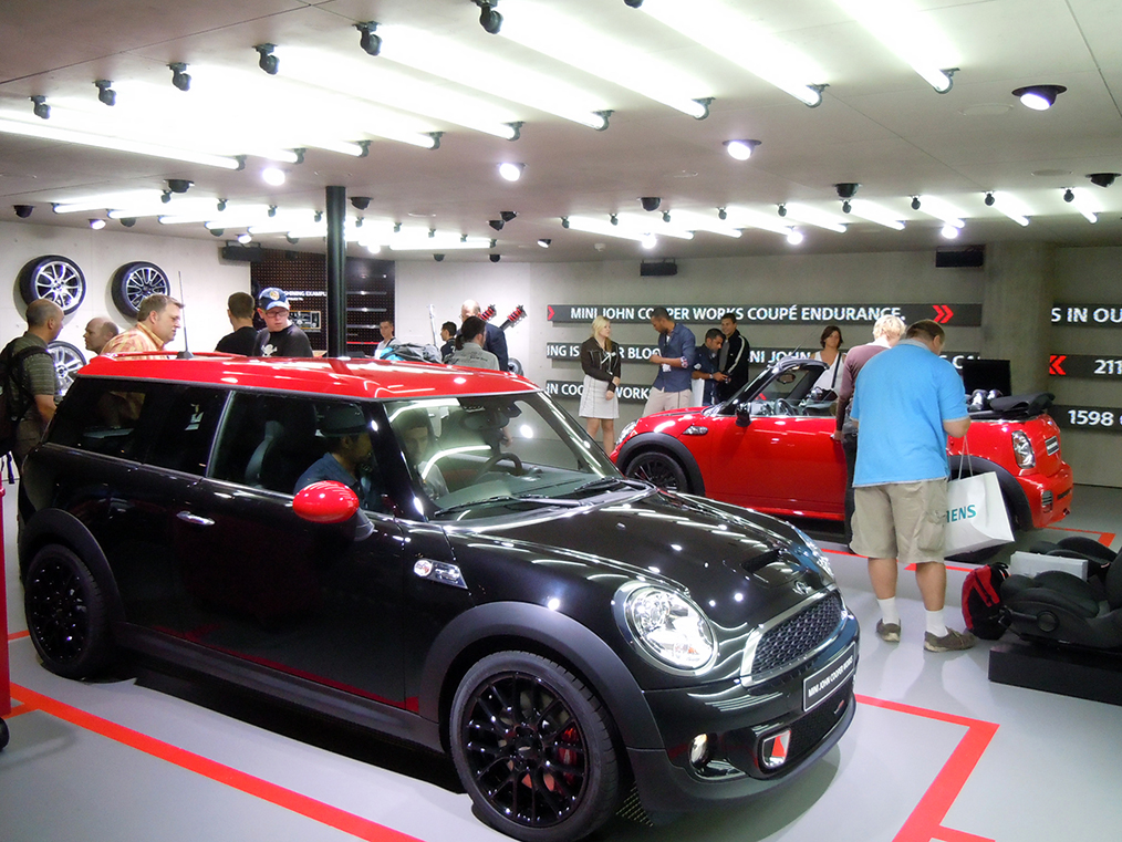
Mini Cooper multiple cars and wall displays

They also showcased their new iPhone app for the car, positioned as the intelligent link between the driver and the Mini. The app claimed to help the driver perfect a more sporty and precise driving style.
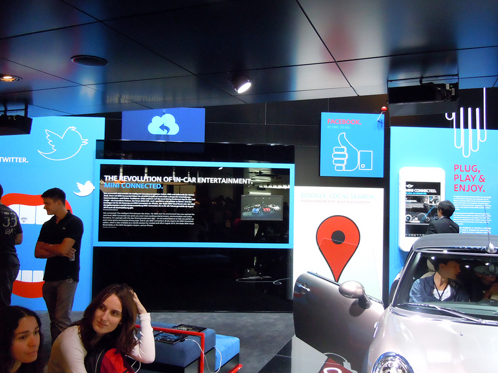
Mini iPhone App

I also spotted Lancia, Fiat, and Alfa Romeo promoting their iPhone apps via simple leaflets.
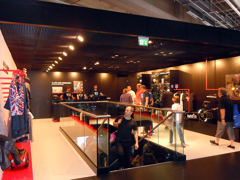
Mini Souvenirs

A souvenirs section greeted visitors on the first floor of the stand.
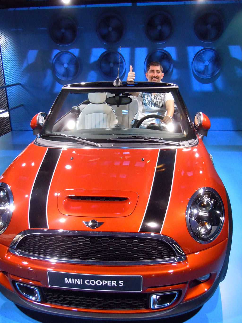
Got my Mini

In the end I got to drive my own Mini!

BMW
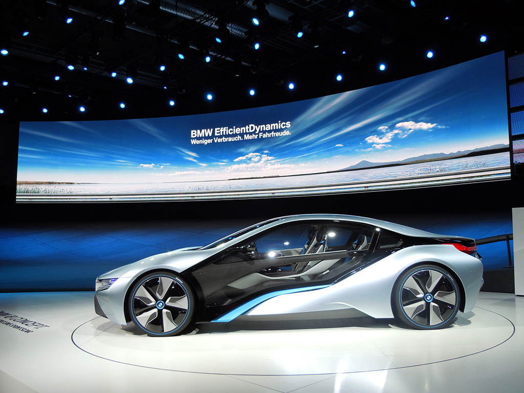
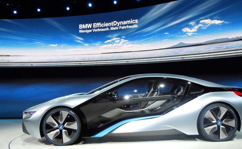
BMW. Mission Impossible Ghost Protocol car

The BMW stand was the biggest in terms of size and digital displays. Two of the most stunning concept cars from IAA were here. The car from the photo above appears in the Hollywood blockbuster “Mission Impossible: Ghost Protocol.”
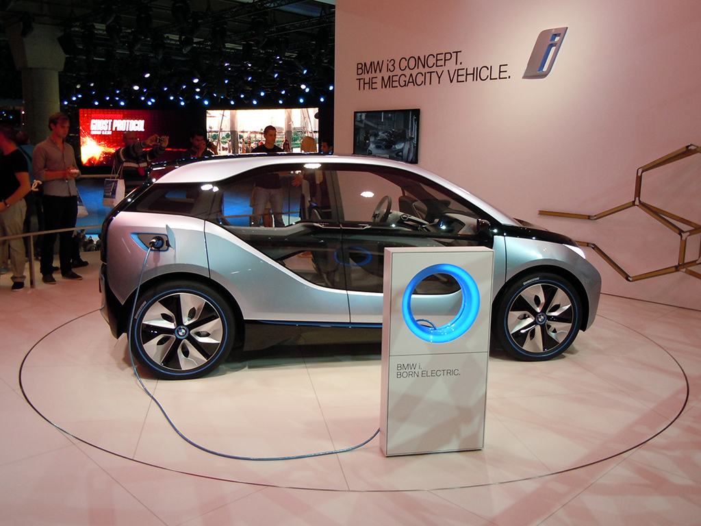
BMW i3 Concept

At the BMW i3 Concept city car area, I found an interactive telescope through which I could watch videos and product demos. To select a video, I had to move the telescope around and point it at what I wanted to play.
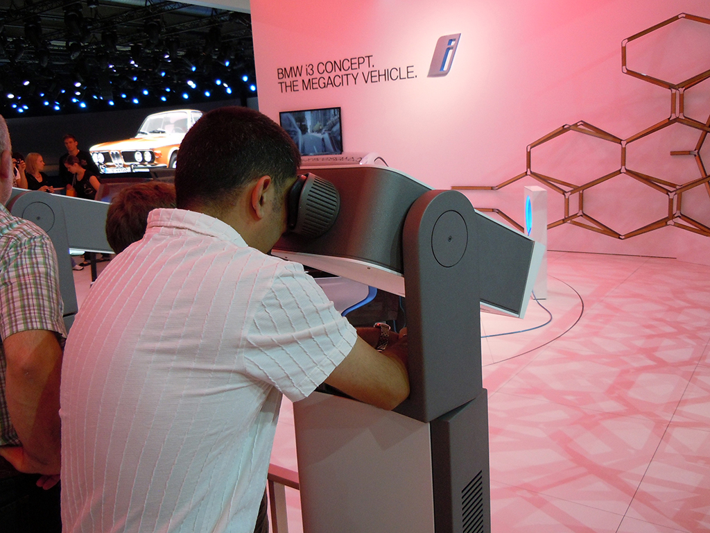
BMW i3 Concept Presentation via Interactive Telescope

Why the most memorable stands worked

The strongest activations turned product messaging into something visitors could do, not just watch. That worked because a gesture, a simulator ride, a scan, or a simple challenge gave the innovation a clearer mental hook and made the brand easier to remember after the show.

Extractable takeaway: At live events, technology earns its keep when it simplifies the story into one obvious action that visitors can try for themselves.

At large automotive trade shows, brands win attention by turning passive footfall into small, guided acts of participation.

The real question is not whether a stand looks futuristic, but whether the technology gives visitors a clear reason to interact, learn, and remember.

The best stands used technology as participation, not decoration.

Closing note from the show floor

I spent seven hours at IAA. It was totally awesome. The only car stalls I could not visit were those of Mercedes and Audi. There were simply too many people crowding those stands, and if I had waited, I would have missed at least half of what else I saw during my time there.

I look forward to the next Internationale Automobil Ausstellung in two years. Till then, this is Sunil signing off from IAA 2011.

What event teams can steal from IAA 2011

  • Make innovation physical. The strongest stands gave visitors something to do, whether that meant gesturing at a screen, taking a simulator ride, scanning a code, or testing a device.
  • Reward exploration. Ford’s stamp mechanic turned stand navigation into a simple game with a visible payoff.
  • Remove friction from participation. When key details are hard to find, as with Hyundai’s Facebook activation, the idea loses force.

A few fast answers before you act

What is this post?

A photo report of IAA 2011, focused on practical uses of touch, motion control, social mechanics, QR codes, and augmented reality on brand stands.

What is the single strongest engagement pattern across stands?

Interactive interfaces that pull visitors into exploration. Motion-based screens, simulators, and hands-on experiences that create a reason to stay.

Which activations stand out most?

Volkswagen’s gesture-based BlueMotion display. Volvo’s Open 70 sailing simulator with wind and water. Ford’s stamp-collection game that drives exploration.

Where does mobile show up most clearly?

Brands promote iPhone apps via leaflets and app demos, plus iPads used widely for specs, videos, and lead capture.

What is the practical takeaway for event experience design?

If you want people to engage at scale, make the interaction obvious, physical, and rewarding. Then make the next step easy to find.

REHAU: Money Rain

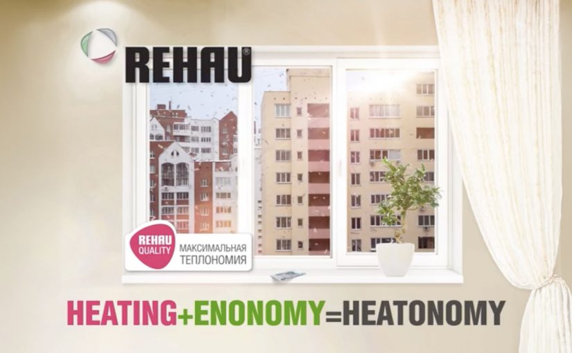
Someone opens a window in winter and starts throwing banknotes into the street. Not a metaphor. Actual money, drifting down like confetti.

That is the demonstration Voskhod builds for REHAU windows. Utility bills keep climbing, and poorly sealed windows turn heat into waste. So the campaign makes the waste visible by “throwing money out of the window”, literally, from low-quality windows. It is a street-level proof that translates heat loss into something anyone can recognize instantly.

Making heat loss look like cash loss

The mechanic is blunt by design. If heat is leaking through your window, your heating budget is leaking too. The stunt turns an invisible inefficiency into a visible spectacle, then ties the solution to REHAU windows and the campaign line “Heatonomy”, a label for treating heat-saving as household economics rather than technical performance.

In cold-climate home improvement markets, the most persuasive product stories convert invisible energy inefficiency into a simple, observable loss that people can picture in their own home.

The real question is how do you make invisible energy waste feel immediate enough that people stop treating better windows as a technical upgrade and start seeing them as basic household economics?

Why it lands as public theatre

The idea works because it skips technical education and goes straight to lived consequence. People do not need U-values or thermal imagery to understand money falling onto the pavement. The spectacle also makes the press angle easy. A strange, concrete act in a familiar setting, with a clear explanation attached. The legacy write-up describes extensive earned coverage and a nationwide reach figure, framed as the campaign’s outcome.

Extractable takeaway: When your product fixes an invisible problem, create a one-scene demonstration that makes the cost of “doing nothing” undeniable, then anchor the solution in a single line that people can repeat.

What REHAU is actually selling

It is not just windows. It is control over household economics in winter. The campaign positions better windows as a direct hedge against rising heating costs, and it gives people a language hook, “Heatonomy”, to describe the benefit without getting technical.

What home-efficiency brands should steal

  • Turn abstraction into a physical proxy. Heat loss becomes cash loss, instantly understood.
  • Build a stunt the media can summarize in one sentence. If it cannot be repeated cleanly, it will not travel.
  • Keep the solution adjacent to the spectacle. The product has to be the obvious answer, not an afterthought.
  • Give the audience a compact label. A coined term can help people remember and share the benefit.

A few fast answers before you act

What is the “Money Rain” idea?

A public stunt that demonstrates heat loss by throwing real money out of low-quality windows, framing wasted heat as wasted cash, then linking the fix to REHAU windows.

What does “Heatonomy” mean in this context?

It is presented as a shorthand for heating economy. A way to express savings from reduced heat loss without technical explanations.

Why does a stunt work better than a technical comparison here?

Because the problem is normally invisible. A visceral proxy creates instant understanding and makes the message repeatable by viewers and press.

What results did the campaign claim?

The legacy description reports broad media pickup, a total of 240,000 rubles thrown, and reach “over 40 million Russians”. Treat these as campaign-reported figures unless you have primary reporting you want to cite.

When should brands use a “visible loss” demonstration?

When the benefit is preventative or efficiency-based, and the audience undervalues it because they cannot see the problem day to day.