
Ford: Max Motor Dreams Cot

It is the middle of the night. A baby will not settle. So a parent reaches for the only reliable hack. Strap in, start the engine, and drive until the motion and hum finally do their work.

Ford Spain’s Max Motor Dreams takes that behaviour and recreates it at home. The cot uses a smartphone app to record the characteristics of a specific journey, then reproduces them back in the crib. Gentle rocking to mimic the car’s movement. A soft engine rumble for background noise. A flowing glow to imitate street lighting passing by outside a window.

In family-focused European automotive brand marketing, the most believable innovation stories take a known behaviour and remove the pain from it without changing the outcome.

Max Motor Dreams is presented as a one-off pilot for now, built as a proof-of-concept rather than a mass product. Ford says that after receiving enquiries, it is considering what full-scale production could look like.

A car-ride simulating cot is a crib concept that captures the motion, sound, and ambient light patterns of driving, then replays them so parents can trigger the same soothing effect without leaving the house.

Why this lands with exhausted parents

The value is not novelty. It is relief. The idea does not ask parents to learn a new sleep philosophy. It simply automates a routine they already know works, then gives them their night back.

Extractable takeaway: If your “innovation” replaces a workaround people already trust, belief comes from preserving the outcome and removing the friction.

What makes the mechanism feel credible

The concept is grounded in a specific recording and replay loop, not a generic “white noise” gadget. Recording an actual route, then replaying that exact motion and sound profile, makes the experience feel personal and less like a toy.

What Ford is really signalling

This is not a sales brochure for a model line. It is a brand move that positions Ford as a company that applies mobility thinking to everyday life problems, and does it with a prototype you can understand in one sentence. That is a smart brand move even if the cot never ships.

The real question is whether you can make a complex capability feel like a bedtime story in one demo.

How to translate mobility tech into a human story

  • Start with a behaviour everyone recognises. Night drives for baby sleep are a universal parent anecdote.
  • Make the loop demonstrable. Record. Replay. Repeat. Simple beats build belief.
  • Show the “one-off” honestly. A pilot can still be powerful if it proves intent and capability.
  • Let the product idea carry the message. When the concept is clear, you do not need heavy copy.

A few fast answers before you act

What is Ford’s Max Motor Dreams?

It is an app-controlled cot concept from Ford Spain that recreates the soothing effects of a night-time car ride by replaying recorded motion, sound, and ambient lighting.

How does the cot know what to reproduce?

Parents use a smartphone app to record a specific journey, then the cot uses that data to reproduce the movement, engine-like sound, and streetlight-style glow.

Is Max Motor Dreams a real product you can buy?

Ford presents it as a one-off pilot concept. It is described as not being in full production, though Ford says it is considering options after enquiries.

Why does this work as a brand story for an automaker?

It reframes automotive expertise as problem-solving beyond the car. The idea borrows the credibility of mobility engineering and applies it to a relatable home problem.

What is the main risk with concepts like this?

If the mechanism looks like a gimmick or cannot be explained quickly, people dismiss it as PR. The concept has to feel technically plausible and emotionally necessary.
Jaguar launches in-car cashless fuel payment

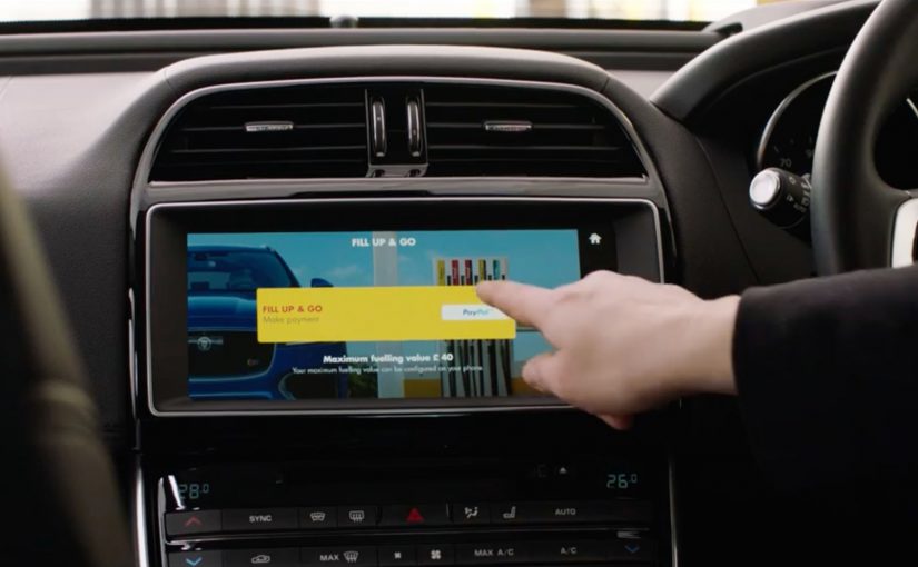
Drive up to a Shell pump. Choose your fuel amount on the car’s touchscreen. Pay without leaving the seat. In a world-first, Jaguar and Land Rover owners can pay for fuel via the touchscreen of their car at Shell service stations. Rather than paying at the pump or queuing to pay in the shop, installing the Shell app via InControl means drivers can drive up to a pump at participating Shell service stations, select how much fuel they require, and pay with PayPal or Apple Pay on the vehicle’s touchscreen.

For more details see Jaguar’s announcement.

Why this matters beyond fuel

This is not really a “payments innovation” story. It is a friction story. The value comes from removing context switching, meaning the driver does not have to break the refuelling task to pull out a phone, walk to the shop, and re-authenticate. No wallet. No phone. No queue. By keeping selection and payment inside the in-car interface, the flow reduces both steps and “did it work” anxiety, which is why it feels meaningfully faster. This is the right direction for in-car commerce, but only if station and pump identification are unambiguous and receipts are immediate. In connected-vehicle ecosystems where multiple brands share the same moment, the primary interface should own the transaction at the point of need.

Extractable takeaway: Collapse checkout into the moment of intent inside the primary interface, and the “innovation” will be felt as time and effort saved.

It moves checkout into the moment of intent

The moment you decide to refuel is the moment you can complete the transaction. That reduces drop-off, reduces effort, and makes the experience feel modern without changing the core product.

It turns the car into a commerce surface

Once the dashboard becomes a trusted place to authenticate and pay, the opportunity expands to other “on-the-go” services where drivers normally step out, wait, or juggle devices. A commerce surface is any interface that can identify the context, confirm the choice, and take payment without switching devices.

It is a clean example of partner-led experience design

Jaguar provides the in-car platform. Shell provides the forecourt context and operational integration. The user experiences it as one flow, not two brands handing off a task.

The real question is whether your primary interface can complete payment at the exact moment intent forms, without sending people into a separate device, screen, or queue.

The reusable pattern

  1. Embed the action where the context already is. Put the transaction inside the primary interface, not a separate detour.
  2. Keep the flow short and explicit. Select, confirm, pay, receipt. Anything more breaks the promise.
  3. Design for trust signals. Clear station identification, clear confirmation, and a clear receipt reduce “did it work” anxiety.
  4. Make the benefit obvious in one sentence. “Pay from your car” is enough. The value is immediate.

What to measure beyond views

  • Adoption. Percentage of eligible drivers who activate the in-car payment feature.
  • Repeat usage. Whether people use it again after the first try.
  • Time saved. Reduction in “fuel stop duration” compared with paying in-store.
  • Experience confidence. Drop-off rates between selecting the pump and confirming payment.

Guardrails to steal for in-car checkout

  • False positives. The system must reliably know which station and which pump the driver is using.
  • Failure recovery. If payment fails, the user needs a clear next step that does not create embarrassment at the pump.
  • Trust. Drivers need clear confirmation, receipts, and predictable behavior every time.

A few fast answers before you act

What is Jaguar’s in-car cashless fuel payment?

A Shell fuel payment flow that lets Jaguar and Land Rover drivers select an amount and pay from the vehicle touchscreen via the Shell app in InControl.

What problem does it solve?

It removes the need to pay at the pump or queue inside the shop. The entire task completes from the car.

What is the core mechanism?

A contextual in-car experience that links the driver, the station, and the payment method into one short flow.

What is the most reusable lesson?

Move checkout into the moment of intent inside the primary interface. Then keep the steps minimal and confidence high.

What is the biggest failure mode?

Any ambiguity about station or pump, or any unclear “did I pay” outcome. Trust collapses fast in payments.

Tostitos Party Safe Bag

On Super Bowl Sunday 2017, Tostitos puts safety into the packaging. The limited-edition “Party Safe” bag can detect when you have been drinking, then helps you get home safely from the party.

How the Party Safe bag works

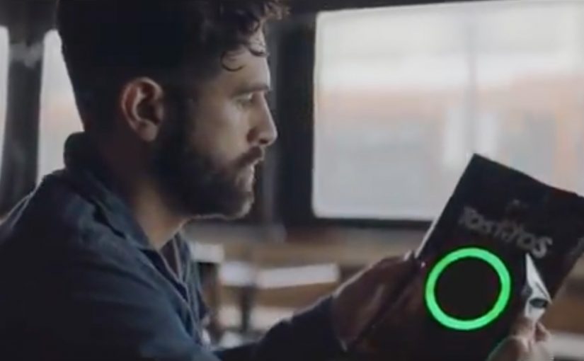
The trigger is built into the bag itself. The bag is created by Goodby Silverstein & Partners and comes equipped with a sensor connected to a microcontroller calibrated to detect traces of alcohol on a person’s breath. If alcohol is detected, the sensor turns red and forms the image of a steering wheel.

Then it turns that moment into action. The bag provides a $10 off Uber code along with a “Don’t drink and drive” message. If you have an NFC-enabled smartphone, you can also tap the bag to call an Uber.

In US mass-market brands, the smartest behaviour design often lives where the decision is made, not where the messaging lives.

Why Tostitos ties this to the Super Bowl

The campaign starts from a hard, uncomfortable statistic. According to the US National Highway Traffic Safety Administration, 45 people are killed in drunk-driving crashes on Super Bowl Sunday 2015, nearly half of all traffic fatalities that day.

Extractable takeaway: When risk peaks at a predictable moment, design the intervention to appear at that exact moment and make the safe choice the easiest next step.

So the “Party Safe” bag frames itself as a practical intervention on the one day when party behaviour and driving risk collide at scale.

This is IoT packaging with a clear behavioural goal

The packaging is not a gimmick for novelty’s sake. It is packaging that nudges a specific decision at the moment it matters most. Do not drive. Call a ride.

By IoT packaging, I mean packaging with sensing and a built-in trigger that can prompt an action without a separate app.

The real question is whether your connected experience can change one specific choice at the moment it is made.

This works because it is a behaviour-change intervention first, and a tech demo second.

The smart detail is the friction reduction. The message is immediate, the code is immediate, and the tap-to-request option removes even more steps. Because detection and the next action live on the bag, the distance from recognition to compliance is intentionally short.

The pattern worth stealing

If you work on connected experiences, the structure is reusable.

  • Put the sensor where the decision happens. Not in a separate app.
  • Translate detection into a single, obvious next action. Make the next step unmissable.
  • Pair the behavioural nudge with a concrete incentive. Give people a reason to comply faster.

A few fast answers before you act

What is the Tostitos Party Safe Bag?

A limited-edition Tostitos bag that detects alcohol on a person’s breath, then prompts a safer way to get home.

How does the bag detect drinking?

A sensor connected to a microcontroller is calibrated to detect traces of alcohol on the breath.

What happens when alcohol is detected?

The sensor turns red and forms a steering-wheel image. The bag provides a $10 off Uber code and a “Don’t drink and drive” message.

How does the Uber action work?

You can use the $10 off code, and NFC-enabled smartphones can tap the bag to call an Uber.