
T-Mobile ‘Tell Me Why’: The Live-Retail Play

A boy-band button in Times Square. And a very deliberate question

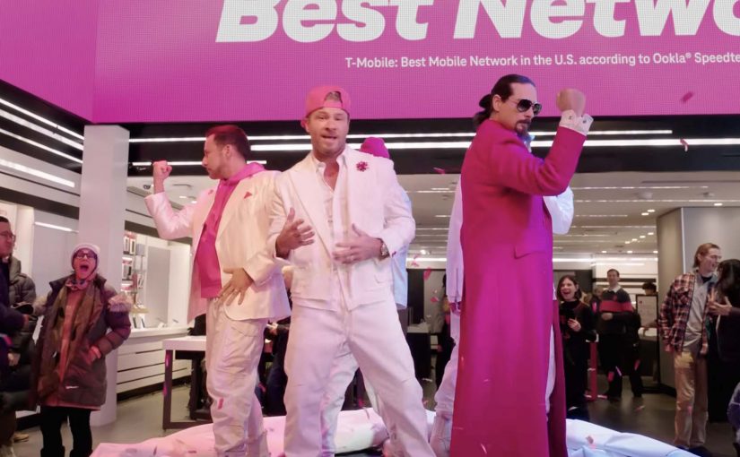
T-Mobile’s Super Bowl LX spot opens inside its Times Square Signature Store, surrounded by real customers, with a plain prompt on-screen: “Why is it better over here?” Then someone hits a big red button, the Backstreet Boys appear, and the “answer” arrives as a reimagined performance of I Want It That Way, with cameos from Druski, mgk (Machine Gun Kelly: Colson Baker) and Pierson Fodé. The commercial is credited to Panay Films and was slated to run as a :60 in the second quarter of the February 8, 2026 Big Game broadcast.

What matters is not the celebrity stack. It is the structural move: a telecom brand turning a comparison claim into a moment people can watch happening to other people.

How “Tell me why” turns a service claim into a stageable event

The core mechanic is simple on purpose. A single question frames the ad like a customer challenge, not a brand monologue. A physical trigger, the button, converts messaging into cause and effect. A live performance inside a real retail space supplies social proof because the audience is already there and reacting in-frame.

You can call this retail-as-stage. By retail-as-stage, I mean a physical store that functions as content set, event venue, and credibility engine at the same time.

When you turn a service comparison into a witnessed moment in a real store, with real reactions, belief shifts from “do I trust this claim?” to “I just saw why it’s true.”

The real question is how you make an invisible network promise feel provable in the moment, not just plausible in a chart.

The fastest path to belief is to turn an invisible network promise into a shared, watchable moment.

In telecom marketing, most value is felt after purchase, so “proof” has to be engineered before the contract is signed.

Why the nostalgia remix works, and why it is not just “a pop-culture hook”

Yes, it is familiar. But the stronger psychological play is fluency. A chorus people can finish in their head reduces processing effort, then that freed-up attention gets spent on the new lyric payload. The button adds perceived transparency. When a brand invites “why,” then stages an immediate “answer,” it signals it can withstand scrutiny.

Extractable takeaway: If your offering is hard to evaluate because it is invisible, abstract, or overloaded with fine print, stop trying to explain it better. Engineer a moment where the audience can watch someone else receive the answer in real time, because observed reactions become the credibility layer your claims cannot earn on their own.

Rewritten lyrics are inherently risky because they can feel like a jingle wearing a costume. This spot reduces that risk by grounding the musical in a real place, with real customers, and a visible trigger that creates a story arc worth retelling.

What T-Mobile is really trying to shift in 60 seconds

Look past the network line and you see a category-level repositioning attempt.

What makes this commercially interesting is that the live-store moment only becomes a scalable growth move when it connects to offer architecture, CRM follow-up, owned-channel reuse, and measurement across retail, social, and conversion.

  • From coverage to a value stack. The ad frames the carrier choice as network plus bundled value plus experience, not just bars and price.
  • From switching pain to switching ease. The broader message is “make it easy to reconsider,” while the spot’s job is to create emotional permission to do so.
  • From brand assertion to customer interrogation. Opening with “why” signals the brand is answering scrutiny, which is a more credible posture in a high-skepticism category.

The Europe echo: making a network promise watchable

It should feel familiar. This “make connection visible” move has shown up before, by turning a network promise into a shared public moment you can actually witness.

Back in 2011, Deutsche Telekom executed a multi-city Christmas activation where Mariah Carey appeared as a hologram simultaneously across five European countries, with audiences linked across cities to experience the same performance at once.

The shared mechanic across both campaigns is consistent.

The real enterprise challenge is not staging one spectacular moment. It is building a repeatable format that local markets, retail teams, and channel owners can deploy without reinventing the proof mechanism each time.

  • Make the promise tangible by creating a collective moment that can only exist because connection exists.
  • Use a universally recognizable song layer to synchronize emotion across audiences.
  • Build a reveal structure so the audience has a story arc worth retelling.

For the full Germany case, see Deutsche Telekom’s hologram Christmas surprise.

Steal the retail-as-stage operating pattern for hard-to-prove categories

  • Start with a question the customer would actually ask. Not a tagline. A test.
  • Build one physical trigger. Buttons, switches, taps, scans. One action that says “watch this.”
  • Make the audience part of the evidence, then instrument it. Capture the proof moment so it can be redistributed across owned and paid channels, and tied to downstream conversion or switching intent.
  • Use music as memory infrastructure, not decoration. A familiar melody can carry new meaning fast.
  • Design for retellability. If it is easy to summarize, it is easier to spread.

A few fast answers before you act

What is the big idea behind “Tell Me Why” in one line?

It turns a telecom comparison claim into a witnessed moment in a real retail setting, using a familiar chorus and real-customer reactions to make “why” feel observed rather than asserted.

What is the core mechanic that makes it work?

A single customer-style question plus a physical trigger, the button, that immediately produces the “answer” as a performance, with the crowd reaction acting as the credibility layer.

Why does the Backstreet Boys remix outperform a normal benefits list?

Because audiences already encode the melody automatically. The rewritten chorus becomes a fast memory container for new information, and the live-style staging reduces skepticism.

What is the strategic intent beyond awareness?

To shift evaluation from “coverage and price” toward “network plus value plus experience,” and to lower switching resistance by making reconsideration feel emotionally safe.

What is the transferable lesson from the Deutsche Telekom hologram example?

If your product promise is invisible, create a synchronized public moment that can only exist because your promise exists, then let the shared reaction do the persuasion work.
Tostitos Party Safe Bag

On Super Bowl Sunday 2017, Tostitos puts safety into the packaging. The limited-edition “Party Safe” bag can detect when you have been drinking, then helps you get home safely from the party.

How the Party Safe bag works

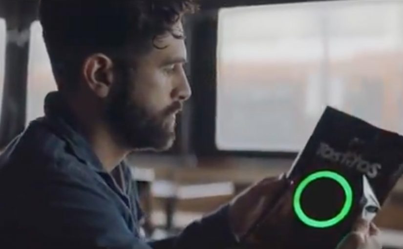
The trigger is built into the bag itself. The bag is created by Goodby Silverstein & Partners and comes equipped with a sensor connected to a microcontroller calibrated to detect traces of alcohol on a person’s breath. If alcohol is detected, the sensor turns red and forms the image of a steering wheel.

Then it turns that moment into action. The bag provides a $10 off Uber code along with a “Don’t drink and drive” message. If you have an NFC-enabled smartphone, you can also tap the bag to call an Uber.

In US mass-market brands, the smartest behaviour design often lives where the decision is made, not where the messaging lives.

Why Tostitos ties this to the Super Bowl

The campaign starts from a hard, uncomfortable statistic. According to the US National Highway Traffic Safety Administration, 45 people are killed in drunk-driving crashes on Super Bowl Sunday 2015, nearly half of all traffic fatalities that day.

Extractable takeaway: When risk peaks at a predictable moment, design the intervention to appear at that exact moment and make the safe choice the easiest next step.

So the “Party Safe” bag frames itself as a practical intervention on the one day when party behaviour and driving risk collide at scale.

This is IoT packaging with a clear behavioural goal

The packaging is not a gimmick for novelty’s sake. It is packaging that nudges a specific decision at the moment it matters most. Do not drive. Call a ride.

By IoT packaging, I mean packaging with sensing and a built-in trigger that can prompt an action without a separate app.

The real question is whether your connected experience can change one specific choice at the moment it is made.

This works because it is a behaviour-change intervention first, and a tech demo second.

The smart detail is the friction reduction. The message is immediate, the code is immediate, and the tap-to-request option removes even more steps. Because detection and the next action live on the bag, the distance from recognition to compliance is intentionally short.

The pattern worth stealing

If you work on connected experiences, the structure is reusable.

  • Put the sensor where the decision happens. Not in a separate app.
  • Translate detection into a single, obvious next action. Make the next step unmissable.
  • Pair the behavioural nudge with a concrete incentive. Give people a reason to comply faster.

A few fast answers before you act

What is the Tostitos Party Safe Bag?

A limited-edition Tostitos bag that detects alcohol on a person’s breath, then prompts a safer way to get home.

How does the bag detect drinking?

A sensor connected to a microcontroller is calibrated to detect traces of alcohol on the breath.

What happens when alcohol is detected?

The sensor turns red and forms a steering-wheel image. The bag provides a $10 off Uber code and a “Don’t drink and drive” message.

How does the Uber action work?

You can use the $10 off code, and NFC-enabled smartphones can tap the bag to call an Uber.

TV Viewing: Super Bowl Meets HoloLens

TV viewing is overdue for a real change

The TV viewing experience does not change drastically for years. Bigger screens, better resolution, smarter interfaces. But the core behavior stays familiar.

That is why sophisticated headsets like Microsoft HoloLens feel like a genuine breakpoint.

They do not just improve the screen. They change the environment around it.

Microsoft and the NFL re-imagine the Super Bowl

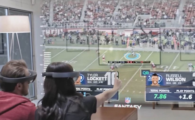
In a recently released video, Microsoft and the NFL re-imagine how a Super Bowl game could be watched with multiple friends and family members.

The scenario pushes beyond passive viewing. It turns the living room into an interactive layer, where the game experience becomes more immersive, more social, and more spatial.

By spatial, I mean the content is anchored to the room, not confined to the TV frame.

This is the kind of concept that makes the future of TV feel tangible.

In mass-market entertainment, the constraint is not what immersive concepts can show, but when consumer hardware becomes affordable, comfortable, and mainstream.

Why this lands for co-viewing

TV should prioritize co-viewing, meaning multiple people watching and reacting together in the same room, because a shared, spatial layer creates viewer control that a single rectangle cannot. The real question is whether you are designing for shared viewer control in the room, or just adding data overlays to a screen.

Extractable takeaway: When you move sports content into the room, design the experience around shared reference points, lightweight interaction, and conversation pacing, not around more screen real estate.

Immersive viewing is real. Consumer timing is not

The video shows how immersive TV watching can get. But Microsoft is not fast-tracking HoloLens for consumer consumption.

For now, only developers can order HoloLens, shipping this year.

No one knows when consumers get access, or when scenarios like this become a reality.

That uncertainty is part of the story. The vision is clear. The rollout timeline is not.

Steal these design cues for living-room sports

  • Design for the room. Treat the TV as one surface among many, then anchor the key moments and data where people naturally look and point.
  • Make co-viewing explicit. Support multiple viewers and viewpoints, so participation feels shared instead of “one person driving.”
  • Prototype for constraints. Assume headsets stay niche for a while, and test what still works when only one person has the device.

A few fast answers before you act

Is this still “TV” or something else?

It starts as TV content, but behaves more like a shared, spatial experience than a single screen.

What is the core shift headsets enable?

They move content off the rectangle and into the room, so viewing becomes environmental and interactive.

What is the biggest constraint right now?

Availability and consumer readiness. Until mainstream hardware adoption happens, this remains concept-led.

What should experience designers take from this?

Design for co-viewing and spatial context. Multiple people, multiple viewpoints, and shared interaction become first-class requirements.

What should you prototype first?

Prototype the simplest “shared moments” layer, so two to four people can compare and discuss the same play without anyone leaving the game flow.