

McDonald’s: Everyone Saves for Something

When a low price becomes a citywide signal

McDonald’s and ad agency DDB Budapest launched a campaign to promote an offer of two cheeseburgers for one Euro. The positioning is simple. A price so low it gives the target audience room to save for things they want.

The twist: turn wrapping paper into media

The challenge is standing out from the usual low-price playbook. Instead of shouting numbers louder, the campaign uses the most recognizable asset McDonald’s already owns. Its iconic cheeseburger wrapping paper.

They wrap “cool stuff” in the same paper, partner with different shops around the city, and turn those places into unusual touchpoints that visually encode the offer without needing to repeat the offer everywhere.

In European QSR value campaigns, price messaging sticks better when it is turned into a tangible object people encounter in everyday places.

The real question is how you make a low-price offer feel noticeable without turning it into just another louder discount ad.

Why it lands

This works because it makes value feel physical. The stronger move is to let a distinctive brand asset carry the value message instead of repeating the price claim more aggressively. People are trained to ignore price claims, but they notice an object that looks out of place. The wrapping paper acts like a visual shortcut. If you recognize it, you decode the brand instantly. If you do not, you still feel the oddness and look closer. The partner locations add credibility because the idea appears to have “escaped” the ad slot and entered the city.

Extractable takeaway: If your message is “cheap,” avoid saying “cheap” more often. Use a distinctive brand asset as a portable visual language, then place it where people already shop, browse, and compare.

What to steal from this value stunt

  • Make one brand asset do the heavy lifting. A recognizable wrapper can outperform another headline about price.
  • Build distributed touchpoints. Partner locations create repeated exposures that do not feel like repeated ads.
  • Let the audience complete the message. Recognition is satisfying. It increases memorability with less copy.
  • Keep the offer legible, but not loud. The stunt earns attention. The offer converts it.

A few fast answers before you act

What is “Everyone Saves for Something” for McDonald’s?

It is a value campaign that promotes an ultra-low cheeseburger deal by wrapping everyday objects in McDonald’s iconic cheeseburger paper and placing them across partner shops as unusual city touchpoints.

What is the core mechanic?

Use distinctive packaging as a portable visual language, then deploy it outside the restaurant to make the offer feel present across the city.

Why does wrapping objects work better than another price poster?

Because it turns a price message into a curiosity trigger. People notice the anomaly first, then decode the brand and offer.

What’s the transferable principle for other brands?

If your message is functional and easy to ignore, embed it inside a recognizable asset and place it where people already make choices.

What is the main risk with this approach?

If the asset is not instantly recognizable, or the placements feel random, the idea becomes decoration instead of a decodable message.
Dentsu London and BERG: Making Future Magic

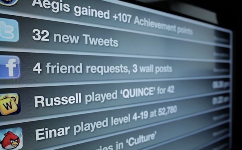
Dentsu London has made two films with BERG as part of an ongoing collaboration to bring their “Making Future Magic” strategy to life. Both films treat the growing number and variety of media surfaces as a canvas.

Here, “media surfaces” means everyday objects and touchpoints that can carry useful information without behaving like traditional screens or ads.

Incidental Media sketches a near future where media surfaces are everywhere, but used to be playful, informative, and better at connecting you to friends and family.

The Journey shifts the same thinking into travel, focusing on opportunities in stations and on trains.

What the “media surfaces” idea actually proposes

The mechanic is a design-fiction approach. Instead of inventing new hardware, the films show existing surfaces behaving differently. Receipts, windows, clocks, tickets, and public displays become quieter, more contextual, and more useful. Small pieces of information appear where they help, then fade back into the background.

In urban, mobile-first consumer environments, the most effective ambient media tends to be context-aware, lightweight, and respectful of attention.

Why it lands

It feels plausible because it is built from things we already recognize. The films do not pitch a sci-fi leap. They demonstrate a series of small shifts in how content could live on everyday surfaces, and that makes the future feel “next door” rather than distant.

Extractable takeaway: If you want people to believe a future-facing strategy, show it as a set of concrete, everyday interactions on familiar surfaces. Keep the behaviors small, specific, and repeatable.

What Dentsu London is really doing with this work

This is strategy communication as an artifact. The films give teams and clients a shared mental model for what “Making Future Magic” could mean in practice, and they do it in a format that is easy to circulate, discuss, and reuse in planning conversations.

The real question is how you make a future-facing strategy tangible enough that teams and clients can picture it, discuss it, and reuse it.

This is a stronger way to communicate future experience thinking than leaving it as abstract language in a deck.

How to make future concepts feel usable

  • Show, then explain. Start with a believable vignette before you introduce principles.
  • Use familiar surfaces. Credibility rises when the canvas is already part of everyday life.
  • Prioritize quiet utility. Ambient media works best when it helps without demanding constant input.
  • Design for context shifts. Travel, waiting, and transition moments are rich canvases for information that matters.

A few fast answers before you act

What is “Incidental Media” in one sentence?

A near-future sketch where everyday surfaces carry small, useful pieces of media that are playful and contextual rather than loud and interruptive.

What does “The Journey” focus on?

Travel contexts like stations and trains, showing how ambient, contextual media could reduce friction and improve the experience of moving through transport systems.

Why use concept films instead of a written strategy deck?

Because films make the future tangible. They align teams faster by letting everyone see the same interactions, not just read abstractions.

Why does this future feel believable instead of sci-fi?

Because the films build from ordinary surfaces and small behavior shifts. That makes the idea feel adjacent to current life rather than dependent on a radical technology jump.

What is the main risk in copying this approach?

Staying too high-level. If the vignettes are not specific enough to feel real, the work becomes mood, not a usable model for decisions.

Augmented Reality Calendar by Audi

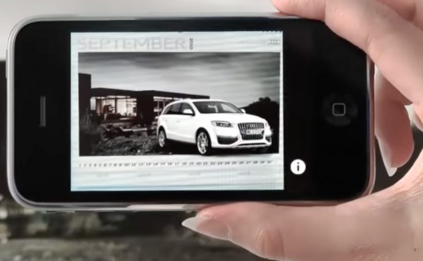
An Audi calendar arrives and it looks almost wrong. Each month is a beautiful landscape, with a deliberate empty space and no car in sight. You open Audi’s iPhone app, point the camera at the page, and the missing piece appears. An Audi A1 fills the blank area in augmented reality, sitting inside the printed scene as if it belongs there. Here, augmented reality means the app renders a 3D car model aligned to the printed page.

The idea. A car calendar without cars

Audi takes a familiar format. The premium calendar. Then it removes the expected hero asset. The car. The calendar becomes an invitation to discover, not a static brand object.

The real question is how to make a physical brand object earn interaction without adding friction.

How it works. Print as trigger, iPhone as lens

  • The printed calendar pages feature landscapes and intentional negative space.
  • People download and open the dedicated Audi iPhone app.
  • They point the phone’s camera at the calendar page.
  • The app overlays a car into the empty area, turning the page into a live scene.

The interaction is simple, but the effect is surprising because it uses a physical artifact as the interface. The calendar is not just content. It is the marker that activates the experience. Because the page is the trigger, the reveal feels like it belongs to the object, not like a separate digital stunt.

In brand marketing, the hardest part of physical brand objects is earning a second interaction without adding friction.

Why this works. A tangible product that earns a second look

This is not augmented reality for the sake of augmented reality. It is a clean integration of print and mobile that rewards curiosity. The calendar builds anticipation with absence, and the app completes the story in the moment you engage.

Extractable takeaway: Design intentional absence in the physical layer, then use mobile to deliver one earned reveal that completes the scene with minimal effort.

Augmented reality earns its keep when it completes a physical moment, not when it competes with it.

This idea is developed by Neue Digitale / Razorfish Berlin and executed for Audi.

What to take from it. Designing the reveal

  • Use restraint to create intrigue. Removing the obvious element can be more powerful than showcasing it.
  • Make the physical object the trigger. When the real-world asset is the interface, the digital layer feels earned.
  • Keep the action obvious. Point camera. See result. Low friction beats complex onboarding.
  • Build around a single wow moment. One crisp reveal is often enough to make the experience memorable.

A few fast answers before you act

What is Audi’s augmented reality calendar?

Audi’s augmented reality calendar is a printed calendar designed to work with a dedicated iPhone app, where pointing the phone camera at a page reveals an Audi car overlaid in augmented reality.

What is the core creative twist?

The creative twist is a car calendar without cars. The car appears only when you view the page through the app.

What role does the calendar page play?

The calendar page acts as the trigger, using the printed layout and empty space as the designed area the AR overlay “completes.”

What makes it effective as a brand experience?

It turns a passive object into an interactive reveal, linking print, mobile, and product desire in one simple action.

What is the transferable pattern for other brands?

Create curiosity in a physical artifact, then use mobile to deliver a single high-impact reveal with minimal friction.