
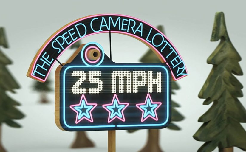
Volkswagen: The Speed Camera Lottery

The winning idea of the Volkswagen fun theory award was submitted by Kevin Richardson, USA.

Can we get more people to obey the speed limit by making it fun to do. This is the question Kevin’s idea answers, and Volkswagen, together with The Swedish National Society for Road Safety, makes the idea real in Stockholm, Sweden.

A speed camera that rewards, not just punishes

The core twist is simple. The concept is described as a lottery wrapped around a speed camera. Drivers who pass at or under the speed limit are entered into a draw. The prize money is described as coming from the fines paid by drivers who speed.

That inversion matters because it changes the emotional frame. Instead of “the camera is there to catch me”, the camera becomes “a chance to win if I do the right thing”.

The mechanic: turn compliance into a game loop

The loop is short and repeatable:

  • Trigger: you approach the monitored zone.
  • Action: you choose to stay within the limit.
  • Reward: you are entered into a lottery, and someone wins.
  • Reinforcement: the story travels because “I won by driving properly” is novel.

Why it lands: it makes “doing the right thing” emotionally positive

Most enforcement is built on fear of loss. This flips motivation into the hope of gain, without removing consequences for speeding. It keeps the stick, but adds a carrot that people actually want.

Extractable takeaway: If you want everyday behavior to change, do not only increase the cost of the bad action. Add a visible, repeatable reward for the good action, and make the reward easy to understand in one glance.

In urban road-safety environments, messaging often underperforms because it feels like punishment instead of shared benefit.

The real question is how to make compliance feel desirable often enough that people repeat it without being re-taught each time.

What the brand really gets from this

Volkswagen is not selling a feature here. It is sponsoring a philosophy. Make better choices feel desirable, and the brand becomes associated with modern, optimistic problem solving rather than lecturing.

That is also why the execution travels so well as a film. It is a simple story with a surprising twist, and it is easy to retell without technical explanation.

What to steal for your own behavior-change campaign

  • Pay attention to framing: the same rule feels different when it is presented as “win” versus “don’t get caught”.
  • Make the rule legible instantly: people must understand the mechanic in seconds.
  • Design for repeat exposure: behavior change needs loops, not one-off impressions.
  • Fund rewards credibly: link the reward source to the problem so it feels fair.
  • Keep it measurable: define the behavior metric first, then build the experience around it.

A few fast answers before you act

What is the Speed Camera Lottery?

It is a road-safety concept where drivers who obey the speed limit are entered into a lottery, making compliance feel rewarding rather than purely punitive.

Why does adding a lottery change behavior?

It introduces a positive incentive that people talk about. The hope of gain can be a stronger daily motivator than the fear of a fine for many drivers.

Does this replace enforcement?

No. The idea is described as keeping normal enforcement for speeding, while adding a reward layer for drivers who comply.

What makes this a “Fun Theory” idea?

It tries to prove that fun, not just rules, can shift behavior. The experience makes the better choice feel more attractive in the moment.

What should you measure if you copy this?

Average speed and speed variance at the intervention point, compliance rate over time, and whether the effect persists once novelty fades.
BI Norwegian Business School: Strip

A Norwegian business school ad that wins with humor

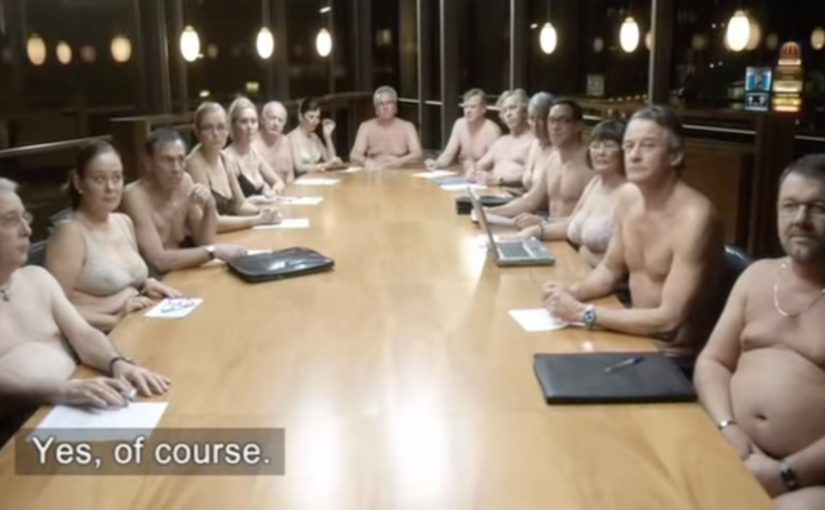
Norwegian ad agency Try has created this humorous TV Commercial for BI Norwegian Business School in Norway.

What the “Strip” format is doing

This film is built like a short, punchy scenario where comedy does the explaining. The title “Strip” signals a reveal. Here, “Strip” means a quick reveal structure. Set up one situation, then strip it back to the point. The joke is the hook, and the point lands after you’ve already committed attention.

When recruitment advertising works, it makes the viewer feel the consequence of being unprepared or underestimated. Then it positions education as the fix.

In higher-education recruitment, attention is scarce and differentiation is hard, so a clear comic scenario can compress the message into something people remember.

The real question is whether your recruitment message can earn attention before it asks for belief.

Why a humorous recruitment ad can outperform “informative” messaging

A humorous scenario is often stronger than an information-led message when you need reach beyond paid media. People rarely share program facts. They share moments. A comedic execution creates that moment, and it travels because it is easy to retell.

Extractable takeaway: If you want your recruitment message repeated by people who owe you nothing, build a retellable moment first and attach the proof after.

It also flatters the audience. If the viewer gets the joke quickly, they feel clever. That positive emotion transfers to the brand.

Stealable moves for recruitment marketing

  • Lead with one simple situation. One scene. One tension. One payoff.
  • Make the title do work. A strong title sets expectation and primes the reveal.
  • Earn the brand message late. Let the scenario pull people in, then attach the takeaway.
  • Keep it culturally specific, but universally readable. Local tone helps, but the human moment should translate.

A few fast answers before you act

What is BI Norwegian Business School’s “Strip” ad?

It is a humorous TV commercial created for BI Norwegian Business School, designed as a short scenario that makes a recruitment point memorable through comedy.

Who created the ad?

The film is credited to Try Reklamebyrå for BI Norwegian Business School.

Why use humor for a business school recruitment message?

Humor increases attention and recall. It also makes the message easier to retell, which helps recruitment campaigns travel beyond paid media.

What is the main creative mechanism at work?

A single situation creates tension, then the reveal resolves it. That structure delivers a clear takeaway without feeling like a brochure.

What is the biggest risk with this approach?

If the joke is stronger than the takeaway, viewers remember the gag but not the school. The brand connection has to be unmistakable in the final beat.

Yellow Pages: Location Based Banner

Here is the next generation of interactive web banners. Tel Aviv agency Shalmor Avnon Amichay/Y&R promoted the Yellow Pages augmented reality location-based app by creating a banner that does the same thing. Here “location-based” means it surfaces nearby businesses based on where you are.

The banner opens your webcam and lets you see the businesses around you. Wave your hand to switch between businesses. Click a business to jump straight to its Yellow Pages listing.

A banner that behaves like the product

The clever part is that this is not “interactive” for decoration. It is a working demo of the core value proposition. If the app helps you find what is near you, the banner proves that promise immediately, inside the placement, without asking you to imagine anything. Utility products should be advertised by demonstrating usefulness, not by describing features.

The mechanic: webcam as context, hand wave as UI

The flow is intentionally simple. Turn on the camera. Overlay nearby business options. Use a wave to move through results. Use a click to convert curiosity into action via the listing page.

In local discovery experiences, the strongest persuasion is a live, context-matched preview of usefulness rather than a feature claim.

Why it lands: it removes the “so what” gap

Most directory and local-search advertising dies in the space between promise and proof. The real question is whether your ad can turn a promise into proof without leaving the page. This banner collapses that gap, because it starts with your own context, then shows results, then lets you act. The interaction is the explanation.

Extractable takeaway: The fastest way to make a utility app feel essential is to let people experience the “aha” moment before they ever leave the page they are on.

What Yellow Pages is really trying to achieve

The business intent is to reposition Yellow Pages as modern, digital, and situationally useful, not just a legacy directory brand. The banner also creates a clear performance path. Engagement inside the unit, then click-out to a listing that can drive calls, visits, or follow-on app consideration.

Steal the demo-first local discovery pattern

  • Mirror the product in the ad. If the product is a tool, make the ad behave like the tool.
  • Use one gesture people understand. A wave as “next” is instantly legible. No tutorial needed.
  • Keep the ladder of commitment short. Preview. Browse. Click through. No extra steps.
  • Make the experience readable for bystanders. Obvious motion plus clear on-screen change sells the mechanic in shared environments.
  • Watch privacy optics. If you turn on a camera, be explicit that it is for interaction and context, not identification.

A few fast answers before you act

What is a “location based banner”?

It is a banner ad that adapts its content to the user’s situation, typically location or environment cues, so the ad can show relevant nearby options instead of generic messaging.

How does this Yellow Pages banner work?

It opens a webcam view, overlays nearby business options, lets you wave to cycle through businesses, and lets you click a result to open the corresponding Yellow Pages listing.

Why use a webcam at all?

Because it makes the experience feel immediate and personal. The ad becomes a live “finder” interface rather than a static claim about finding things.

What makes gesture-controlled banners risky?

Friction and variability. If the gesture detection fails or is unclear, users assume the ad is broken. The interaction must be forgiving and the feedback must be instant.

What is the safest way to replicate the idea today?

Keep the mechanic to one simple input, provide clear on-screen feedback, and ensure the user can still get value even if they do not enable the camera.