Getting people into a stadium rarely starts with sport. It starts with habit. Lowe in Sydney uses the pre-Christmas rush to put a match invitation into a moment people already care about, without needing another ticket ad.
A Christmas “service” that flips into promotion
The activation doesn’t fight for attention in a new media slot. It borrows an existing ritual, getting gifts ready, when people are already in a generous, social mindset and open to small surprises.
The smart part is the order of operations. It feels like help first, marketing second, which lowers resistance and makes the message easier to carry into conversation afterwards.
The reveal is the media
Once people opt in, the experience pivots. What looks like a straightforward offer becomes a playful con, and that pivot is the part people remember and retell.
That retelling is the distribution engine. It converts passive reach into a personal anecdote, and personal anecdotes are what move a friend group from “I saw something” to “we should go.”
In crowded sports and entertainment markets, attendance is often won at the everyday decision points where people choose what they will do with their next free evening.
The real question is whether you can turn an attendance ask into a story people want to retell, not just a message they notice.
Why the idea lands so well
The “swindle” framing does two jobs at once. Here, “swindle” simply means a playful bait-and-switch, the wrapping offer flips into a match invite. It creates tension and emotion in the moment, and it makes the participant feel involved, not targeted. The reaction is the content, and the retelling is the distribution.
Extractable takeaway: If you can attach your message to a real-world ritual that people already care about, you don’t need to “earn attention” from scratch. You simply redirect it, then give people a story they can repeat without you.
This is also listed in Effie Awards Australia reporting as a winner in the “Most Original Thinking” category, which fits the design: a small behavioural hack, not a big media buy.
What the league is really buying
The hidden win is not just awareness. It’s habit disruption. You take a non-football moment and reframe it as football-adjacent, then you push the idea of attending into a context where people are already planning social time around the holidays.
A ritual-first activation like this beats incremental ticket messaging because it recruits people’s social planning habits, not just their attention.
That’s how you move from “I saw an ad” to “we should go”. The campaign manufactures a nudge that feels organic because it is embedded inside a familiar activity.
Ritual-based attendance nudges to copy
- Pick a ritual with built-in foot traffic: shopping, commuting, queues, checkouts, waiting rooms.
- Make the reveal the message: the twist should be the reason people talk, not an extra layer you explain after.
- Design for retelling: if the story can be repeated in one sentence, it will travel further than the experience itself.
- Keep the CTA implicit: the best outcome is that people decide to act while they are still talking about what happened.
A few fast answers before you act
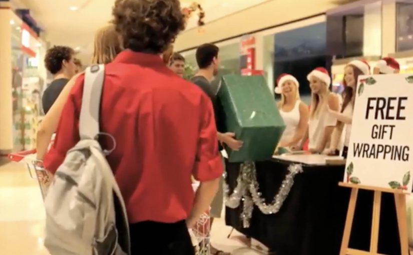
What is “The Great Christmas Gift Wrapping Swindle”?
It’s a holiday-season activation that turns gift wrapping into a surprise promotional stunt, engineered to spark conversation and drive attendance.
Why is gift wrapping a smart channel for sports marketing?
Because it’s a ritual people willingly engage with. The message travels physically with the gift, and the moment is social by default.
What makes this more effective than a standard ticket ad?
The participant becomes the messenger. A prank-style reveal produces a story, and stories outperform slogans when it comes to getting people to act.
What’s the main risk with prank mechanics?
If the reveal feels mean-spirited or wastes people’s time, you get backlash without benefit. The tone has to stay playful, and the participant has to feel “in on it” quickly.
How do you adapt the pattern outside sports?
Attach your offer to a real-world ritual in your category. Then design one clear twist that transforms the ritual into a story people want to repeat.