
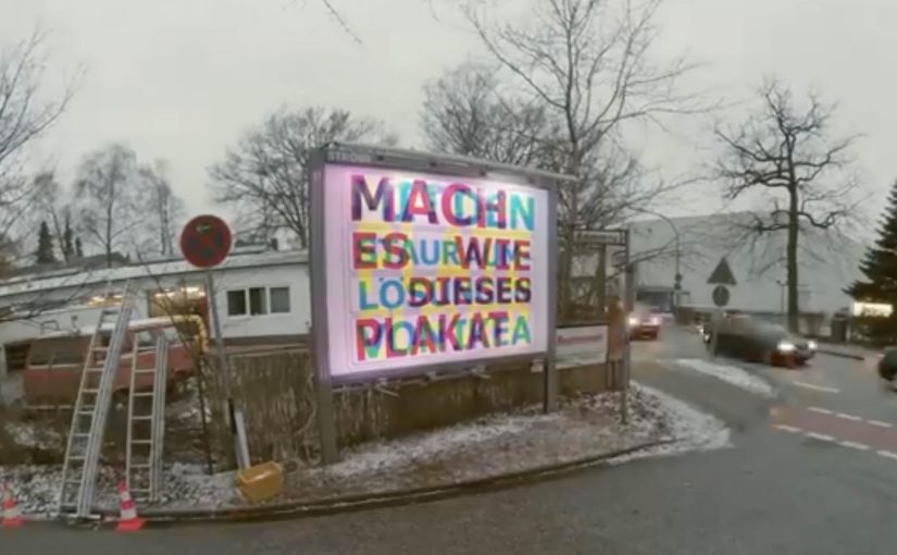
Ikea RGB Billboard

German ad agency Thjnk and production studio I Made This teamed up to create a unique RGB Billboard that revealed different messages depending on the colored lights.

The billboard featured three different messages in three different colors. Cyan, magenta and yellow. At night, the billboard was lit up by red, green and blue (RGB) light bulbs, which made the different messages visible depending on the shining light bulb.

The red showed the cyan text. The green made the magenta text visible. And the blue light revealed the yellow text. With this simple visual trick, the billboard made the most of its limited space and embodied IKEA’s space-saving message.

How the RGB trick works

The idea leans on a simple perception hack, meaning the light color determines which printed layer stands out to the eye. You print multiple messages in different ink colors, then you control which one becomes dominant by changing the light color that hits the surface.

By switching between red, green, and blue lighting, the billboard effectively “filters” what you see. One physical surface. Multiple readable layers. No moving parts required. That works because each light color makes one printed layer readable while pushing the others back.

In crowded retail and FMCG environments, that kind of space efficiency matters because one surface often has to carry more than one job.

Why this is a very IKEA way to communicate

IKEA’s promise often comes down to doing more with less space. This billboard does the same thing. It demonstrates the benefit while delivering the message. The medium becomes the proof.

Extractable takeaway: When the medium visibly demonstrates the product promise, the ad explains itself faster and sticks longer.

What the idea is trying to do for the brand

The real question is not whether people notice the trick, but whether the trick makes IKEA’s value proposition easier to remember.

That is exactly the right move for out-of-home. The business intent is to turn a space-saving claim into a live demonstration, so one billboard works as both message and proof.

What to borrow for your next OOH idea

  • Make the constraint the concept. Limited space becomes the creative engine.
  • Use a mechanism people can explain. “Different lights reveal different messages” travels fast.
  • Build a repeatable reveal. The change over time, or over conditions like day and night, creates a reason to look twice.

A few fast answers before you act

What is the IKEA RGB Billboard?

It is a billboard designed to reveal different messages depending on whether it is lit by red, green, or blue light.

Who created it?

German ad agency Thjnk and production studio I Made This.

How many messages did it contain?

Three messages, printed in cyan, magenta, and yellow.

What lighting was used at night?

Red, green, and blue (RGB) light bulbs.

Why was it a good fit for IKEA?

It demonstrated a space-saving principle by making one billboard placement do the work of multiple messages.
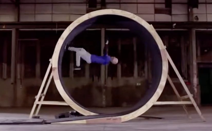
Pepsi Max: Human Loop

Last year, Pepsi Max for its ongoing #LiveForNow campaign created an unbelievable bus levitation stunt. Now continuing this “unbelievable feats and experiences” brand positioning, they challenged daredevil stuntman, Damien Walters to do another unbelievable stunt for them. Here, positioning means the single promise the brand wants people to remember and retell.

Pepsi Max provided Damien with a human-sized loop-the-loop in an abandoned warehouse and then got him to defy gravity for them…

In global FMCG marketing, stunts like this earn value when they reinforce an existing brand platform, not when they try to create one from scratch.

Why this stunt fits the brand

The mechanism is simple. A clearly defined physical challenge, executed by credible talent, makes the “unbelievable” promise feel real because the payoff is visible without narration.

Extractable takeaway: If your positioning is a claim, design one repeatable moment that functions as proof, then film it so the viewer can verify it without explanation.

  • It commits to the promise. “Unbelievable” is not a line here. It is the product.
  • It is instantly legible. You understand the challenge in one second, then you watch to see if it is possible.
  • It is built for replay. Stunts invite rewatching, pausing, and sharing because people want to verify what they saw.

How to make the stunt behave like proof

The real question is whether your brand promise can be proven in one obvious moment on camera.

This kind of spectacle earns its keep only when it is a direct proof point for an ongoing platform, not a disconnected attempt at “random viral”.

If your positioning is about experiences, you need executions that behave like proof. This kind of spectacle works when the idea is simple, the talent is credible, and the payoff is visible without explanation.

  • Make the promise behave like proof. If positioning is about experiences, the execution should demonstrate it, not describe it.
  • Keep the idea simple and the payoff visible. The viewer should understand the challenge instantly and see the outcome without explanation.
  • Use credible talent, then shoot for replay. Stunts invite rewatching, pausing, and sharing when people want to verify what they saw.

A few fast answers before you act

What is Pepsi Max “Human Loop”?

It is a Pepsi Max #LiveForNow stunt featuring Damien Walters attempting a human-sized loop-the-loop setup inside an abandoned warehouse.

Why does a loop-the-loop stunt perform so well in video?

The challenge is obvious, the risk feels real, and the outcome is visually conclusive, which makes it highly shareable.

What is the core pattern behind this kind of campaign?

Make the brand promise measurable in one moment, then capture it cleanly so the viewer does not need context to understand it.

How do you keep stunts from feeling like “random viral”?

Anchor them to an ongoing brand platform, use consistent talent and tone, and make each execution feel like a credible next chapter.

When should you avoid a stunt-led proof moment?

Avoid it when the idea cannot be understood instantly, the talent is not credible, or the execution does not ladder up to an ongoing brand platform.

DHL: DHL Is Faster Trojan Parcels

A courier from UPS, TNT or DPD walks through a busy city centre carrying a large, plain-looking parcel. A few minutes later, the same box is effectively doing outdoor advertising for DHL, with a bright message reading: “DHL is Faster.”

Turning competitors into media

DHL’s large network of offices, trucks and employees is a straightforward speed story, but saying it loudly in a traditional ad campaign is expensive. So DHL worked with German trojan campaign specialists Jung von Matt/Neckar to make competitors unknowingly promote DHL as the fastest parcel delivery service. In this context, a trojan campaign hides the brand message inside a neutral object or someone else’s distribution until it reveals itself in public.

The mechanism: temperature reveals the punchline

Large, inconspicuous parcels were created and sealed with a thermo-sensitive foil. When cooled in refrigerators, the parcels appeared black, hiding the message. UPS, TNT and DPD were then asked to deliver these parcels to difficult but central city locations. Exposed to warmer street temperatures during delivery, the parcels shifted colour and revealed the words “DHL is Faster.”

A “trojan” mechanic in marketing is a message that travels inside a neutral object or someone else’s distribution, then reveals itself at the moment of maximum visibility.

In competitive European parcel logistics, a proof-by-demonstration stunt can move “we’re faster” from claim to spectacle without buying classic media.

Why this lands

It works because the reveal happens in public and in motion, exactly where speed matters, and it borrows credibility from the awkward fact that a rival courier is doing the carrying. The stunt also makes the comparison feel earned rather than asserted, because the message appears as a consequence of the journey.

Extractable takeaway: If your advantage is hard to believe as a headline, design a mechanism where the environment exposes the proof, and let the proof show up at the exact point where the audience can “see the claim happen.”

What DHL is really buying

The real question is how to turn a functional speed claim into a public proof people can instantly understand and retell.

This is less about humiliating competitors and more about reframing the category. It turns delivery speed into a street-level moment that people can film, retell, and instantly understand, while the brand pays for production rather than for repeated media placements.

What to steal from DHL’s reveal design

  • Build a reveal. Hide the message until the moment the audience is already watching.
  • Use context as a trigger. Temperature, light, movement, location. Let the world “activate” the story.
  • Put the proof on the distribution. The carrier becomes the billboard, not a separate ad unit.
  • Make the explanation obvious at a glance. If it needs a voiceover, the stunt is too clever.

A few fast answers before you act

What is the “DHL is Faster” stunt?

It’s a trojan-style activation where rival couriers deliver parcels that reveal “DHL is Faster” as they warm up in city conditions.

How does the reveal work?

The parcels are wrapped in a thermo-sensitive foil that looks dark when cooled, then changes to expose bright lettering when the parcel warms during delivery.

Why call it a trojan campaign?

Because the message travels hidden inside a neutral-looking object and is distributed by someone else, then reveals itself at the most visible moment.

What brand point does this communicate?

Speed and network scale, reframed as a live demonstration rather than a paid claim.

What’s the main risk with this kind of idea?

Brand backlash if the stunt feels mean-spirited or deceptive, and operational complexity if the reveal is inconsistent or hard to understand in the wild.