VW Polo Principle: Crowdsourced 3D Prints

VW Polo Principle: Crowdsourced 3D Prints

Volkswagen last year launched “The Polo Principle” ad campaign to convey the message that high-end innovations were now available to Polo drivers.

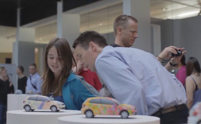
Then, to democratize the innovation process, they allowed people to actually design their very own 3D Volkswagen mock ups. The top 40 designs were chosen by a panel of judges and then put on display in Copenhagen, with the entrants receiving their (mini) 3D printed Volkswagens in the mail.

From innovation message to innovation participation

The mechanism is a neat escalation. The campaign starts with a claim: premium innovation is no longer reserved for premium models. Then it turns that claim into an action: if innovation is being “democratised,” people should be able to shape it. A 3D design tool becomes the interface for participation.

Instead of asking audiences to agree with the brand message, Volkswagen invites them to contribute to it, visually and playfully.

In co-creation campaigns, participation becomes persuasion when people can make something that physically proves the brand promise.

In enterprise marketing teams, co-creation only scales when the participation interface is simple and the payoff is concrete.

Why it lands: ownership beats persuasion

This works because creating something triggers a different level of engagement than watching something. Designing a mock up requires time, intent, and taste. Once you invest that effort, you become emotionally tied to the campaign. And when your design is selected, the brand is no longer a distant manufacturer. It is a platform that amplified you. Co-creation is most persuasive when the act of making produces an object people can keep or show.

Extractable takeaway: When you claim “innovation for everyone,” turn the claim into something people can make, so the audience owns a proof of the promise.

The Copenhagen display adds a public payoff. It moves the work out of the browser and into a real space, which signals seriousness and status.

The intent: make “accessible innovation” feel real

The business intent is to attach innovation to the Polo brand without sounding like advertising. Here, “accessible innovation” means making premium innovation cues feel reachable for everyday Polo drivers, not only for flagship models. The real question is whether your “innovation” story can be experienced, not just believed. User-generated designs create social proof. The 3D printed mini cars make the campaign tangible. “Innovation is available to you” becomes “here is something you made, and here is a physical object that proves it.”

Make co-creation tangible

  • Turn a message into a mechanism. If you claim democracy, build a democratic action people can take.
  • Reward with something physical. A mailed 3D print is a memorable artefact, not a forgettable badge.
  • Curate publicly. Exhibiting the top designs creates status and raises the perceived value of participation.
  • Use judges plus community. A panel can signal craft and quality, not just popularity.
  • Design for shareability. People naturally share what they created, especially when it looks good.

For more examples on brands using 3D printing click here.


A few fast answers before you act

What was the core idea behind the Polo Principle extension?

To move from talking about “innovation for everyone” to letting people participate by designing their own 3D Volkswagen mock ups.

Why add 3D printing to a campaign?

It creates a physical proof point. A printed mini model makes the experience feel real, personal, and worth keeping.

What role did the Copenhagen display play?

It gave public status to the best designs and signalled that the brand took the contributions seriously, beyond a digital stunt.

Is co-creation mainly an awareness play?

It can drive awareness, but its deeper value is emotional ownership. People remember what they helped create.

What is the main takeaway for brands claiming “democratisation”?

If you want the message to stick, build a mechanism that lets people experience the claim directly, and reward participation in a tangible way.

Chrome: Super Sync Sports

Chrome: Super Sync Sports

Google has recently released their latest Chrome Experiment called “Super Sync Sports” which allows players to convert their mobile phones and tablets into a remote control for their desktop browser.

To give it a spin visit www.chrome.com/supersyncsports/, choose a game i.e. running, swimming or cycling and then follow the instructions to sync your mobile phone. Once the sync is complete you can then play your way to victory, while the game plays out on your desktop.

What “super sync” really means in practice

The core mechanic is simple. Your desktop browser becomes the shared “big screen” for the race, while each phone or tablet becomes a personal input surface. Instead of mirroring the desktop, the mobile device acts like a controller and streams gestures to the browser in real time.

This is a classic second-screen pattern. A shared display for feedback, plus personal devices for control. It is a small idea with a lot of leverage when the onboarding is frictionless.

In digital marketing and product teams, multi-device web interactions are a repeatable way to turn passive screens into participatory experiences.

Why it lands (even when it is “just a game”)

It also makes a quiet point about distribution. The browser is the platform, so the “controller” is something people already have in-hand. That matters if you are designing for living rooms, events, retail floors, or any moment where downloads and logins kill momentum.

Extractable takeaway: When you want participation, put the rich visual feedback on a shared screen and keep input on personal devices. This lowers setup friction, supports groups naturally, and makes interaction feel immediate without specialized hardware.

The tech stack is the message

What will be interesting to see is how this type of interaction and technology is finally leveraged. The experience is described as being built on HTML5-era capabilities such as WebSockets for live synchronization, plus Canvas and CSS3 for rendering and motion. For brands, the value here is the interaction model, not the sports theme. The real lesson is not the specific APIs. It is the end-to-end pattern of low-latency input, shared feedback, and lightweight pairing.

The real question is whether you are building a one-off demo or a repeatable interaction model that people can join with the device already in their hand.

What to steal for brand experiences

  • Pairing flow: Use a short, forgiving pairing step (code on the big screen, quick join on the phone) and get to interaction fast.
  • Shared spectacle, private control: Keep the crowd watching one shared output, while each participant has a private “control lane” on their device.
  • Competition as UI: A leaderboard (even a lightweight one) can turn a demo into a repeatable loop.
  • Design for latency: Prefer simple, discrete gestures that still “feel” athletic even with imperfect connectivity.
  • Make it modular: The same controller concept can drive product configurators, quizzes, sampling stations, or event installations.

A few fast answers before you act

What is Super Sync Sports?

It is a Chrome Experiment that lets you run a sports game on a desktop browser while using a phone or tablet as the controller.

Why use a phone as the controller instead of the desktop keyboard?

It reduces the learning curve, supports multiplayer easily, and makes the interaction feel more physical. Touch gestures can map naturally to “run”, “swim”, and “cycle” without extra hardware.

What makes this pattern useful beyond games?

The same multi-device approach can turn any shared screen into a participatory surface. Think demos, audience voting, retail activations, guided experiences, or interactive storytelling where people control outcomes from their own device.

Which technologies are doing the heavy lifting?

The experience is described as using WebSockets for real-time synchronization, and Canvas and CSS3 for visuals and animation, all running in the browser.

What is the biggest risk if a brand tries this pattern?

Onboarding and latency. If pairing takes too long or input feels delayed, the magic disappears. The best executions keep the join flow short and the interaction vocabulary simple.

TAC: How to Plan a Funeral

TAC: How to Plan a Funeral

In September 2012, the Transport Accident Commission (TAC) in Australia runs a Pinterest campaign with a line that lands like a punch: How to plan a funeral.

The idea is aimed at girlfriends and mothers of young men. The case frames the problem bluntly. Young men are far more likely to die in a crash than young women, and speeding is positioned as a primary contributor to those fatalities.

How Pinterest becomes a road-safety channel

The mechanism uses Pinterest boards that look like practical inspiration for funerals. Images and pins map to real funeral-planning themes, then steer toward the campaign’s message: “I’d hate to plan your funeral. Slowing down won’t kill you.” That works because the planning format lowers resistance before the safety message lands.

In road-safety behavior change, the most effective interventions often come from trusted relationships rather than institutional authority.

Why it lands

It shifts the emotional weight. Instead of telling a driver what TAC wants, it lets a partner or parent express what they fear. Pinterest is a deliberate platform choice because the boards feel like a real place someone would browse for “ideas”, which makes the moment of recognition more personal and more unsettling.

Extractable takeaway: If you need behavior change, route the message through the person with social permission to say it, meaning someone whose concern will be heard as care rather than control. Then build the media experience so it feels like everyday browsing, not an “ad break”.

What the campaign is really optimizing for

This is not trying to win an argument about enforcement. It is trying to trigger a conversation at home. The work uses a shareable, repeatable line that people can copy in their own words, because a close person saying it carries more force than a government body broadcasting it.

The real question is how to make the warning come from someone the driver will actually hear before the risky behavior happens.

The stronger strategic move here is to design for the relationship, not for the institution.

What to steal for your own safety or health campaign

  • Design for the messenger. Decide who the audience will actually listen to, then craft the creative for that relationship.
  • Choose a platform that matches the behavior. If the message is “planning” and “ideas”, a board format can feel native.
  • Use one line people can borrow. If supporters cannot repeat it verbatim or paraphrase it easily, it will not travel.
  • Make the consequence concrete. “Funeral planning” is an action. It forces imagination to do the work.

A few fast answers before you act

What is the core idea of How to Plan a Funeral?

A TAC Pinterest presence that looks like funeral-planning inspiration, designed to help girlfriends and mothers deliver a more impactful “slow down” message to young men.

Why use Pinterest instead of a typical road-safety ad format?

Because the browsing context feels personal and practical. That makes the emotional message land as something a loved one would stumble into and share, not something an authority announces.

What is the key insight behind the campaign line?

A close relationship can say what an institution cannot. “I’d hate to plan your funeral” is a social message first, and a safety message second.

Who is the message really meant to activate?

Girlfriends and mothers of young men. The campaign is built for the people whose concern is more likely to be heard as care than control.

What is the biggest risk in copying this approach?

If the platform context feels forced or exploitative, people disengage. The creative must feel native to the behavior on that platform, and the tone must stay respectful.