A night out with the boys usually needs an excuse, at least as the joke goes. Norte, a beer brand associated with northern Argentina, decides to turn that familiar line into a socially useful premise.
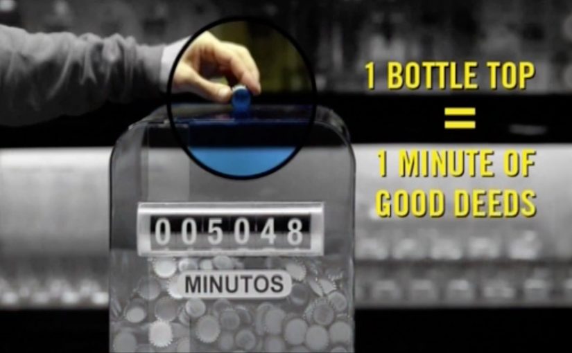
The idea is deliberately simple. For every Norte beer consumed at a bar, the brand donates one minute of time to practical community work, including fixing houses, maintaining parks, and repairing schools. Followers can monitor the donated minutes and the progress made through a dedicated website, which turns “we went for a beer” into a measurable counter of good deeds.
How the “minutes” mechanic works
The mechanic converts consumption into a visible unit of contribution. One beer equals one minute, then the brand performs the work and publishes progress so the audience can see the tally move. The counter is the proof, and the proof is the story people repeat.
In FMCG marketing, especially in categories tied to social rituals, converting a purchase into a transparent, trackable unit of public benefit can reframe indulgence as participation.
Why it lands
It removes the defensiveness from the behavior by giving it a credible upside. The campaign is not asking people to stop going out. It is redirecting the narrative from “pointless drinking” to “we contributed minutes.” The tracking layer matters because it reduces cynicism, since the audience can follow a concrete output rather than a vague promise.
Extractable takeaway: If your category has a guilt narrative, turn the core behavior into a quantifiable unit of visible impact, then publish progress often enough that people can use it as social proof.
What the brand is really trying to win
This is reputation as much as reach. Norte is positioning itself as the beer you can choose without needing to defend the choice later. The community work is the legitimacy, and the “best excuse” line is the social wrapper that helps the story travel.
The real question is whether a beer brand can turn a familiar excuse into a credible, repeatable proof of usefulness.
What to borrow from Norte’s minute logic
- Make the unit understandable. A minute is easier to grasp than a donation percentage.
- Design the proof before the film. A public counter and visible work outputs keep the idea credible.
- Let the audience retell it in one sentence. “Every beer adds a minute” is built for word-of-mouth.
- Guard the integrity. Transparency and follow-through matter more here than polish.
A few fast answers before you act
What is “The Best Excuse Ever” in one line?
A beer campaign where each Norte beer consumed converts into one minute of real community work, tracked publicly so people can see progress.
Why does the minute-based unit help?
It is concrete and easy to visualize. It also makes progress feel additive, so participation scales naturally with social occasions.
What makes this more credible than typical cause marketing?
The proof mechanism. A visible counter plus documented work outputs reduces the “donation fog” that often makes audiences skeptical.
What is the biggest risk with this approach?
If the brand cannot consistently deliver the promised work, the counter becomes a liability and the campaign reads as opportunism.
When does this model work best?
When consumption is already social and habitual, and the brand can operationally execute real-world outputs at the pace the campaign generates demand.