The Schweppes Facebook Profile App

The Schweppes Facebook Profile App

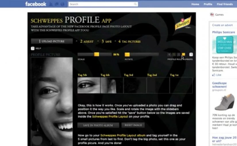
You want a standout Facebook profile, but you do not have Photoshop skills. Schweppes solves it with a Profile App that helps you build a polished new profile design in minutes, using simple templates instead of design tools.

What changed on Facebook that triggered this

Facebook rolled out improvements to the profile experience that made it easier to tell your story and learn about your friends. Creative people quickly started experimenting with the new profile design, turning profiles into personal canvases.

What did Schweppes build

That wave inspired Schweppes to develop the Schweppes Profile App on Facebook. It gave anyone who did not have Photoshop skills, and does not have much time, a way to create a great new profile.

On social platforms where the profile itself is part of how people present themselves publicly, the strongest brand utility is the one that makes visible self-expression easier.

The real question is whether the brand can make a rising social behaviour easier to join without making the experience feel like advertising.

Why this is a smart brand move

This is a smart brand move because it provides a service that becomes increasingly popular as the trend catches on. Templates matter here because they turn a design behaviour into something ordinary users can complete quickly, which is why Schweppes gets used inside the trend instead of interrupting it from the outside.

Extractable takeaway: When a platform change creates a new expression trend, the most effective branded response is often a simple utility that removes skill and time barriers so more people can participate.

What Schweppes is really buying

The business intent is not just profile creations. It is to link Schweppes to an emerging Facebook behaviour at the moment people are actively shaping how they appear to others, which gives the brand relevance through participation rather than message repetition.

What to steal if you build branded social tools

  • Ship a tool that helps people express themselves. Identity improvements get repeated use because the user cares about the output.
  • Ride an emerging behaviour with utility, not messaging. When a platform change sparks a trend, a simple enabler scales faster than a campaign claim.
  • Make quality accessible for non-experts. Templates turn “I need skills” into “I can do this in minutes”.
  • Measure what stays live, not just what gets tried. Adoption is about how many people keep the output active and visible to others over time.

A few fast answers before you act

What is the Schweppes Facebook Profile App?

It is a branded Facebook app that helps people create a customised profile look without needing Photoshop or design skills.

Why does this work as content people actually use?

Because the output is identity-based. People are motivated to improve how they present themselves, so a tool that makes it easy gets adoption.

What is the core pattern to copy?

Spot an emerging behaviour, then ship a simple tool that helps people do it better. The brand earns attention by enabling, not interrupting.

Why does accessibility matter more than creative polish here?

Because the idea scales only if ordinary people can complete it quickly. Templates beat complexity when the goal is broad participation, not elite design output.

What should you measure if you run something similar?

Creations completed, share and usage rate, how many people keep it live, referral loops from friends viewing profiles, and repeat usage over time.

IKKI.be: The Crying Invoice

IKKI.be: The Crying Invoice

USG People, one of the world’s biggest outsourcing companies, launched ikki.be. A portal for freelancers in search of new projects. The mission was to build awareness among freelancers and get them to sign up.

What they learned is simple. One of a freelancer’s biggest concerns is getting paid on time. Which they usually do not. So instead of another feature-led pitch, they created a physical reminder that lets freelancers “recall” the accounts department of late payment, with a little smile. Here, “recall” means prompting the payer to act by making the delay impossible to ignore.

An invoice that complains for you

The execution is the product truth turned into a prop. A mailed invoice that starts to cry when the envelope is opened. Case write-ups describe the trigger as a simple sensor reacting when the invoice is exposed, so the sound becomes unavoidable in the moment the payment decision is made. That matters because the trigger turns a forgettable invoice into an unavoidable emotional cue at the exact moment payment is being processed.

In European B2B lead generation for freelance marketplaces, the fastest attention often comes from solving a cash-flow anxiety rather than talking about platform features.

Why it lands

It lands because it reframes a painful, familiar workflow into a moment of social pressure that feels playful rather than aggressive. The invoice does the awkward part, and the person opening it becomes the one who has to explain why it is “crying”. That flips the emotional burden away from the freelancer chasing and onto the payer delaying.

Extractable takeaway: If your audience shares a recurring frustration, build a small object or mechanic that creates a socially visible cue at the exact decision point, then let that cue do the persuasion instead of your copy.

What the business intent really is

This is awareness built on relevance. It ties ikki.be to a pain point that every freelancer recognizes immediately, and it makes the brand memorable through a single, repeatable story people will retell. This is the right kind of B2B awareness work because it earns memorability by dramatizing a real freelancer pain instead of dressing up a feature list. The real question is how to make your brand useful at the moment the pain is felt, not just visible before it happens.

What to borrow from this payment-pressure idea

  • Start from a shared anxiety. Build the message around what keeps your audience up, not what your roadmap shipped.
  • Move the moment to where decisions happen. Here, the reminder appears at envelope-open time, not in a banner.
  • Use humor as a pressure valve. Playful discomfort can be more effective than aggressive escalation.
  • Make it explainable in one line. “It cries when you open it” is instant word of mouth.

A few fast answers before you act

What is “The Crying Invoice”?

A physical invoice that audibly cries when opened, designed to nudge late payers and spark conversation around paying freelancers on time.

Why does this work better than a standard awareness ad?

Because it appears inside a real payment workflow and turns a private delay into a socially noticeable moment, without needing confrontation.

What problem is the campaign solving for ikki.be?

It makes the portal relevant by anchoring it to the most common freelancer concern. Getting paid on time.

What is the main risk with this approach?

If the gimmick feels mean-spirited or humiliating rather than playful, it can trigger backlash and reduce goodwill.

How can another B2B platform copy the pattern?

Identify the shared operational pain, then create a lightweight intervention that shows up at the decision point and makes the issue easy to talk about.

La Senza: The Cup Size Choir

La Senza: The Cup Size Choir

In this holiday video from London ad agency Karmarama, Canada-based lingerie maker La Senza presents a novel Christmas choir. Women in their underwear lie on a puffy piano, each singing the musical note represented by their bra size, from A to G.

A Christmas choir built from cup sizes

The hook is immediate. A to G becomes a scale. The set becomes a keyboard. The cast becomes the instrument. It is a simple idea that explains itself in seconds, and it gives the viewer a reason to watch again just to catch how the “notes” are assigned.

How the mechanic sells the range

Instead of listing products, the film turns product variety into a performance system. Each cup size is framed as a distinct note, and the choreography is built around sequencing those notes into a familiar holiday tune.

In holiday retail marketing, the quickest way to earn attention is to turn the product range into entertainment people can instantly understand.

Why it lands as a share

The format is cheeky, high-contrast, and easy to summarize. That makes it naturally social, because people can describe it in one sentence and still do it justice. The “keyboard” visual also creates a clear pattern, so even casual viewers feel like they are in on the joke.

Extractable takeaway: When your product offer is breadth, not one hero feature, convert that breadth into a simple system the audience can see and repeat, and the message sticks without explanation.

The intent behind the wink

This is brand entertainment with a retail job to do. It keeps La Senza top-of-mind during a gifting season and spotlights that the brand serves a wide range of sizes, while the tone keeps it light enough to travel beyond existing customers.

The real question is whether the performance makes that size range memorable enough to travel beyond the existing customer base.

How to turn range into a shareable system

  • Make the organizing idea visible. A to G as notes is instantly legible.
  • Use a familiar frame. A holiday tune lowers comprehension cost.
  • Sell the range without “catalog copy”. Show variety as a system, not as a list.
  • Keep the runtime tight. Short spectacle beats long explanation for sharing.
  • Let the craft do the persuasion. Production, choreography, and rhythm carry the message.

A few fast answers before you act

What is the core idea of The Cup Size Choir?

Assign musical notes to bra cup sizes and build a performance that turns product range into a simple, watchable system.

Why does this work as holiday advertising?

It is easy to understand, easy to retell, and it uses a seasonal structure people already recognize, so the message lands quickly.

What is the main brand message?

That the brand offers a broad size range, communicated through entertainment rather than product claims.

What is the biggest risk with this kind of execution?

If the tone feels gratuitous or distracting, the audience remembers the stunt but forgets the brand or the point.

How can a different category copy the approach safely?

Translate “range” into a clear system. Use a familiar cultural frame. Keep the mechanic obvious, and let the craft carry the story.