
Foursquaropoly: Real-World Monopoly via Foursquare

Can you imagine playing a real-world version of Monopoly wherever you go, 24/7. A bunch of students decide to explore exactly that, and the result is a concept video that mashes up Foursquare-style check-ins with classic Monopoly rules.

Mechanic in plain terms: your location becomes the board. You “move” by going places, you “claim” by checking in, and ownership plus rewards become part of everyday movement through a city.

In mobile-first consumer experiences, location-based play works best when it turns routine movement into a simple loop of progression, competition, and collectible status.

Why it lands

It takes an abstract board game and makes it instantly legible in the real world. Because the check-in becomes both the move and the proof, the player gets status feedback without learning new controls. The joy comes from recognition. Streets become properties, venues become squares, and everyday decisions get a light layer of consequence. The real question is whether you can keep the loop fair and legible once real places and real rewards enter the rules.

Extractable takeaway: When you translate a familiar game into a real-world experience, keep the rules understandable in one sentence and the feedback immediate. The faster a player can see “what I did” and “what it unlocked,” the longer the concept stays sticky.

What this hints at for brands

The intriguing angle is not just “Monopoly in the streets.” It is the reward layer. By “reward layer,” I mean a simple, visible benefit attached to a check-in. Brands could join in by sponsoring virtual rewards that are redeemable for real-world objects, using check-ins as the trigger and redemption as the payoff. Done carefully, the value exchange is clear: attention and footfall in return for something tangible. This works best as an opt-in, time-boxed layer, not a permanent loyalty system.

Steal these mechanics for location activations

  • Turn geography into progress. Make “being somewhere” the action, so participation feels effortless.
  • Use scarcity that maps to reality. Limited locations, limited time windows, and visible ownership are more compelling than generic points.
  • Reward the behavior you actually want. If you want visits, reward arrivals. If you want repeat, reward streaks and routes.
  • Keep the redemption simple. The moment the payoff is confusing, the game stops being a game and becomes admin.

A few fast answers before you act

What is Foursquaropoly?

A concept for turning Monopoly into a 24/7, location-based game where check-ins and real-world movement replace dice rolls and board squares.

Why is Monopoly a good fit for a real-world location game?

Because it already maps cleanly to places, ownership, and rivalry. Those ideas translate naturally into neighborhoods, venues, and repeat visits.

What makes a location-based game loop feel sticky?

It feels sticky when each check-in produces immediate feedback, such as status or ownership, and the rules stay understandable without a manual.

How could brands participate without breaking the experience?

By sponsoring rewards that feel additive, such as limited-time bonuses at specific locations, and keeping the rules consistent so the game still feels fair.

What is the biggest risk in making this real?

Player fatigue and confusion. If the rules are too complex or the rewards feel arbitrary, people stop understanding what to do next and the loop collapses.

Prigat: Smile Stations

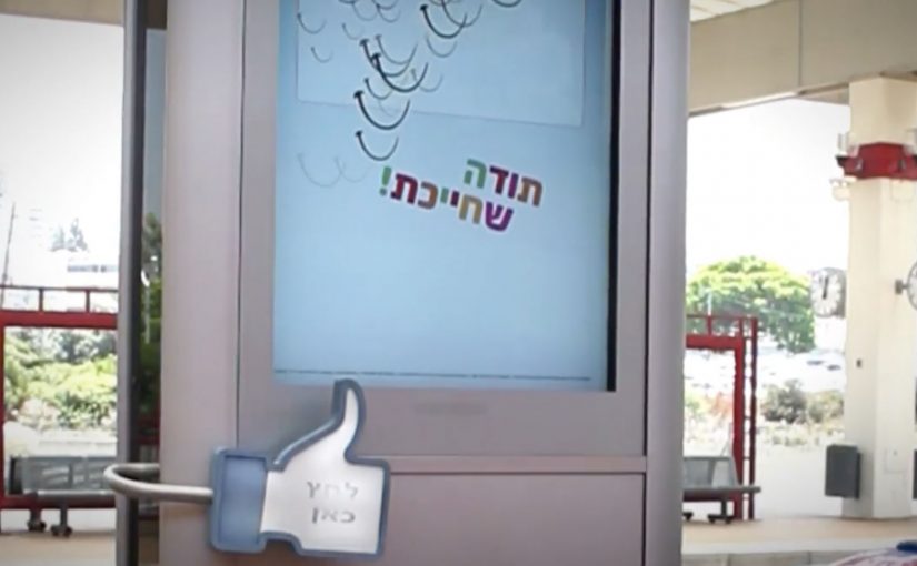
Publicis Israel and e-dologic are back with a new campaign for Prigat, a leading company in the Israeli fruit juice market.

This time they use innovative digital billboards called “Smile Stations” to send real-time messages at various train stations. The aim is to get passers-by to smile, and “like” the moment.

The mechanic: turn a Facebook message into a station moment

It starts on the Prigat Facebook Page. People send messages that are pushed to screens at train stations. Commuters walking by can approach the screen and press a physical “Like” button.

That button press triggers a simple payoff. The billboard captures the moment, then broadcasts the video back to the person who sent the message. Users who generate the most smiles win a prize.

In busy public transit environments, interactive out-of-home works best when the action is obvious, the feedback is immediate, and the reward is shareable.

Why it lands: it makes public emotion measurable

Most out-of-home asks for attention. Smile Stations asks for a reaction, then turns that reaction into proof you can send back to the originator.

Extractable takeaway: If you want participation at scale, close the loop. Let a remote user trigger a real-world moment, let a passer-by respond with one physical action, then send that response back as a personal artifact the originator can keep and share.

Reported figures put this at over 10,000 messages sent to station screens, with thousands of people responding by hitting the Like button.

What the brand gets from this

The real question is whether a public display can turn a remote social prompt into a personal moment worth sharing.

This is stronger than passive digital out-of-home because the physical Like button reduces effort and the returned video turns a fleeting reaction into a personal memory both sides can own.

The campaign does not just generate impressions. It creates a two-sided interaction where both parties feel like they caused something to happen. That is a stronger memory structure than “I saw an ad”, especially in a context as repetitive as commuting.

What to steal for your own social-plus-out-of-home activation

  • Design a one-step physical interaction: one big button beats a complicated interface in public space.
  • Make the response visible: the passer-by should understand instantly that their action “counts”.
  • Return a personal artifact: sending the video back is what turns participation into sharing.
  • Gamify without friction: “most smiles wins” is a clean mechanic with no explanation overhead.
  • Pick locations with dwell time: stations work because people pause, look up, and wait.

A few fast answers before you act

What is a “Smile Station”?

It is an interactive digital billboard at a train station that displays user-submitted messages and invites passers-by to respond by smiling and pressing a physical Like button.

What makes this different from a normal digital billboard?

It is two-way. Remote users trigger messages, commuters respond physically, and the response is captured and sent back as video, creating a closed feedback loop.

Why include a physical Like button?

Because it removes friction. A single, tangible action is faster and more intuitive than asking people to pull out a phone, scan, or type.

How do you measure success for an activation like this?

Message volume, unique senders, Like-button presses, response rate per message, video shares by originators, and dwell time around the screen locations.

What is the main execution risk?

Latency and unclear feedback. If the system feels slow or people are unsure what their button press did, participation drops quickly in a commuter setting.

Durex: Xerud, The Lover’s Fortune Teller

Durex Taiwan’s sales were in decline, but reminding a young audience about the risks of unprotected sex came with a local constraint. Sampling works well in many markets, yet in Taiwan the category carries enough taboo that street promoters struggled to start conversations and hit daily contact targets.

OgilvyAction’s answer is a low-budget distribution idea disguised as something people already seek out. An unbranded fortune-teller machine called “Xerud”, placed in bars, nightclubs and karaoke venues.

The machine prints playful “predictions” about relationships and sex, then dispenses a discreet sample condom pack matched to the forecast and the product benefit. The pack also includes simple educational tips about safer sex.

A sampling machine that earns permission first

The core mechanic is not the giveaway. It is the cover story, meaning the socially acceptable reason to approach the machine. People approach “Xerud” for curiosity, not for condoms, which changes the emotional posture from embarrassment to play. The venue context does the rest. Lower inhibition, higher openness, and a built-in reason to talk about love.

In mainstream consumer marketing, the most efficient way to handle taboo topics is to place them inside a familiar cultural ritual, then let that ritual create permission to engage.

Why it lands

This works because it swaps confrontation for self-service. Nobody is being “sold” to in public. The user opts in privately, receives a personalized message, and gets a product sample that feels relevant rather than generic. The experience also makes the first sentence easier. It gives people a prompt to laugh about, which is often the fastest route into a serious subject.

Extractable takeaway: When your category is socially sensitive, design distribution that people can initiate themselves, inside a context that already legitimizes the topic. That one design choice can triple throughput versus direct promotion.

What the numbers are really saying

The case write-up reports that an average street promoter hands out about 23 samples per hour, while “Xerud” dispenses about 77. The real question is whether the framing removes enough shame to make self-initiated sampling scale better than promoter-led outreach. The headline is not “a clever machine”. It is that the right framing can outperform manpower when the bottleneck is shame, not reach.

What taboo-category marketers can steal

  • Use an unbranded entry point. Let the experience earn consent before the logo arrives.
  • Match the venue to the conversation. Nightlife lowers barriers for relationship and intimacy topics.
  • Personalize the “why this sample”. Relevance reduces awkwardness and increases retention.
  • Make education feel like a bonus. Tips land better when they arrive inside a playful ritual.
  • Measure throughput honestly. Compare against the real baseline, not a best-case scenario.

A few fast answers before you act

What is Xerud, in one sentence?

An unbranded fortune-teller machine placed in nightlife venues that prints love predictions and discreetly dispenses matched condom samples with safer sex tips.

Why does the “fortune teller” disguise matter?

It gives people a culturally familiar reason to approach, which reduces embarrassment and makes the first interaction feel voluntary rather than confrontational.

What is the main marketing objective?

Increase trial and restart conversation in a category where social taboo blocks normal sampling and awareness tactics.

What is the biggest execution risk?

If the machine feels too obviously “a condom stunt”, the protective disguise collapses and usage drops. The socially acceptable reason to approach has to feel legitimate in the venue.

How can other taboo categories borrow this approach?

Pick a trusted ritual or interface people already opt into, then embed sampling and education as an unobtrusive “extra” that follows the ritual’s logic.