
Sukiennice: Secrets Behind Paintings

The Sukiennice Museum in Krakow is one of the oldest museums in Poland, and it is reopening after a complete renovation. The problem is not the building. The problem is attention. Young people do not automatically find 19th-century Polish art interesting.

Leo Burnett Warsaw gets the challenge to pull this audience back in, and answers it with an integrated campaign anchored by the New Sukiennice augmented reality app.

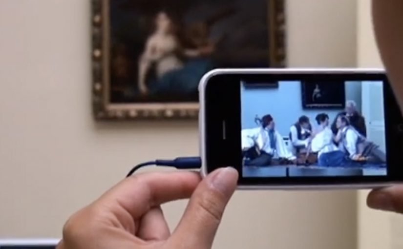
The mechanic: bring paintings to life with viewer control

The app turns the visit into an interactive layer. Point your phone at selected works and the paintings come alive, revealing their stories through short films and animated moments. Instead of reading a label first, you get pulled into a scene first, then you choose to go deeper. Here, viewer control means visitors choose when to trigger the story and whether to go deeper.

In European museums trying to win younger audiences, lightweight AR can translate static collections into short, shareable stories without rewriting the institution’s identity.

Why it lands: it swaps “art history” for narrative tension

This is not about making the museum more “digital”. It is about making the first minute feel rewarding. Young visitors do not need more information at the start. They need a reason to care. That works because short films give the paintings a hook, and the phone becomes a bridge between a familiar screen habit and an unfamiliar art period.

Extractable takeaway: If the barrier is “this feels irrelevant”, do not lead with education. Lead with story. Give people one fast, emotional moment they can experience, then let curiosity pull them into context and detail.

An integrated campaign that keeps the app from being a lonely download

The real question is how you make a heritage visit feel immediately worth a young person’s time without turning the art into a gimmick.

The app plays the central role, but it does not stand alone. The campaign also uses billboards, social media and e-cards to create buzz and point people toward the experience. The intent is clear. Get young people to show up, then let the AR layer turn “I visited” into “I discovered”.

The buzz generated by the campaign is described as attracting a significant share of Krakow’s population to the museum.

What to steal for your own cultural or heritage activation

  • Start with one irresistible moment: pick a small set of works and make them unforgettable, rather than trying to animate everything.
  • Put the story before the lesson: emotion first, interpretation second.
  • Make it usable on-site: the experience should work in the gallery without long setup or instructions.
  • Design for “showing a friend”: the best museum tech spreads when people can demonstrate it in seconds.
  • Support it with media that explains the payoff: billboards and social should communicate the “why” of the visit, not just the existence of an app.

A few fast answers before you act

What is the New Sukiennice app?

It is an augmented reality museum app designed to bring selected paintings to life and reveal their stories through short film content during a gallery visit.

Why is AR a good fit for 19th-century painting?

Because the barrier is often distance. AR can add narrative entry points and context quickly, helping visitors connect emotionally before they engage intellectually.

What makes this more than a tech demo?

The app is positioned as the core of an integrated campaign. The surrounding billboards, social media and e-cards create the motivation to visit, and the on-site experience delivers the payoff.

What’s the biggest risk with museum AR?

Friction and distraction. If setup is slow, or the experience pulls attention away from the original work instead of back into it, the technology becomes the point and the art loses.

How should a museum measure success here?

Look at youth attendance lift, repeat visits, time spent in targeted rooms, and whether visitors progress from the AR moment into deeper engagement like reading labels, joining tours, or exploring more works.
FRANK Oslo: Giuliani 9/11 Tweets

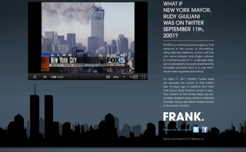
You follow a Twitter feed as if it is happening now. Updates arrive minute by minute, building confusion into urgency, then urgency into shock. The feed is written from New York mayor Rudy Giuliani’s point of view, and it recreates September 11, 2001 in real time.

FRANK is a communications agency from Oslo that wants to demonstrate the power of storytelling through the right medium. To commemorate 9/11 a decade later, they recreate and share the day as a live social stream experience.

On September 11, 2011, FRANK’s Twitter feed recreated the events of that day ten years earlier in real time from Giuliani’s point of view. The feed is described as being shaped using content collected from reputable public-domain media sources.

Real-time remembrance as a platform-native documentary

The mechanism is simple and specific. A single account publishes a paced sequence of posts that map to the original timeline, written in a constrained perspective, so the audience experiences the narrative in the same format they use for breaking news.

Here, platform-native means the story is built for the feed itself, not merely promoted through it.

In crisis and remembrance communications, real-time formats can make historical events feel immediate without changing the facts.

Why it lands

The power is in the temporal constraint. Real-time pacing prevents the viewer from jumping to the ending, which recreates uncertainty and heightens attention. The Giuliani viewpoint acts as a narrative spine, giving the stream a human decision-maker and a consistent voice, rather than a collage of headlines. It is a reminder that storytelling is not only what you tell, but also how you sequence it and where you let people experience it.

Extractable takeaway: If you want audiences to feel the weight of a known story, constrain the format. Pick one viewpoint, match the original timeline, and let pacing do what exposition cannot.

What the campaign is really doing

This is a proof of medium choice. The real question is whether the medium can carry remembrance with the same urgency as the original news cycle. Twitter is not used as a promotion channel. It is used as the container for the story. The campaign demonstrates that a platform-native structure can increase empathy and attention for complex events, while staying grounded in documented reporting.

What to steal from this real-time storytelling pattern

  • Choose one perspective. A single viewpoint makes large events navigable and coherent.
  • Use timing as a creative constraint. Real-time sequencing creates tension and attention without additional production.
  • Build credibility into the sourcing. If you rely on archival material, describe your source discipline clearly.
  • Match story to medium. The most persuasive channel is sometimes the format people already trust for “live” information.

A few fast answers before you act

What is FRANK Oslo’s “Giuliani 9/11” idea?

A real-time Twitter reconstruction of September 11, 2001 from Rudy Giuliani’s viewpoint, published ten years later to let audiences experience the timeline through a live-feed format.

Why use Twitter instead of a film or article?

Because the platform format is the point. A feed is how people experience unfolding events, so the campaign uses that native behavior to recreate pacing and uncertainty.

How does the single viewpoint help?

It creates narrative continuity. Viewers follow one decision-making perspective rather than switching between fragmented sources.

What is the main credibility requirement for this pattern?

Source discipline. If you claim accuracy, you need a clear method for selecting, verifying, and sequencing archival material.

When should you use real-time reconstruction?

When the goal is remembrance, education, or empathy, and when pacing and sequence are essential to understanding the human experience of the event.

SNS Bank: I Want Interest on My Current Account

SNS Bank promotes a simple product shift. Paying interest on a normal current account. Instead of leading with rates and fine print, the work frames it as something worth protesting for.

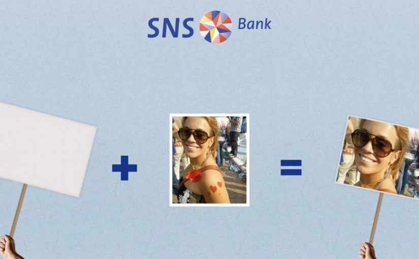
People “join” the protest using their Facebook or Twitter account. Their profile picture then becomes the campaign’s moving unit, connected into live rich media placements running on Dutch publisher inventory such as msn.nl and telegraaf.nl. Here, the moving unit is the participant’s profile picture reused as the visible building block of the protest crowd.

How the protest mechanic is built

The mechanism is straightforward. Sign up with a social account, capture the profile image, then re-render that image as part of a marching crowd inside dynamic banners. The same identity asset travels from social sign-up, to landing experience, to high-impact display formats, including what is described as a homepage takeover on telegraaf.nl.

In European retail banking, feature-led propositions like “interest on current accounts” often need a memorable way for customers to visibly participate to cut through price parity and low attention.

Why it lands

It takes a boring benefit and gives it a human visual. A rate becomes a crowd. That shift matters because it makes the offer feel socially validated and easy to explain. It also turns ordinary display inventory into a live proof point, because the banners visibly update with real people rather than generic stock photography. This is the right strategic move because the campaign makes participation itself the proof of relevance.

Extractable takeaway: When your proposition is a small financial feature, convert it into a visible social object. One reusable profile image can power sign-up, storytelling, and proof across every paid placement.

What SNS Bank is really trying to achieve

The business intent is to make “interest on a current account” feel like a category change, not a marginal tweak. The protest framing gives SNS Bank permission to be louder than the feature itself, and it creates a participation funnel that can be measured from social sign-up to on-site conversion.

The real question is how to make a marginal banking feature feel like a public movement rather than a line item in a comparison table.

What to steal from this protest-led banking launch

  • Turn the benefit into a visual system. If the offer is intangible, give it a repeating picture that accumulates and grows.
  • Use one identity artifact everywhere. A single profile image can unify sign-up, landing experience, and ad formats into one story.
  • Make paid media feel live. Dynamic creative that visibly changes reads as proof, not just persuasion.
  • Respect permission and platform rules. If you are pulling profile images, ensure consent is explicit and the experience stays compliant.

A few fast answers before you act

What is the core mechanic of this campaign?

People join via Facebook or Twitter, and their profile image is then reused as the creative building block inside a marching protest rendered across rich media banners.

Why use display banners for something that starts in social?

Because banners can function as visible proof at scale. The audience sees real faces moving through the ad units, which makes the proposition feel active rather than purely claimed.

What is the main advantage of the “protest” framing?

It makes a dry feature feel like a cause. That reframing increases memorability and gives people a simple story to repeat.

What is the biggest risk in copying this approach?

Using social identity assets without clear consent creates trust and compliance issues. If the sign-up step is not explicit, the same mechanic can backfire fast.

When does this kind of mechanic work best?

It works best when the product feature is real but visually weak. The participation layer gives the feature a public shape without changing the underlying offer.