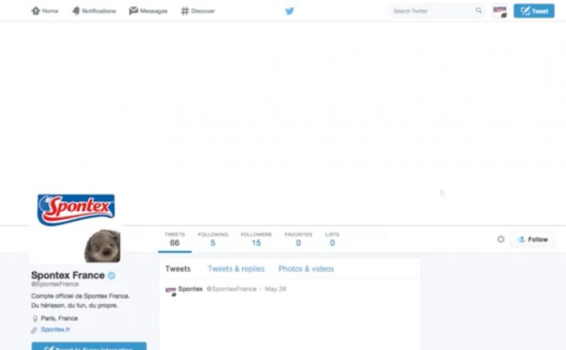
Twitter is one of the most used social networks worldwide. With billions of tweets being generated everyday, Spontex, a French homecare brand found it to be a mess.
To fight dirt online and at the same time have the cleanest Twitter account in the world, they created @SpontexFrance and started tweeting in white. This not only gave their Twitter timeline a spotless look, it got people talking about their unique Twitter account.
At first glance, the tweets from the account seemed to be blank. Clicking the tweets unlocked the secret messaging behind them. In some cases the first person to favourite the tweet won free products from Spontex.
Why “tweeting in white” is a smart brand mechanic
The idea is simple but loaded with meaning. Here, the brand mechanic is the repeatable rule that makes every tweet look clean first and reveal its message only after interaction. White space signals cleanliness, so the feed looks calm and spotless compared to the usual noisy timeline. Because the reveal requires a click, curiosity becomes a small commitment, which makes the brand idea more memorable than a standard tweet. The real question is how to make a cleaning brand feel distinctive on a noisy feed without shouting louder than everyone else. This is smart brand design because the execution makes the product promise visible before a single word is read.
Extractable takeaway: When the product promise is simple, build it into the format people use so the benefit is felt before it is explained.
For homecare brands on crowded social platforms, this matters because the interface itself can carry the brand promise when media attention is scarce.
What the brand is buying with this move
The business intent is to turn a low-cost social execution into distinctive memory, earned conversation, and repeat checking of the account.
What to borrow for social ideas
- Make the format the message. The visual cleanliness is the product proof.
- Add a lightweight unlock. One click turns passive scrolling into active participation.
- Reward fast interaction. “First to favourite” makes the feed feel live and worth checking.
A few fast answers before you act
What did Spontex do on Twitter?
They created @SpontexFrance and tweeted in white so the timeline looked clean and the messages appeared blank until opened.
Why did the tweets look blank?
Because the text was designed to blend into the background. Clicking the tweet revealed the hidden message.
How did the campaign drive engagement?
People had to click to unlock the message, and in some cases the first person to favourite a tweet won free products.
Why does this feel more interesting than a normal tweet?
The blank-looking post creates a small mystery. Opening it feels like discovery, so the interaction carries more attention than passive scrolling.
What is the core takeaway?
Use a platform-native behaviour, scrolling and clicking, and a simple visual twist to make participation feel like discovery, not advertising.