NIVEA Creme: Second Skin Project

A mother puts on a headset and a skin-like suit. Her son does the same, thousands of kilometres away. The promise is simple. If they cannot be together for Christmas, technology will let them feel a hug anyway.

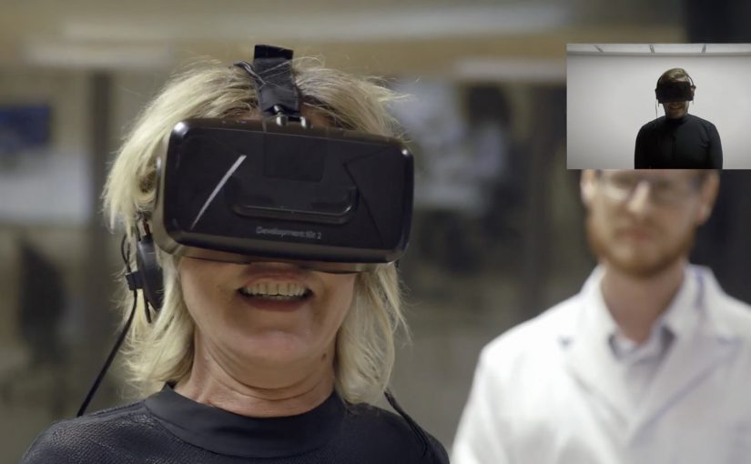
That is the set-up in NIVEA Creme’s “Second Skin Project” with Leo Burnett Madrid. The film introduces Laura in Madrid and her son Pablo, who is away volunteering in Paraguay. They are invited to test a “Second Skin” garment that is presented as a high-tech fabric designed to simulate human skin and transmit the sensation of touch at distance, paired with virtual reality headsets.

The story then pivots. What looks like a tech demo is used to make a point about touch, not technology. The most persuasive moment is not the suit. It is the human reunion that follows, designed to underline NIVEA Creme’s belief that nothing beats skin-to-skin contact.

The “Second Skin” mechanism that pulls you in

The film borrows credibility from advanced-sounding materials and VR. That framing creates anticipation, because the viewer wants to know whether the experiment can actually work. The suit and headset are the narrative engine that earns attention for long enough to land the real message.

In global consumer brands where heritage products compete with endless alternatives, emotional proof often carries more weight than functional claims.

The real question is whether the tech is the story, or whether it is just a credible pretext for the brand to own the value of touch.

The twist that protects the brand meaning

There is a risk with tech-led emotion. The technology can become the hero and the brand becomes a sponsor. This script avoids that by using the tech as a decoy. The reveal shifts the spotlight back to the product truth. A hug is still the best “gift” and NIVEA Creme wants to be associated with that intimacy.

Extractable takeaway: When you borrow a shiny mechanism to earn attention, make the emotional payoff explicitly restate what the brand believes, or the gadget takes the credit.

How to use “purpose + tech” without losing the human truth

  • Use technology as the hook, not the conclusion. Let it earn attention, then pay it off with a human truth.
  • Make the brand stance explicit. Here the stance is clear. Technology can be amazing, but touch matters more.
  • Cast real stakes. Distance, holidays, and family history make the outcome feel earned.
  • Keep the product role emotional, not technical. NIVEA Creme is not “the innovation”. It is the comfort cue that frames the story.

A few fast answers before you act

What is the NIVEA Creme Second Skin Project?

It is a Christmas-season film and experiment setup where a mother and son test a VR-led “Second Skin” suit that is presented as transmitting the feeling of touch at distance, then the story reveals the value of real human contact.

Why does the campaign use VR and a “second skin” suit?

Because it creates a believable question the audience wants answered. Can technology replicate a hug? That curiosity holds attention long enough for the campaign’s real point to land.

What is the core message NIVEA Creme is trying to own?

That skin-to-skin contact matters. The work uses technology to highlight that, even in a world of advanced tools, nothing replaces human touch.

What makes this more than a generic emotional video?

The narrative structure. It starts as a tech experiment, then pivots into a human reunion. That contrast makes the conclusion feel stronger than a straight sentimental story.

What is the biggest risk with “tech-as-story” campaigns?

Audience misattribution. People remember the gadget and forget the brand meaning. The fix is to ensure the emotional payoff clearly belongs to the brand stance, not the device.
360 Videos on Facebook

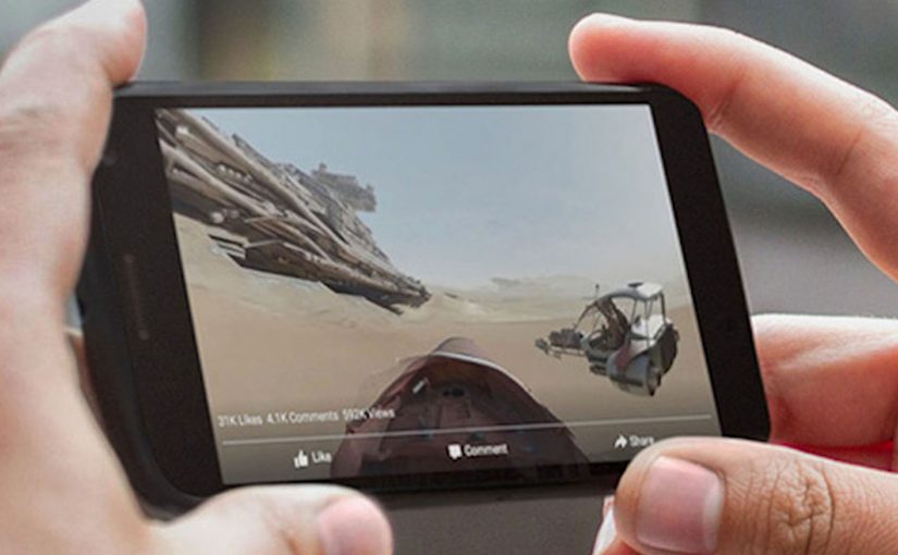
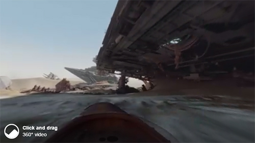
Disney drops you into the Star Wars universe. You can pan around the scene and explore the world in 360 degrees as part of the launch hype for The Force Awakens. It is one of the first big brand uses of Facebook’s new 360-degree video support.

Star Wars The Force Awakens 360 degree ad

(View the video directly on Facebook by clicking on the above image.)

Next, GoPro pushes the same format into action sports. A 360-degree surf film with Anthony Walsh and Matahi Drollet lets you experience the ride in a more immersive, head-turning way than a standard clip.

GoPro 360 degree ad

(View the video directly on Facebook by clicking on the above image.)

Facebook makes 360 video a native format

In September, Facebook launches 360-degree video support. That matters because it turns a niche format into a platform behaviour. Here, “platform behaviour” means a default interaction the feed makes effortless for viewers. Because the interface gives viewers control over where to look inside the post, the format can carry discovery without asking people to install anything new.

For global brands publishing inside feed-first social platforms, distribution mechanics shape the creative more than the other way around.

Mobile rollout is the unlock

Facebook announces that 360 video support is rolling out to mobile devices, so it is no longer limited to desktop viewing. That is the moment the format becomes mainstream.

Brands should plan 360 video as a mobile-first unit of viewer control, not a desktop novelty.

The real question is whether your story still works when the viewer can look anywhere, not only where your edit points them.

Why brands care. Distribution scale

Facebook’s own numbers underline why marketers pay attention. The platform cites more than 8 billion video views from 500 million users on a daily basis (as referenced in the Q3 2015 earnings context). If 360 video becomes part of that daily habit, it is a meaningful new canvas for storytelling and experience marketing.

Extractable takeaway: When a platform makes a format native and mobile-first, distribution scale, not production polish, becomes the main differentiator for whether your experiment turns into repeatable marketing.

Facebook supports creators with a 360 hub

To accelerate adoption, Facebook launches a dedicated 360 video microsite with resources like upload guidelines, common questions, and best practices.

Practical moves for Facebook 360 video

  • Design for discovery: Assume the viewer will look away from the “main” action, so build the story world to reward exploration.
  • Make mobile the default: Treat handheld viewing and quick replays as the baseline, not an adaptation.
  • Ship where the habit already lives: Prioritize platform-native distribution over bespoke experiences that require new installs.
  • Plan guidance for creators early: If your team is producing the format repeatedly, document capture and upload rules so it stays scalable.

A few fast answers before you act

What launches the 360 format on Facebook in this post?

Facebook adds native support for 360-degree video, making it publishable and viewable directly in the feed.

Which two examples headline the post?

Disney promoting Star Wars: The Force Awakens, and GoPro publishing a 360 surf video featuring Anthony Walsh and Matahi Drollet.

What changes when mobile support rolls out?

360 viewing is no longer limited to desktop, so the format becomes accessible in everyday mobile usage.

What scale stats are cited to show why this matters?

More than 8 billion video views from 500 million users on a daily basis, cited in the Q3 2015 earnings context.

Where does Facebook publish creator guidance?

Facebook points creators to a dedicated 360 video microsite with upload guidelines, common questions, and best practices.

JWT Brazil: Black Bar Donation

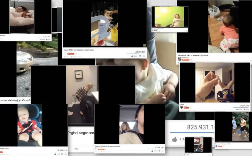
Videos that are recorded vertically and then posted online generally end up with black bars on either side. Lots of viewers find that wasted space annoying. So JWT Brazil came up with the “Black Bar Donation” campaign, which lets creators donate those bars to NGOs that need help promoting themselves.

On the campaign microsite, people select a vertical video to upload, tag it with the NGO of choice, and then publish it directly to their own channel with the NGO messaging living inside the black bars.

Turning a formatting mistake into donated media

The idea is neat because it starts from a real irritation. The bars are normally dead space. Here they become a donation surface that travels with the content, wherever the video gets shared or embedded. By “donation surface,” I mean a fixed, consistently visible part of the frame reserved for the NGO message. The “media spend” is created from a mistake people already make every day.

The mechanism: creator-led distribution with a cause payload

Traditional NGO awareness depends on buying reach or earning press. This flips the model. Creators supply the distribution. The campaign supplies the insert. Here, the “cause payload” is the NGO message container that sits in the bars and stays consistent across creator videos. NGOs receive a consistent message container that rides along with user-generated video. This is a stronger pattern than producing yet another standalone PSA, because it turns creator distribution into donated inventory.

The real question is whether your cause message can hitchhike on creator distribution instead of demanding attention on its own.

It also gives creators a low-effort way to feel helpful. Upload once, choose a cause, publish. No new platform to build an audience on. No complicated call to action.

In digital marketing where attention is scarce, the smartest cause campaigns repurpose existing media waste into useful inventory without asking audiences to change their habits.

Why the “black bars” frame is a strong creative device

The bars work because they are visually stable. They sit outside the main video action, so the NGO message does not compete with the creator’s content. At the same time, the contrast is impossible to miss because the bars are solid, empty shapes that viewers are already staring at.

Extractable takeaway: When you can transform a widely repeated user error into a benefit for someone else, you get scale through behaviour, not through budget.

A pattern for scale without media spend

  • Find a ubiquitous waste surface. Dead space, downtime, defaults, leftovers. Anything people already produce at scale.
  • Make contribution feel effortless. One clear action, one clear outcome. No learning curve.
  • Keep the creator’s content intact. Add value around it, not on top of it.
  • Design for portability. The message should travel with the asset as it gets re-shared.
  • Make the intent obvious. Viewers should instantly understand that the added space supports a cause.

A few fast answers before you act

What is “Black Bar Donation” in one sentence?

It is a campaign that repurposes the black side bars on vertical videos as donated ad space for NGOs, so the NGO message travels with the video when it is published and shared.

Why does this work better than a normal PSA video?

Because it piggybacks on content people already choose to watch. The NGO message becomes part of the viewing frame, not an interruption users try to skip.

What makes this campaign scalable?

The supply is user behaviour. As long as creators keep shooting vertical video and uploading it, the campaign has new “inventory” to convert into donated space.

What is the biggest risk with this model?

Quality control and brand safety. If the creator video is problematic, the NGO message can end up adjacent to content it would never choose intentionally.

How would you adapt this idea for other platforms or formats?

Look for other consistent “frame” areas that do not disrupt the core content. Then build a simple creator workflow that lets people attach a cause payload without editing tools.